If you are an actor, then your website can be a key marketing tool, helping to promote you and your skills. So it is important that you take the time to create a vibrant and successful website, that helps showcase your talents, engage with your fans and helps you connect with prospective employees.
When you start looking, there are many different types of actor websites. There are actors who are actively looking for work and using their website to help them do so. Then there are the big stars who have already made it. These actor’s websites help them reach out to their fans and publicize their recent projects.
In this article, I have included a mixture of actor websites, containing a variety of design elements. So where ever you are in your acting career, take a look at some of these examples of actor websites built with WordPress to help you find inspiration for your own site.
1. Leonardo Dicaprio
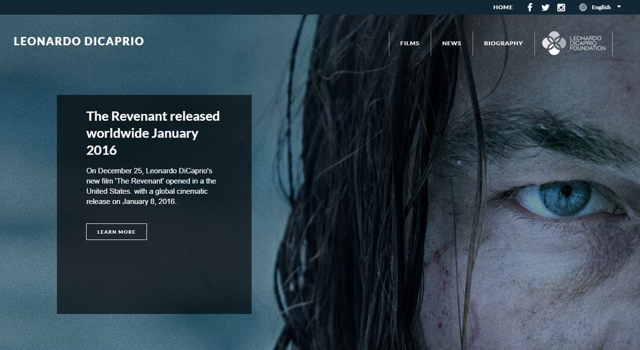
Leonardo Dicaprio’s website easily stands out amongst other actor websites. A full-screen automatic slider displays stunning images of Dicaprio. The homepage is then divided into sections, with videos from his most recent film, powerful quotes from a selection of other films he has starred in, and recent blog articles.
Social media is well promoted on Leonardo Dicaprio’s website. An additional navigation bar is displayed at the top of each page showing Facebook, Twitter, and Instagram icons. Instagram and Facebook feeds are also given prominent places in sidebars throughout the site, as well as an email opt-in form. These encourage Dicaprio’s fans to follow him and keep up to date with his recent releases and news.
2. Kate Britton
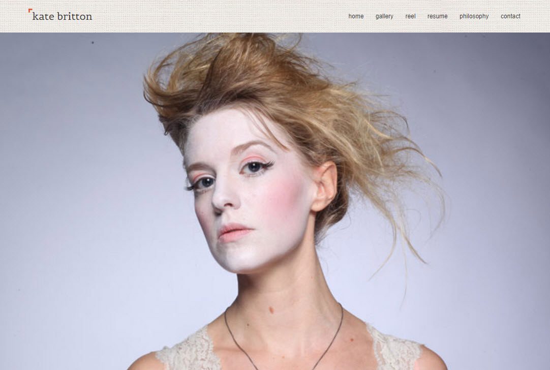
Kate Britton’s site is a great example of a working actors website. It includes all the crucial pages that those looking to employ an actor may need. There is a ‘Gallery’ page of photographs showing her playing different characters, and a ‘Reels’ page displaying videos of her acting. As well as this, there is a ‘Resume’ and ‘Contact’ page, so that potential employees can see what experience she has had and can contact her if they are interested.
However, this website is also creative and interesting, giving you a good insight into Kate Britton herself and her career. The homepage consists of just a full page slider, which displays images of Kate Britton in a variety of roles and costumes. And a page on Kate’s philosophy on acting helps you understand what motivates her acting career.
3. Russell Brand
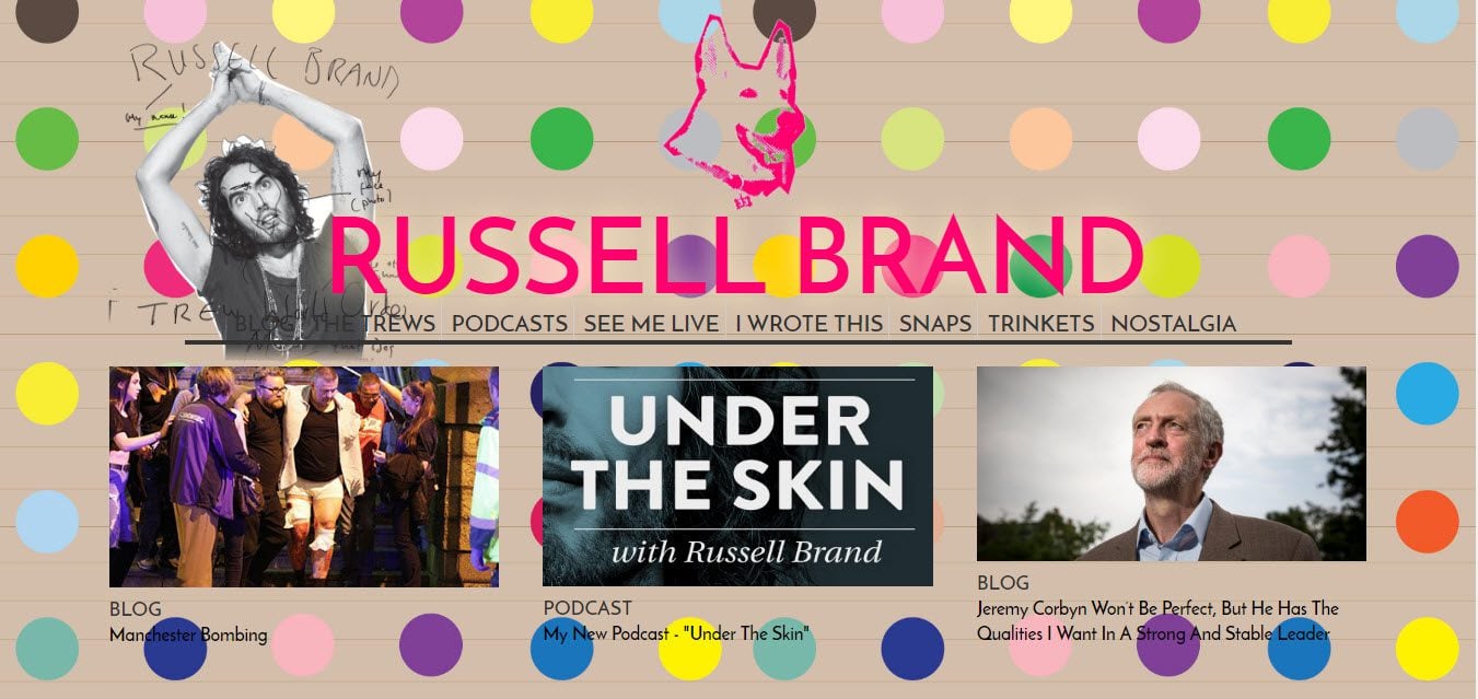
Actor and comedian Russell Brand has really embraced his website’s design. The result is a WordPress site that reflects his loud and chaotic personality. A parallel effect, with moving content and a bright, spotty background helps immediately grab visitor’s attention. Content is written in the first person, which helps his audience connect and engage with him.
The homepage is arranged into a grid layout, displaying blog articles, podcasts, videos and more. At the bottom of the page, Twitter and Facebook feeds are displayed. These show Russell Brand’s up to date news, comments and thoughts. And encourage his website visitors to follow him on social media.
4. Helen Mirren
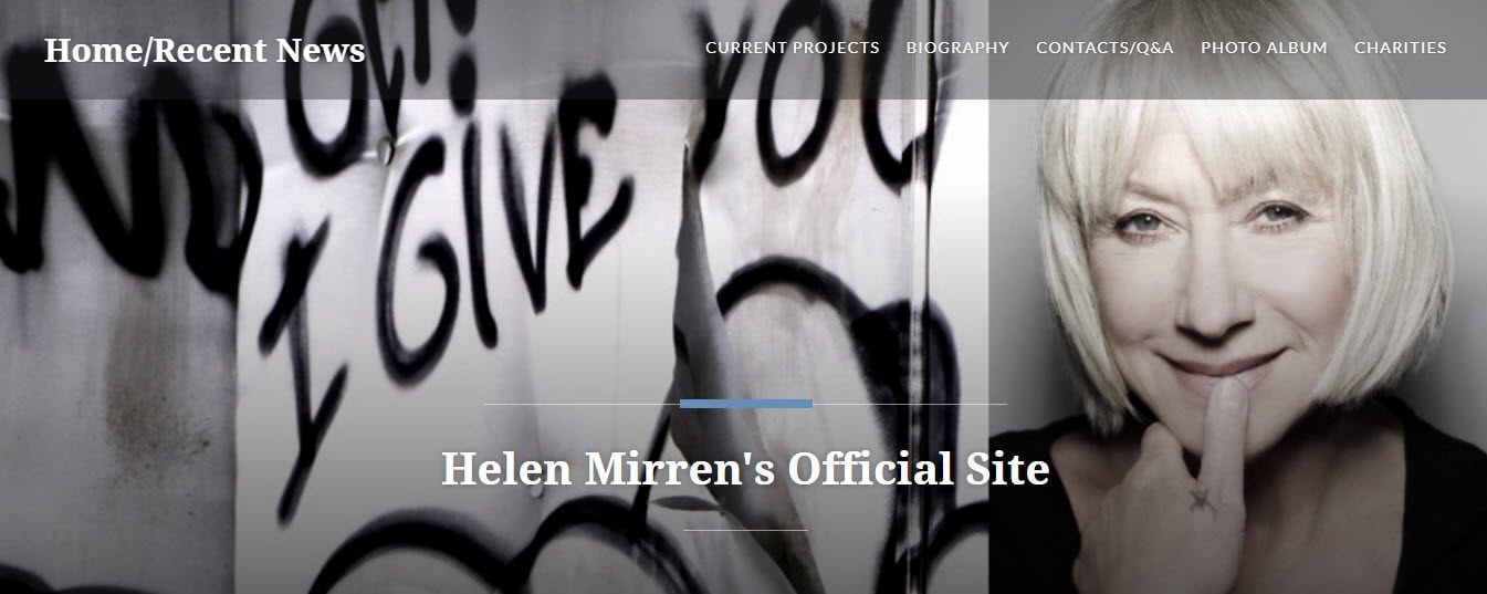
Helen Mirren’s beautiful WordPress website combines stunning images with a great navigational layout. The homepage displays a full-screen image with text overlay and a sticky menu bar. Following this is a grid layout of articles and matching photos, sharing news and recent events involving Helen.
This website contains a selection of pages of interest for Helen’s followers. A ‘Biography’ page gives a detailed list of the different films, theater shows and TV programs she has starred in. A ‘Current Projects’ page shares information on what she is currently working on. And a contact page contains an online form, an office address, and emails for her agency.
5. Beyonce
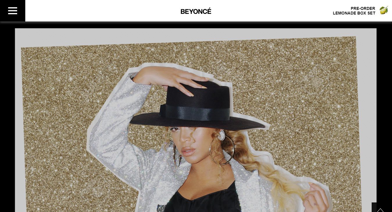
Beyonce’s WordPress website uses a bold white and black color scheme, which makes a lasting impression. The homepage is made up of full-screen shots of Beyonce in a variety of outfits. Clicking on individual images displays social media buttons, encouraging social shares.
A slide in menu can be accessed from the top left. This provides information on Beyonce’s music, tours, and much more. An icon on the top right of the homepage takes visitors directly to the Beyonce shop. Here products from Beyonce’s collections can be purchased directly on site.
6. Ben Whitehair
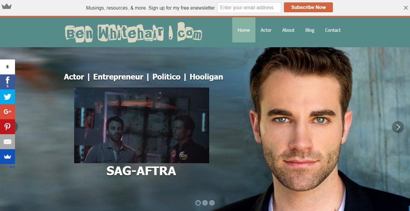
Ben Whitehair is a one-page WordPress website, creating an extremely easy user experience. A full page slider greets visitors, displaying photographs of Ben, with text overlay and embedded video. A relaxed color scheme is also used, with an off-white background and grayish text. This results in a casual and laid-back look and feel to the site.
This website displays a variety of lead generation tools. A sticky social media bar stays glued to the left-hand side of the screen at all times. A Sumo pop-up is displayed in the bottom right-hand corner to collect email addresses. And hello bar along the top of the page encourages visitors to sign up to a newsletter. Using these methods together should help Ben achieve a large following and fan base.
7. Judy Gold
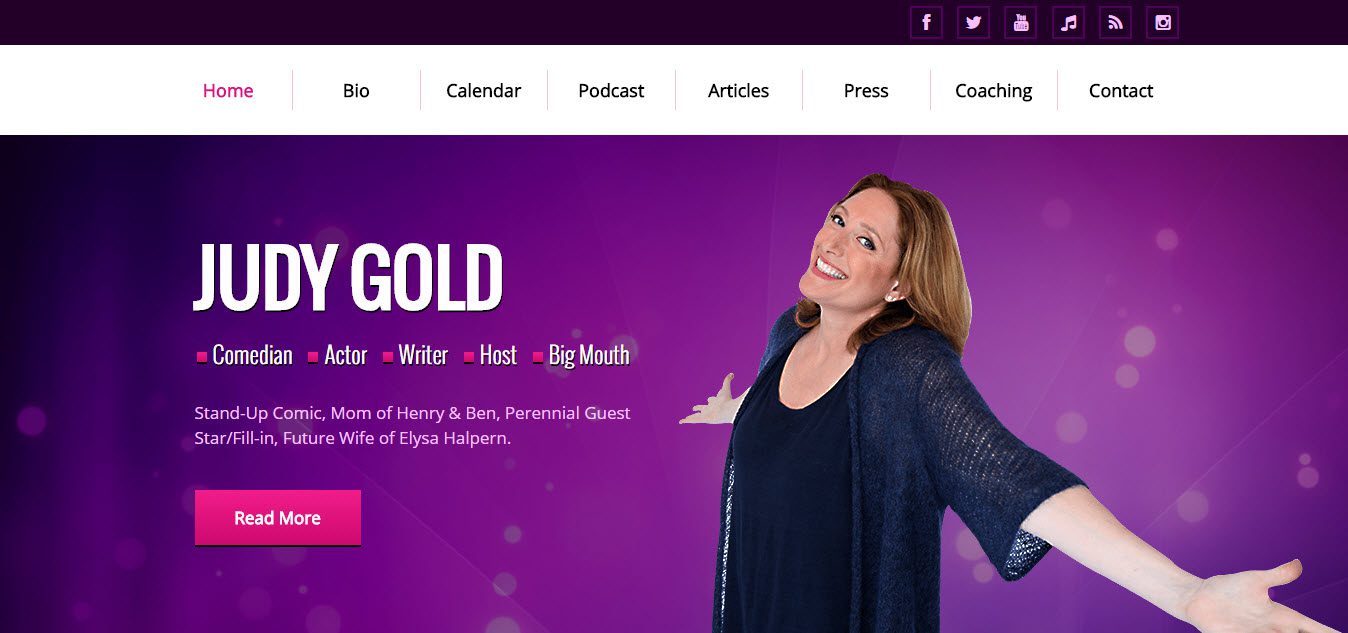
Judy Gold has a loud and exciting website, that matches her personality. A purple and pink color scheme and a homepage photo of herself with text overlay describing what she does (“comic, actor, writer, host, big mouth”) leaves you in no doubt that you have arrived at Judy Gold’s website.
Judy’s website contains a selection of attention-grabbing features. Videos of her stand-up performances, promotion of tickets for her upcoming shows, links to her weekly podcasts, her latest Tweets, follow buttons for her other social media channels, and lots more. This website really displays Judy’s range of talents and helps the audience engage with her ongoing projects.
8. Michael Bay
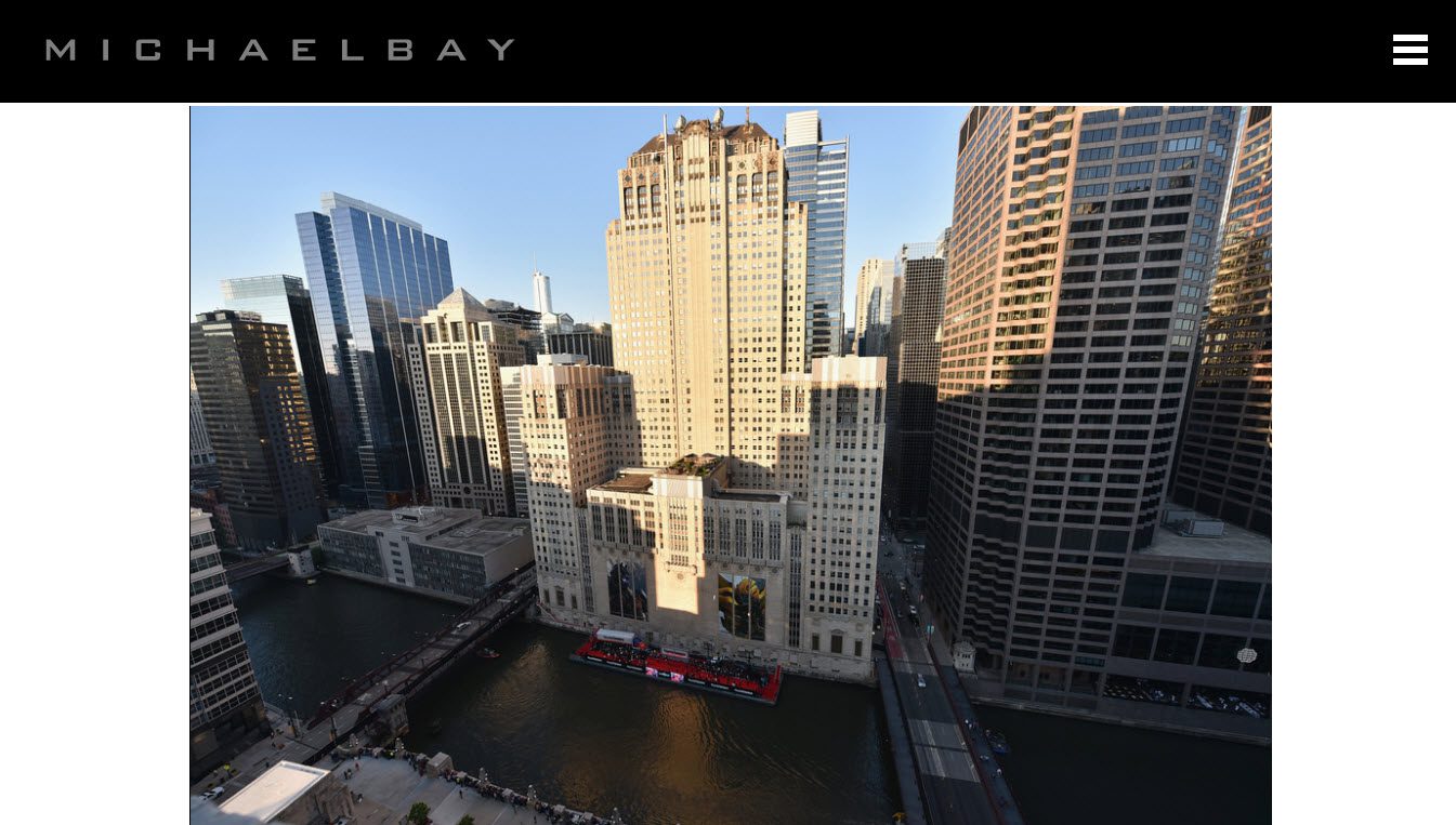
Although Michael Bay is a director and not an actor, his WordPress website is definitely worth a mention. This website uses a bold but simplistic black and white theme. This results in no distractions from the large images and videos that dominate the whole homepage.
A drop down menu on the right top hand side contains all the pages his visitors could need, as well as a numerous social media follow buttons. All images and videos displayed on these pages are large and centered middle of the page to help them make a statement of importance. There is also an official forum page that fans can comment in, and discuss Michael Bay, his many films, and the projects he has worked on.
9. Susan Bennett
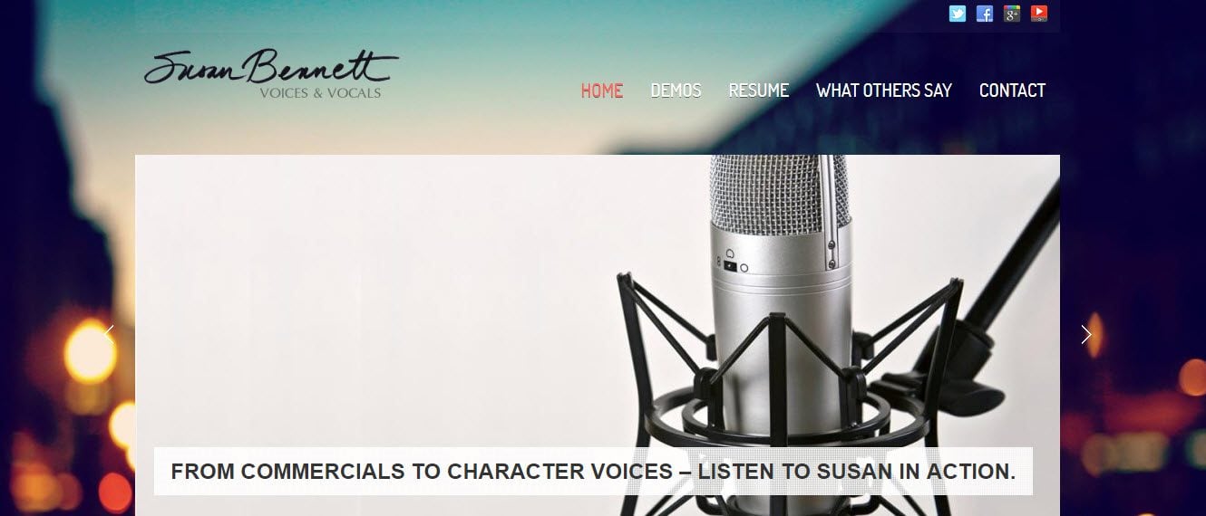
Susan Bennett’s WordPress website ticks all the boxes for an actor website that is looking to impress potential clients. Video and voice demo clips give examples of Susan Bennett’s work. A ‘Resume’ and ‘Testimonials’ page are both provided. And a logo carousel is displayed on the homepage, showing some of the top companies Susan has worked for.
The website’s ‘Contact’ page exhibits two Google Maps. These share the locations and contact details of both agents that represent Susan. The site’s footer also contains contact details for her agents, social media follow buttons, and a Twitter feed, enabling people to easily get in contact with her about possible upcoming work.
10. Reuben Langdon
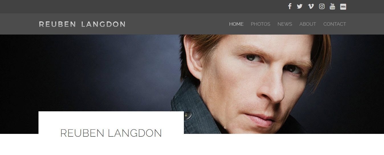
Reuben Langdon’s website displays an impressive homepage, packed full of useful information for the site’s audience. The page uses a parallax effect, with sections containing large images and text overlay sharing testimonials, links to videos of Reuben’s previous work, and much more.
Further down the page, news and events involving Reuben are shared, alongside his Twitter, Facebook and Instagram feeds. The ‘Photo’s’ page on this website has an effective layout. Photos are categorized under ‘Head Shots’, ‘Movie Posters’, ‘On Set’, and ‘Promo’. Images are then displayed in a grid layout, with a clean white border. This helps them catch the attention of visitors.
11. Sylvester Stallone
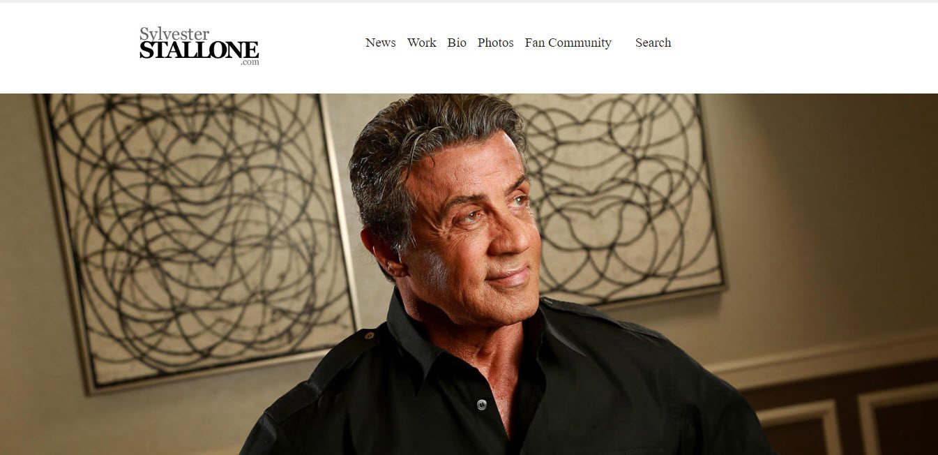
Sylvester Stallone’s website is classic, stylish, and very well organized. This WordPress site uses a white background with black text. A large full width featured image of Sylvester dominates the homepage. And a plain menu runs along the top of the page, so visitors can easily see what content is available to access.
The Sylvester Stallone website displays an Instagram feed on the homepage, with a ‘Load More’ button. This means users can view as many recent Instagram images as they wish, without actually having to leave the website. A ‘Fan Community’ page is also available, where fans can join up and discuss all things Sylvester Stallone.
Final Thoughts on Actor Websites
Not every actor website will need all the features and functionalities mentioned in this article. Just choose the elements most suited to your WordPress site’s needs. Then create a website that will help land you that next star role. Good Luck!
What elements will you add to your WordPress website? Please share in the comments below…
Featured Image by Macrovector / shuttershock.com






These sites are so poor examples of what we can do with WordPress.
The only one which catch my eye was helenmirren.com with the “new” Dyad 2 Theme (https://wordpress.com/theme/dyad-2)
Thanks Daan for the links.
Thanks for your comment Yiannis. Please have a look at what I have written to Rob in response to the designs of the site’s mentioned in this article.
Megan
Since people asked which of these are made using Divi, here’s a list:
Leonardo DiCaprio: HTML5 blank (http://html5blank.com/)
Kate Britton: Snapshot (http://siteorigin.com/theme/snapshot/)
Russell Brand: Custom theme (russel_brand)
Helen Mirren: Dyad (https://wordpress.com/themes/dyad/)
Beyonce: Custom theme (beyonce_2014)
Ben Whitehair Rise, with child theme (http://wedesignthemes.com/themes/rise)
Judy Gold: Custom theme (judy-gold)
Michael Bay: Port (http://themetrust.com/port)
Susan Bennett: Mural (http://themeforest.net/item/mural-business-portfolio-wordpress-theme/2453593)
Reuben Langdon: Divi, with child theme (http://www.elegantthemes.com/gallery/divi/)
Sylvester Stallone: ia5 (couldn’t find a link)
From this list, Reuben Langdon is the only actor who has had his website made using the Divi theme.
Thanks for sharing Daan!
Some of these sites are quite average from a design point of view and not really as good as they could be. Kate Britton isn’t even mobile responsive.
Hi Rob,
Thanks for your comment. It was actually incredibly hard to find some good examples of actor websites using WordPress. So I just went with the best of what there is out there, and then people can take from each site what they will.
Cheers,
Megan
Which of them if any, are built with Divi?
Hi Liz,
This isn’t a Divi list, it is just site’s that are made using WordPress. That said, the Reuben Langdon site has been built using Divi.
Megan
These are the amazing actor website. Is it possible to build actor website using DIvi ?
Hi John,
Thanks for the comment and glad you like the list. Yes I would definitely recommend using Divi to create an actor website – Divi is so flexible it could easily cater for the needs of this type of site.
Megan
Great list…do you have a similar list for music groups sites? I want to create a site for a new group…just need some ideas
Great idea Bill, will see what I can do!
Megan
Hi!
1.) your title says “actors” – did you forget actresses???
2.) why an article about actors sites with WORDPRESS? More interesting would what actors sites are made with DIVI!!!
Nastrovje!
Actor is the correct term though.
Steve,
1) While you are trying to make a good point I think it is more relevant to say ‘Actor’. Using the term ‘Actress’ sends equality back another ten years in the same context as you wouldn’t still call a female doctor ‘lady doctor’ or even ‘male nurse’. The term ‘Actor’ umbrellas both male and female.
2) I agree, I was part way through the list before even realising these sites were not made in DIVI!
Hi Steve,
Totally take your point about actresses but there are only so many words you can get in a title, and I have included actresses’ websites too!
As for another article focusing on actor sites made with Divi, watch this space!!
Thanks for your comment,
Megan