What goes in the footer? I hear this question a lot. Footers are often ignored. They’re the last thing reader’s will see, so they’re the last thing that gets any kind of attention – even from busy developers. It makes sense. However, the footer is more than just a place for your copyright notice and login links. The footer is still prime real estate in a WordPress site. It’s very usable and customizable.
Most readers usually do not pay attention to the footer. Usually readers won’t make it that far down because they assume that the footer just contains links to other content on the site and those same links are usually at the top of the page. They will scroll until they’re almost there and then scroll back up. If it’s a long page, they might scroll on down to look for a button to get them back to the top so they don’t have to scroll by hand. They also might look for some navigation buttons.
Footers usually have very low click though rates (CTR). This is partially due to the idea that most readers don’t get down that far. They do go below the fold, but they probably won’t go all the way to the footer. For this reason, developers tend to leave the footer basic. They save it for last and everything that gets placed there is either an afterthought or just more of the same.
Instead of more of the same, you can surprise your readers with something more creative. Reward your readers with something shiny. Once they discover the shiny, they will visit the bottom of the page more often and the more of your content they will see. Better yet, they’ll visit because it’s useful.
This article will look at 7 (well, maybe more) creative ways you can use the footer of your WordPress site to your advantage.
First, the Must Haves and the Standards
These are what visitors are used to seeing in the footer. Some are what they expect to see – and many would argue should be there. Others are what is usually found there just because. You might decide to keep these elements (in the case of navigation links you probably should keep them). If you do, you have a few options to do them a little more interestingly.
Don’t get so creative that you ignore what readers need. Your site’s footer still needs to have the basics. It still needs your primary navigation links:
- Home
- About
- Contact
- Blog
- Store
- Portfolio
Your readers will visit your footer expecting these links. They want the convenience of not having to scroll all the way back to the top just to click on one of these links.
However, you can present them in a creative way. It doesn’t have to look dull or boring. One interesting way to do this is by using shortcodes to create buttons. We’ll take a look at Elegant Themes’ shortcodes and how to do this a little later. Probably the best choice is to use a plugin that places your links there or to create your own hyperlinks.
Your Best and Recent Content
It is common to see a list of the most popular and/or recent content. This is usually a list of 5 posts. It works better for blogs than business sites. You can use shortcodes for these as well and place them in tabbed boxes. Again, we’ll see this later.
Placing your best and recent content in the footer isn’t a requirement. It is okay to forego these links for something more interesting.
The footer is a great place to provide one last chance for your readers to follow your social media efforts. This is a perfect place for a plugin such as Monarch.
Monarch
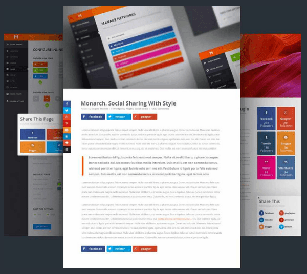
Monarch is Elegant Themes’ powerful social media plugin that comes with a widget that can be placed in the footer. It connects with over 20 networks and can be placed on many locations including on images. It also has 3 popup and fly-in triggers so your visitors will get one more chance at sharing your content. It also has several button shapes and hover effects. It includes a dashboard that shows statistics about how your visitors are sharing your content. It’s easy to use, is responsive, and looks great in the footer.
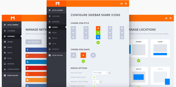
Speaking of social media, the footer is also a great place to show off your social proof. This lets your visitors know that they’re in great company. It helps in building your credibility. This is especially true if you’re selling a product or a service. By having social proof it shows potential customers and clients that others have already invested in you and had a great experience – so great that they felt the need to share their experience with their own social networks.
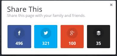
Monarch does this as well by showing the number of shares your page has had. This also show readers that this content is worth sharing, so it will help influence them to share as well.
Monarch is part of the $89 per year Developer plan, which includes access to all themes, plugins, layered Photoshop files, perpetual updates, and premium support.
And speaking of social proof, you can also include images of your client’s logos in your footer. This will show potential customers and clients who has already invested in you. As an example, if you go to the site of two web-developers and see that one has logos of IBM, Microsoft, and Apple as examples of their clients, and the other has none, you immediately think the one with the logos is more reputable. Showing these icons in the footer is a great way to display this.
Of course it doesn’t have to be clients. It can be news-media where your work was featured, too.
How to Add Them
There are several ways you can add icons to your footer. You can use HTML in a text box and point the image source to your image. It would look like this:
<a href=><img src="http://sample.com/wp-content/uploads/2013/02/companylogo.png" alt="Company Logo" </a>
Another option is to add the logos to a single image that will show across your footer. You would create the image, or banner, in an image editing program like Photoshop (or our favorite) and place it in the footer of your theme using HTML. For example, in the Twenty Twelve theme, your HTML could go in footer.php after <footer id=”colophon” role=”contentinfo”>
An easier method would be to use a plugin that gives you easy access to the footer and allows you to add icons. Here’s a plugin called Footer Putter that does this easily.
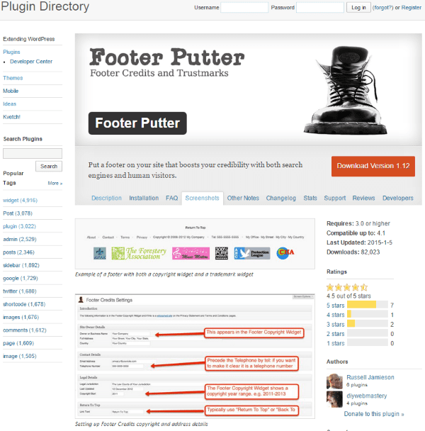
Footer Putter puts a footer in your footer’s footer. Yes, seriously. The focus is on business. It adds a copyright widget and a trademark widget. It adds a menu with links to your contact, privacy, and terms and conditions pages. You can include your phone number, mailing address, email address, etc. It presents the data in the best way for search engines. This is an excellent plugin to help build credibility and trust. The trademark widget will add your client’s logos, too.
It adds a new widget area to your theme called Credibility Footer. The information for the widget is found in its settings. The information includes site owner details, contact details, legal details, a link to return to the top (you can change the text), and action and filter hooks.
I found this one easy to use and set up. It looks nice and provides a good bit of information and links for your visitors. The plugin is free.
Contact Form
Rather than showing your visitors a link that they would have to click on in order to contact you, you could include a small contact form in the footer. Many readers will scroll to the bottom to look for contact information. This would allow them to skip the extra click.
You could call this one “Site Suggestions” or “Hire Me” if you want a different response from your visitors than your standard contact page.
cformsII – contact form
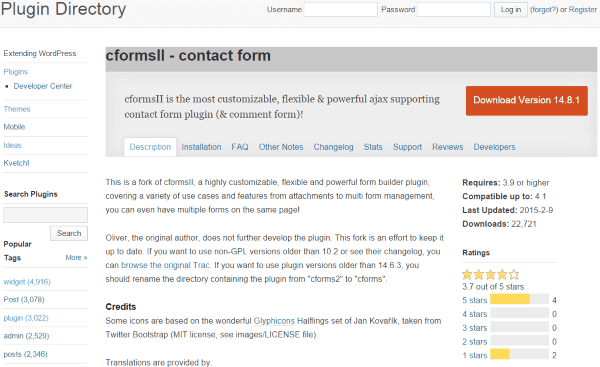
This is a powerful form building plugin that allows you to easily create and build custom forms. The forms are created using AJAX. They can be styled using CSS. You can place the forms as a shortcode into the footer widgets or you can place them in the lower footer by pasting the code into your theme’s PHP.
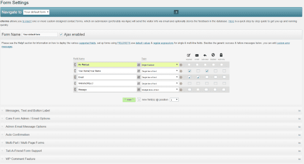
This plugin is easy to use and is highly configurable. It includes lots of help files to step you through using it. Not bad for a free plugin.
The footer gives you one last chance to get your visitors to sign up to your newsletter. There are of course other ways to do this. You can have your newsletter subscription popup as your visitors leave your site, but they can ignore this and go on their merry way. A signup form in the footer might be that one place they actually see it. They might not be used to seeing it there, so they might not ignore it.
MailChimp for WordPress
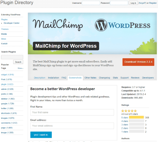
This free plugin lets you build forms for your MailChimp newsletter. You can use it to add forms and signup checkboxes in your footer. It includes 5 colors and will integrate with WP Comment form, WP Registration form, WP MultiSite form, Contact Form 7, Events Manager, bbPress, and BuddyPress.
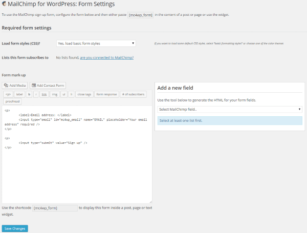
It provides a dashboard where you can create the form. Once you’ve created the form with all of the fields you want you can use the shortcode that it provides and paste it into a text widget in your footer.
There is also a Pro version with several pricing options. It includes unlimited forms, AJAX, customer colors, styles builder, integrates with WooCommerce and Easy Digital Downloads, and includes statistics. The Personal plan is $49 for one site, Business is $79 for 3 sites, and Developer is $149 for 10 sites.
A Sample From Your Portfolio
Of course I don’t mean your entire portfolio, and likewise I don’t mean a link to your portfolio. You can show an image of something you’ve created. For example, if you’re an artist, let’s say a painter, then you can show a picture of your best painting across the footer. All of your links can go over the painting. The same goes for photography, graphic design, a picture of you on stage, or just about anything you can think of that can be captured in a photo or image. This is a great way to show your visitors some of your work even if they don’t go to your portfolio. This is my favorite use of a footer.
For photos and links you have several options. For one, you could use the method discussed earlier about adding HTML to text box widgets. For another, you could use a plugin such as Header and Footer.
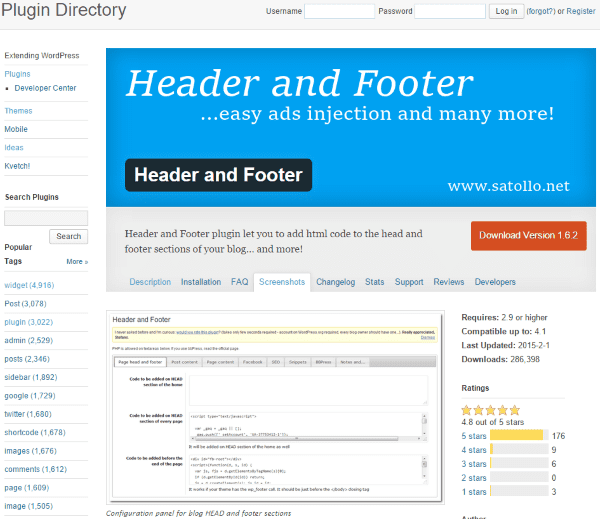
This one allows you to add HTML to your footer. You can use this to place all of your analytics and tracking code from Google, MyBlogLog, and others so you can manage them from a central point. You can place Facebook image tags, manage codes that will be placed before and after your post content, and more. It’s great for adding image files that will go into the footer.
Using the same HTML code as you would place in a widget (we saw this earlier), the code will place the full size image under the footer at the bottom of the page. Just be sure to save the image in the exact size you want it to appear.
Shortcodes
Another option is to use shortcodes to create boxes and tabs. Shortcodes are a great way to place things in your text widgets.
ET Shortcodes
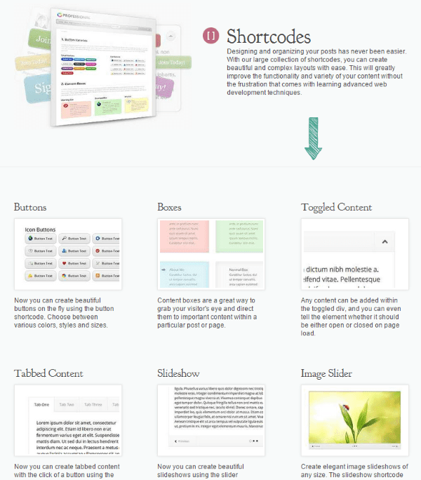
ET Shortcodes can be used in text widgets. You can type them by hand or you can create them in a post and then copy and paste.
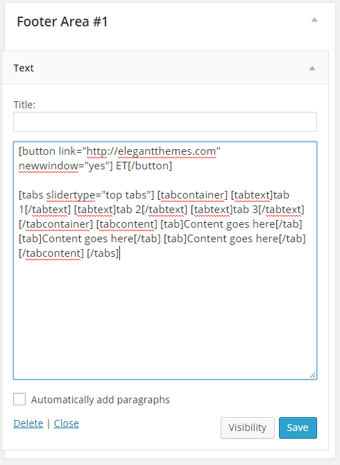
In this example I’ve created a button and a tabbed box. I can place any information or links I want and make this an interesting content area.
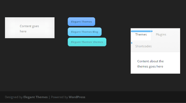
Pretty much anything that can be created with a shortcode can be placed in the footer.
Compact WP Audio Player
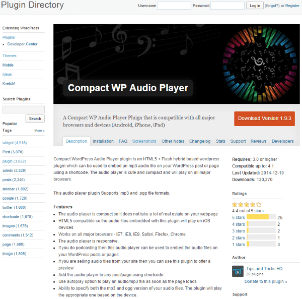
If you’re a musician you might even have a sampling of your music that visitors can play. This plugin does that. It gives you shortcodes that can be used in your footer’s widgets. If will allow you to play a sample of music that you have for sell. There is also an auto-play option. It’s an HTML5 and Flash hybrid that’s compatible with all major browsers and devices.
![]()
To use it just type in the shortcode and include the URL of the song. There are several templates to choose from, so you can change the look of the audio player if you want.
The plugin is free and there is extensive instructions on the developer’s website.
Links
You could also provide a list of links to your work on other websites. These can be added to a text widget as a hyperlink.
Your Product
You could place an image of your product, whether it’s a physical or digital product, in the footer. This uses your footer as your own personal banner ad. This can be done using the same methods we’ve already discussed about adding images to the footer. You can create your own banner using image editing software such as Photoshop, and then link to its URL.
Tips
I don’t recommend using all of these… just a few. You want to keep your footer nice and neat. Here are a few tips to help make your footer sparkle.
- Keep your footer clean and free of distractions. Use whitespace. Try to keep it to 1-4 pieces of content, depending on your site’s design.
- Make it user-friendly.
- Too much content can slow your page load time down.
- Don’t stuff your footer with SEO keywords as this can be seen as spam.
- Use the footer to show off your artistic work.
- Don’t try to have links to everything. Use links sparingly in order to keep it clean. The footer should not be used as a master navigation.
Here is a short list of other items that could be added to your footer:
- Search bar
- Writer/Company Bio
- Button to scroll back to the top of the page
- Event Calendar using a plugin
- Customer service info
Wrapping Up
Even though it may not be seen by every visitor, the footer is an important part of any website. It needs to give your visitors some quick and easy information or suggestions, and lead them to the response you want from them. The footer might be the last thing they will see. It’s important to make the best use of it possible.
How about you? Have you done something creative with your footer? Have you used one of these methods or did you use something else? Do you have other suggestions to add to this list? I’d like to hear about it in the comments below!
Article thumbnail image by hobbit / shutterstock.com




Nice ! I personally feel Footer Putter is a good Plugin.
Social media links are a great way to let your readers know where they can find more about you. Thanks for sharing!
I printed this post out because I could tell it would just what I needed for a checklist when I finally sat down to redesign my site. Today was the day that I sketched it all out, and I appreciate how easy you made for me to add value to the footer.
I have a regular ol’ footer too & these are solid ideas.
Check out what http://Lynda.com recently did with their footer. They used to have a massive footer with many links. I used & actually liked it.
They totally reversed that thinking and now have as small bar with pop-up menus. I thought it was innovative and fresh approach to footer navigation.
They probably do A/B split testing! Hope you can see it. Lol!
Hi dear elegant themes team.
I am always thinking I am not using the footer on my sites the most efficient way. So this post gives me a lot of inspirations. Thanks a lot for all yourrr ideas and this post. I am a lover of your DIVI team and look forward so much of what will come from your team in future. You all together do a great job! Thanks a lot for everything!
Matthias from http://KaffeevollautomatHQ.com
Passionate user of the DIVI theme!
Thanks for great post. Is helpfull 🙂
Thanks for a great article. I feel good that most of these I’ve been using already.
I do with that Divi gave an option to change the amount of Footer columns or to merge two for one wide column and two short. Always having 4 starts looking redundant.
Added this page to your bookmarks. Great post
Nice ideas Brenda, all of them! I liked the idea of keeping the linkable logos of some of our prominent clients, it definitely would make giant of an impression. Putting small contact form could be great for a lazy visitor.
This is a great article. Thanks for the creative ideas. Im thinking about adding a newsletter signup form and a storage auction announcement area.
Brenda, I will gonna apply these on my website footer. I guess it will gonna help in keeping my website visitors engaged to my website.
Thanks Brenda some great ideas. I have been trying to come up with some ideas for a client and this has helped a lot.
A mini contact form is my favorite and thanks for breaking up the footer with new tips.
Cheers!
Great ideas! I can vouch for the Compact WP Audio Player, but watch out if your site in on shared hosting. “Unlimited” doesn’t always mean unlimited.
A mini contact form is my favorite. Thanks for the new thoughts and reminders as well. 🙂
Great Post. Thank You
Thanks a lot for the recommendation! Many, including me, usually use footer to add post list widgets. Now I realize it’s wrong.
Thank you for sharing these good Ideas with us. It will help our customers in the future to have a better WordPress communication.
My site footer has 3 columns. Currently, I have recent posts, an image quote to inspire, a short About-us, Disclaimers, I am thinking maybe I should add a newsletter sign-up form and some basic links.
My site footer has 3 columns. Currently, I have recent posts, an image quote to inspire, a short About-us, Disclaimers, I am thinking maybe I should add a newsletter sign-up form and some basic links. Thanks for the tips Brenda. I will work on my footer again 🙂
Thanks for these suggestions.
The one I added to my footer is the schema info (https://schema.org/) to help with my Google profile. I hid all the info behind a simple copyright text note.
I used “Organization Schema Widget” which allowed me to add all the info Google wanted but also hide it all.
Thanks again,
ernie
Thanks – these are great pointers!
Thanks Brenda for useful suggestions to make the footer area more involving. If you like to remind something that could be missed in the content area then footer is the best place to use for that purpose.
Thank you Brenda for many ideas for make footer look different than other webs..
Suggest taking these ideas and creating some layouts via Divi. Save the layouts and export them. For new project one can import and choose the footer of their dreams!
Great blog post Brenda, I will have to be some what more creative with my footers and use some of your top tips 🙂
Great reading and look forward to the next post
Great tips and resources Brenda. I really like having the contact form in the footer. I get more touches from the footer contact form than i do the contact page. Great tips. Keep em coming.
Thank you Brenda for a nice fresh take on a topic without too much coverage.
Thank you guys for all your awesome blog posts! I have been loving them since I have been subscribed!
First Thanks to share with helpful article with us. The content nicely describe the best way to use WordPress footer.
I always like share a short intro about the site on the footer 🙂
Hi Brenda,
Some of these plugins look interesting. I will have to check them out.
Thanks!
Adam
Hi Brenda
The old question… what to put in your footer.
Some useful and unusual suggestions here, which may inspire me to be a tad more creative.
Hi Brenda
Love the way you writing Your post.
Very long and exhaustive descriptions.
I have read a few posts and it seems that this is the best blog about wordpress ever 🙂