As an experienced developer, you might feel that Divi would constrain you from flexing your CSS muscles. However, you’d be wrong.
While Divi was built to be easy for users to pick up even if they have little experience with WordPress, it also caters to more demanding users. For example, the Divi ePanel includes a useful feature to add custom CSS code without any fuss – just type the code into a box and you’re good to go.
If you want to check out just what this custom CSS option is capable of, today’s your lucky day. We’ll be showing you how to use the ePanel, step by step, and cover nine of our favorite (and easy to implement) CSS tricks.
Editor’s note: this post originally contained ten scripts. One has been removed since adjusting the size of your logo and header upon scroll can be achieved using the theme customizer and does not require a code snippet. See this video for an example.
- 1 How to Use the ePanel to Add CSS
- 2 1. Superimpose Your Logo
- 3 2. Add a Quasi-Transparent Background Image to the Header
- 4 3. Change the Sidebar Width
- 5 4. Remove the Header Bar Bottom Border
- 6 5. Add Dividers Between Widgets
- 7 6. Add Connected Bullet Lists
- 8 7. Add a Background Color for Slider Text
- 9 8. Animate the Divi Toggle Icon
- 10 9. Switch to the Mobile Menu on Desktop Displays
- 11 Conclusion
How to Use the ePanel to Add CSS
This is a piece of cake.
Head over to your WordPress Dashboard and click on the Divi tab. This will take you to the Theme Options section of the ePanel, where the aforementioned Custom CSS box lays.
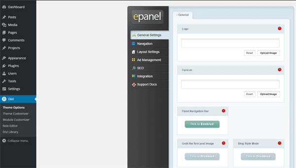
Once you’re in the ePanel, scroll all the way down until you find the CSS field at the end. Do you have some code you’d like to try out? Great, then paste it in and click Save and, well, that’s pretty much it.
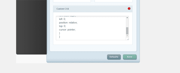
Now – if you want to play around with some CSS customizations, take a look at the simple snippets we’ve compiled below from several enthusiastic Divi and overall web development resources such as Calcatraz, Brian Sniff Designs, Divi Theme Examples, and GenoQuiroz.
1. Superimpose Your Logo
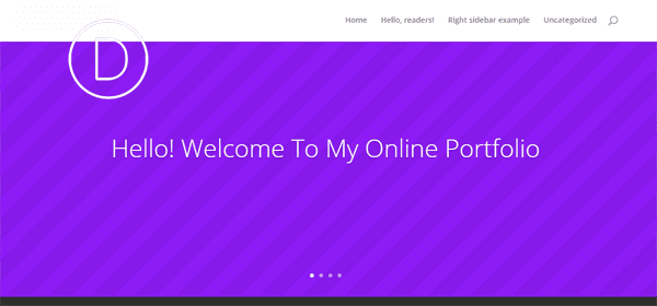
Let’s get things started with a simple trick. The default Divi header bar is nice and elegant (plus it resizes itself by default as you scroll down the page), but it does not play nice with logos with an ample height.
Should your logo be too big, it will automatically be sized down to fit into the header bar. What the following CSS code does is modify the z-index of your logo to an absurd value to make sure it’s superimposed over any other content on the page, even as you scroll down.
Aside from that, you can also play with the max-height and margin-top values until your logo displays exactly as you want.
#top-header {z-index: 99999;}

#logo {

max-height: 220%;

margin-top: -32px;

z-index: 100000;

}

@media only screen and (max-width : 980px) {

#logo { margin-top: 0px}}
2. Add a Quasi-Transparent Background Image to the Header
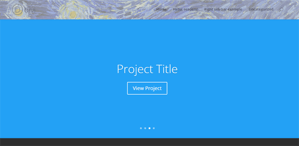
For an added touch of originality, you can actually use an image as the background in your header. However, whichever image you choose should be of an adequate size to actually act as a header.
All you have to do is upload your new background to your WordPress media files and place its URL below where it says yourimagegoeshere.png. The rest of the code is meant to modify its opacity (so the colors don’t overpower the rest of the elements in your header), set its edges and specify its z-index as below all other elements.
#main-header::after {

content: "";

background-image: url('yourimagegoeshere.png');

background-size:cover;

opacity: 0.5;

top: 0;

left: 0;

bottom: 0;

right: 0;

position: absolute;

z-index: -1;

}
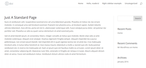
This one is pretty straightforward – we’re going to be changing the default width of the Divi sidebar widget. If you’ve ever felt like it was too narrow, all you have to do is take a look at the code below.
This code will change the default width to 300px and set a margin of 30px on the edge of the viewers screen. However, you might have noticed there’s a media query in there as well. Since we’re going to be forcing new a new width and a margin, if it weren’t for that media query, your side might break on small screens.
For testing purposes, we set a minimum width of 1,200px for enforcing the CSS changes outlined below. If the viewer’s resolution matches or exceeds that minimum, they’ll be able to see your new sidebar.
@media only screen and ( min-width: 1200px ) {

.et_right_sidebar #sidebar .et_pb_widget {

margin-right:30px !important;

}

.et_left_sidebar #sidebar .et_pb_widget {

margin-left:30px !important;

}

.et_right_sidebar #left-area,

.et_left_sidebar #left-area {

width:720px !important; /* 1020 - width */

}

.et_right_sidebar #main-content .container:before {

right:300px !important; /* width */

}

.et_left_sidebar #main-content .container:before {

left:300px !important; /* width */

}

.et_right_sidebar #sidebar,

.et_left_sidebar #sidebar {

width:300px !important; /* width */

}

}
4. Remove the Header Bar Bottom Border
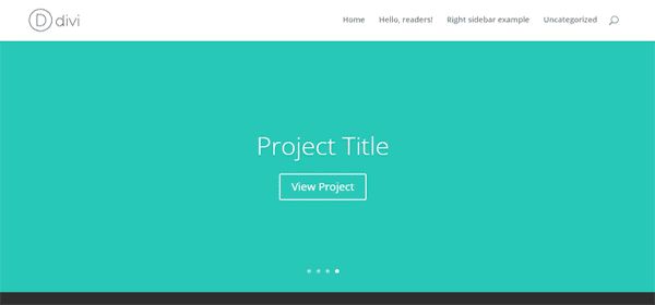
If you’ve got a keen eye, you might have noticed a small border on the bottom side of your Divi header. Well, get ready for some excitement, because today we’re going to teach you how to get rid of that pesky little border for good.
At the risk of blowing some minds, we must clarify that small divider is not exactly a border per se, but a simple CSS shadow, and the code below simply sets its value to ‘none’.
#main-header{

-webkit-box-shadow:none !important;

-moz-box-shadow:none !important;

box-shadow:none !important;

}
5. Add Dividers Between Widgets
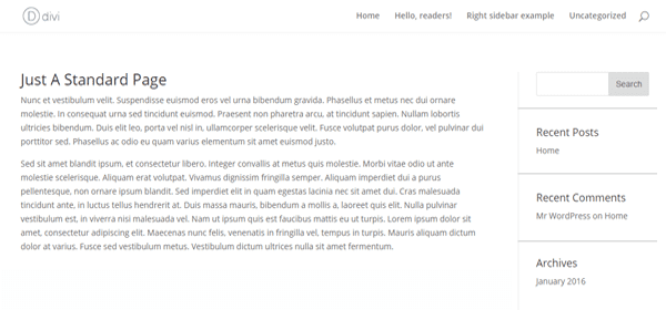
“But Tom, what if I’m not a border-hating communist?” is what you might be asking yourself after going over that last CSS customization. Well then, honestly, we prefer not to discriminate between border advocates or otherwise.
In fact, to make up for our thoughtlessness, we’re going to be teaching you how to add some additional borders or dividers to your sidebars. Yes, we’re that cool.
The code below will create dividers between each widget or section of your sidebar, giving your site a more organized feel. You can modify the height and color of the borders by changing the values right the beginning.
#sidebar .et_pb_widget {

border-bottom: 1px solid #ddd;

padding-bottom: 20px;

margin-bottom: 20px;

}

#sidebar .et_pb_widget:last-of-type {

border-bottom:0;

}
6. Add Connected Bullet Lists
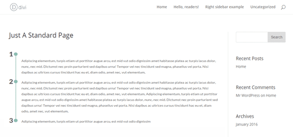
This one is pretty cool – the effect you see on the image above is actually achieved by creating CSS lines and dots as part of the background.
Beware, though, this code will apply the effect globally across all lists.
.dots-list {

width: 100%;

}

.dots-list ol {

padding-left: 50px;

position: relative;

margin-bottom: 20px;

list-style: none !important;

}

.dots-list ol li {

position: relative;

margin-top: 0em;

margin-bottom: 20px;

}

.dots-list ol li .number_divider {

position: absolute;

left: -50px;

font-weight: 800;

font-size: 2em;

top: -5px;

}

.dots-list ol li:before {

content: "";

background: #8dbeb2;

position: absolute;

width: 2px;

top: 1px;

bottom: -21px;

left: -24px;

}

.dots-list ol li:after {

content: "";

background: #8dbeb2;

position: absolute;

width: 15px;

height: 15px;

border-radius: 100%;

top: 1px;

left: -31px;

}

.dots-list ol li:last-child:before {

content: "";

background: #ffffff;

}
7. Add a Background Color for Slider Text
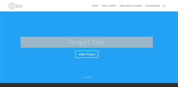
By default, Divi will simply overlay the text on your sliders directly on top of the images, and it looks great. But what if you choose to use images that make it hard to discern the text? Well, you could make modifications to the style of the text itself, or give it a simple background to make it pop.
As you might surmise from the title of this point, we’re about to teach you how to pull off the latter. The code below will create a simple background rectangle around your text, the color of which you can modify by changing the value where it says ‘background color’.
You can also play around with the padding, borders, and opacity, so go nuts!
.et_pb_slide_description h2 {

background-color: #000;

border-top-right-radius: 5px;

border-top-left-radius: 5px;

-moz-border-top-right-radius: 5px;

-moz-border-top-left-radius: 5px;

-webkit-border-top-right-radius: 5px;

-webkit-border-top-left-radius: 5px;

padding: 15px;

opacity: .8;

}

.et_pb_slide_content p {

background-color: #000;

border-bottom-right-radius: 5px;

border-bottom-left-radius: 5px;

-moz-border-bottom-right-radius: 5px;

-moz-border-bottom-left-radius: 5px;

-webkit-border-bottom-right-radius: 5px;

-webkit-border-bottom-left-radius: 5px;

padding: 15px;

opacity: .8;

}
8. Animate the Divi Toggle Icon
This little snippet will let you have some fun with the Divi toggle icon; more specifically, by changing its color and spinning the default arrow around once it’s been toggled.
.et_pb_toggle_open .et_pb_toggle_title:before {

transform: rotate(180deg);

content: "\25bc";

transition:all 0.5s ease-in-out 0s;

color:#e5e2d3;

}

.et_pb_toggle_title:before {

content: "\25bc";

font-size:2em;

transition:all 0.5s ease-in-out 0s;

color:#179baf;

}
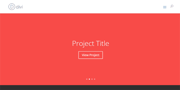
If you don’t want to clutter up your header bar with too many links, you can always choose to emulate what mobile displays do: use a toggle to display a navigation menu.
Divi actually does this when being browsed from a mobile device, and the code below simply makes this toggle button accessible when your site is being viewed from a PC. This way you can keep your header looking uncluttered.
@media only screen and ( min-width:980px ) {

#et_mobile_nav_menu { display:block }

#top-menu-nav { display:none; }

}

/**change these settings if you want to style it**/

.mobile_menu_bar:before {

content: "\61";

font-size: 32px;

left: 0;

position: relative;

top: 0;

cursor: pointer;

}

}
Conclusion
Even if you’re using a theme, that doesn’t have to preclude your site from being truly unique (especially if that theme is Divi). There are always customization options available to WordPress users regardless of which theme you choose, on top of thousands upon thousands of tutorials to tackle any feature you might wish to implement.
As far as Divi goes, remember that all you have to do in order to make your own CSS customizations without touching any core files is jump into the Divi tab on your dashboard. This will automatically take you to the Divi ePanel, and follow the simple instructions in our “How to Use the ePanel to Add CSS” section.
Do you know any cool CSS tricks for Divi? Share them with everyone else in the comments section below!
Article thumbnail image by Iconic Bestiary / shutterstock.com




how to get rid of that pesky …… ‘http://www.mydomain.com/wp-content/uploads/2016/03/myimage
Hi, I’m using Divi theme for a site with Persian language. The thing is that I need to set Persian font to some elements. But the font does not appear in the fonts list, and I don’t know where to add the CSS code. This is the css I write to use the font in a regular HTML file.
@font-face {
font-family: Casablanca;
src: url(‘fonts/DBS-MjCasablanca.eot’); /* IE9 Compat Modes */
src: url(‘fonts/DBS-MjCasablanca.eot?#iefix’) format(’embedded-opentype’), /* IE6-IE8 */
url(‘fonts/DBS-MjCasablanca.woff’) format(‘woff’), /* Modern Browsers */
url(‘fonts/DBS-MjCasablanca.ttf’) format(‘truetype’), /* Safari, Android, iOS */
url(‘fonts/DBS-MjCasablanca.svg#svgFontName’) format(‘svg’); /* Legacy iOS */
}
@font-face {
font-family: bmifont;
src: url(‘fonts/bmifont.eot’);
src: url(‘fonts/bmifont.eot?#iefix’) format(’embedded-opentype’),
url(‘fonts/bmifont.woff’) format(‘woff’),
url(‘fonts/bmifont.woff2’) format(‘woff2’),
url(‘fonts/bmifont.ttf’) format(‘truetype’),
url(‘fonts/bmifont.svg#svgFontName’) format(‘svg’);
}
hi
is there any one who know how to add the span date of elegant themes blog (the circle with the date of the post in front of the post title)
Hi, I tried #2 (“Add a Quasi-Transparent Background Image to the Header”) but it didn’t work. Obviously I replaced ‘yourimagegoeshere.png’ with something like
‘http://www.mydomain.com/wp-content/uploads/2016/03/myimage.png’, sized 900×110 pixel, and I left all the rest unchanged. Can you help me please? Thanks in advance!
I noticed the same thing. I noticed there is a double colon situation, so I deleted one of them and it works. Modified code is:
#main-header:after {
content: “”;
background-image: url(‘http://imgurlgoeshere.png’);
background-size:cover;
opacity: 0.5;
top: 0;
left: 0;
bottom: 0;
right: 0;
position: absolute;
z-index: -1;
}
Hope this helps!
When I use #1 – Superimpose Your Logo, I’m getting a white bar on the right of the screen on mobile. Any hints for how to fix this without creating a child theme?
Hi! there is a way to add Dividers Between Recent Posts Widgets?
Thanks!
Nice post! But I’m having issues with my sidebar in SAFARI. On Chrome or Firefox the sidebar just look perfect. But in Safari the sidebar just moves to the bottom of the page.
Any idea of what is wrong?
Thanks!
Always great, always useful. Congrats ET team… as always.
There’s an extra closing bracket on number 9 at the bottom. It looks like the media query has been closed twice by accident. Nice list though. good stuff.
I am wondering how to move the menu bar below an image like: http://brewlife.com
Thanks
I believe you can use the “blank page” template, make your first module a full width image, and then add a menu module below that.
Love this type of post….
Question: I am trying to use the example from #9 Switch to the Mobile Menu on Desktop Displays. I would love for the drop down to be on the right hand side of my screen. I adjusted values in left and position but nothing really changed. Anyone have any tips or helps? Thanks in advance!
code from post
@media only screen and ( min-width:980px ) {
#et_mobile_nav_menu { display:block }
#top-menu-nav { display:none; }
}
/**change these settings if you want to style it**/
.mobile_menu_bar:before {
content: “\61”;
font-size: 32px;
left: 0;
position: relative;
top: 0;
cursor: pointer;
}
}
Item 4 removes the bottom border from the Header Bar. There also appears to be borders on the Social MediaBar/Secondary Menu. I have tried a couple of things to try to remove those, but haven’t hit it yet.
Advice here would be appreciated as I’d like to see the small right and left side borders disappear.
Thanks for sharing – love these kind of tips myself! Keep them coming!
Hello, thank you for your tips.
I have an issue with Tip#1 ( Superimpose Your Logo).
The new logo is ok, but the falling sub-menu of header2 (top) are masked by the logo level.
So, it can’t be used with 2 headers.
Any solution to solve this ?
Thanks
Patrick
For some reason #6 is not showing the numbers in an ordered list? Its acting like an ul but its def an ol. Any ideas?
Another great blog post. I too would like to see more of these CSS tips!
Soooooooooooo how about an image overlay for the footer? I tried using the code above but clearly I’m missing something, or have something extra.
I got #6 to work this way…
In your module / custom css tab / css class: “dots-list
(it actually doesn’t change all lists throughout afterall) = )
/*—————- DOTS LIST —————————————–*/
.dots-list {
width: 100%;
}
.dots-list ol {
padding-left: 50px;
position: relative;
margin-bottom: 20px;
list-style: none !important;
}
.dots-list ol li {
position: relative;
margin-top: 0em;
margin-bottom: 20px;
}
.dots-list ol li .number_divider {
position: absolute;
left: -50px;
font-weight: 800;
font-size: 2em;
top: -5px;
}
.dots-list ol li:before {
content: “”;
background: #8dbeb2;
position: absolute;
width: 2px;
top: 1px;
bottom: -21px;
left: -24px;
}
.dots-list ol li:after {
content: “”;
background: #8dbeb2;
position: absolute;
width: 15px;
height: 15px;
border-radius: 100%;
top: 1px;
left: -31px;
}
.dots-list ol li:last-child:before {
content: “”;
background: rgba(0, 0, 0, 0);
}
Still can’t get his dots list to work…
I have a text module, with a standard bulleted list
I give the text module the css class of dots-list (exactly like that, no quotation, no period, no hashtag) in the custom css tab
I copy and paste Mark Richmond’s css above into my child theme stylesheet…
…and I still have a plain old bullet list. Can anyone else make this work? It seems by the comments above that lots are trying!
You have to make sure the list in the editor is using numbers instead of bullets.
Thanks for a really good blog post! Good stuff that I just need to try out. I like to contribute with a cool effect. This is a pretty cool thing that I have used for the Blurb module. It makes the whole module looks three-dimensional with a shadow around it when you hover over it. Just set the css-class .start_image to the Blurb module and give it the same padding as you have on the css effect, in this case 10px. You can see the effect on http://olsson.hosterspace.com/ wich is a site I´m working on for a client.
Works great for me.
.start_image:hover {
transform: scale(1.050, 1.050);
-webkit-transform: scale(1.050, 1.050);
-moz-transform: scale(1.050, 1.050);
-o-transform: scale(1.050, 1.050);
-ms-transform: scale(1.050, 1.050);
-webkit-box-shadow: 0px 0px 15px 5px rgba(147, 147, 147, .75);
box-shadow: 0px 0px 15px 5px rgba(147, 147, 147, .75);
padding:10px;
}
.start_image {
-webkit-transition: all 0.7s ease;
transition: all 0.7s ease;
}
Great idea Peter!
Thanks for sharing
You’re welcome Igor! ??
Hi Peter,
Just implemented on a new client’s site.
Really beautiful & elegant effect! And it’s working with any Divi modules, not only a blurb one.
Thank you one more time.
Hoping you will share some more cool stuff.
Regards,
Igor
Very cool css tricks to play with Divi. Expecting more css kind of articles.
Cool! More of that please!
Hello,
“Add Dividers Between Widgets” seems not to be working on my site.
What can be wrong?
In the meantime I have noticed that if a page is created with the WordPress editor, the dividers appear between the widgets.
But if I use the Divi Builder to create a page (2/3 of the page width for the page content and 1/3 for the sidebar with widgets), no dividers…
This is fantastic! I can see myself using most of these at some time. It would be great to get more of these posts so we can build a library of css fixes. It would also take some of the burden off your wonderful support moderators.
Simply awesome.I just love each and every article of this blog.These all are great snippets.Love your helping hand Elagant themes ?
These are all great snippets. I just started using this theme about two weeks ago and see a lot of creative potential. Thanks!
Hello,
How to keep the normal menu (not hamburger) on tablet portait view?
Thank you & have a nice day!
I like this post 🙂 I have felt that Elegant Themes have been a little short at times on these kinds of tutorials. WMPU Dev have recently done a whole bunch on building templates, widgets and all manner of things while Elegant Themes rarely seem to go the extra step in providing extra development options and tutorials. So for me, this is a welcome change and it’s good to see. I wish we had more of this… Thanks!
#6 doesn’t work. Added the code to my style.css and tag to the list but no change
This article is great as I don’t know css. 🙂 So adding new snippets would be fantastic!
Can you provide a snippet I can add to change the footer note permanently?
As I do not have a child theme I have to change the footer note manually after every update. 🙁
@Skye I have asked continually for the footer to have an option to enter your own text without requiring a child them for every install but my requests are ignored. There is a Divi child theme available however. In some cases I have resorted to hiding the footer via css. However, “one click child theme” plugin has worked very well for me to date. You can copy files such as footer.php to the child them directory and once it is done, it is pretty much done for good. I use the same footer on all my sites then. They want to make page and website building easy for you, but then insist on you requiring css and other skill to take their footer text out, which to me seems counter to the the product they are trying to sell.
i know although u have very tight scheduled…. Thats why this articles epanel is old… (Just kidding)…
Please try to make DIVI module css editor tips….
but dont make it small… make big article….
it will be really a very nice gift for your user…
By the way… DIVI guys u r rocking….. Keep it up…
Hello Divi
I have installed Divi 2.6.1 on a local PC and now I can’t find the e-panel any longer?
What has happened?
Best Lars
Plz provide some big article on Power of using Class and ids in module… by new update u simplyfi use of classes and ids in module but i know most of us still not getting perfect idea how to deal with this…
and also i know this is most powerfull tool in ur divi theme. Plz provide big article on module css editor instead of e-panel.
PLZ this is the biggest requirement of all of us…
Very cool css tricks to play with Divi. Expecting more css kind of articles. You guys are so elegant. 🙂
Did you ever try it ?
The few that I tried none of them worked.
Not sure if i just missed something simple or not, but with No. 6, you will need to add a CSS class (dots-list) to the module you have the list in and then add the numbers into a span like;
01:This is the content
02:This is the content
03:This is the content
adding the class directly into the ol ( didnt work for me…
cheers
Hi… what do you mean add the numbers into a span? I love the look of number 6 but can’t figure out how to get it working? any thoughts?
Added the css class (dots-list) into text module where I had the list but not working.
copied and pasted your example above… (01: This is the content etc) into a text module but still not working…
made it bullet points and/or numbers in the text module as a list and still not working… not sure what I’m doing wrong 🙁
We have the same problem. Numbers not showing, only vertical lines visible.
Igor
Love this! Bookmarking and please add my vote to more snippet articles. 🙂 Thank you!
Great blog as always…is there a website with a bunch of divi css snippets or only this blog. Would love to find more..
Great blog as always…is there a website with a bunch of divi css snippets or only this blog. Would love to find more.
Couple questions:
How can I keep the header/menu at the top when using mobile?
How can I make a slider that cycles slides/pics, but keeps the same static text?
Make images appear faded monochrome until hovered over – good for a gallery of logos.
Using a text module, insert your image and click the pencil icon to edit its properties – in the box for Image CSS Class, put: grey_logo
Add the following code to the Theme Options Panel:
.grey_logo {
-webkit-filter: saturate(0%) opacity(50%);
filter: opacity(0.5) saturate(0%);
}
.grey_logo:hover {
-webkit-filter: saturate(1) opacity(100%);
filter: saturate(1); opacity(1);
}
Works great in Firefox, Safari & Chrome – who cares about Internet Explorer?
Great info especially for a newbie. If you put the css in epanel, do update affect them?
I 100th the motion for more like this.
Yes, I want to know this, too. Where is it safe to add CSS to divi and not lose it after an update? Would child theme be better?
It is safe to add in the ePanel as shown in the post. You can also add custom css to your child theme’s stylesheet or anywhere within the builder meant for css. None of these will be affected by a parent theme update.
Good stuff. Would much prefer to see more content like this than articles about plugins or other non-et related things.
Show us things we can do with Divi. Then show us how to do it.
Fantastic post!! Thanks for this. Great stuff.
Erm…The Divi Epanel looks a bit different now 😉
About 9, its impossible to choose this type of menu only for mobile or tablet devices and keep different type for desktop menu….yo must choose one menu for all devices…thats an error, megamenus on mobile are very ugly
Can #1 – The logo superimpose over the secondary menu at the very top?
I’d like to see a whole post on how to make some more unqie headers. Divi has very limited options compared to other themes.
Examples: floating headers, menu below sliders.
Some neat tricks. Thanks, Tom.
Hi,
Thanks for those css tips !
If anyone want to have a nice shape under his fullwidth header, like here :
https://www.evernote.com/shard/s253/sh/b2f30b27-900f-4d4d-a255-12443bb6d23f/a10c044d3d91410c
He can just give the header this custom class :
.pointer
and add this epanel (or child theme style.css) :
.pointer:before {
right: 50%;
border-right: 100px solid transparent;
border-left: 1000px solid #fff;
}
.pointer:after {
left: 50%;
border-left: 100px solid transparent;
border-right: 1000px solid #fff;
}
.pointer:after, .pointer:before {
content: ”;
position: absolute;
bottom: 0;
width: 50%;
z-index: 100;
border-bottom: 50px solid #fff;
-moz-transform: rotate(0.000001deg);
-webkit-transform: rotate(0.000001deg);
-o-transform: rotate(0.000001deg);
-ms-transform: rotate(0.000001deg);
transform: rotate(0.000001deg);
}
.et_pb_fullwidth_header.pointer {
padding: 90px 0;
}
Hi Paul,
Is it possible to get this effect for a Fullwidth Post Title, for example here – https://eshop101.ru/?p=55
Thanks!
Nice! I like it.
More of this !
Was waiting for that kind of items in Divi Nation…
Also missing the “Days Of Divi”…
Most of non-dev (like me) wonders what power lies behind “ID” and “class” of each Divi module and how to unleash it. We don’t know what are the possibilities and how to achieve them.
Some examples were given but only show minor changes.
Some Divi websites in the showcase displays dramatic changes. It would be interesting to know how they did it. (Divi Nation ?)
Sorry for my bad english, french inside…
Thanks for this post.
Thanks for this. I’ll see what we can do to better illuminate the ID and Class fields in the Divi Builder.
Nathan, thanks for considering this input.
Very Nice Nate. I also have a snippet that switches the main and top header bars so the top head is on the bottom. Let me know and i can send it to you. a simple feature i am hoping for in the divi theme customizer soon.
Just share it here mate 🙂
good idea. haha.
.et_fixed_nav #main-header,.et_fixed_nav #main-header
{
position:fixed;
}
.et_fixed_nav #main-header,.et_fixed_nav #top-header
{
position:fixed;
}
body.et_fixed_nav.et_secondary_nav_enabled #main-header
{
height:81px;
top:0!important;
}
body.et_fixed_nav.et_secondary_nav_enabled #top-header
{
top:80px;
}
.et_fixed_nav #page-container
{
padding-top:80px;
}
.et_fixed_nav.et_secondary_nav_enabled #page-container
{
padding-top:80px;
}
body.admin-bar.et_fixed_nav.et_secondary_nav_enabled #main-header
{
top:32px!important;
}
body.admin-bar.et_fixed_nav #main-header,body.admin-bar.et_fixed_nav #top-header
{
top:112px;
}
As with anything, please test it before you put it up. I did it back at 2.0 and it continues to work for me, but i don’t know if it will carry over to new 2.5 installs as well. I don’t want to have bad code c fall back on us.
No ePanel in Divi 2.6.1…..or do I have to add ePanel into Divi?
From the above screenshot, ePanel looks useful….eg SUPPORT DOCS
Ian,
There is the epanel, however, it has been reskinned to match the divi builder. it is under Divi > Theme Options.
Thanks Dylan.
There is indeed an epanel in Divi 2.6.1 it’s simply been redesigned. This post was written before the redesign was launched on January 25th.
Thanks Nathan. Wondering….where can I find the Support Documentation.
Here you go: http://www.elegantthemes.com/gallery/divi/documentation/
In the future you can find it via the member’s area by clicking the “read me” link next to the Divi theme download.
Ian,
In your browser…
Click on themes…
Choose the theme (Divi)…
In the address bar add the word “documentation” without erasing anything else…
Enjoy 😉
I’ve been thinking about this for a while – having to read through thousands of support posts to find the solutions and tips to common problems, etc. is a pain.
You could easily create a sticky post under the Divi forum for these kind of snippets and tips. Keep it moderated rather than open so only tested and confirmed solutions are in there.
Great idea for a blog post, would like to see this type of post becoming a regular feature.
Isn’t 7 now obsolete in Divi 2.6? text overlays
Great stuff. Thanks
Why do we need CSS to change the sidebar width? Isn’t that an option on the theme customiser?
Sort of. Under Customizer > General Settings > Layout you can adjust the website content width.
Not sort of, exactly! At the same place there is an option to adjust the sidebar as well as the content.
Ha, you’re totally right. I had that collapsed when I double-checked for you.
Is there a way to remove the sidebar, site-wide somewhere? I’ve been trying forever to figure this out, but I don’t see a global setting to remove the sidebar from all posts. Doing it one by one is ridiculous. Thanks!
Hi Lindsay, you are correct in thinking that there is no single setting for removing the sidebar site-wide in Divi. But our awesome support staff gave me this bit of css that you can paste into your Divi Theme Options’ custom CSS panel to disable the sidebar globally:
#main-content:before {
background: none;
}
#left-area {
width: 100%;
margin-right: 0;
}
#sidebar {
display: none;
}
Maybe the developers gets jealous of the support staff’s awesomeness and put an option to remove the sidebar on the optimiser?
More than half of our visitors are using a mobile. For them sidebar is a footer!
One of your best blogs to date. This should be a regular feature as I’m sure there are many more tips for this theme.
Thank you very much – great information! It would also to have these in a library separate from the Support area.
Another great article! As a Newbie to Divi it’s great to see what’s possible. Question: Do ePanel CSS Code Snippets get lost when updating the Divi Theme?
No they do not. Only additions made directly to the stylesheet are lost upon update. Unless you’re using a child theme and adding CSS to the child theme’s stylesheet.
Good to hear, had the same question. Where are these CSS customizations stored then? What file?
Jeff
7, 8… what’s the difference?
Yes, my bad.
I got it to work with the CSS class attached.
Excellent article. The screen captures are from the old ePanel 🙂
Yes, this article was written before that update 😉
Thanks for these tricks! How to delete all shadows from bottom header (fix)?
Wonderful stuff.
Any chance we could have a regular snippet feed?
Perhaps having a poll (maybe on FB) – asking readers for suggestions?
+1
yes
Yes Please, I spend a whole lot of time searching “Help” looking for correct css ideas.
+1 to the snippet!
+1 on this!
+1. I agree. Snippet trick post will be excellent.
+1 on Divi snippet repository from me as well 🙂
+1
+1
I think we could put together a snippet repository in the near future 🙂
A snippit repos is a great idea – second that
+1!!!
yes please!
Great idea!
That would be awesome!
Yes please – that would be wonderful. I’m new to Divi and find myself searching the support all the time for this sort of stuff.
Oh yiiiiiiesssss – this would be so amazingly helpful 🙂
Another +1. A snippet repository would be incredibly helpful.
+1
Would love it!
A snippet repository would be great!
Yes, please do!
Was thinking about that right now ! 🙂
Yes please! 🙂
+1
++1
A snippet repository would be fantastic.
another +1 on Divi snippet repository.
A snippet repository would be really welcome. Thanks!
second that
Excellent snippets …
Any chance we can expand on this by having more such articles?
Perhaps we could have a poll asking readers for snippet suggestions?
Kudus ET.
Hi,
Steve great idea… I would love to see more articles like this…or even a forum where CSS examples are posted…
Nice article..
Yes, we are definitely planning more Divi related content moving forward.
Is there any CSS we can use to make the header not resize? So it’s the same all the time. I personally really dislike how the logo shrinks and enlarges, especially on a typographic or hand lettered logo.
There is no CSS needed for that. Here is a quick video tutorial on how to achieve this in the theme customizer:
https://www.youtube.com/watch?v=B1ZLXWka6k8&index=3&list=PLF17V-5878mWVOcXf16DqIwStUtMS53ef
Thanks Nathan! Much appreciated.
These look really interesting. I tried #8 on my staging site but didn’t succeed.
What am I missing?
http://screencast.com/t/q6hSIU1XJ4U
Be sure to assign the class to your numbered list, like so:
after placing the CSS code into your ePanel or in your child theme’s stylesheet.
Interestingly, that code wound up killing my menu items on
http://www.philsimon.com.
http://screencast.com/t/71Xuw4lYA
I removed that css class and all is well.
Phil, very cool the flying text in the fwSlider!!!
How you did it?
Thanks.
Modified from this:
http://www.divisoup.com/fullwidth-header-with-changing-words
Thanks.
Hey Phil !
Your website is awesome !! You really knew how to use all divi modules.
I like your menu (and CTA button). How you did it ?
Phil, how did you get the social icons in the top menu bar. Divi only has space for Facebook, Twitter and Google+.
That’s odd, considering it’s a class designation which shouldn’t have any global effect related to other lists. Unfortunately your screencasts don’t show how the code was applied. Can you give me some details on how you implemented it?
Hey Brian
I just put it in style.css. I agree; it shouldn’t have had any effect on the header.
Hey Phil, I had to update the post and remove one snippet. I think the one you’re referencing is now number 6–the connected bullet-point list. Is that correct?
Wow… the coffee really hasn’t kicked in. Yes, the bulleted list. Apologies.