Storyboards…that’s what screenplay writers use to create movies and TV shows, right? Yeah, that’s true, but storyboards aren’t limited to the world of fictional entertainment. They can also play an important role in your user experience design process.
In this post, I’m going to get into everything storyboards. I’ll start with a simple definition and work up to how you can use storyboards to craft your users’ journeys on your project and consequently design a better user experience.
What Are Storyboards?
Storyboards are a fairly simple concept. Basically, they’re simple illustrations that move through a story sequentially. As I mentioned, they’re known most for their use as a tool to develop the plot lines for movies and plays.
For a fun visualization of how storyboards work when applied to movies, Flavorwire put together a list storyboards from some famous movies. Remember that famous shower curtain scene from Psycho? Here’s what it looked like in storyboard form:

But storyboards aren’t only useful for laying out fictional plots. They’ve also become a popular method of visualizing how a real human being experiences a website or app.
When it comes to your website or app, a storyboard basically follows the full journey of a specific user persona, starting from them struggling with a problem and ending with them interacting with your creation and experiencing a positive resolution.
The important thing is that your storyboard depicts a real person with a real problem in a real environment. Storyboards should always feel authentic and grounded in reality.
So what might this look like in reality? Here’s an example from Chelsea Hostetter at the Austin Center for Design:
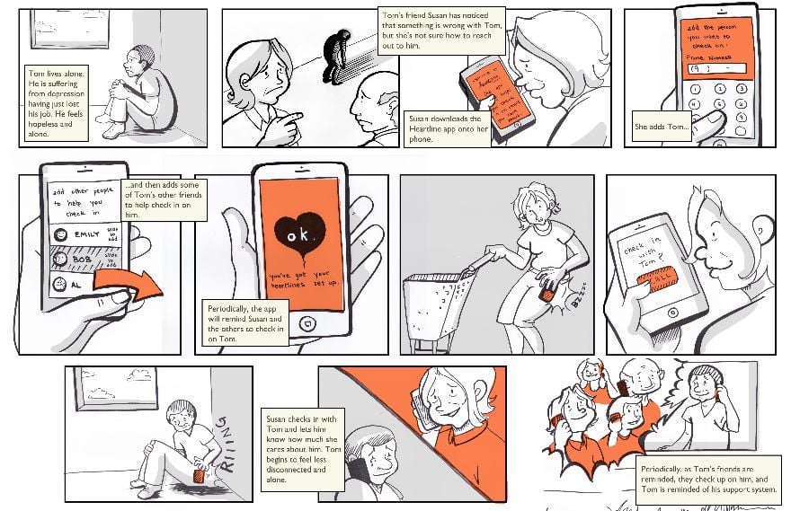
Notice how Chelsea’s storyboard depicts a full story from start to finish? It doesn’t just focus on Susan’s use of the Heartline app. It begins with a real life situation, peaks with Susan using the app to connect with Tom, and ends with the real-life resolution of the problem.
How Do Storyboards Help Improve User Experience Design?
Nowadays, there’s a huge focus on big data. And while cold hard data is certainly valuable, it completely removes the human from the design process. Storyboarding can help bring that human element back into design.
With storyboarding, you have real humans completing real actions, rather than abstract feature descriptions or analytics data.
Beyond the human element, storyboarding also makes it easy for you to quickly revise and iterate on your ideas. Because all you’re doing is sketching out the process, you need to invest far less time than you would need to create a working prototype of the same functionality.
That means you can roll out changes more rapidly than would be possible with a prototype.
Tips to Help Create Your First Storyboard
You don’t need to be a professional illustrator to create a storyboard, but there are some strategies you should follow to create storyboards that are actually helpful to your design process.
Remember, your goal is to create something that’s authentic and convincing. If you need to, go back and peek at the Heartline example again. Notice how the story:
- Is chock full of human emotions
- Focuses on the whole scenario, not just the part where the characters use your product
- Has a clear resolution
While Chelsea’s end product is a good example, don’t feel like you need to go straight from blank page to fully fleshed out storyboard.
Instead, it helps to slowly build up to that end product.
First, remember that your goal is to have:
- Authentic characters
- A real life problem
- A logical, authentic way to solve that problem via your product
- An actual resolution at the end of the storyboard
To make sure you hit all of those elements, it’s easier to start with plain text descriptions that sketch out the basics of the story. Connect them together in a narrative arc, but don’t worry about going too in-depth just yet.
Then, go back and rewrite your story by bringing in more detailed emotions. What are your characters feeling at each stage in the journey? Are they happy? Sad? Indifferent?
Once you have the narrative and emotions sketched out in plain text, you’re ready to translate that into an actual storyboard. To do that, break up each action in the story into an individual frame and sketch it out using real illustrations.
If you have the artistic skills, try to actually bring emotion into your illustrations when drawing your storyboard.
Tools To Help You Create Storyboards
Before I go too much further into some tools to help you create user experience storyboards, I should lead with the fact that you probably already have sufficient tools sitting in a closet somewhere.
That is – you don’t necessarily need anything fancy to create a storyboard. Going lo-fi with pen and paper is totally fine if you’re going to be the only one looking at your storyboard. Or, you can always go with a digital approach using something like PowerPoint to put it together into a cohesive story.
But if you’re going to be collaborating with other team members, you might want to create storyboards that look a bit more polished and professional than pen and paper or PowerPoint allow. In those situations, the following tools can help out…
Storyboard That
Rather than sketching by hand, Storyboard That lets you build frame-by-frame storyboards using pre-made drag and drop elements. Once you’ve sketched out your story with plain text, you can use these elements to build a more polished final product.
The tool is fairly simple to use. All you really need to do is:
- Choose a background for your scene
- Add characters
- Bring in text or items
For example, I was able to create this basic storyboard in just a couple minutes:
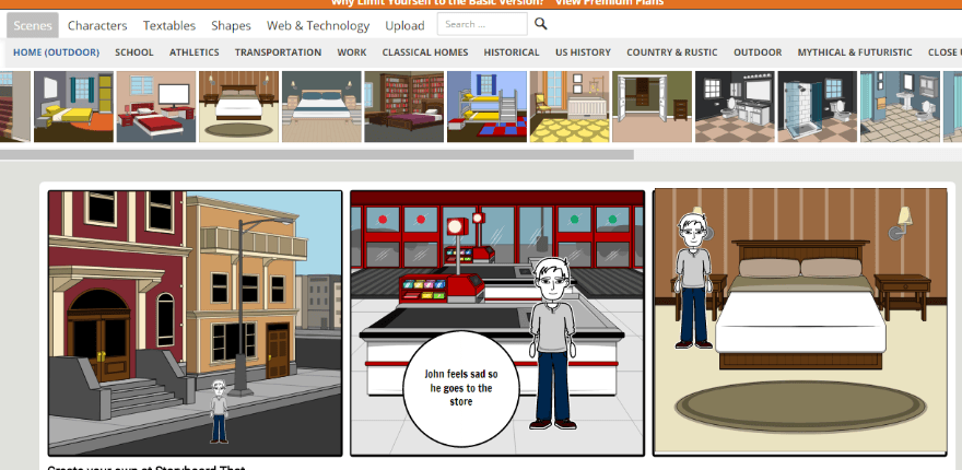
While I doubt I’ll win a storyboard competition, it’s much quicker than sketching by hand (at least for me). The only downside is that you lose the ability to express emotion with your characters’ facial expressions.
The basic Storyboard That tool is free, though they do also have premium plans that offer more features.
Boords
Boords is a more slick and high-tech tool which helps you create storyboards from existing illustrations.
While it won’t help you actually create those illustrations, it does help you arrange them, add notes, and share your storyboards over the Internet or PDF:
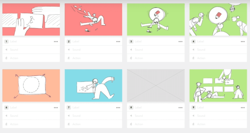
So if you’re planning to collaborate with others on your storyboard, Boords makes it much easier to adjust on the fly.
There’s a basic free plan that lets you have up to two storyboards for free. But after that, you’ll need to pay for Pro.
Wrapping Up
Storyboards aren’t just for movies and plays. They help you iterate faster, understand your users better, and put a human face on your whole design process.
Just remember – your storyboards need to be authentic and convincing. Sketching up a hair-brained situation where your product saves the world might feel good, but that’s not the goal of storyboarding. Keep it realistic and focus on telling the full story from start to finish.
Now over to you – do you use storyboards in your design process? If so, do you think that they’re worth the time that they take to make?
Article thumbnail image by CharacterFamily / shutterstock.com




Wow this was amazing, and right on time, I needed to express some situations for a client this will be a fun and efficient idea to propose, they where looking something out of the box, I think this will do great. Thanks
Really usefull tool, I’m gonna test it.
Are you promoting other tools here? How can I build a storyboard with Divi? That is what I would expect from a Divi blog?
Thank you,
This specific post is about how the practice of creating storyboards can help you think through the user experience of your website or products, not how to create storyboards with Divi. Though that might be a fun idea too!
This sounds inserting. I don’t think I’m super clear on the concept though. Would you use the storyboard to design the sites pages? Is it an overall plot for the flow of the sites navigation and purpose? Thank you for the article and resources Colin.
Colin,
Thanks for demonstrating how storyboards can illuminate user experience for software application development. I have worked as an illustrator and graphic designer for the past 10 years, crafting quite a few storyboards for TV commercial production for ad agencies and corporate clients.
Your article is convincing of a much broader application that utilizes a story to clarify and reveal how people are motivated, challenged and rewarded within a common cause, whether a commercial or community context.
Kind regards, Kent Looft, Design & Illustration
Thanks for the excellent post Colin. It highlights the importance of starting with an understanding of the Customer, with their problems and needs.
It’s worthwhile mentioning that the ‘story’ you created would be great at forming the basis of case studies… Customer Problem> How we helped> Result.
Thanks again,
John
John, what a great idea! So true that you could write better case studies with story boards. I’m going to try this approach — I think it will make the process more fun (fun = getting them done!). Thank you.
-Kellie Sue
Beautiful approach, but how realistic is it when considering time and effort invested in design compared to diving straight to prototyping?
If its going to take more time and effort to come up with storyboard, wouldn’t it be better creating a working prototype for a client? Knowing that time is a major factor in this contest.
TK