In my last post here on the elegant themes blog, we talked about creative ways to drive more traffic to your website. In today’s post, we’re going to talk about one specific way to increase engagement and improve conversion rates so you can get the most out of all that new traffic.
Specifically, we’re going to be talking about the importance of using beautiful imagery in all things associated with your website. That includes your over-all site design, landing pages, blog posts, associated social accounts, search result rich snippets, and more.
As the title would suggest, this isn’t exactly an open ended discussion in our book. We feel the data shows pretty conclusively that images improve user engagement–and beautiful (brand appropriate) images all the more.
You don’t have to take our word for it though. Check out the data for yourself!
The Facts Are In: Images Improve Engagement
In a post on the Search Engine People blog in May of 2014, they rounded up some interested facts and studies that prove images in web design (and on web platforms) increase engagement.
Among the many interesting facts/studies they site, here are a few I find most compelling and relevant to our discussion today:
- Research by Stanford University shows that for 46.1% of the people who view a website, the site’s design quality is their top criteria for deciding if the company/brand are credible or not.
- Bright Local found that 60% of consumers prefer local search results that include images
- A Skyword Study found that content including a relevant photograph or infographic increased its total views by 94% compared to content without an image in the same category
Clearly, images are important.
But, the Wrong Kind of Images Can Hurt Your Brand & Conversion Rate
As Derek Halpern of the popular blog Social Triggers points out in a post called How Images Improve–or Destroy–Conversion Rates, just throwing any old image up on your website or into your content is not enough.
According to him and the study he cites, using images for purely decorative purposes or images that are not relevant to the information they accompany can significantly decrease your conversion rates.
Depending on just how random or unhelpful your images are they can even hurt your brand, as it associates you and your message with something that can be ignored.
Hence, the Need for Beautiful Imagery (That is Brand Appropriate)
But what does that mean? Beauty, to be sure, is a subjective term. Which makes defining what, exactly, we mean when we talk about “beautiful imagery” difficult.
Ultimately, deciding on if something is “beautiful” or not will probably come down to personal taste. However, there are some general guidelines you can follow that will give you a better shot at tapping into something considered objectively attractive to a wider audience.
General Tips for Getting the Most Out of Your Images
Now that we can all agree on the importance of images, let’s talk about the right way to use them when adding them to your website.
Remember: Quality & Beauty Are Essential to Perception
As we’ve already mentioned, high quality and beautiful imagery is important for a number of reasons, not the least of which is the perception of your brand/business as reputable and the resulting conversions.
But what does “high quality” and “beauty” mean in this context? I’ve listed a few that I hope we can all agree on:
- Using the proper image extension (jpg, gif, png, etc.)
- Proper levels of compression. No unnecessary bloating with massive image files, but also being careful not to compress the clarity of your images out altogether.
- In photographs, lighting matters. Don’t use images that are overly grainy, blurry, dark, or washed out.
- If using photos, use photos that follow some basic rules of photographic composition.
- If using a graphic, use graphical elements and/or full images that follow basic rules of graphical composition.
- Try to maintain a level of consistency. If you tend to use illustrations or other graphic design style images–stick to those as much as possible. Same goes for photographs.
- If you’re talking about a detail, show it. Such as showing a close up of a relevant button/setting in a plugin tutorial instead of allowing the detail to be lost in a larger screenshot.
(Feel free to add to this list in the comments below if you feel I’ve missed something important.)
Keep Your Images Relevant
It’s possible that you could follow all of the tips I’ve just mentioned above for ensuring that you have a high quality, beautiful image–and still miss the mark. That’s because if an image isn’t relevant to what you’re talking about or asking your visitor to do, then it’s nothing more than a distraction–no matter how awesome it is.
Faces Humanize (And Convert)

Notice how ManageWp (and many others) use the faces of those giving positive testimonials to add authenticity and trustworthiness to their landing page.
We humans, despite the existence of basement dwellers and workaholics, are a social bunch. The mere sight of another human face is proven to get a positive response from us. That’s why many have seen consistently better results on landing pages (in both sales and customer support) featuring bright, inviting faces.
Line of Sight Focuses Attention
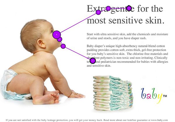
image via baby.com and usableworld.com
You can continue to use the human face, specifically the eyes, to help nudge your visitor’s attention in the right direction by directing the line of sight of people in your images towards content or calls to action.
Big Images Sell
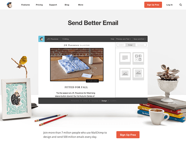
image via mailchimp.com
One reason why the one page, responsive site has blossomed in popularity in recent years, in my opinion, is because it tends to feature sections with big full-width images that convert better than anything else. If you happen to be a Divi user, you can accomplish this with ease using the Divi page builder and test the rise or fall in your conversion rates for yourself.
Color Speaks its Own Language

image via Peter Hermes Furian // shutterstock.com
It is well established that color theory plays a large role in customer/user experience and behavior. Certain colors choices make your content easier to read and consume, red buttons convert better than green buttons, blue inspires trust, etc.
Whatever your site goals are and whatever you want to say, it’s worth making sure your color choices are saying the same thing as your words and that your general design is optimized for a pleasant experience.
For a quick primer on color theory and web design, check out this article. For a quick introduction to the psychology of color for web design (with a focus on improved conversion rates), check out this article.
Where to Find High Quality, Beautiful Images
One of the biggest obstacles to using all of the tips and information above is the simple fact that finding great images (especially ones that you are allowed to use) is difficult and time consuming.
Not long ago I published a post here called A Quick Guide to Creative Commons Image Plugins for WordPress. This post was designed to highlight a few useful tools for quickly finding and inserting royalty free images into your WordPress content. For many of you, that post will be a great place to start your search.
If however, you want or need more options for great images you can use on your website, the links below should provide a more exhaustive (but still focused) range for your search. And as much as I’d like to take credit for these little lists, I have Steve from Site Builder Report to thank for them. He listed these sites/tools and more in a post over on their blog from back in November of 2014.
Photo Blogs
Photo blogs who publish high quality images that are not on stock photo websites are a great way to lend your site/content some uniqueness and originality. Just be sure to take note of their licensing/accreditation policies.
- Unsplash
- New Old Stock
- Move East
- Gratisography
- Splitshire
- Life of Pix
- Kaboom Pics
- Designer Pics
- Iso Republic
- Startup Stock Photos
- Skitterphoto
- Jay Mantri
- Snapwire
- Je Shoots
Photo Search Engines
If on the other hand, you are willing to search through the often sea of bad images on royalty free stock photo websites in order to find the good stuff, then this list will give you plenty to sift through.
- Photo Morgue
- Pixabay
- Flickr (not all are royalty free, but many)
- Pic Jumbo
- Compfight
- Wikimedia Commons
- Stock Photos for Free
- Free Images
If you have some money in your budget for images, then the following sites/services can be a great tool for finding exactly what you need in a quick and legal fashion.
Hire a Professional
Finally, if you either don’t have the time/energy/desire to get this aspect of your website just right, it may be beneficial to simply hire a professional.
There are a lot of potential benefits to this approach. For one, professional will have their own resources for acquiring or creating images. Such as a camera or access to high quality graphics and images like the ones linked to above.
Additionally, they will most likely (if they’re any good) be trained in using and recognizing the tips and theories I mentioned earlier. Which will make implementation much easier and faster for them since they’re using skills and knowledge they’re well acquainted with.
In Conclusion
The overwhelming consensus of data seems to be saying that images and the web were made for each other. Most of human kind is what is known as a “visual learner” and we all tend to remember and respond to things that we see and experience more readily than things that we simply read or hear.
That’s why in this post we learned not only that images (in a broad, general sense) are what’s needed for improved site performance, but high quality, beautiful imagery that is brand appropriate. We also took a look at some tips and best practices for implementing those images on our sites and linked out to various places around the web where high quality, beautiful images can be found.
If you have anything to add to this post or a thought to share with the community, I hope you’ll take a few seconds to drop us a line in the comments below.
Article thumbnail via Max Griboedov // shutterstock.com



I use freeuse.io because it has only CCO licensed images, no combination of copyright-protected and free to use images.
Hi Nathan,
awesome post and useful list of resources!
I love to take screenshots and use them for my content.
Other than this, my favorite places to get free images for my blogs are Stockvault, MorgueFile, Pixabay and Photopin.
Thanks for sharing your knowledge, have a fantastic week!
Link on Shutterstock is broken. Correct it, please!
Fixed it, thanks!
Another great article. Thanks for sharing great resources and recommending DIVI.
The line of sight trick is great – hadn’t thought of that before! Thanks.
Excellent blog Nathan, many thanks, specially, for the many sources you have given here, this would help me a lot. I would like to add to what you have mentioned, apart from images being relevant, they shouldn’t be more than required. Remember too much of them would make the page load a little slower(though with rising internet speeds, it is no longer a huge problem but still)
I case of a blog, only one image is sufficient, but if it is a tutorial then nothing like couple of infographics.
Great resource and perfect timing. I just started using Pinterest for my website, where images are everything. I’ll be putting these tips to good use. Thanks1
Great info, thanks for sharing! I am always looking for sources of good photos to use. I will look into some mentioned here as well. I have been using http://www.bigstockphoto.com they have good size/pricing, commercial licensing, and a large selection.
Thanks again, Brian
Hi Nathan,
Another source of nice free stock photography is http://negativespace.co, we post 20 photos each monday, You can search photos and sort them by category, colors and copy space position.
The photos are distributed without any copyright restriction under CC0 and finally we join the raw file with each photo we post so you can play with it.
Perfect, ET is getting psychic when it comes to meeting my web building needs. This, and the other great article on image plugins, arrived just as create a brand new site that needs a lot of images to drive it, building with DIVI of course. Many thanks as always 🙂
Hi there,
Thanks for a great selection of sites for finding images, one we use a lot and is not listed is Dollar Photo Club – https://www.dollarphotoclub.com/. The images are all extra large, so idea for cropping to the required size and they are all only a $1 each, affordable in any money.
Kind regards
John
Informative, I have bookmarked a lot of the links above. Cheers!
Thank you for the great blog articles, Thank you
Very useful post, Nathan. Thank you!!
Great list of sources and interesting advice about which image to choose. I’d love to know what is the right way to title images for SEO. WITH keywords, WITHOUT keywords, but related so as not to look like you’re stuffing? I’m embarrassed to admit: I’m confused! 🙂
Great resources! Thank you.
Good article!
Just one question though – is there a place to go for royalty free graphic art – vector based esp?
Have you tried graphic stock.com?
How do photo blogs that publish free photos generate income? Advertising, contributions, a freemium model?
Even if a site says all photos are in the public domain for private and commercial use without attribution, I wonder if I need to keep a document with urls to photos in case I’m ever challenged by someone claiming I’m using their photo.
Thanks for this compilation Nathan, I have an entire bookmarks-section devoted to images. This post will now go there as well.
As a entry to your last category, one of my current go-to sites is dollarphotoclub.com
Very fluid, easy, and remarkably stocked site that is updated with even more photos on a weekly basis. And yes, as the name implies, 1 dollar per photo.
Don´t forget pixabay for public domanin pics
Sourcing images is something I find so time consuming. Thanks for this comprehensive list, it will be very useful.
Thanks Nathan! I often look for resources such as the ones you have posted in this article.
Remember that Getty is not just for premium images; for non-commercial use, it’s an awesome resource for free, embeddable images: http://www.gettyimages.com/embed
I wouldn’t touch anything from Getty with a 10 foot insulated pole while wearing rubber gloves and boots. Those clowns are running around suing everybody on the planet that uses an image that they think might have come from their stock. When sued, most companies just pay the outrageous fee that Getty demands in order to settle instead of fighting it.
With these predatory practices, they will NOT be getting a penny from me, nor will I use any of their “free” images.
I’m not worried. I’m careful not to use images of dubious origins. They can try to sue me for one of my own photos, but they will not win. I like the fact that if I use theirs, the attribution’s easy.
This for a thumbnail image only and this image cannot be re-sized, and it depends on the use of the image. For editorial purposes… well it costs more.
Interesting. The main reason I haven’t used them more is that you cannot use them as thumbnail-sized images (or featured images).
Interesting. The main reason I haven’t used them more is that you cannot use them as thumbnail-sized images (or featured images).
Thanks so much for the resource list. I’d just like to add a point about hiring professional photographers, which some small businesses see as an extravagance … yet often it’s not.
Professional photographers — in particular those who specialize in a field — have expensive lenses, lighting, backgrounds and props that make products look spectacular. In addition, they’re masters of Photoshop, the go-to tool for turning good into great. If you’re in real estate (where room sizes and proper lighting are hard to capture), food (where the difference between drab and glistening comes from a photographer’s bag of tricks), automobiles (where lighting and reflection management is a science and an art), or luxury items (where a great, evocative image can double or triple a retail price), then a pro photographer could become your new bff.
I’ve recently had to console a first-time real estate developer who decided to save $400 by not using a professional real estate photographer. That bit of penny-pinching caused him to sit on an unsold property for a month while his competitors (with better photography) closed deals in a week. Why? Because great photographs inspire buyers to show up, which mere iPhone snapshots do not. In real estate, “buyers showing up” is the difference between closing and not closing … a very expensive lesson my developer client has learned the hard way.
Great post — thanks again.
Great article! Also worth a mention, for image prices we like 123rf.com… have to buy credits to download the images you want as opposed to the subscription which you won’t use without a high volume requirement…
Great article Nathan. Thanks for the list and of course the recommended Divi. I must make some time to explore that some more.
Best link for royalty free stock pictures : http://thestocks.im/
I used to use iStock for stock photos, but since their price increases, I’ve moved over to Depositphoto. Using AppSumo, I got 100 full-sized stock photos for $39.
I used to live in iStock and sang their priases. Their new price structure, however, is absurd and has me scrambling for a replacement. Thanks for the tip.
Good article thank you. But as you seem to realise that imagery is very important why do you make it almost impossible for Divi users to show our images as we intend them to be seen rather than your bizarre sliders and gallery thumbnails tendency to crop and scale them out of proportion?
Richard has a point … this is the one thing in Divi that limits its use and, much as we love Divi’s other features, the slider wierdness has our team reluctantly looking for an alternative theme.
Working with images within a format that resizes images for responsive viewing is complicated.
I’ve worked as an Art Director and Creative Director for more years than I care to remember and this is one of the new challenges we all face as we work online with creating content for different devices and screen resolutions vs traditional print design. It is also one of the more difficult concepts to explain to clients, yes I can move that but then when it is viewed on that device or at that resolution this will happen…
The difference between print where you can minutely place images and copy and digital where these mitigating factors combine to make your creative life difficult requires some effort and a few concessions.
On the last site I just finished using Divi I ended up making some templates as I resized the site on my monitor and then used these in photoshop as I created my imagery as a guide to place my most critcal type etc. I found it most difficult on sliders where the slider with the most type content effects the final size of all the sliders. But in the end using templates worked pretty well for me though I am sill tweaking some parts with my client to show more or less of an image—so not perfect. (I’d attach my templates if it were possible. Or perhaps a future blog post for me somewhere) The fruits of my labour is here: http://oceanviewhelicopters.ca (hope it’s okay to add this link.)
In the end, it is not really Divi, but any site design which scales imagery and content for multiple devices which creates the creative challenges.
Another excellent post and bookmarked for ongoing reference! Thanks for sharing links to some great articles and top notch image resources.
Another Great Article…
Another great article…
Thanks so much…
John Malloy