Style guides are documents that contain instructions or guidelines to be followed when working on a project. As the name suggests, web design style guides are used when working on website projects.
In this article, we’ll be providing you with examples of high-quality web design style guides. The purpose of this is to help you implement one of the top web design tips from a recent article that recommended using these style manuals in your projects.
- 1 What are Style Guides and Why Should I Care?
-
2
The 10 Best Web Design Style Guides in 2016
- 2.1 1. Material Design from Google
- 2.2 2. BBC Global Experience Language
- 2.3 3. Mozilla Style Guide
- 2.4 4. Twitter Brand Assets Guidelines
- 2.5 5. Adobe Corporate Brand Guidelines
- 2.6 6. Foursquare Brandbook and Brandguide
- 2.7 7. MIT Graphic Identity
- 2.8 8. Ubuntu Style Guide
- 2.9 9. MailChimp UX Guide
- 2.10 10. Web Style Guide: Basic Design Principles for Creating Web Sites
- 3 Other Style Guides for Online Makers
- 4 Final Thoughts on Web Design Style Guides
What are Style Guides and Why Should I Care?
Style guides can range in size and scope from simply outlining the fonts and colors to be used, through to cataloguing every aspect of a project including tone of voice, photographic content, column spacing, merchandise choices, and anything else you can think of.
Most projects can benefit from having a style guide, whether it’s a new website build, formulating a marketing strategy, the creation of a brand, or even publishing a blog post. Using a style guide can help document important decisions before starting work and ensure that you, your team, and your client are all on the same page from the outset.
Another benefit of using a web design style guide is that they create consistency throughout a project and ensure that if anyone picks up where you left off, they will have a clear set of instructions to follow.
So if you need inspiration for your next project, want to know how to create your own style guide, or you’re just a pixel pusher who enjoys geeking out on typography and grid layouts, here are 10 web design style guides to check out in 2016.
The 10 Best Web Design Style Guides in 2016
To get the most from this collection, you could follow one of these web design style guides to the letter, mix and match your favorite elements, or use them for inspiration for your own set of guidelines.
1. Material Design from Google
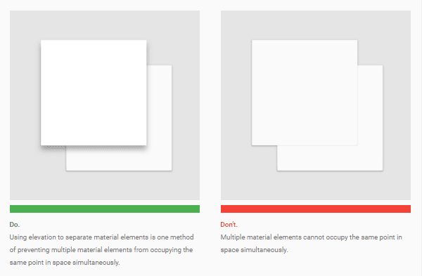
A sample from the Google Material Design style guide
Let’s start with the style guide most of you will be familiar with, whether you know it by name or not, Google’s Material Design. This style guide is apparently based on paper and ink, although it’s far from backwards looking in its approach to design.
Hopefully, you’ll have run into Material Design being used out in the wild. Whether that’s from using Google’s own products and services, such as the Android mobile operating system and the Google Now tool, or the many other products that have been influenced by this popular web design trend, either way, Material Design shouldn’t be new to you.
Material Design picks up where the flat user interface trend left off and helps designers add more depth and personality to their work while still harnessing the modern appeal of minimalist user interfaces. Typical characteristics of this popular web design style guide include grid-based layouts, animations, and shadows.
The good news is that if you want to adopt this design language, the Google Material Design handbook is freely available online and helps explain the intention of this web design style guide. It’s also a great example of a highly detailed style guide for anyone tasked with creating such a document.
2. BBC Global Experience Language
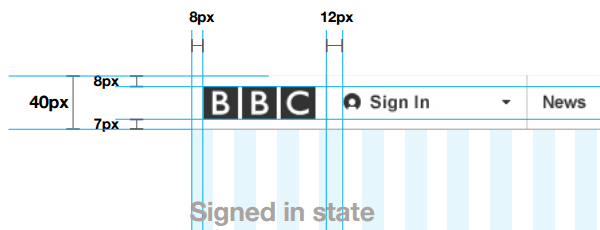
The BBC online style guide leaves nothing to chance
If you’re looking for a style guide that doesn’t leave anything to chance, then the instructions that make up the BBC Global Experience Language document are a great example.
Created for web designers building websites for the BBC, this style guide starts by laying out the philosophy behind the rules. From then on, this document dives deep into the details. You’ll find information covering the pixel widths of column gutters, grid layout rules, logo positioning guidelines, and everything else you could possibility think of when it comes to creating online content.
For inspiration on how to create a style guide that ties a wide range of entities together under one master brand, you won’t be disappointed with this resource from the BBC.
3. Mozilla Style Guide
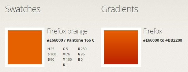
Everything you need for a consistent website design
If you want to know more about the design ethos of the team responsible for the world’s second most popular web browser, then the online Mozilla Style Guide is well worth checking out.
In this style guide, you’ll find some great examples of how to produce instructions that cover the use of logos, color schemes, tone of voice, and wordmarks. If you want to create a guide for your clients or team to follow, then the Mozilla set of instructions will show you how it’s done.
4. Twitter Brand Assets Guidelines

The Twitter style guide covers everything from logos to wordmarks
Logo designers and those of you who are using logos and graphics as part of your projects will appreciate the clean and clear instructions from this social media behemoth.
In the Twitter brand assets style guide, you’ll find some good examples of how to write instructions that help ensure your logos and other assets are used in the correct way. This online style guide includes details covering color palettes, logo orientation, element spacing, and a glossary of terms.
Whether you want to ensure your web design clients don’t butcher your hard work or the logos and branding behind for your project aren’t distorted, the Twitter brand assets style guide is a good model to follow.
5. Adobe Corporate Brand Guidelines
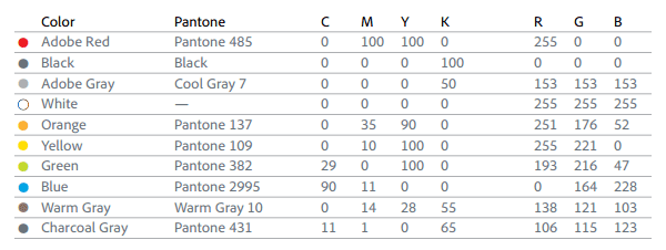
The Adobe Corporate Brand Guidelines document is an impressive example of how to make sure your brand and company philosophy is consistently applied across a wide range of platforms and mediums. Everything from websites and emails, through to printed posters and merchandise is covered here – not to mention the suite of Adobe CC apps web designers should be using.
Although huge in scale, the Adobe brand guidelines mix detailed instructions with usage examples to demonstrate how to create a large style guide that is relatively easy to understand, despite its scope.
If you’re working on a project that spans multiple platforms, then this style guide from Adobe can show you how to create a set of instructions that apply to all aspects of your work.
6. Foursquare Brandbook and Brandguide
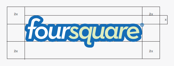
The Foursquare bandbook covers internal and external use of their branding
The Foursquare location finder app and website follow a strict set of guidelines to make sure their content is easily recognizable, whether that content is published on their own platforms or being shared on social media and elsewhere.
If you’d like to add this level of brand identity to your work, browsing the brandbook and brandguide documents from Foursquare is a worthy investment of your time.
In these two brief style guides, you’ll find plenty of dos and don’ts that cover everything from logo usage and positioning, through to iconography rules, badge design, copywriting guidelines, and tone of voice recommendations.
If you’re working with icons or designing for the web as well as mobile devices and social media, then the style guides from Foursquare offer plenty of pointers on how to deliver a consistent message, both on and off your own properties.
7. MIT Graphic Identity

The MIT Graphic Identity aims to keep things simple
If you’ve found the larger style guides from the likes of Adobe and Google a bit overwhelming, then the web design section of the MIT brand book should offer a welcome contrast.
Simply featuring basic information about logo positioning and wording, this is a good example of how you can create consistency in your web design projects without going overboard.
8. Ubuntu Style Guide
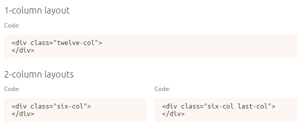
The Ubuntu document includes HTML and CSS to help improve consistency
The aim of the Ubuntu style guide is to bring this brand to the web with precision. To help with that goal, this web design style guide includes instructions for adding the Ubuntu CSS file to any webpage a developer or designer might be working on.
Providing a CSS file is an interesting idea. It’s a quick way to ensure that all the elements on a web page look the same, now and in the future. The document then goes on to explain the various styles that are required for specific elements, such as links and headings, before moving on to cover layout grids, typography, forms, tables, media, and more.
The Ubuntu web design style guide is well worth checking out. This is because it not only includes the guidelines and instructions, but the necessary HTML and CSS markup that is required to achieve the result is supplied as well.
9. MailChimp UX Guide
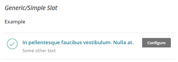
The MailChimp UX guide includes lots of useful examples
MailChimp is one of the most popular email marketing services around, so it’s great to see that they’ve made their style guide publically available.
As well as providing followers with examples of how elements should be styled, the underlying code is also on offer to make implementing these guidelines as straightforward as possible. This online document is nicely formatted too, making it one of the easier web design style guides to follow.
As everything is covered here, from grid layouts and typography, through to icons and dialogue boxes, no matter what platform you are designing for, you should be able to get some pointers from the MailChimp style guide.
Web designers and email marketers alike will find the MailChimp style guide a good source of inspiration when it comes to enforcing consistency in their projects. You can hear out about the story behind this guide in an interview with Federico Holgado, the lead UX designer at MailChimp.
10. Web Style Guide: Basic Design Principles for Creating Web Sites

For a more general style guide keep this book on your desk
If you’re looking for an offline resource that you can keep on your desk, then the Web Style Guide by Patrick J. Lynch and Sarah Horton is a bit of a classic.
Admittedly, the Web Style Guide book hasn’t been updated for a while. However, you should find that the advice on web design fundamentals and the needs of web designers in a range of organizations still offers some value.
Some ideas never go out of fashion, and having a printed book to reference when making design decisions can be invaluable – even in the digital age.
Other Style Guides for Online Makers
There’s often more that goes into a successful web design project than just the website itself.
If you’ve been tasked with content creation or graphic design, then seeking out style guides for those disciplines can help you produce work that is more consistent. Again, you can also use them as a template for creating your own detailed instructions for others to follow. So here are a few other style guides you might like to consider:

This style guide from Associated Press is a must for online writers
The AP Stylebook is described as the journalist’s bible and is available as a spiral-bound book as well as an interactive eBook. This writing style guide is regularly updated, so it should be able to provide guidance when writing about the most recent of topics.
The Yahoo! Style Guide is a popular resource for writing, editing, and creating content for the digital world. It’s an affordable option that anyone writing for the web will be able to benefit from having to hand. If you want to ensure your writing stays consistent, having a style guide like this by your side can really help.
If you are looking for software that can help you produce professional looking style guides, check out our collection of the best web design tools in 2016.
Final Thoughts on Web Design Style Guides
As you can see, web design style guides can take many forms. From single page documents that simply outline color and font choices, through to large documents that cover everything from design philosophy, through to the pixel width between elements on a page, you have plenty of freedom when it comes to creating your own.
After exploring these web design style guides, you should now have a better insight into the work involved in creating a consistent and recognizable style across a wide range of properties and mediums.
By drawing inspiration from these guides, you’ll now be able to write effective instructions for you, your clients, or your team to follow. This, in turn, will increase the chances of your vision being understood and the project becoming a success.
If you’d like to hear the stories behind the style guides of organizations like Lonely Planet, Captial One, and Starbucks, the Style Guide podcast is well worth a listen.
Which of these web design style guides impressed you the most? Please share your thoughts in the comments below.
Article thumbnail image by Axsimen / shutterstock.com




This was really helpful.
Informative blog ! These 10 tips described here are quite supreme and can be used as best examples for designing website. The guidance will be very helpful for designers in their project. Keep updating articles likely.
Looking is important for every thing. Really educational publish. I’m looking to get began along with my very own internet business. Your site offered started ideas whilst reading through. I simply registered for this income generating website. A person men ought to most likely take a look as well it’s awesome.
That’s great.. the article explains a great tips about the Web Development.
thanx for sharing such a valuable ideas about Google’s Material design
Insightful article. Style guides play an important role to build consistency across the website. Adobe Corporate Brand Guidelines mentioned in the article is a good example where it can be applied to multiple brands and websites,, however while talking about consistency, I feel using enterprise web content management services like Sitefinity CMS, WordPress and Drupal will be beneficial. These are the web content management solutions that allows frameworks, which acts as a platform to build web pages. Implementing frameworks across the site and even on other websites ensures consistency. One of the good examples of WordPress Framework is Divi.
I really loved “Mozilla Style Guide”. how about you?
i think for a good web design, not only the layout is important but also the loading speed of the web page is very important.
your article are nice. very much impressing… as like your themes… loves you elegant themes a lot…
That’s great! Thank you! This is going to help me a lot! Great article!
Very thorough article. I didn’t know the BBC offered that service, bookmarked that!
One thing I did notice is that on under the MailChimp UX Guide, you’ve linked to the Ubuntu Web Style Guide 🙂
Fixed 🙂
Thanks for thes great sources.
Never heard of Google’s Material Design before.
Thanks !
Link to Mailchimp’s giude points to the Ubuntu one 🙂
Very nice article by the way
Thank you, very well written.
Great article!
link for mail chimp goes to ubuntu
Thanks for the heads up, it’s been fixed.
Another Great Article – So in one paragraph can you sum up Google’s Material design?
Also how can I put this into action using Divi?
Sure!
“Material Design is an alternative to flat design that brings back some nice graphical elements. It’s a set of Google design standards that separates elements using the layers concept found in image editing software. It can stack and remove elements as needed. It even has built-in animations that would normally need to be created manually.”
From our post, A Forecast of 2016 Web Design Trends.
http://www.elegantthemes.com/blog/resources/2016-web-design-trends
There a lot more after the jump ^
That’s helpful. I have a number of ebooks online for download. I’ll make a note and hire someone in the future to style design them for me. I’d love to see how they look after professional style designing! Thanks.
Wow! This is a comprehensive list of style guides that I was not aware.
Now I have some to study. Thank you.
That is a huge list, I was not aware of it either. Thanks for sharing good to know.