With packages such as Google Fonts and Typekit collectively offering thousands of different fonts, there is almost a countless amount options for choosing the right font for your specific project. However, you’re still only limited to selecting a font that someone else has created. There are various motivations for wanting to create your own font, and similarly lots of options for doing so.
This article will take you on a step-by-step journey through creating a custom font with intermediate-level software. We’ll also offer suggestions for some less technical options, as well as more advanced alternatives. However, before that, let’s figure out why you’d want to create a font in the first place.
- 1 Why Create a Custom Font?
- 2 Some Basic Tools for Getting Started
- 3 How to Create Your Own Font (In 6 Simple Steps)
- 4 Step #1: Outline a Design Brief
- 5 Step #2: Start on Paper
- 6 Step #3: Choose and Install Your Software
- 7 Step #4: Start Creating
- 8 Step #5: Refine Your Character Set
- 9 Step #6: Upload Your Font to WordPress
- 10 Advanced Tools for Professionals
- 11 Conclusion
Why Create a Custom Font?
Font creation can become very technical, time-consuming, and expensive – so it’s worth figuring out how deeply you want to dive before you start. The intended use of your font will help decide how much time and financial investment you want to put into its development.
If it’s just for fun, a basic font creation tool such as a handwriting converter could be all you need. If it’s for a specific project, you may want to take the time to learn some vital techniques, and also use more sophisticated software. This is the route we’ve taken throughout this piece.
Finally, if you’re creating a font that’s intended for use by others, you’ll likely need to invest a lot more time in the development process, and spend money on some professional software.
Some Basic Tools for Getting Started
Before we dive into the tutorial, let’s take a look at some basic tools for those who simply want to have fun creating a custom font. These solutions can also be a good jumping off point for becoming familiar with some of the technicalities of font creation:
- PaintFont (Free): This service enables you to turn your handwriting into a font by filling out and scanning a template.
- FontStruct (Free): Using FontStruct, you can create your own font using geometrical shapes.
- Fontself ($49): This enables you to turn hand drawn characters into fonts within Adobe Illustrator, and will soon be compatible with Adobe Photoshop.
- Metaflop (Free): This tool enables you to customize basic fonts by adjusting a simple set of parameters.
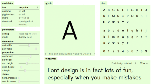
Metaflop’s design interface is colorful and minimalist.
Now we’ve looked at the simpler options for creating fonts, let’s move onto the more technical method.
How to Create Your Own Font (In 6 Simple Steps)
If you’re a little more serious about creating a unique font, and want more customization options, there are several free tools to choose from. However, before we get to the software itself, there are a couple of introductory steps we need to take. Let’s tackle each in turn.
Step #1: Outline a Design Brief
This is the most important step in the font creation process. As with any design project, it’s imperative that you outline your objectives from the outset. Here are some potentially important questions to ask when creating your own design brief:
- Will your font be project specific, or have a broad application?
- Will that application require a large or small font size?
- Do you want the basic font type be Serif or Sans Serif?
- Have you come across any fonts you could use for inspiration?
Once you have the answers to these questions, you can then move onto planning out your font’s design.
Step #2: Start on Paper
While it can be tempting to go straight to your software, many professional font tutorials advise that the early design work should be done on paper. Trying to create the shapes that represent your vision could potentially be awkward and time-consuming on a computer, and putting pen to paper is often easier and quicker to begin with.
Here are a few useful tips for creating letters on paper:
- You don’t need to draw a full character set – recommended ‘control characters’ are often “H”, “n”, “o” and “y”.
- Mark out the baseline and other important height lines to use as a guide.
- Look at other fonts to see where shapes are repeated within a character set.
- Moving the page, instead of your hand, will allow you to create smoother curves.

There are plenty of handy graphics on the web to help understand the terminology you’ll need.
For more information on creating letters on paper, you can check out this tutorial from Tuts+.
Step #3: Choose and Install Your Software
For intermediate typography design there are a number of free applications available, and it’s important to choose one that feels comfortable to use, and has the required functionality to get the job done. Here are some of our favorites.
1. FontForge
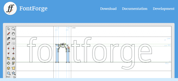
FontForge is an open-source font editor with a huge amount of online documentation to guide you through the design process. While the design interface can be a little intimidating at first, once you get used to it FontForge is a powerful tool for creating beautiful custom fonts. You can start from scratch using the available tools, or upload images of fonts to use as a starting point.
2. Birdfont
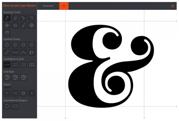
Birdfont is slightly more intuitive than FontForge, so it may be a better option for anyone looking to get started quickly. As with FontForge, you can start your font from scratch using the editor, or upload images as a starting point. However, while there are tutorials available, Birdfont doesn’t offer the same depth of supporting information as FontForge. Birdfont is free for creating fonts under the SIL Open Fonts License, but requires a donation of $5 or more for commercial use.
3. Glyphr Studio
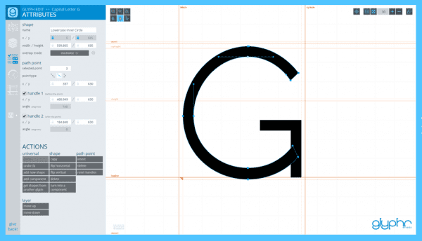
While the above two tools are desktop-based, Glyphr Studio is strictly web only. As for ease of use, Glyphr Studio falls in-between the other solutions on this list. It’s slightly more intuitive than FontForge, and offers more of an aesthetically pleasing design interface than both alternatives. Glyphr Studio also comes with a decent amount of support documentation, though it’s not as in-depth as that of FontForge. In addition, while this tool doesn’t give you the option to upload an image, you can upload font files to edit further.
While all of these tools have similar offerings, in the end it comes down to a matter of preference. You could try two (or even all three) to see which you are most comfortable with. In any case, it’s worth reading through FontForge’s support documentation, just to get a good idea of the overall scope of the software.
Step #4: Start Creating
Once you’ve installed your software, you’re ready to start creating your font. Depending on your software choice you can start from scratch, upload images of your paper drawings, or upload a font file for editing. Once you have your control characters translated, you can expand to include letters, numerals, and other characters.
This part of the process can be quite lengthy to begin with, as each piece of software will have its own learning curve. However, once you start getting the hang of things, the process should speed up fairly quickly. To help get you up to speed, here is some of the terminology you’ll need to become familiar with at the start:
- Glyph: Each individual character within a font is considered a glyph.
- Baseline: The invisible line on which all of the font characters sit.
- Ascender line: The invisible line at which ascenders begin.
- Ascender height: The height of the upward vertical stroke on letters such as “h” and “k”.
- Descender depth: The depth of the downward vertical stroke on letters such as “p” and “y”.
- Stem: The main vertical stroke of a letter such as “F” and “T”.
- Bowl: The closed rounded part of letters such as “b”, “d” and “o”.
- Bézier curve: A parametric formula used to model smooth scalable curves.
We’ve barely scratched the surface here, but if you’re a visual person (likely if you’re creating your own font!), this diagram from Thinking with Type shows some of the font anatomy we’ve just discussed, and more:
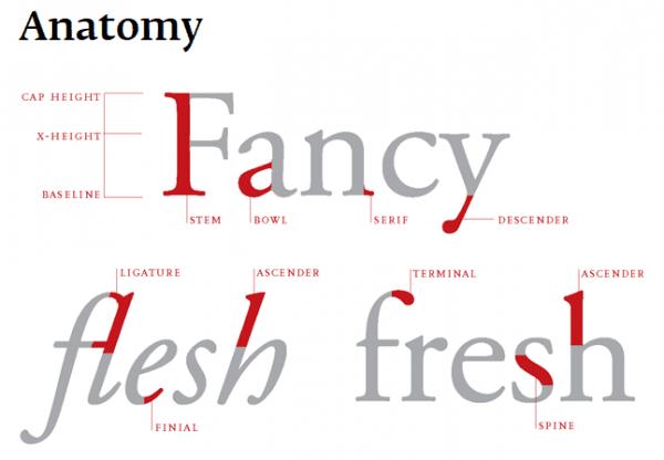
Thinking with Type’s font anatomy diagram is a vital resource for beginner designers.
Step #5: Refine Your Character Set
During the font creation process, it is easy to focus solely on the individual characters. However, it’s also important to consider how the font will look as a whole when refining them. Here are a few tips to keep you on track while refining your character set:
- Pay attention to the spacing and kerning of the letters by combining a series of them during the process.
- Test out various sizes for each character, especially if the application of your font has the potential to be broad.
- Print your work regularly throughout the design process, as seeing things in print often makes it easier to spot subtle mistakes.
At this point, you’re almost there! You’ve designed your font, chosen and got to grips with your software, translated it to a digital format, and refined it to perfection. All that’s left now is to upload it.
Step #6: Upload Your Font to WordPress
Once you’ve finished your custom font, you’ll probably want to start using it. If the intended use for your font is on your own WordPress website, there are a number of upload methods available. The simplest is to use a font plugin, one of the most popular being Use Any Font:

This plugin automatically converts your font files, extracts the CSS code, and embeds it into your theme’s files. It supports TTF, OTF, and WOFF files, and once uploaded the font will be available for use in WordPress. This plugin is free for a single font conversion, but a donation of $10 or more will let you convert an unlimited number.
If you’d rather not use a plugin, another option is to add you own CSS code. Firstly, you’ll need to use a font generator such as Font Squirrel or Transfonter to obtain the necessary code. You can then add this code to your theme’s style.css file. Going deep on this is outside the scope of this piece, but there are plenty of available guides on the web to guide you.
Advanced Tools for Professionals
If you’re looking to go even deeper with custom font creation, and want to create fonts for wider usage, there are a number of advanced tools available. FontLab Studio, FontCreator, Glyphs, and Robofont are some popular options for professional typographers.
Finally, if you’re interested in increasing your typographic knowledge, there are a plethora of wonderful resources to be found all over the web, each focused on creating fonts. To get started, check out the content at sites such as I Love Typography, Thinking with Type, and Creative Bloq.
Conclusion
Even with the multitude of fonts available, you may still find that none are suitable for your WordPress website. The solution in this case is to crack out the stationery and create your own. By following the steps above, you can create your own beautiful custom font to use on your website, or in other projects.
Let’s recap them quickly:
- Outline a design brief.
- Start sketching control characters on paper.
- Choose and install your software.
- Start creating your font.
- Refine your character set.
- Upload your font to WordPress!
Have you ever attempted to create your own font, and how did you fare? Let us know in the comments section below, and don’t forget to subscribe so you can follow the conversation!
Article thumbnail image by Undrey / shutterstock.com.





As tempting as it might be to jump right into software and start making your font (which some designers do), you will probably find it best to sketch out your concept on paper first.
Chris
Good tip, Christopher!
Great Article, Thanks for share amazing post, I will try this !
Thanks, Ricky!
Bookmarked!
Just imagine the added value you have when you can offer a client a font in his own handwriting!
That’s just one of the benefits. 🙂
Thanks for your comment, Richard!
Thanks for this. I’ve played a bit with my own font design, but have not tired all the options you describe here.
I have tried “Use any font” but with absolutely no luck. Maybe I’m doing something wrong.
I think I’ll try a couple of the font design options you’ve shown me here then I think I’ll try the CSS route.
Thanks again.
No problem, Ernest. 🙂
Tom, Fontself has created an amazing plug-in for Ai that allows you to create your own font. Check it out: https://creativemarket.com/fontself/761404-Fontself-Make-fonts-in-Illustrator
Thanks, Dalton!
Would a custom font of this nature play well with current browsers and mobile? Or would the majority of folks see my secondary font as a backup?
It should be just fine if it’s uploaded correctly. However, it’s always worth choosing an appropriate secondary font, just in case.
A big thank for this post. I was wondering how to go about it… Creating fonts is like ‘ultimate digital calligraphy’ I guess. It’s a project I was considering, especially after spending hours picking fonts here and there and always wanting one or two letters different from the sets I found.
So when I’m ready I will start with your post as guidelines!
Great stuff! Let us know how you get on. 🙂
I prefer to use some fonts which are used by popular social media webs.
Hey, Tom, could you supplement this article with one on how to load a font for use in the Divi theme? I can add via CSS, but a) figuring out how to specify so my font choice overrides the defaults can be tricky at best and b) choosing from the drop-down would be Sooo much easier. I’d love to be able to choose via menu.
Thanks for this article; my son is eager to build his own font and this will get him started.
We’ll bear it in mind for future pieces, Matthew!
Thanks, I will try this.
Thanks Andy. 🙂
@Tom Ewer
Fantastic article. Well explained with the example!
Definitely, I’ll try it. 🙂
Thanks for the kind words. 🙂