Below are a number of CSS tricks to help customize your Explorable Theme user interface. Each example has a preview and a block of custom CSS required to achieve the effect. As always, we recommend that you add all custom CSS via a Child Theme or the Custom CSS Box in ePanel.
Minimal Interface Styling
The following CSS will give your Listing Modals and hover states a more minimalistic look.
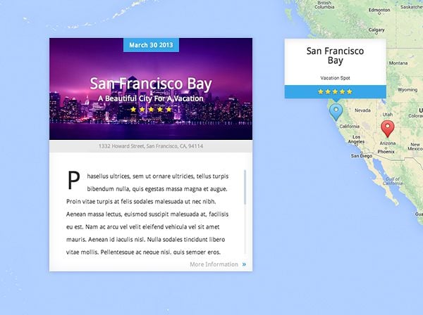
#et-slider-wrapper, .location-description, .et-place-text-wrapper {
	background: none;
}

#et-slider-wrapper {
	background-color: #fff;
}

.et-place-content, .et-map-postmeta, .location-title, .location-title h2 {
	border:none;
}

.et-date, .et-map-postmeta {
	text-shadow:none;
}

#et-slider-wrapper:after, #et-slider-wrapper:before {
	display: none;
}

.et-map-post .viewport {
	width: auto;
}

.et-place-content {
	padding: 40px;
}

.et-place-main-text {
	padding-left: 0;
}

.et-map-post .scrollbar, .more {
	margin-right: -25px;
}

.thumbnail:before, .et-date, .location-rating {
	border:none !important;
	-webkit-box-shadow: inset 0 0 0 !important;
	-moz-box-shadow: inset 0 0 0 !important;
	box-shadow: inset 0 0 0 !important;
}
Remove Drop-Cap
By default, listing descriptions begin with a drop-cap. The following CSS will remove this style and the first letter of the description will appear just as the rest of the text.
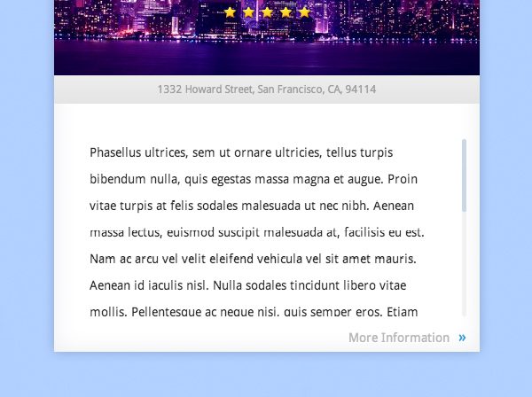
.viewport .overview > p:nth-of-type(1):first-letter {
	display: inline;
	float: none;
	font-size: 14px;
	margin-right: 0;
	margin-top: 0;
}
Thumbnail Hover
The following CSS will modify your listing thumbnails to fade to dark on hover, with a reverse animation when the cursor hovers off.
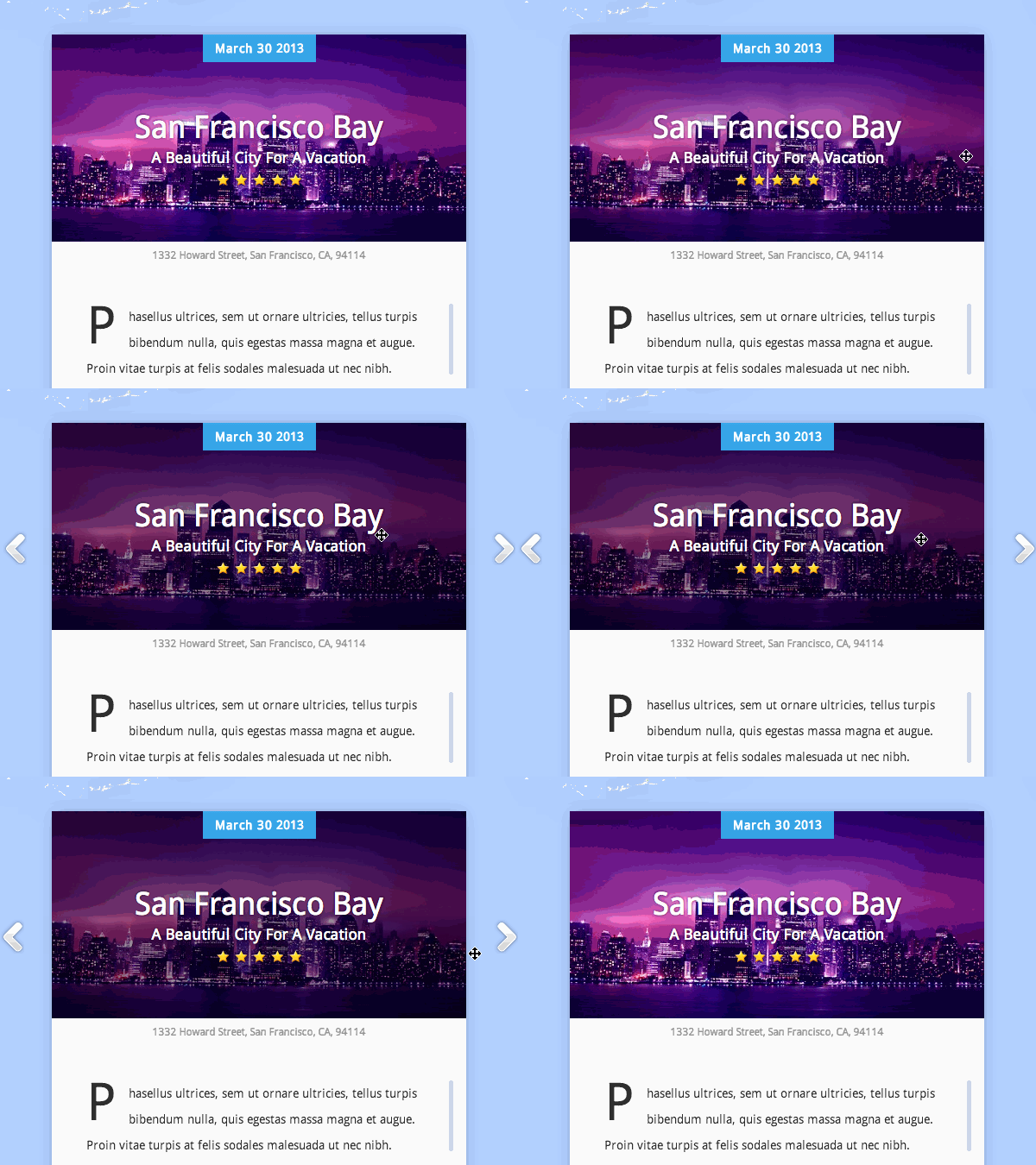
.thumbnail {
	background-color: #000;
}

.thumbnail img {
	-moz-transition: all 0.3s;
	-webkit-transition: all 0.3s;
	transition: all 0.3s;
}

.thumbnail:hover img {
	opacity:.6;
}
Rounded Corners
The following CSS will add rounded corners to your listing modals, listing hover states, and listing post pages.
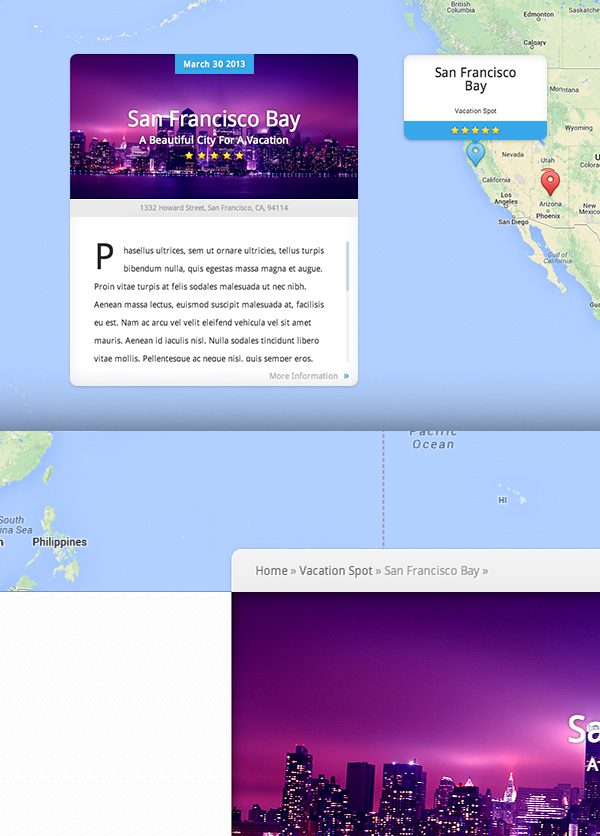
.et-place-content, .location-rating, .sub-menu {
	-webkit-border-bottom-right-radius: 10px;
	-webkit-border-bottom-left-radius: 10px;
	-moz-border-radius-bottomright: 10px;
	-moz-border-radius-bottomleft: 10px;
	border-bottom-right-radius: 10px;
	border-bottom-left-radius: 10px;
}

 #et-slider-wrapper:before, .thumbnail:before, .thumbnail img, .location-title, #breadcrumbs {
	-webkit-border-top-right-radius: 10px;
	-webkit-border-top-left-radius: 10px;
	-moz-border-radius-topright: 10px;
	-moz-border-radius-topleft: 10px;
	border-top-right-radius: 10px;
	border-top-left-radius: 10px;
}

#content:before{
	-webkit-border-bottom-right-radius: 12px;
	-moz-border-radius-bottomright: 12px;
	border-bottom-right-radius: 12px;
}

#et-slider-wrapper, .et_marker_info, #main-area .container, #content, .location-description {
	-webkit-border-radius: 12px;
	-moz-border-radius: 12px;
	border-radius: 12px;
}

#main-area .et-map-post img, #main-area .et-map-post .thumbnail {
	-webkit-border-radius: 0;
	-moz-border-radius: 0;
	border-radius: 0;
}

#et-slider-wrapper:after {
	display: none;
}
The following CSS will add a semi-transparent dark banner behind your listing titles.
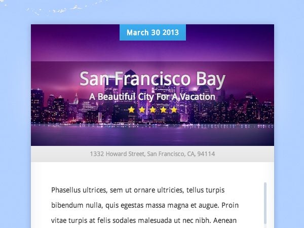
.et-description {
	background-color: rgba(0,0,0,.3);
	padding:20px 0;
	margin-top: -20px;
}
If you liked this theme tip, take a stroll around the blog for more of our free resources and please let us know what our next theme tip should be!




Nice little tricks ! 🙂 By the way, Explorable is in dire need of an upgrade and is feeling neglected 😛
Agrre, they just need to fix the theme so we can use this fantastic tips. 😛
Since this theme debuted I have thought it was a great idea. Now I just need to find a project worthy of using it 🙂
Haha! No kidding Adam, I’m still racking my brain for a way to use it 🙂 It’s a fantastic theme.
How about this idea? People want to donate their backyard vegetables and fruit to soup kitchens and pantries, but they don’t know where these entities are located, who to contact and what are the drop off hours. The country needs a “matching system” I’m here show me what’s close by. We are an all volunteer organization and need some pro bono help. [email protected]
Nice tricks, I have used many such in my child sheet.
I must confess, Explorable is properly broken in mobile view.
I know fixes are on the way but it is in dire need of repair.
http://www.fuelled-by.com/events
There are four event types that use the Explorable theme, modded to work as best they can on mobile, but Chrome on mobile is simply broken.
You’re complaining about chrome on mobile. Yes… Elegant Themes should definitely fix mobile chrome ASAP… What?
You realize people view websites (like an Elegant Themes website) using things called ‘browsers,’ right? And that website compatibility with specific browsers tends to be up to the website (like an Elegant Themes website) rather than the browser figuring out absolutely everything.
So an issue with Explorable theme’s mobile presentation in different browsers – this can be fixed by Elegant Themes – Google Chrome is not going to specifically come and make sure their browser adapts to whatever older standards Explorable is still trying to push. Elegant Themes or someone who owns the theme has to modify the theme as web standards evolve and change. Does that clear it up better for you?
Otherwise, I’ll see your ‘what’ and raise you a ‘WTF?’
Nice one.
Hi Mike – just took a look at your website, nice work very impressed!
It seems to be Divi for the homepage and explorable for the events? I’d love to know how you managed that! looking to use the same combination, working on a tourism directory idea for east african destinations.
With all these themes getting updates, i’d love to think that modules are being made for “divi”! top work as always guys!
Is there anyway to use this theme as a module for Divi or generally use it as a plugin? that would be awesome.
What about using it as a sub site?
I’m using it for a travel agency website and it’s great! I think I’m gonna use some of this tricks for this project.
Thanks a lot!
FANTASTIC tricks Kenny!
Can’t be to hard to implement the one needed 🙂
Thanks,
Love the rounded corners… thanks as always. 🙂
It was worth reading this post. You have explained these tricks in a good manner. I would like to use these tricks ahead. There are many themes having good appearance. I consulted to one of my friend who is using an Elegant theme. I am also thinking to use these themes for my blog. Thanks for sharing your knowledge.
I have been looking for a superior theme to use for a genealogy site. In general, the genealogy themes on the market really add nothing to the site. I am going to try out Explorable, and try out the mapping design as a means to locate ancestral homes and movements as each is discussed. Hopefully with my modest skills this idea will work.
Hi!
Thank you for those tricks they are very cool!
Check out how I use the Explorable theme on my blog 🙂
http://frenchyincali.com/listing/?lang=en
Jean
Hi Jean, I love your stylings, how did you get your header image to change size with the mouse over, I love that effect!
Thanks for this! We’re using this theme for one of our blogs, and I could definitely make use of these tricks. I specifically like the rounded corners effect, and the darkening of the box on hover.
Thanks for sharing tips and tricks to make your site more attractive. I am going to use these themes for my blogs. I loved the trick of rounded corners effect.
Good tips. I finally found a site that could use this theme. Here it is: http://portperrybandb.ca/
I may implement some of these CSS tricks on it.
How did you get the theme to default to a local view of the immediate area instead of the entire world map?
thank you in advance for any tip/help.
SS
thanks Kenny!!
Okay, I’m gonna say it… Elegant Themes is awesome! I love these customizations! Thank you Kenny.
Next theme tip… hmmm
How about helping everyone who uses this theme to a reasonable extent by…. Drumroll …. Markerclusters!!!!!!
Please!!!!
Really nice article! 🙂 Thank you for giving me an idea how to enhance my tumblr blog themes. I also tried to use some advanced css codes coming from this site: http://www.generatecss.com/advanced/ plus your blog and it gives me a good output for my blog.
Explorable theme I loved!!!!!!
Hi there. I’m looking for someone who can help me with challenges implementing Explorable. please drop me an e-mail at
allsocialsusan {at} gmail {dot} com if you are very familiar with the Theme and
have a little time to answer questions or help with this project on a small budget. Many thanks.
We love this Explorable Theme for the State Government. However, the home page malfunctioned for us in Google Chrome on one computer, (we fixed that in our computer) then our tester reported the same problem.
Well that is no good, because every last person in the State of Guerrero has to be able to access the Home Page of this site for it to work.
Is Explorable stable enough for use in an important project like this?
Does anybody here know? Really appreciate your help with this, as this theme looks great and suites special needs for a WordPress site featuring the cultural content of the extraordinarily creative people of this region.
In advance, thanks.
Anyone know how to make the front page listing rotate instead of staying on the last listing created?
Hi,
May I add another code:
To disable the scrollwheel zoom for single post, open single-listing.php and change “scrollwheel: true” to “scrollwheel: false”