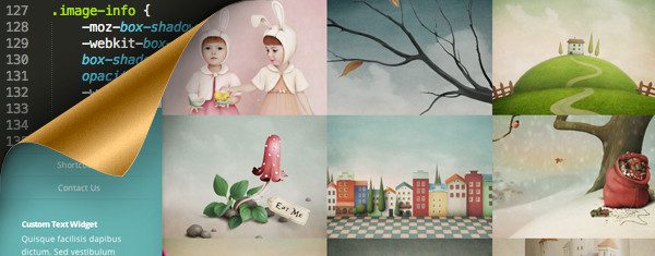
Below are a number of CSS tricks to help customize your Origin Theme homepage. Each example below has an animated preview and a block of custom CSS required to achieve the effect. As always, we recommend that you add all custom CSS via a Child Theme or the Custom CSS Box in ePanel.
Project Hover – Fade In
The CSS below will modify the project info so that it fades in upon hover, with a reverse fade when the cursor hovers off.
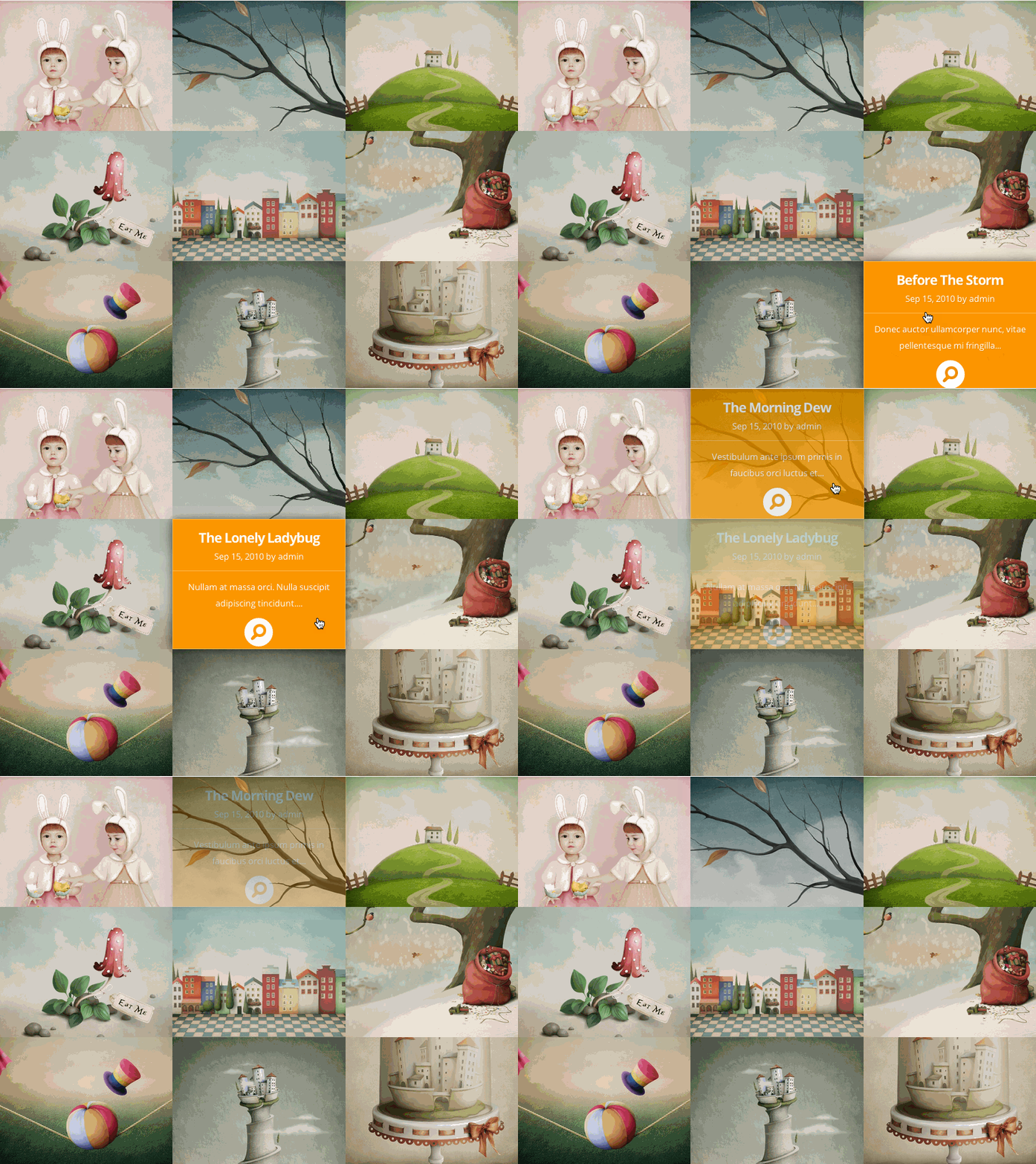
.image-info {
	opacity: 0;
	-webkit-transform: scale(1);
	-moz-transform: scale(1);
	-o-transform: scale(1);
	-ms-transform: scale(1);
	transform: scale(1);
	-webkit-transition: all .5s ease-in-out;
	-moz-transition: all .5s ease-in-out;
	-o-transition: all .5s ease-in-out;
	transition: all .5s ease-in-out;
}

.entry-image:hover img, .entry-image.et_hover img, .entry-image:hover .image-info, .entry-image.et_hover .image-info {
	opacity: 1.0;
	-webkit-animation: none;
	-moz-animation: none;
	-ms-animation: none;
	-o-animation: none;
	animation: none;
}
Project Hover – Fade Up
The CSS below will modify the project info so that it fades in and upwards upon hover, with a reverse animation when the cursor hovers off.

.image-info {
	opacity: 0;
	top: 5px;
	-webkit-transform: scale(1);
	-moz-transform: scale(1);
	-o-transform: scale(1);
	-ms-transform: scale(1);
	transform: scale(1);
	-webkit-transition: all .4s ease-in-out;
	-moz-transition: all .4s ease-in-out;
	-o-transition: all .4s ease-in-out;
	transition: all .4s ease-in-out;
}

.entry-image:hover img, .entry-image.et_hover img, .entry-image:hover .image-info, .entry-image.et_hover .image-info {
	opacity: 1.0;
	top: 0;
	-webkit-animation: none;
	-moz-animation: none;
	-ms-animation: none;
	-o-animation: none;
	animation: none;
}
Project Hover – Zoom In
The CSS below will modify the project info so that it fades and zooms in upon hover, with a reverse animation when the cursor hovers off.

.image-info {
	opacity: 0;
	-webkit-transform: scale(.98);
	-moz-transform: scale(.98);
	-o-transform: scale(.98);
	-ms-transform: scale(.98);
	transform: scale(.98);
	-webkit-transition: all .4s ease-in-out;
	-moz-transition: all .4s ease-in-out;
	-o-transition: all .4s ease-in-out;
	transition: all .4s ease-in-out;
}

.entry-image:hover img, .entry-image.et_hover img, .entry-image:hover .image-info, .entry-image.et_hover .image-info {
	opacity: 1.0;
	-webkit-animation: none;
	-moz-animation: none;
	-ms-animation: none;
	-o-animation: none;
	animation: none;
}
Project Hover – No Shadow
By default, the info overlay appears with a drop shadow. If desired, the CSS below will remove the default shadow. The example below is combined with the “Fade In” example above, but can be combined with any or no addition modifications.

.image-info {
	-moz-box-shadow: inset 0 0 0 0 rgba(0,0,0,0), 0 0 0 rgba(0,0,0,0);
	-webkit-box-shadow: inset 0 0 0 0 rgba(0,0,0,0), 0 0 0 rgba(0,0,0,0);
	box-shadow: inset 0 0 0 0 rgba(0,0,0,0), 0 0 0 rgba(0,0,0,0);
}
Project Hover Custom Color
The CSS below allows you to set a custom color for the project info overlay. The example below is combined with the “Fade In” example above, but can be combined with any or no addition modifications.
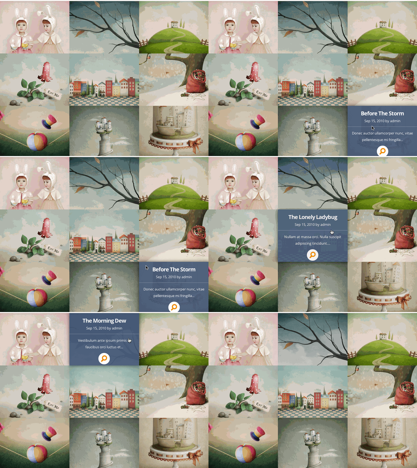
.image-info {
	background: #465A78; /* overlay HEX color */
	background: rgba(70, 90, 120, 0.9); /* overlay RGBA color */
	-moz-box-shadow: inset 0 0 0 0 rgba(0,0,0,0);
	-webkit-box-shadow: inset 0 0 0 0 rgba(0,0,0,0);
	box-shadow: inset 0 0 0 0 rgba(0,0,0,0);
}
The CSS below modifies the default navigation item hover state. See the hover effect below.
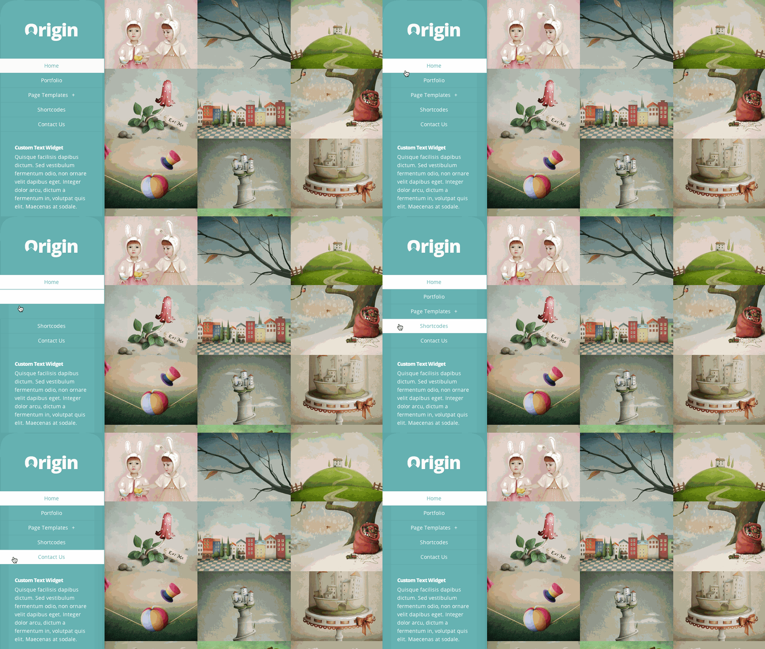
#top-menu .link_bg {
	-webkit-transform: scale(1);
	-moz-transform: scale(1);
	-o-transform: scale(1);
	-ms-transform: scale(1);
	transform: scale(1);
}
By default, the side navigation in Origin scrolls up and down with the page content. If desired, the CSS below will create a fixed navigation. If you have a lot of content in your sidebar, this effect is not recommended because the amount of viewable content in your sidebar is limited by the user’s browser height.
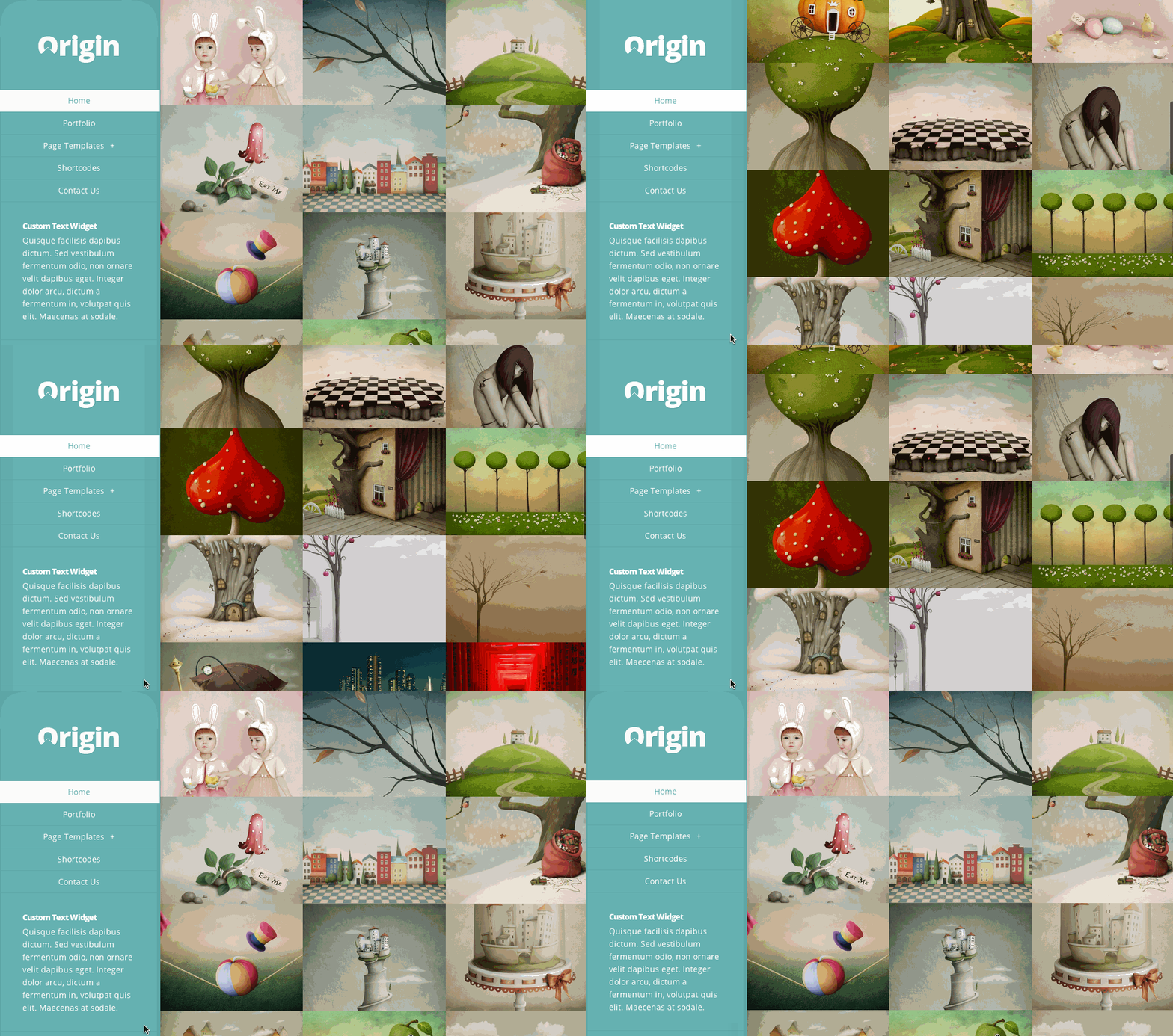
@media screen and (min-width: 1024px) {
	#info-area { position: fixed; }
}
If you liked this theme tip, take a stroll around the blog for more of our free resources and please let us know what our next theme tip should be!




Hey, it is possible to apply above custom CSS code to the images of portfolio /project page in divi themes? Thanks
The syntax would be different, but in effect, you should be able to similarly modify the overlays in Divi. Maybe I can get more specific in a future post 😉
Is there a way to use the code on the blurb module in Divi? That would be awesome if there is.
Hi Kenny
I’m not using Origin but I’m always interested in playing around with CSS effects.
Thanks for putting these together.
Origin is great for displaying portfolio items. I actually use it for my personal portfolio site.
Great tips! What do you use for the screen cast and convert to GIF? I’d love to use that on some client sites. Thanks!
Thanks, Steve 🙂
here is the link to the software http://www.cockos.com/licecap/
Thanks for that share Kenny.
That has me thinking, maybe a future post about the essential tools in a developer’s toolbox might be a good idea.
With links similar to the one above.
You know, seeing how you guys are not that busy…!
😉
Plus one for this…
Nice post, Kenny. Thanks a ton for the Licecap link. Very cool little program!
I love Elegant Themes Blog – one of the few blogs where I learn stuff every post.
Thanks!
That’s what I was looking for… thanks a lot for sharing.
Thanks for asking Steve and thanks for the link Kenny.
Nice effects. I’m using the Divi theme. Will these effects translate to Divi?
Hi, that was a great article – Thanks!
I read above that you are looking for ideas for what the next theme tip should be – I was wondering if you have tips to make the Divi slider animation more interesting than the effect that is on there right now?
Rosy
This is good information, but is there any new themes in the works? It’s been a while since Divi released with no new themes since..
Mist, we are always working on new themes— you can see sneak peaks of what we currently have in the works here 🙂
http://www.elegantthemes.com/blog/theme-sneak-peeks/divi-2-sneak-peek
http://www.elegantthemes.com/blog/theme-sneak-peeks/another-look-behind-the-curtain-at-divi-2-0
That’s more of a theme/framework update..
Is there no new actual themes in the works? Or are we now just going to get updates to Divi?
Great tips. Thanks for share
This post has me rethinking using Origin for a client who is a seamstress and needs her projects displayed prominently. She doesn’t blog though. Can the front page be made up of pages instead of posts?
Also, with the diversity of Divi (that sounds cute doesn’t it?), what is the advantage now of using these singular themes? Just curious on your thoughts? Thanks.
A good job is being done here at Elegant Themes. I had left you guys for Woo for awhile, but I’m liking what I’m seeing, and will probably kick Canvas to the curve for Divi.
Appreciate the tips n tricks. But as we all know mobile browsers are becoming the most used and since it’s impossible to ‘Hover’ with a mobile browser these tips n tricks are beneficial for desktop browsers that use a mouse.. now that brings an interesting thought…O_o! to have a hover feature on a mobile browser 😉
The css effects still work on mobiles, though only when you tap them. A css workaround to have the text overlays display permanently on mobile devices may be the better option.
One of the best css tricks .
Awesome tips, thanks Kenny…
I don’t know how to use this stuff but you give me hope I will learn.
Haven’t worked with this theme yet, but will definitely start using it soon! Still very much in love with Divi… *drool*
nice tutorial. will help the wordpress user’s
Are there CSS codes and tricks to make things cooler on Divi? Origin is a great theme, don’t get me wrong, but would love to learn some CSS tricks on my website for Divi 🙂
How do I change the background hover color on the navigation bar? When hovering over child categories the default background color hides the default text color since they are both white. Thanks!
this tutorial very useful for me. thank uuuuu
Dear Kenny Sing,
if you are using a plugin photoshop ? please share in the plugin or is there a trick CSS3 tutorial source you use.
Thanks 🙂
Hi, could you say wich is the size to make the thumbnails look well? the only bad thing of this theme is that, it should resize the images.
superb post.
thank u
Hi Kenny,
Is there a rtl option for the origin theme?
The theme is perfect for me and I want to use it but since I can’t customize the theme to start from the right, it’s a major setback.
As you can see, Im using divi 2.0 but the problem seem’s to be that. when I hover over the top header menu’s they give me a black hover color which is bad considering I wish to put black as my header color. so it tends to make the menu’s dissapear. Tried applying the #top-menu .link_bg {
-webkit-transform: scale(1);
-moz-transform: scale(1);
-o-transform: scale(1);
-ms-transform: scale(1);
transform: scale(1);
}
didn’t work. please help me out. 🙂
Kyosuke,
Try this, worked for me:
#top-menu li a:hover {
color: #ffffff !important;
}
I can’t seem to get my featured images to line up in a grid like they do in the demo. How do I get rid of the spacing issues? I am totally green when it comes to programming.
If you need help with anything, please open a ticket in our support forums so that our team can assist you.
You have solved the problems of spacing ?
Hi, I changed the color of the project info overlay, but now the magnifying glass keeps being orange. How can I change that color because it does not match with my other colors.
I am also wondering how I can change the color of the magnifying glass. I have changed the color overlay, but can’t figure that part out.
Hey Jenilee,
Did you ever figure out the answer to the magnifying glass question? I’d like to change the image, or remove it altogether. Any help would be much appreciated!
Faar, Funy enough I did this today, here’s how…
The magnifying glass is actually an image being loaded. To change the colour you need to change the CSS, so that it calls a replacement image.
Find a replacement magnifying glass online, it needs to be 23x24px (24×24 should be ok though). Upload it to your server or media library.
then add this in your custom css:
.entry-image .readmore span {
background: url(YourImageUrlHere) no-repeat!important;
}
If you need any help email me & I’ll be happy to give you hand.
Jamie
[email protected]
I love the Origin theme, but i have 2 questions:
1. How do I adjust the width of the side bar?
2. How can I make the tumbnails on the home-page jump to a certain url?
Thanks!
Hello to all,
there is a way to get the images (featured) out all the same size ? otherwise I get a result with blanks space. thank you
Hi, I am using the Origin theme for one of my sites and it leaves an awfull blanck space on the right side (my sidebar/menu are on the left side). I don’t find a way to make the content fill the space.
hope you can help me!! Thank you!!
Hi Gabriela, we’d be happy to help. But the best place for us to do that is via our support forum. Just head over there and look to see if someone has already address this particular issue. If not, create a new ticket and we will help you sort it out 🙂