Travel blogging is a popular niche. If you are looking to create your own WordPress travel website, this can play to your favor, as there are so many travel blogs to gather inspiration from.
In this article, we will look at a number of travel blogs (in no particular order) created with WordPress. Hopefully, these sites will help inspire the design, layout, navigation, pages, images, sidebars, widgets, and many other aesthetics and features, of your own travel blog. So let’s get started…
- 1 1. PS I’m On My Way
- 2 2. The Poor Traveler
- 3 3. Migrationology
- 4 4. Scandinavian Standard
- 5 5. Travels of Adam
- 6 6. Nomadic Matt
- 7 7. Helen in Wonderlust
- 8 8. Mrs O Around the World
- 9 9. Hand Luggage Only
- 10 10. The Blonde Abroad
- 11 11. Be My Travel Muse
- 12 12. Urban Travel Blog
- 13 Final Thoughts on Travel Blogs
1. PS I’m On My Way
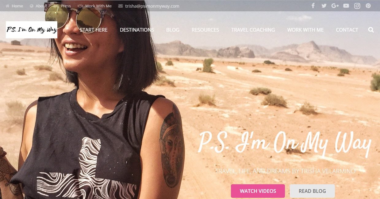
Apart from a great name, PS I’m On My Way boasts a fun, exciting, and action-packed travel blog. The homepage makes an immediate impact on new and returning viewers with a full-screen image and a bright eye-catching color scheme. The use of a parallax effect, combined with rows of article images and a beautiful full-width background image with text overlay, helps break up the page and give it a dynamic feel.
User-friendly, PS I’m On My Way displays an interactive map enabling the audience to find the countries and relevant articles that interest them. Create your own interactive map using a plugin like these. On individual blog pages, sidebars contain numerous helpful widgets including information on the blog author, social media follow buttons, an email opt-in form, and much more.
2. The Poor Traveler
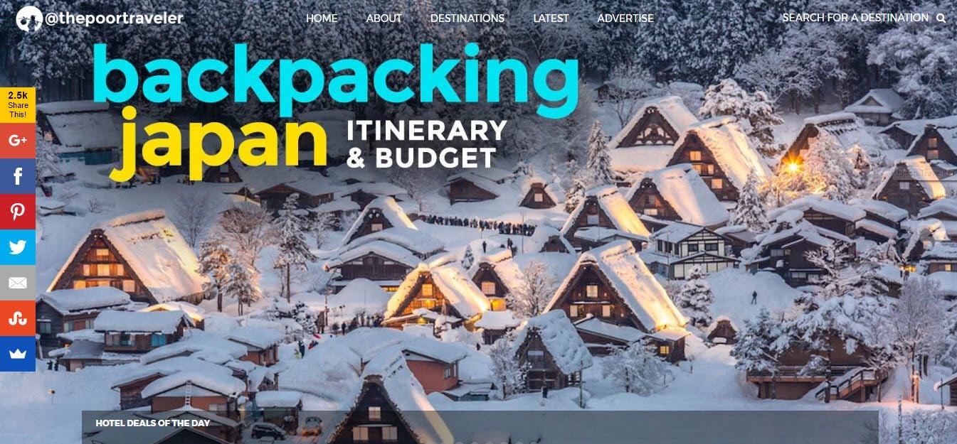
The Poor Traveler uses a full-screen slider that displays awe-inspiring images which will immediately connect with wanna-be travelers. An Agoda search bar sits at the bottom of this slider. This helps visitors find accommodation in their chosen city, which in turn, aids the monetization of the blog.
Social media plays an important role for this travel blog. Social media buttons are shown, including the number of current followers. An impressive Instagram feed is also displayed on every page, as well as underneath each blog post.
3. Migrationology
Migrationoloy is a travel food blog that is well laid out, organized, and very easy to navigate. The homepage uses full-screen video media to appeal to fellow or wanna-be travelers, and it works. The rest of the homepage is divided into sections, displaying full-width images with text overlay, a search tool, latest blog articles, and ‘Join Me’ buttons leading to an email signup form.
A clear grid style is used to display the blog’s articles. Individual posts consist of a multitude of relevant photographs. Guides for a selection of countries also list information in a clear format, with large images and links to hotels, restaurants, and further travel info.
Scandinavian Standard is a minimal, sleek and sophisticated travel and lifestyle blog that is extremely easy on the eye. The design and layout make for a calm and relaxing environment. This ensures visitors are at no point overwhelmed with a magnitude of information, as so often is the case with jam-packed travel blogs.
The white and black color scheme, combined with large, well spaced, article images, small amounts of text, and block buttons, help create an arty yet serious look and feel to the site. Widgets are present, yet don’t distract the audience. These include a search bar, social media buttons, and a Pinterest feed, all which fit beautify with the site’s branding. It is easy to see how this site could become a go-to travel blog for those not only researching their travels, but also looking for inspiration.
5. Travels of Adam
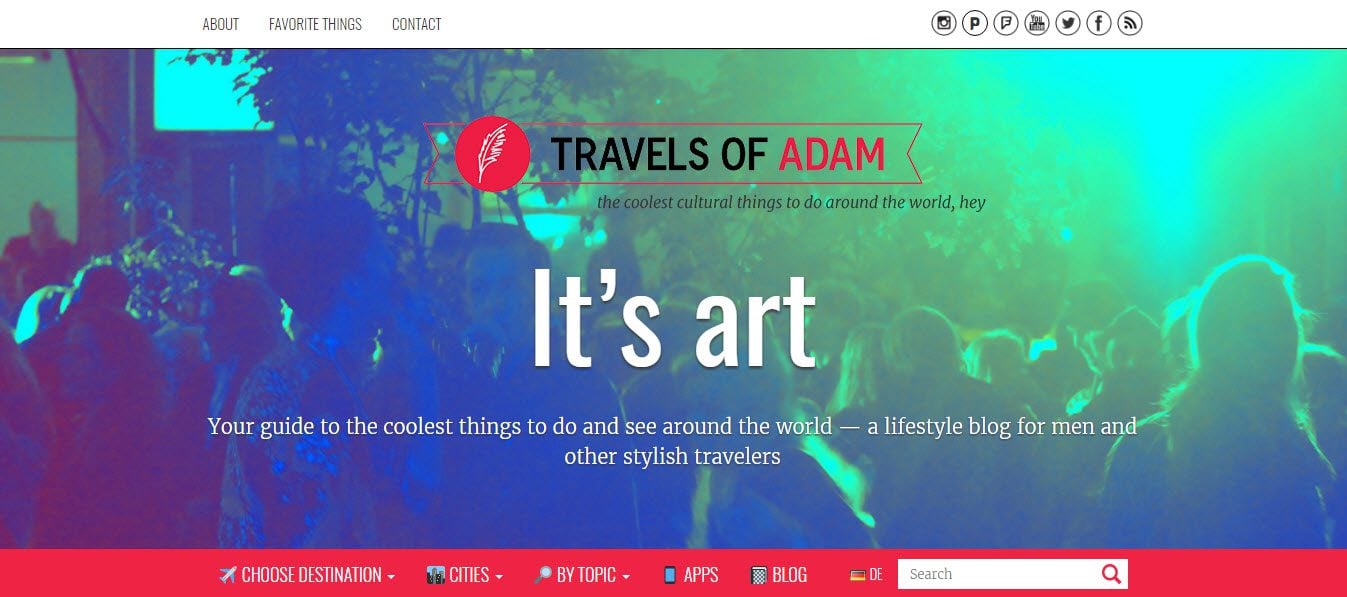
Travels of Adam is extremely user-friendly, with categories well laid out and displayed on the homepage. Quickly browse featured posts, latest posts, city guides, popular destinations and lots more. The blog’s author displays his About Me info on the homepage, so his visitors can quickly see who he is, where he is traveling, and understand what they will find on his blog.
The color scheme is a real standout feature of this travel blog. A combination of bright colors and bold text grab the attention of visitors and help give the site a fun and refreshing feel.
6. Nomadic Matt
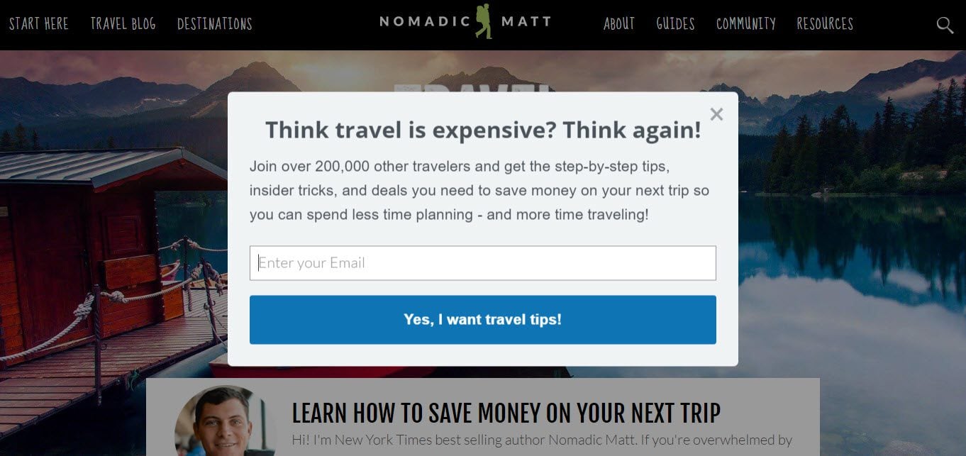
At first glance, this looks like just another fun-loving travel blog. However, don’t be fooled, Nomadic Matt means business. This built for purpose travel blog displays an email opt-in form in a prominent position on the homepage. It also includes a pop-up for further lead generation.
Nomadic Matt creates revenue from selling travel books. Set up as an eCommerce store, visitors can purchase books on the site from the Checkout Page.
7. Helen in Wonderlust
Helen in Wonderlust is a stunning travel portfolio site that puts bold and bright images at the forefront of its blog. Bright, colorful and packed full of interesting and helpful information, this site easily stands out in the crowd of travel blogs.
A drop down menu at the top of the page and a packed sidebar help users easily navigate this site and find what they are looking for. Widgets include a description of the author and blog, a newsletter sign up form, social media follow icons, and links to travel tours.
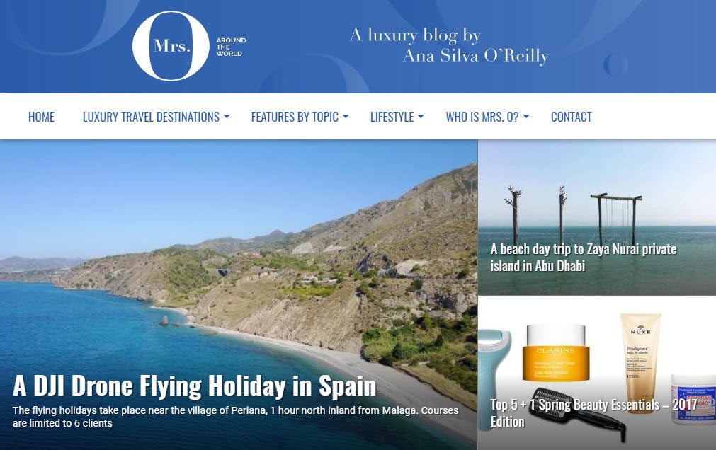
8. Mrs O Around the World
Mrs O Around the World has a distinctively professional look and feel. Let’s not forget, traveling isn’t all backpacking, hostels and crazy off-road journeys. There is a huge industry based around up-market, luxury travel companies. This travel blog has tapped into that niche perfectly.
Using a grid effect to display the featured image of each blog article, the homepage of Mrs O Around the World is taken up with a selection of interesting and eye-catching images. A scrolling sidebar allows a range of widgets to be easily accessed by site visitors. These include an Instagram feed and an email signup form. The layout is easy to navigate and branded colors create a sense of organized consistency across the blog.
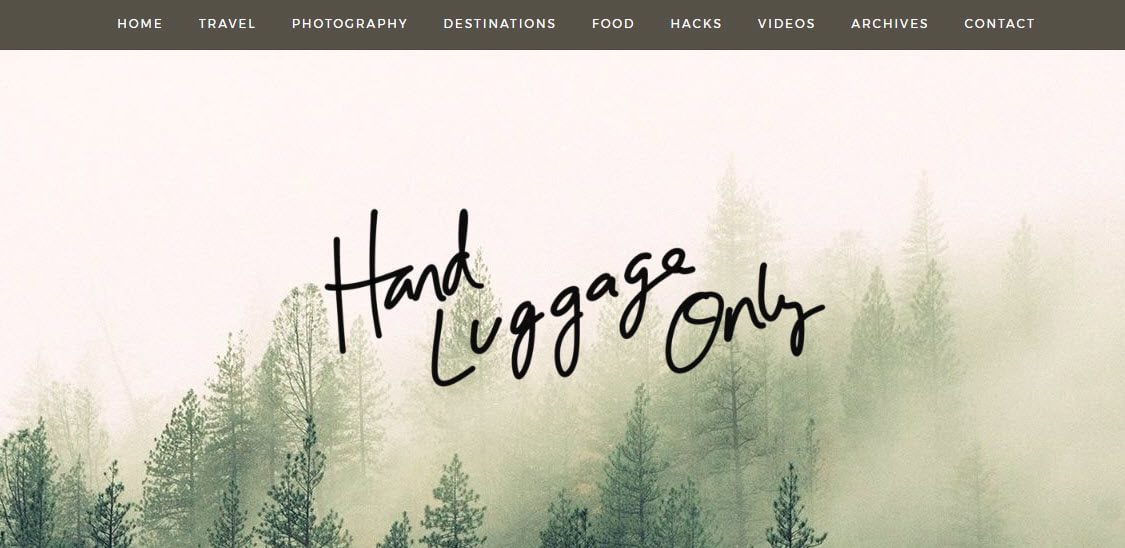
9. Hand Luggage Only
Hand Luggage Only’s artistic design and layout immediately appeal to the creatives amongst us. A full-width homepage image, with a hand written overlay, steals center stage when visitors arrive at this travel blog. This is followed by a nearly full-screen slider displaying recent and most popular blog posts. Large well-spaced images then help users easily navigate the site’s categories. All in all, the homepage is full of an arrangement of beautiful visuals, helping to keep this blog real.
The Contact Page of this website is particularly engaging. Here you will see photos of the blog’s authors, social media buttons, a contact email address and a contact form. There is also a comments section, where a discussion between the readers and writers takes place, creating a dynamic community.
10. The Blonde Abroad
If there is ever a time where you open a web page and immediately want to swap lives with an individual, this is it. The Blonde Abroad uses a stunning full-width video to create awe and immediate interest in this traveling blog.
The home page boasts an interactive map, an email signup form, stylish icons and buttons, links to recent articles and much more. Its quirky text gives the blog a relaxed, modern and young feel, helping it appeal to its fan base. The Blonde Abroad also displays an attractive Instagram feed, displaying beautiful images to help encourage social media follows.
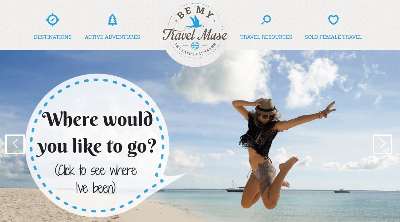
11. Be My Travel Muse
Be My Travel Muse has a strong color theme running throughout the site. The blog’s logo takes center stage on the homepage, as well as a fullscreen slider with text overlay. An interactive map helps engage with the readers, whilst an email opt-in form and social media buttons are displayed to increase lead generation.
The author of Be My Travel Muse has also written her own book so she displays a page dedicated to its promotion and sales. And a checkout page, powered by Stripe, allows on-site purchases.
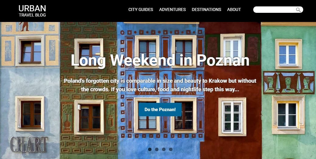
12. Urban Travel Blog
The Urban Travel Blog projects a strong and bold design, using black and white in blocks of color and text. The blog uses an exit pop-up, offering a lead magnet in the form of a free eBook, to capture leaving visitors and collect email addresses.
The homepage displays attractive images via a full-width slider. A variety of travel articles and city guides are then displayed, organized by category. This makes it extremely easy for users to access information on the destination of their choice.
Final Thoughts on Travel Blogs
Researching WordPress travel blogs is certainly an interesting and important first step when creating your own travel site. However, don’t let your ‘research’ stop you from committing to your own site’s creation. Take the visuals and features that inspire you from the current travel blogs out there. Then plow forward with a new and unique travel blog of your own.
What design elements stand out to you? Please share your thoughts, and any other WordPress travel blogs that you think will help inspire others, in the comments below…
Featured Image by VLADGRIN / shutterstock.com










Do you know what was used to create the interactive travel maps shown on The Blonde Abroad and the Poor Traveler?
Love your collection of Blogs for inspiration. And i like the way you respond to every comment.
Hi Sri,
So glad you like the collection!
Thanks for commenting,
Megan
Hey Megan,
Thanks for this list. Wondering if you know whether PS I am on my way was created with Divi? Or if Divi is capable three nav bar system like this site has. I have been using ET forever. My travel blog has been online for almost 13 years, using Nexus. It is time for a facelift. Thanks for the inspiration.
Hi Devin,
Thanks for your comments and glad the post has helped get you inspired. PS I Am On My Way isn’t made with Divi but if you are looking to give your site a facelift I would definitely recommend Divi (yes I am a little biased, but yes Divi is also great!)
Best of luck with it!
Megan
Have a look here for examples of travel websites using Divi…
https://www.elegantthemes.com/blog/divi-resources/examples-of-travel-websites-built-with-divi
Hope it helps!
They’re travel websites, any travel “blogs” made with divi?
You know most blogs are made with WordPress. It’s like saying 20 books made with paper.
I gather this is paid gig so to Elegant Themes, we’re interested in Elegant Themes related posts, not any old daily post to keep Google happy.
Great list with some of the best travel blogs out there. We built our travel blog with Divi and never looked back. The level of customisation possible is great and we’re continually improving it
Great travel blog David – love the UNESCO World Heritage Sites Section! Thanks for commenting.
Megan
Cool to see so many travel blogs using Divi these days!
I think we were probably the fist to use Divi when we designed our travel blog back in 2014. We were lucky enough to be featured on this blog as a Customer Spotlight and that gave our blog its first traffic push.
Obviously, we have redesigned since then but it’s still with Divi 🙂
Hi Espen,
Love your blog – it’s great to see creativity and usability working so well together. Guess that’s where Divi is so helpful. Love the images you have used too, especially the background image near the bottom of the homepage – the Great Wall of China?
Good luck with your travels and blog moving forwards!
Megan
I was looking for this post for a weeks time, thank god lucky today morning found this post in my inbox
Hey Rajendra,
Thanks for commenting and so glad you found this helpful!
Megan
Guys, does anyone know the IG plugin they used in the first website?
Thanks a lot for the inspiration! 😛
InstaShow Lite.
Self taught, I built our travel blog on WordPress and Divi! Been on the road since August 2016 and loving every minute!
Hey Shawn,
That’s a great achievement! Just been checking out your blog, I used to live in Bangkok so your recent article on ’10 things to do in Bangkok’ brought back some great memories! Best of luck on your blog and enjoy your travels, looks like you are having an amazing time (jealous much!!)
Megan
Hi Megan,
That’s a great list os blogs, thanks. I knew most of them, but thanks for showing me PS I’m On My Way, which for some reason I’ve never visited before. I’m a travel blogger myself, running the oldest Portuguese travel blog and I’ve been using WordPress for a long, long time. Can’t imagine a travel blog in other platform… 😉
Great to hear from you Filipe. Running the oldest Portuguese travel blog is a pretty cool claim, love that! And I am totally with you on using WordPress for travel blogging, it just makes sense! Best of luck with your blog moving forwards.
Megan