Gravity Forms is one of the best WordPress form plugins available today. It lets you manage, distribute and connect your forms on your WordPress site. I’ve been using it for a few years now across multiple sites, and in that time, the plugin has continued to add new features and expand what you can do with it. For simple forms, it tends to be a bit overkill. But for anything beyond that it’s a great choice. In this article will go over how to use Gravity Forms, and what it is best used for.
Inside Gravity Forms
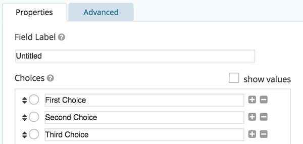
Gravity Forms takes cares of forms from completion to submissions to notifications. It has a drag and drop interface for creating forms with a lot of fields to chose from. Fields like address, email, name, file upload, drop-downs, CAPTCHA, and a lot more. Just take the field you want, slide it over to the form editor, and customize its value. Gravity Forms also allows you to set up conditional logic so that certain fields are only shown to users if, for instance, a certain option from a drop-down menu is selected. This is useful for more complex form trees.

Customize your field values
You can add the form to your site using a shortcode or function call, meaning you can include it on individual posts and pages, or built within your template. There is also an included widget if you want to attach your form to a sidebar.
Gravity Forms takes care of all the back-end validation that is required when a form is submitted. It will check that an email address is valid, make sure a CAPTCHA is filled out, ensure that all required fields are finished, and that every entry is sanitized. This is, by far, the most difficult part of setting up a form on your own. There are a lot of malicious attacks that can happen through a form, either intentionally or incidentally. And there are plenty of spambots out there ready to take advantage. Gravity Forms keeps things secure and prevents this kind of spam, even without extra measures like a CAPTCHA.
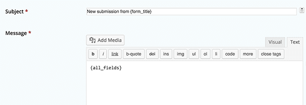
And finally, Gravity forms has a fairly complex notification set-up you can take advantage of. By default, form submissions are logged by Gravity Forms and stored on your database so that they can be viewed in the WordPress admin. But you can also set up email notifications to let various people know when a new form is submitted, and build an email template for each form. You even have the ability to send notifications to different email addresses based conditionally on answers from the form.

Setting up the email template
So basically, Gravity Forms takes care of everything for you, behind the scenes. It is meant to address a large variety of use cases, and so a lot of its features are a bit more hidden from view. We’ll talk a bit more about that later. But getting things set up is actually fairly simple, and you can have your first form up and running quickly.
Setting it Up
Gravity Forms actually has a pretty good on-boarding process for new users, and quite thorough documentation, so it is most likely worth diving into those resources for details, but I’d like to share a quick overview on how to get started.
You can get started creating your first form after you install and activate Gravity Forms and register your license. To do so, you just go to Forms -> New Form in the WordPress admin. You will be brought to the form editor, with your blank form on the left, and list of possible fields on the right. You can start adding form fields right away by dragging them into the form editor. Each field comes with a set of options specific to the field type. Sometimes this will just require a single value and a checkbox to indicate that it is a required field. Other types will have more complex options available, with conditional logic or a set of values. Forms can have as many fields as you like. Of course, you should keep these as short as possible for the benefit of your users.

Customize the layout of your form
The next step is to visit the “Form Settings” page where you can set up some global options for the entire form. This includes basics like the form title and description, as well as settings for its look and feel. You also have the option to add a CSS class to your form if you’d like to style it yourself. At the bottom of Form Settings you have the ability to activate the “anti-spam honeypot” which uses a hidden field on your form to prevent spambots, and is a bit more user-friendly than a CAPTCHA. It is pretty effective at stopping spambots, and invisible to your users, so I’d recommend switching this on in most cases. There is also a “Confirmations” tab, where you customize the message shown after a form is submitted successfully. Or, you can chose to redirect to a new page entirely.
The last tab is “Notifications” where you can set up who will receive a form’s message when it is submitted. I find that this section really sets Gravity Forms apart. Rather than defaulting to a simple message to the admin’s email address, you can set up a series of notifications to any email address you want, and auto-responders so that users will receive an email that their message has been received. These notifications can be as complex or as simple as you want, and have built in conditional logic. That means that, depending on a user’s answers to a form, emails can be directed to a variety of different addressess and with a set of different auto-responders. You can also customize the contents of the email message, using a few shortcodes to add the form message and answers to the template.

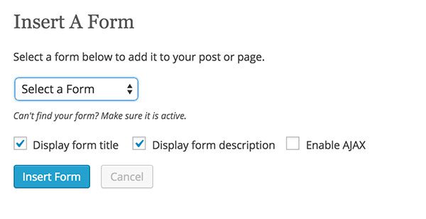
Change the default parameters for each form
The last step is to actually add the form to your site. You can do this by clicking the new “Form” button right next to the Add Media button in the post editor, and selecting your form. Or, you can use the [gravityform id=”X”] shortcode to embed it manually. For even more control, or for inclusion in templates, you can also use the gravity_forms() PHP function in your template files. There is also a Gravity Forms widget that can be used with your sidebars. Each one of these methods contains a list of parameters, such as the ability to turn AJAX on or off, or editing the tile and description. Gravity Forms will walk you through this process in the WordPress admin as you go along, so it won’t take long for you to have your first form up.
Advanced Features
Gravity Forms has been around for a little while now, so it has had time to add features when users request them. Through that roadmap, a lot of more advanced functionality has come out.
Gravity Forms now supports multi-page forms, which can be set up by adding a page break field to your form. This comes bundled with a progress indicator, either as a percentage progress bar, or as steps. For longer forms, this can provide feedback to users so they know where they are in the form process.

What multi-page forms look like
The plugin also allows you to set up payments, so that forms can be used to sell products on your site. It is far from a complete e-commerce solution for WordPress, but it allows you to have different prices based on user selections in the form, and has add-ons that allow you to integrate with Stripe or Paypal.
Speaking of add-ons, Gravity Forms features a three-tiered pricing structure, each with a yearly license. The most basic package comes with a few simple add-ons allowing for integration with Aweber, Campaign Monitor, or Mailchimp newsletters. But the most expensive license comes bundled with a suite of add-ons for getting more out of forms. You can use Gravity Forms to create quizzes, polls, or surveys. Another add-on lets you collect online signatures on your forms. On the e-commerce front, apart from payment gateways like Stripe, Paypal, and Authorize.net, you can also offer coupons that can be used in your forms, or integrate directly with Freshbooks whenever a payment is made. Gravity Forms also integrates with third-party API’s like Twilio and Zapier, so that you can hook up form submissions to just about any service you can imagine. For the most advanced users out there, these add-ons may be essential, and the developer license might just be worth it.
And for developers, there are plenty of ways to hook into various stages of the form process and customize exactly what will be shown to the user and where. Truthfully, I haven’t had to use these hooks and filters too often, and I’ve come to rely on Gravity Forms defaults for most steps. But there are dozens of hooks and filters available on the back end, and plenty of room to expand. For front-end developers, there are also quite a few JavaScript events that are fired through the form process, so that changes can be made to the DOM on the fly.
So if you’re wondering whether or not Gravity Forms is advanced, the answer is yes. Its team continues to add new features all the time, and it is a premium plugin for a reason.
The Final Word
In the past, I’ve described Gravity Forms more as a platform than as a single functionality plugin. It can be used to power everything from data collection to online stores. It simply offers a host of tools to help you do so. For some solutions, like a full e-commerce site, it is not necessarily the best solution out there. But it can certainly be tailored to just about any use.
On top of that, Gravity Forms is established in the market. That means they know how to provide great support and add to the plugin without making it too complex. They’ve also managed to dig up some great partners, and you can go to the Gravity Forms website to see optimized form themes from leading theme developers and shops.
At the end of the day, the plugin has to be worth the money for you. If you’re looking for a simple contact form, there may be better, and cheaper, alternatives. But if you really need to make sure that your form submission process is easy to set up and optimized for users, I’d recommend Gravity Forms.
Article thumbnail by Jane Kelly / shutterstock.com


Make life a lot easier. Connect HighLevel integrate directly with Gravity Forms for WordPress
Well Explained! I’m a great fan of Gravity forms and their rich features. It’s ease of use makes complex features possible without hassle.
The post images disappeared!
I’m looking for a way to have something on my WordPress site with functionality like the old Choose Your Own Adventure books. You present options during a story and the reader’s choices determine how the story ends. Could Gravity Forms be a good choice for this?
I’d Take Formidable pro over Gravity forms any days. The software is great and the support answer’s any questions that i have ever had in a few hours it’s amazing.
It’s a lot cheaper too and the fee is one time. i would buy formidable pro even if the price was 3 times more than what it is now.
There wouldn’t be even a competition between those 2 it’s an obvious choice the only thing Gravity forms has over formidable pro is that Gravity forms is more famous. that’s it
It’s terrific that you are introducing Elegant Themes’ customers to Gravity Forms, Jay. Gravity forms is an excellent low cost solution for the digital marketer. The annual subscription model ensures the software is continuously updated with feature enhancements and is kept up to date without incurring large upfront out of pocket costs.
The product itself accommodates all levels of digital marketing expertise. Like me, you may initially start using Gravity Forms because it provides a high level of control over form styling using CSS. But, as your digital marketing sophistication grows, you’ll learn how the forms can be used for more than simple contact forms. You’ll learn to bolster the accountability of your marketing programs by integrating your forms with Google Analytics URL tags and goals. And if you are a B2B marketer, you’ll learn that your forms become central to your lead generation program when integrated with Salesforce.
All of this starts with the basics that Jay Hoffman has written about in this blog post. Thank you Nick Roach for another helpful article.
Hi Jay,
Greatly explained entry…Gravity Forms actually suits complex needs and works better (in addition to justifying the expense) when one has such needs. If none of such exists, a simple (free) contact form plugin would nicely ensure.
Do make the day great!
Always,
Terungwa
These gravity forms are so useful. I start using them in my most recent websites and it looks amazing.
It’s a great way to let readers get what they want really fast.
Thanks for explaining some interesting details about this tool!
Have a great day.
I often read review about gravity form, but do you know there is a form that can absolutely compete with gravity form in terms of features and prices. Yeah, that is formidable pro. I used this formidable pro to build not just simple form contact but also a complex applications like student information applications without custom code. You can use formidable pro to display data entered by users in front end and let them edit their data. Gravity for just win in marketing strategy but in terms of features and support, formidable pro is #1.
Hi Jay,
You have covered this article in great detail. It is one of my favorite WordPress plugins.
Whenever i am in doubt, Gravity forms is the best choice for me. And it is not only because of its functionality, but ease-of-use too.
Regards,
I have been using gravity forms for last one year. It is a must have tool for blogger. Thanks for the awesome post.
Ugh. Another plugin “review”. I think elegant themes must have paid writers this year instead of developers.
About to switch off
It looks like that many developers changed to bloggers and affiliate partners 🙂
When Elegant themes did last theme ? completely turning to blogging ?
How helpful are these ”reviews” if I can read the same on every second wordpress site ?
Our blog does not contain any affiliate links or paid advertisements. This information is free, and we spend a lot of time creating quality content that we think will be useful to our readers.
Nice, I just thought, that Elegantthemes is developer of themes, not blogger.
I did not mean that you are affiliate, just wrote, that every second blogger write about gravity forms and for example I almost never read about Formidable forms, sometimes about Ninja forms.
These are not worse.
Hi Jay
Gravity forms is the king of form plugins but it is a paid service and payments are ongoing.
I’d love to see a post on taking say Contact Form 7 and adding fields and styling it to look like a Divi form.
Hello Keith.
I alo dislike Gravity subscription model ( and it’s not cheap). Install Contact Form 7 in a test website and start experimenting. It’s very easy. Lots of resources online on doing what you need. Just google it.. ja.
Here’s something to get you started.
1. Install the plugin in your website.
2. Add this code to your theme’s child theme style sheet (style.css) (create one if don’t have it). You can do this in any simple text editor. I use Coda for mac which has a built in ftp which is very handy.
3. Here’s some sample code to get you started. Lot’s of online resources which show you all styling parameters for css. This code will style text fields email fields, text areas and Pulldowns (select). Change the values and play with it. Note: You may not need all the parameters I’m using so just delete that line.
4. Here’s an example of how it looks http://www.seguromas.com/wordpress/automovil/
You can Google also how to make a 2 column form with contact form 7.
Hope this gets you started 🙂
.wpcf7 input[type=”text”],
.wpcf7 input[type=”email”],
.wpcf7 textarea
{
background-color: #f7f7f7;
font-size: 14px;
color: #000;
height: 20px;
width: 75%;
}
.wpcf7 select
{
background-color: #f7f7f7;
font-size: 14px;
color: #000;
height: 20px;
width: 75%;
}
Hi, Fernando!
That is excellent code and I do like to experiment with things like that! The point I was making was for those who don’t like to code and need an excellent GUI for making complex forms, they should take a look at Formidable Pro.
For little more than the price of a Gravity Forms “Business License” (which is three sites/one year of upgrades), you can get a Formidable Pro “Unlimited License” (Unlimited Sites/Lifetime Updates).
I know it sounds like I work for these guys but I don’t. There just seems to be a push these days to get WordPress developers to use “rental software” and I’m getting a little frustrated with it. This is just one example.
Saying that, I apologize to Jay (who wrote the above blog post) for any conversation-hijacking away from Gravity Forms. It’s a very informative post and–apart from my disdain for their pricing model–seems to be a very worthy tool.
Yeah, Gravity Forms might be amazing, but I get a little weary of their ever-present affiliate marketing (I know the above blog post isn’t an example of that). In addition, I also like to buy, rather than rent, my software tools.
I don’t hear people mention Formidable Pro quite as often as Gravity Forms and Ninja Forms, but I think Formidable Pro is fantastic. It has tons of features, they’re constantly improving it and–just like Elegant Themes–they have a one-price-gets-it-forever option. Maybe their downfall is they don’t seem to do affiliate marketing! Anyway, I’d recommend that they are certainly worth a good, long look.
There’s only one thiing preventing Gravity Forms from being great: forms are NOT responsive at all an it sucks badly to open a form on a phone.
Something else, a lot of theme makers are providing custom css for Gravity Forms. Elegant Theme should provide such css.
Regards,
Thanks for share, mostly all points are clear of Gravity Forms.