Landing pages are pages you create for one purpose: conversion. You want to convert page visitors into followers, sign-ups, or customers. Having an effective landing page can be the difference between success and failure for your entire online venture.
Many of you have been using our theme Divi for years because it’s one of the best tools out there for quickly and easily creating WordPress landing pages. Now, thanks to the release of Divi 2.7 and its powerful split testing feature Divi leads, it’s also one of the most effective ways to create a landing page for WordPress users.
In this article I’m going to explain the anatomy of an effective landing page and then show you how to split test it for success with Divi Leads.
Anatomy of an Effective Landing Page
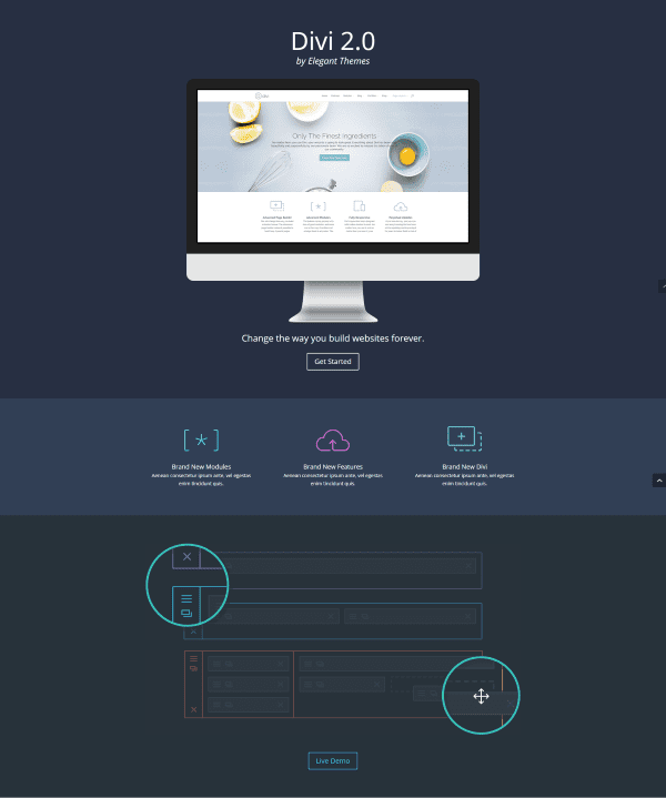
An effective landing page will draw the reader’s attention to your call to action and give them the information they need to make the decision to act. Here’s a look at the key elements that make a landing page effective.
Headline
The headline is one of the first things the visitor will see. It should contain two elements:
Page headline – the primary title and purpose of the page.
Sub heading – provides supporting information.
The importance of a good headline cannot be over stated. Headlines should be clear, concise, and draw your reader’s attention. If they’re not, they could be costing you big time.
In this guide to writing attention grabbing headlines, authors Neil Patel and Joseph Putnam state that in marketing, headlines are worth 90% of the advertising dollar. And they personally have seen a single word in an email subject line make a 46% difference in a campaign’s conversion rate.
Image or Video
This is a hero image or video of the product. Use the highest quality image or video and audio as you can. Make sure they have great lighting and use professional photography standards. They shouldn’t look like cellphone images. They should look like studio images.
Offer and Benefits
This is the ad copy that tells about the product and the benefits of using it. It should follow from the headline and be precise. Use laymen’s terms. Don’t over-sell the product and make promises that are too fanciful. Break it up into a clean list of features and benefits.
Call to Action
The call to action is the primary purpose of the page. The rest is supporting information to lead your visitors to the CTA and give them the information they need to make an informed decision. These are typically buttons that use action phrases such as buy, download, join, click, and then add terms such as free. For example, buttons could include text such as “Buy Now,” “Download for Free,” “Join Today,” “Click Here for 15% off,” etc. Call to action buttons should be well-labeled, prominent, and above the “fold” (viewable on a desktop without having to scroll). Never force a visitor to search for your CTA button.
This includes ratings, reviews, interviews, sales figures, press statements, guarantees, and any other material to build trust. This should include statements that are both good and bad and reviews that are precise and not rounded numbers. This proves the reviews and testimonials are honest and not making false claims and builds credibility. Another way to build trust is to add trust and security badges.
You don’t want to distract your visitors from your call to action. The menu system should be short and simple with just a few links that are easy to understand and follow. You don’t want every page and category in the menu. This is not a complete navigation structure like you would expect on a regular page. Remember, the focus is conversion, not leading them to another page on the site.
You might even consider dropping this navigation completely in favor of your call to action. If you do want a navigation, then just a link to the homepage would be enough. Some recommend that you have no navigation at all on this page. Some include the logo in the header to identify the website while some do not. I prefer to include the logo for better site identification. That’s something you could test and see what works best for your website.
Placement
Placement will vary depending on the type of screen or device the visitor is using and the type of device you’re trying to target. The most important space on the screen is what appears before a visitor has to scroll. That’s where you need the most important elements of your page such as your title, text, and CTA. Supporting elements, such as social proof and extra information can be placed below the scroll (or fold). This is more prominent on a desktop.
Initial Trial Run
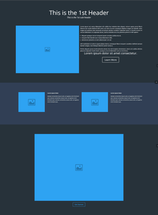
Using the concepts outlined above, I developed a landing page by hand using the Divi Builder. In a real-world test I would run the site for several days (or however long it took to run a statistically significant test) to see the results of my call to action. This would give me a baseline to compare my improvements to and help me quantify my data. Once I had my baseline I would start my A/B tests.
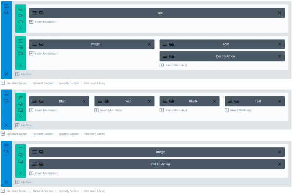
Initial A/B testing trial run
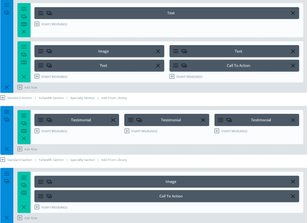
This is the layout that I’m starting with. It gives me a clear heading, sub-heading, image of the product, text for the product, CTA, blurbs for users, another image, and another CTA at the bottom of the page. I took several queues from the landing page template in the Divi Builder Library.
Once I had enough quantifiable data I was able to start my tests.
Testing
The idea isn’t to just make changes for the sake of making changes. Tweaks should be specific and testable with the best results implemented. The best way to know where to focus on making improvements with Divi is by running an A/B test using Divi Leads.
In this section, I’m showing the tests that I performed and the results I got. In order to decide what tests to perform, I simply started with the first element and made a change to see what would happen. I want to test each element using a Divi Leads A/B test. In reality I would run the tests for much longer than I did in these tests and would get lots of traffic and clicks. The results are just simulated so the numbers are small and unrealistic, but they’re just for demonstration purposes.
Header Text

A/B test on header text
I started with the header text. I wanted to see how well the text grabbed the reader’s attention. For this I used the text as the subject and the call to action button as the goal.
Results

The second header had a lot better reading rate than the first header. I kept the second header text and moved on to the next test.
Image and Text Location

In this test I’m comparing the location of the image and text to see which layout has the best effect on the call to action. I want to know if the call to action works best under the image or under the text. I’m leaving the call to action in place and swapping the image and text.
Results

The results show that row 2 got more impressions but had the same number of clicks as row 1, giving row 1 a higher click-through rate. For now I will keep row 1.
Blurbs and Testimonials

Next I want to see what type of testimonials will work the best. I’m using the module as the subject and the call to action as the goal.
Results

The results show that row 2 had a higher engagement than row 1, meaning the two testimonials stacked was more successful than the two horizontally placed blurbs with text next to them.
Testimonials Versions

Since the testimonials were so close to both CTA buttons I decided to expand the test. I wanted to try a different layout for testimonials and include the bottom CTA button. Using the call to action as the goal I created a new layout for this row. This time I created a third option for testimonials, so now I have two with one over the other, two side by side, and three side by side. Also this time I added a second test. I added the shortcode to a different page that the second call to action leads to. This way I could get more data and see if I received more clicks from the first CTA or the second.
Results

I can see that row 2 and row 3 both have more clicks per impression than row 1. I needed another factor to know which would be better to choose, so I looked at the shortcode conversion rate.

Row 3 had a higher shortcode conversion rate than row 2. I could analyze further since row 1 tied with row 3 for shortcode conversions, but I like row 3’s click rate better so I will stick with row 3 for now.
Image and CTA
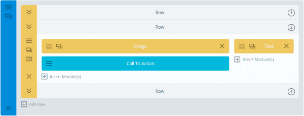
For the image and call to action I want to test the row rather than the module. This way I can try different layouts, add different elements, etc. I used the CTA as the goal.
Results

Of the four rows, row 1 and 2 had the best results. To help make a decision I looked at more data.

I can see in further analysis that row 1 had higher goal views and reads than row 2, so I kept row 1.
Second Call to Action
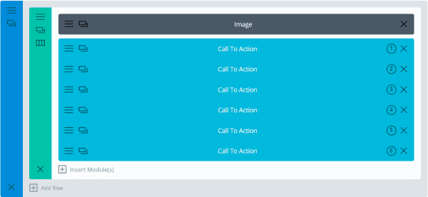
I want to experiment with my second call to action button to see if it should be larger, a different color, have a different text, etc. For this test I created six variations. Some of the differences were minor while others were more extreme.
Results
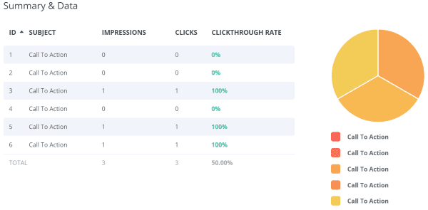
CTA’s 3, 5, and 6 performed equally. They were similar so I just kept the third one. This is something I can always come back to or continue testing for until I have a clear winner.
Section Colors
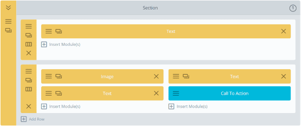
Once I made some tweaks to the layout I wanted to test colors for the backgrounds one section at a time. I created two sections with the same layout, one with a dark background and one with a light background. Once I’m done with this test I’ll try it again with a different color or with a background image. You could even leave a section blank if you wanted to test the page with and without a section (of course you wouldn’t do that with THIS section).
Results

Both sections received the same number of impressions and clicks, but section 2 had a higher bounce rate. Also, my shortcode conversion rate was higher than on other tests, showing that the color of the last section was more popular (that’s where the second CTA was). This accounts for the bounces because customers used the second CTA button instead of the first.
Optimization
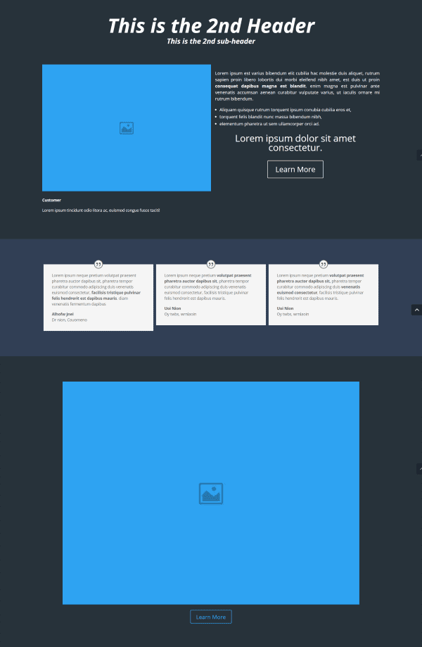
The best way to optimize your landing page is to analyze the data and make changes based on that data. After analyzing all the data I found which modules and layouts performed the best. I then went back to those modules and made more modifications and performed more tests using different colors, text sizes, locations, reducing the amount of text, changing the images, changing the wording for call to action buttons, using bold text to draw the reader’s attention, etc. The point is keep testing and making improvements based on those tests.
After enough testing I would compare the results to my baseline to know how much my conversion rate has improved. With very little effort you can easily improve your conversation rate by leaps and bounds.
I’m taking the less is more approach and keeping the layout clean and simple. Cut out anything that’s not needed. Since we have 5 seconds to capture our visitor’s attention I decided to remove a lot of the text. If you give too much information it could discourage visitors from reading and make it more difficult for them to make a decision. I cut the amount of text down almost by half. This allowed the reader to focus more on the images and buttons. I also decided to use more bullets, bold, and highlights where appropriate to help lead the reader’s eye and make the page scannable. If they can’t quickly figure out what the page is for they will probably leave.
Too many different calls to action can confuse customers. Rather than removing the second call to action, I decided to make it clearer that it’s another place they can click for the same product. Another option would be to remove it completely, but considering its location it could improve the conversion rate. If I continue to test this CTA and find that it doesn’t improve conversion then I’ll consider removing it. It’s okay to have more than one CTA for the same offer, but it needs to be easily understood and easy to see.
What’s next? Keep testing! Change anything that isn’t helping your conversion rate. This includes the layout, wording of your headlines, amount of text, color choices, button choices, etc. Never stop tweaking your landing page. Testing is something that you’re never really finished with. You’ll never need to stop making improvements on your website. Just one small improvement can increase your conversion rate and make the difference between success and failure.
Final Thoughts
Divi Leads makes it easy to test landing pages to see where to make improvements. The test examples I’ve given here are just a few of the many ways you can test a single landing page using Divi Leads. Start with good landing page design principles, develop a baseline, and then start testing. You just might see your conversion rate soar.
The key to building the most effective landing page possible is to consistently test and make improvements based on those tests. Just keep testing and your conversion rate will thank you.
We’d like to hear from you! Do you have any landing page design tips to add? Have you tried testing landing pages with Divi Leads? Let us know about your experience in the comments.
Article thumbnail image by / shutterstock.com




Hello.
Tell me please how to disable navigation at all.
Because i don’t want to use it.
Just site with out navigation.
Regards.
Very nice – but: we don´t need split testing because we know what is good 😉
steve
is it possible to test variations of an entire site against each other?
No that is not possible with Divi Leads.
the test that were made in this article require a lot of visitors to get statistical significant… For my site it probably would take a year ^^
Hi,
Does Divi Leads allow redirection to a custom page or URL upon form submission?
This is critical for serious marketers.
Regards,
Steve
Yes, in the contact form module there is a redirect option.
It would be helpful if each of the trial items had a different name. It’s hard to figure out which one did best when they’re all named the same thing, like “Call to Action”.
This was helpful! Learning to use Divi for landing pages.
A/B Split Testing is the best way to see what works better for your site. With Divi Leads it is easier to test landing pages to spot the area of your site that needs improvement.
Very nice – Ill give it a try later today.
Can’t thank you enough for all of the hard work in putting together such a detailed tutorial. Let the split testing begin! 🙂
Thanks for the tutorial, but I would suggest doing A/B testing when you already have some decent traffic (I would say at least 50 unique visitors daily) and not just 1-2 impressions in the whole test like it is on the images in this post.
Hi, great post indeed.
My concern is about to delete the menu system in this kind of page. How could I do to remove it from this particular page?
Thanks!
Hi Daniele, when you are creating or editing a page on the backend of wordpress, there is a metabox on the right hand side of the page called Page Attributes. As long as you have Divi installed there is an option to change your page template from default to blank. If you select blank it will remove the header and footer from your pages giving you the perfect blank canvas for a landing page.
Really explained in detail. Great job!. I will be trying to implement the features to a newly started landing page design job, thanks anyway.
Oh its a fantastic post Randy . Thank you so much for describe elaborately. All of your hard work reflect through the post. You have arranged all the statistics, Charts and images very well and that is why i love your this article.
Nice article ad well written ! Cannot wait to implement this !
Hi,
Does it wok with thrive leads headline optimizer plugin ?
Hi Mike, no Divi Leads does not work in tandem with the headline optimizer plugin. You can use Divi Leads to optimize your headlines and a lot more all on its own.
I wish things like landing pages and popups would go away. I can not stand when I try to go to a website and have fight through those things just to get to where I want to go. I simply can not promote something on my site that believe to be annoying to customers.
Would be helpful if you showed what the page visitor sees….as they don’t see the divi page builder…and looking at it it’s almost impossible to visualise what looks like.
Hi Ian, the frontend page images are the first images under the headings “Initial Trial Run” and “Optimization”.
Where do I find the 3 new templates, wonderful option to lead pages
I totally agree. Afterall the title of the article is “How to build and effective landing page from scratch.” You would think they would spend some time on the actual “building” part. Oh well he tricked me into reading the article so I guess he was successful.
Succinct and very useful reference – Thanks!
I can’t wait to use these features!
Goodnight Leadpages.
Than again what’s the advantage of leadpages anyway?
-> Lots of templates to save time
If Divi can follow up on this (like they did already with their 3 overall templates a couple of days ago) Leadpages get really unnecessary.
Looking forward to implementing this article into my tool bag. Thanks!
plz inform if you have implemented this and whats your view about divi leads.
Thank you for writing this article, though I have already read much of this information it is very helpful to have it all compiled into one article focused on using Divi to split test landing pages. I have it bookmarked and will be getting right to work testing a new landing page for my site.