Columns are basic website design elements. They allow you to display your content in chunks that are visually appealing. They allow you to create layouts that look like magazines and newspapers.
But creating them can be tricky. It is possible to code them by hand, but that can require lots of adjustments for every single post. You can also create them using one of the many plugins, or even one of the many themes, that give you the ability to create your own layout. This article will discuss all three of these methods.
Creating Columns in Code
It is possible to create columns within your posts and pages using tables, but the ideal method to create columns is through HTML and CSS. The Support tutorials for WordPress show many advanced examples. Columns are actually easy to make in code. Let’s take a look at an example to create columns.
To create columns in the text editor use the <div> tag along with a style attribute.
<div style="width:40%;padding:0 10px 0 0;float:left;">
Your content for your column #1
Your content for your column #1
Your content for your column #1</div>

<div style="width:40%;padding:0 10px 0 0;float:right;">
Your content for your column #2
Your content for your column #2
Your content for your column #2
</div>

<div style="clear:both;"></div>
This example of code creates two columns like this:

You can change the size of the columns by adjusting the width and padding values. By adjusting the numbers you can create more or less space between the columns and change the width of the columns. To add more columns simply add another block of code. It would look like this:
<div style="width:30%;padding:0 10px 0 0;float:left;">
Your content for your column #1
Your content for your column #1
Your content for your column #1</div>

<div style="width:30%;padding:0 10px 0 0;float:left;">
Your content for your column #2
Your content for your column #2
Your content for your column #2
</div>

<div style="width:30%;padding:0 10px 0 0;float:right;">
Your content for your column #3
Your content for your column #3
Your content for your column #3
</div>

<div style=”clear:both;”></div>
If you add more columns you’ll want to change the width percentage to ensure they fit. In this example, it was changed from 40% to 30%.
The columns don’t have to be the same sizes either. For example:
<div style="width:20%;padding:0 10px 0 0;float:left;">
Your content for your column #1
Your content for your column #1
Your content for your column #1</div>

<div style="width:20%;padding:0 10px 0 0;float:left;">
Your content for your column #2
Your content for your column #2
Your content for your column #2
</div>

<div style="width:50%;padding:0 10px 0 0;float:right;">
Your content for your column #3
Your content for your column #3
Your content for your column #3
</div>

<div style=”clear:both;”></div>
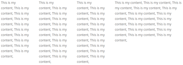
This code would create two narrow columns and one wider column:

Using this code you can create multiple columns on any page or post, creating a magazine or newspaper look. You can also layer them by continuing to add columns:

I created the space between the lines by using a break tag between column 3 and 4: <br><br/>
This is as simple as it gets for coding by hand. However, you still have to preview and make sure everything fits on your pages and posts the way you want them to – every single post. An easier way to do this in your visual editor is by using a plugin. Also, this only affects your posts and pages – not the site design itself.
Plugins and Shortcodes
Plugins do this coding for you. They give you choices so you can see how your columns will fit within the post. Some provide shortcodes that you place within your content. Others provide buttons or other additions to your visual editor, allowing you to make quick selections. Here is a quick look at some nice plugins.
ET Shortcodes
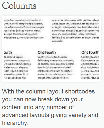
ET’s Shortcodes plugin adds buttons to your text editor. Here’s what the editor looks like without the buttons:
![]()
And here’s what they add:

As you can see, there are lots of layout options that have been added to your list of choices. The options for your layout include:
- One half
- One half last
- One third
- One third last
- One fourth
- One fourth last
- Two third
- Two third last
- Three fourth
- Three fourth last
Using the codes is simple. Type your content, and then in text mode highlight the portion you want to appear within a column, and select the column width.
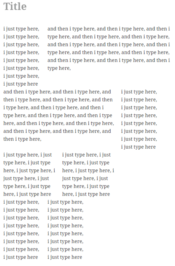
That’s all there is to it. You can change it by removing the code that’s wrapped around the text and then making another selection.
Tip – experiment with the column widths and hit preview to see what works best for your theme and gets you the perfect layout you’re looking for.
ET Shortcodes are responsive and extremely easy to use. They’re part of the Developer plan for $89 per year. It gives you access to all themes, plugins, premium technical support, perpetual updates, and layered Photoshop files.
Elegant Builder
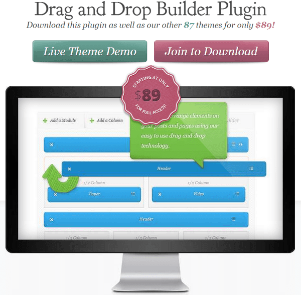
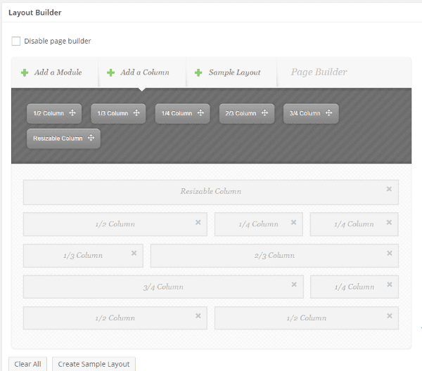
The Layout Builder creates a canvas for each post or page where you can drag and drop columns of various sizes. You select the columns from the menu. Your choices are:
- One half column
- One third column
- One fourth column
- Two thirds column
- Three fourths column
- Resizable column
You can place them yourself or you can load a template. Once you have the layout the way you want it you can save it and reload it as many times as you want.
After you’ve placed your columns where you want, you can add any one of 17 modules to any or all of them. You can also save the layout with the modules, so you can reuse it again.
Elegant Builder is responsive and one of the easiest plugins that I’ve used to create columns quickly. It’s part of the Developer plan for $89 per year. It gives you access to all themes, plugins, premium technical support, perpetual updates, and layered Photoshop files.
Advanced WP Columns
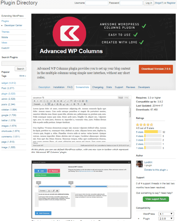
Another plugin that will add columns is Advanced WP Columns. This free plugin has some nifty features. It lets you create columns with a simple interface without using shortcodes. It supports responsive layouts.
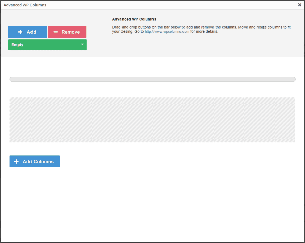
It adds a button to your visual editor that brings up a screen where you can drag and drop your layout. You can choose between 2, 3, or 4 columns. Once you have your columns you can make adjustments by using sliders.
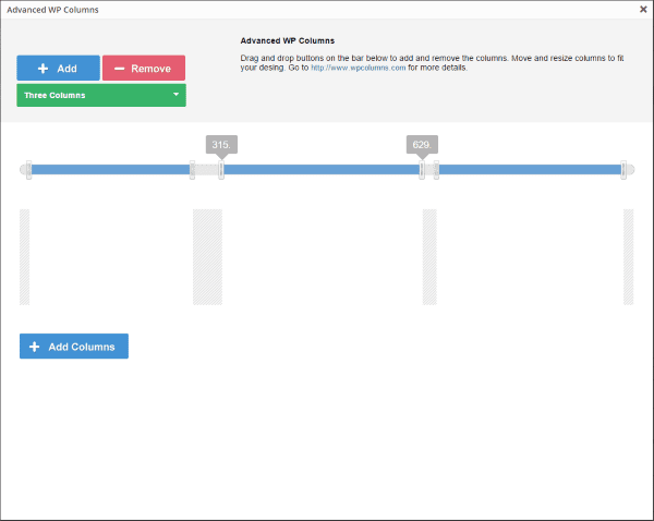
The sliders will let you change the width of each column, and you can change the width of the space between the columns. This is easily done using the sliders on the screen.
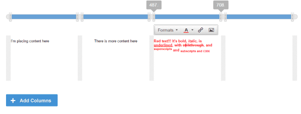
You can add your content directly into the columns in the popup if you want. You have the full range of textual features that you expect: bold, italic, underline, strikethrough, superscript, subscript, code, header, H2-H6, Paragraph, pre, link, etc.
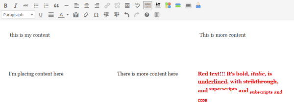
You can also place your content in the column within the visual editor. You can make any modifications to the content that you want from either the visual editor or the popup. The visual editor of course gives you more media features, so I find it the better choice.
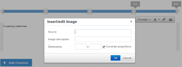
You can add images to any column. Instead of adding media as normal you have to give it the link, description, and dimensions.
You can also set some defaults such as the container width, container CSS, and number of columns. This is an easy plugin to use and the pages look great. There is a user guide and a video tutorial to get you started. Not bad for a free plugin.
WP Easy Columns
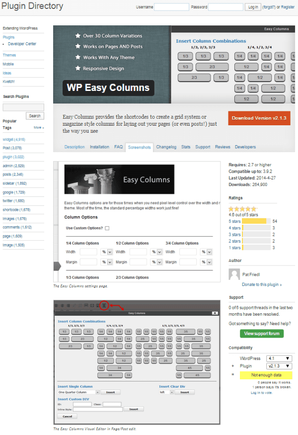
This plugin adds shortcodes that work on both pages and posts. It adds a button to your visual editor. Clicking the button brings up a popup with lots of selections.
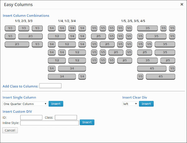
Click on the row that has a layout that interests you and it adds placeholders to your text.

Replace the description of the column with your text.
Your content will be placed in the columns. If you want a different layout under this one you simply click the button again and select the row you like. You can click on as many rows as you like, but you have to click on them one at a time.
At the bottom of the selection screen you can choose a single column width from a dropdown box. You can also add classes and styles. This is a nice way to easy add column combinations to your pages and posts. And it’s free. The only real downside is that you have to work between the shortcodes within your content. This can be a little confusing at first, especially if you have a lot of shortcodes within your text.
Responsive Column Widgets
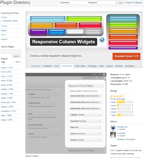
This one also works with a shortcode. Unlike the others, there is no button to add them. It will let you place widgets in columns, so any widget you have can go anywhere you want. You create a widget box, add widgets to it, and then call them with a shortcode.
You can set up the number of columns, number of widgets, number of columns per browser width, column span, and lots more. You can also write PHP code to display them in the theme template.
There are lots of settings and it can take a while to work through them all. Setting them up is not as easy and intuitive as the others, but there are a lot more options. One thing I don’t like about the free edition is it has ads, so I’m not recommending the free edition.
There’s also a Pro edition that adds multiple widget boxes, import/export widget options, no ads, custom CSS, and premium support. It costs $57.98 for one site, $97.98 for five sites, and $297 for unlimited sites.
MiniMax – Page Layout Builder
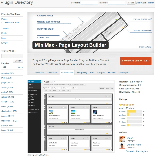
This is a drag and drop responsive page builder that adds buttons to your visual editor. You can add from 1 to 6 columns. It will also let you import or export your layout and you can even clone it for use in another page or post.
This one is simple to use. When you create a new page or post you’ll see a new tab between your visual editor and text editor called MiniMax. Clicking this gives you buttons to add the number of columns you want, or to import/export, or clone.
I clicked to add 6 columns. This added 6 boxes that I could add content to. I could add CSS to each box individually. There are plus and minus buttons that allow you to increase or decrease the size of each column. You can also adjust the border, pattern, and margin.
Clicking on the folder for the column opened up a box where I could choose from modules (widgets) to go in the column. After I was done with that row of columns I clicked on a cloning button on the left side of that row. This cloned the row and placed it under the first row. I could drag the rows and rearrange the order easily.

I did run into an issue with saving my post as a draft. Every time I saved it, my content was erased. I had to give the post a name first. Once I named it, I didn’t have any issues with saving the content. For sheer simplicity and ease of use, this one is hard to beat. It’s also free.
Themes
Using Shortcodes
Many professionally designed themes come with shortcodes. Shortcodes allow you to easily use premade design elements without having to do any of the coding yourself. You can develop advanced layouts that include columns just by dropping a shortcode into the post. Shortcodes are one of the easiest methods to add columns without having to write your own code.
Drag and Drop
Other themes include options for designing your own layout. Many of them do this through drag and drop design elements. Here are a couple of examples.
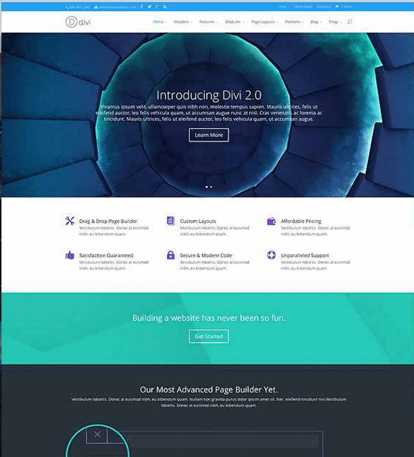
I can’t leave out ET’s most popular theme. Divi has its very own page-builder built right in to the core of the theme. Using it, you can create pages with pretty much any kind of column-layout you want. You can load pre-made templates or you can use drag and drop to create your own layouts. Here’s a quick tour:
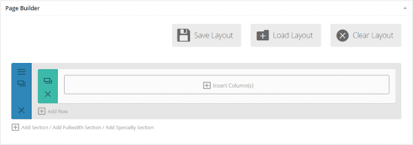
On a page, click the Use Page Builder button and you’re given this screen. From here you can either load a premade layout and then use or modify it to your heart’s content, or you can start inserting columns.
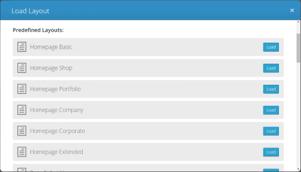
There are a lot of premade layouts with lots of options.
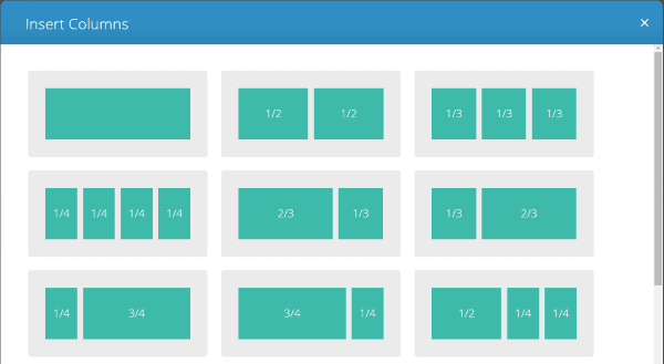

There are 11 different layout options if you choose to insert columns. Select the one that you want.
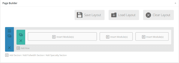
Your columns appear in the layout you chose and you can start inserting modules.
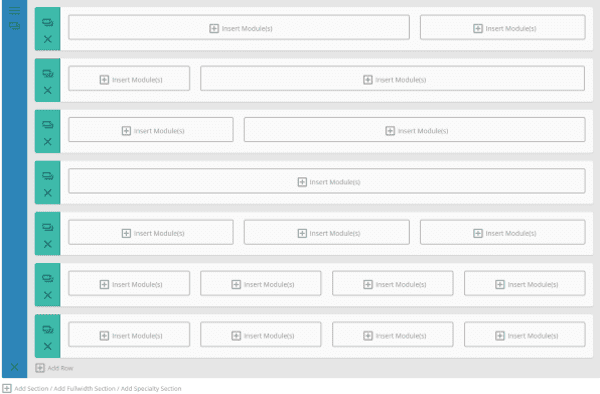
You can add as many rows as you want and give each one any layout of columns you choose. Once you’ve chosen your layout you can add modules. You can also go back and edit the layout and add or remove columns if you want. You can also drag and drop the rows. It’s just as easy to modify the layout as it is to create it in the first place.
Divi is very easy to use and you can have a unique and professional layout in just a few minutes. It’s part of the Personal plan, a $69 per year package which gives you access to all themes, perpetual updates, and premium technical support.
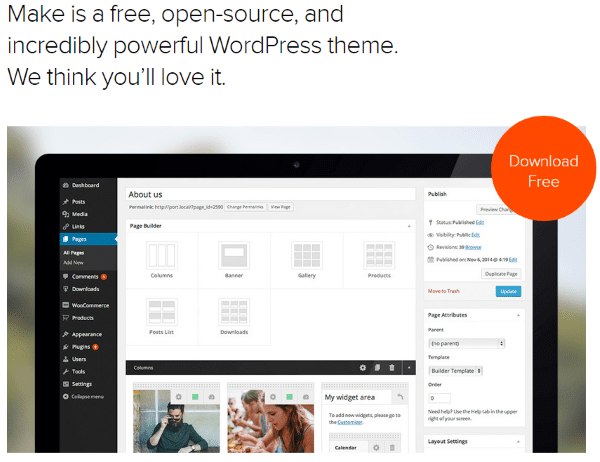
Make includes a powerful drag and drop layout editor that allows you to create column layouts with a simple click. You can display between 1 and 4 columns in a section. Each column can contain a featured image or content. You can rearranged the columns by drag and drop.
I installed this to try it out. When you create a new page you will have some layout options including one for columns. By default, there are three columns already placed. I added some images that I shot with my smartphone to each column and that was it.

Using it was easy and straightforward. It is free for personal use on a single website. The Make Plus Developer edition is $299, which can be used on unlimited websites.
Wrapping Up
Columns can really make your content pop. They can make your content easier on the eyes and visually more interesting. With so many good choices of tools to make them, anyone can have nice and elegant columns in their layouts.
Your turn! Have you used any of these methods to create columns? Did I leave out your favorite? I’d like to hear about it in the comments below!
Article thumbnail image by Bloomua / shutterstock.com




I just found Page Builder by SiteOrigin and really love how well it works (https://wordpress.org/plugins/siteorigin-panels/). The Elegant Builder was my favorite page builder, but there are some things about SiteOrigin’s builder that I like more.
Sure. I was in the beta test group and the result is really awesome !
what does the
do for the page. I understand the columns but not sure about the clear:both.
Because the two divs are floating (one left and the other to right) and so you need to clear that float before continuing your layout.
Take a look on Divi columns code and you will see a lot of ‘clearfix’ class added that work as a fix for this common issue with floating elements.
I like the Column Shortcodes plugin – https://wordpress.org/plugins/column-shortcodes/. The interface is simple and easy for clients to use and it creates responsive columns.
Great resource – I love the DIVI theme, although the one thing DIVI is missing is adjusting the space between the columns. I do it via CSS. Just would be great to do it right in DIVI.
We are planning to add options like this in Divi 3.0 🙂
Anything regarding Sections Management improvement, maybe?
Any sneaky previews or timescale for Divi 3.0 release Nick?
Nick one of the things that would make DIVI much easier for our CUSTOMERS to use (you know, the business who can’t create web sites and hire us to do it for them) is to have the DIVI Page Builder create not just placeholders for the individual content elements, but an actual editor box for each element’s contents. Of course, opening a pop-up editor the way it does now would give more features, but it would be excellent to be able to just look a the layout in the designer and see the text inside an element and edit it. That would be something my clients would really love, because when I do a training session for a first timer, the page layout builder is a very difficult hurdle for them to conquer.
Davidson — Where can I find instruction specifically on adjusting columns in Divi? I’m a photographer trying desperately to use Divi, but the nonadjustable columns is a deal breaker.
Nice post.
I love to use Divi as a parent theme in my projects.
Is there a way to use the page builder also for posts?
It can be used for the projects, this is a custom post type… Would love to use it for some standard postings too.
Hi,
I was like you surprised to see that we couldn’t use the page builder for post.
This is the trick I am using:
1) create a page using Page builder facilities,
2) Change the post type from page to post using the Post Type Switcher plugin,
3) Back to page when necessary (for modification layout or example).
Not really simple but it works….
I had the same concern to build my posts and ended up using the Divi Page Builder Integration.
Super simple to use: after one minute I was building my posts just the same way I’m doing my pages 😉
Great summary!!
I’m using Divi 2.0 at the moment with great results. It’s a charm. I also used Shortcodes Ultimate with another sites with great success:
https://wordpress.org/plugins/shortcodes-ultimate/
Very powerful beyond the column capabilities.
I’ve tried nearly every builder on this list and they all have an issue that I consider a dealbreaker: They only let you create columnar layout in content generated from the_content(). They don’t let you actually lay out your page.
That’s understandable, but it’s also kind of pointless. Mostly because most themes aren’t designed for columnar content layout to actually make sense.
An exception might be Beaver Builder, but it’s impossible to know without buying the premium version. Otherwise, BB only lets you format the output of the_content() as well. Which, again, is pointless.
These plugins would make sense if you are providing them with a custom theme designed specifically for the_content() output to be modified by such a plugin, which I think is what the premium version of Beaver Builder does (but this can’t be tested without an purchase).
Thrive Themes also have a builder on offer. It’s marketed very well. I intend to test it eventually, but I haven’t tried it yet. It looks like it is designed to work with only themes from Thrive Themes. Which is probably a good thing.
You might like the Layouts (premium) plugin from http://wp-types.com.
Hey Sunil! Just wanted to quickly chime in here. You’re right that Beaver Builder only lets you modify content generated by the_content(). You’re also right that two of our premium packages include the Beaver Builder theme (which was designed to play very nicely with the page builder plugin). You can actually test both the theme and the page builder, without purchasing, on our live demo: http://demo.wpbeaverbuilder.com/
Feel free to reach out if you have any other questions/concerns. Thanks!
Thanks for the great
I use the elegant Drag&Drop plugin and DIVI. But it is not as resposive as I want it to be. I think it need some update. It has some features Divi has not, like the intuitive sizing of elements. I like the prizing table much better than the divi one. I use it here:http://www.actxcellence.de/e-learning/ispring-presenter/
I also miss the possibility to copy elements. This is a feature of DIVI I really love. click click click and you have columns of content to show to a customer, and all he needs to do is to fill in text.
I hope the new version will make it easier to see a preview.
Thanks for the great software. Its far beyond what I expect from a theme. The consistency makes it usable in daily live. Very professional !
Thanks!
These are all good and interesting ways to create a column layout, however what I’ve always thought was missing is a way of linking text content… I’d like to have a layout of 2, 3, 4 columns to the depth of whatever, then add one text element (made up of many paragraphs – but one long text stream) and have that text split equally across the columns… making them the same depth (apart from the last one which might be a line or 2 out). Then if I want to ‘call out’ a short paragraph I’d do that by hand… The responsive side would combine them into one column… simple …?
Best way, easy and fast create columns using page layout builders in WordPress.
Thanks for sharing these plugins.
Great post! I would like that the Divi page builder to have a user admin control based on user role. For instance, editor role could only change the content and properties of a page, but the editor would not change the layout of the page, like delete or move modules, columns or rows. This feature makes me think about change to page builders of others developers.
Brenda, thanks again for another excellent and informative article. And just know someone out there appreciates the time it takes to put something like this together. Good job!
Any sneaky previews or timescale on the much anticipated Divi 3.0 release Nick?
Hi
website not up yet so not sure if you can help without seeing it. I can invite you as a user if need be. Your WP text editor code to create columns is great and has solved a major issue for me. I am adding an image and a line of text underneath – so far so good. However, on one of the images, the text appears at the right hand side of the image and not underneath and I can’t seem to fix it. I’ve made sure all the images are the same size, the code is exactly the same so not sure why this is happening. Any ideas? Thanks, Dawn
Hi,
You say Elegant builder is responsive (why I chose is), but is that true? I have trouble with my site in small devices, where the columns cross each other. The theme I got (fruitful) is responsive, so it shouldn’t be a problem.
Hi – this is fantastic thanks. The only thing is the code
doesn’t work for me and I need to second and third rows of columns. Any ideas what else I could try?
Also – if I create 3 columns, there’s a bigger space between the right and centre columns than the centre and left columns. I’ve tried playing around with padding and width of the columns but can’t seem to fix it.
Thank you,
Dawn
Hi, this is a very clear explanation on using code – the best I could find by far. It worked a dream.
The only thing I struggled with was I wanted two columns just for the top part of the blog, then to revert to full width. I couldn’t get that right, and finally added the code again with 100% width after the two columns. I suspect that’s not very elegant, but it worked.
Adding an explanation of how to do that to your blog might help other newbies like me. Congrats on the clarity of the explanations.
Hello
I am a beginner who wishes to learn the technical aspect of managing and setting up a website with WordPress. I am helping a friend set her site up to gain experience. She purchase the Elegant Theme : Aggregate (Developer package at $89) I would like to install the Elegant Page Builder and Elegant short codes plugins on WordPress.org. Could you suggest a link or resource to help me?
Thank you
Great post! Here’s a new columns plugin that some might find useful: https://wordpress.org/plugins/lightweight-grid-columns/
Excellent post. Thanks a lot for sharing all this.
But I have a question, about the last two solutions with drag and drop builder embedded in themes like Make and Divi.
Theses themes are great but is there is not a problem to have the content bound to the theme’s builder ? What if you want to change the theme ? You can’t reuse it ?
I thought we have to keep unbound the content and the theme in order to be able to change the theme when we want. Using a plugin to manage the colums allows to do it. Am I wrong ? Thanks
Great post!
This is helping me out endlessly. Favourite’d for future reference!
I’ve been trying to find the answer to my floating WP shortcode problem for too long now. This was the solution I needed!! THANK YOU SO VERY MUCH!!
Hi, I’m trying to overlay text onto images, and have the images in a row in WordPress. It seems I can have one or the other.
Even if I use the column code above, the second image always starts in the row where the text from the first image has stopped. I’m totally flummoxed. Can anyone suggest anything?
Many thanks
Dude. Awesome. You just saved me days of time! Thanks!
Finally something that is simple and works! Thank you, thank you, THANK YOU