With over a million active installs, Contact Form 7 is by far one of the most popular WordPress plugins ever. It’s popularity probably has a lot to do with the truth behind its description: “Simple but flexible.”
Contact Form 7 allows you to create multiple contact forms using nothing but simple HTML markup (which it generates for you). Once created, each form can be quickly deployed by placing its corresponding shortcode where you’d like the form to appear; in page, post, or widget area. Messages submitted via the forms are sent to the email address provided in the plugin settings and spam is combatted via support for CAPTCHA and Akismet.
Contact Form 7 is so simple that it seems literally anyone can use it effectively. Styling too, is intended to be simple. But perhaps too simple for some. By default the Contact Form 7 plugin does not style its forms. Any styling they do have is a result of default stylings present in a WordPress theme’s style sheet.
Usually resulting in something quite basic, like this:
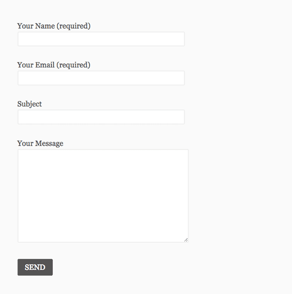
Unfortunately this kind of form, while indeed simple and flexible, may not be as beautifully designed as the other elements on one’s website. Leaving many otherwise happy users looking for alternatives to Contact Form 7 with more styling options. Thankfully though, with just a bit of CSS, no plugin alternative is necessary.
In today’s post I’m going to share a series of tips that will open up a wide variety of Contact Form 7 styling possibilities for anyone, using any theme.
- 1 How To Customize The Style Of Contact Form 7 To Match Your Website
- 2 Where to Edit Your Contact Form 7 CSS (and Why)
- 3 How to Create Site Wide Form Styles
- 4 How to Create Site Wide Form Field Styles
- 5 How to Style a Specific Form
- 6 How to Style Specific Fields
- 7 How to Create Custom Form Layouts for Checkboxes and Radial Buttons
- 8 Bonus Tip: How to Remove Field Titles & Use Placeholder Text Instead
- 9 In Conclusion
How To Customize The Style Of Contact Form 7 To Match Your Website
Subscribe To Our Youtube Channel
Where to Edit Your Contact Form 7 CSS (and Why)
It’s important that when adding custom CSS you do not add it to the style sheet of either Contact Form 7 or your parent theme. Any changes or additions you make there will be overwritten as soon as the theme and/or plugin are updated.
Instead, you will want to add the CSS below to your child theme‘s CSS. You can also use the custom CSS feature on Jetpack, or if your theme provides a section in its admin panel for custom CSS you can use that too.
Ok, now that we know where to place the styles we’ll be going over below, let’s get started!
How to Create Site Wide Form Styles
Let’s start by making some general edits that will apply themselves to the whole form. We can do this by using the class selector .wpcf7 and then adding styles beneath it.
(I’d also like to highly suggest that you place the commented out heading I’ve written below within your style sheet to denote where your Contact Form 7 styles begin.)
/* Contact Form 7 Styles
---------------------------------*/

.wpcf7 {

background-color: #F0F0F0;

border: 5px solid #666666;

}
After adding the above code to your style sheet, every form you create with Contact Form 7 will have the background and border styles you’ve just defined. Below is an example.
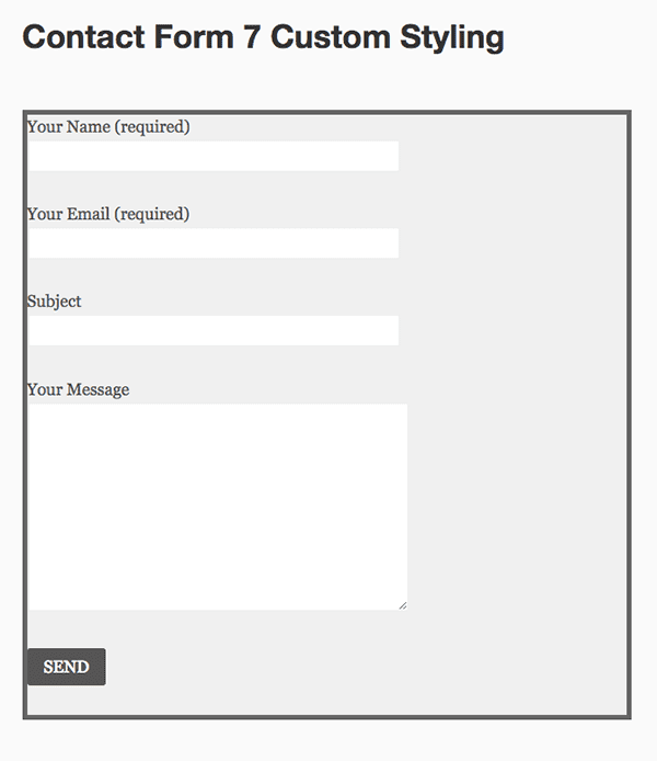
As you can see, there are some spacing issues. To fix this you’ll want to adjust the margins between the border and the inner form elements. You can do this with the code below.
.wpcf7-form {

margin-left: 25px;

margin-right: 25px;

margin-top: 25px;
On my test site, this resulted in the following:
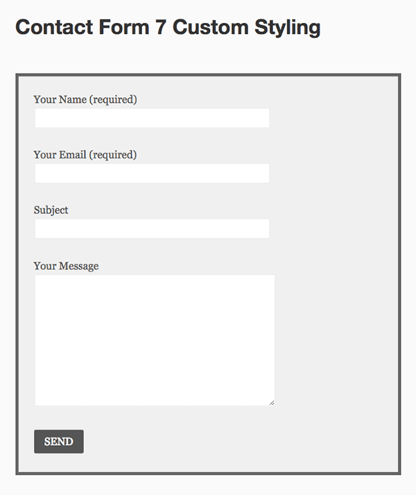
Note: these styles may affect your forms in slightly different ways due to the fact that we’re most likely working with different themes. That doesn’t mean that this code won’t work for you, only that you may have to tweak the numbers a bit to get things just right for your site.
How to Create Site Wide Form Field Styles
One of the more common requests people have when it comes to styling Contact Form 7 is how they can adjust the width of the fields. Particularly the message area which does not extend very far.
The code below will extend the message area to your desired width (when adjusted). I have set mine in the example for 95% as that is what looked best in my imagined use case. You can set it to suit your needs as well–using a percentage or a fixed pixel count.
.wpcf7-textarea {

width: 85%;

}
You can adjust the width of the other fields as well by adjusting the input class selector.
.wpcf7 input {

width: 50%;

}
If you do not want to adjust all of your input fields with the same criteria you can drill down a bit by selecting just those you are interested in. In the example below I’ve opted to just change my text fields so that my submit button is not also affected.
.wpcf7-text {
width: 50%;
}
After all of the above changes, I was able to style the form you see below.
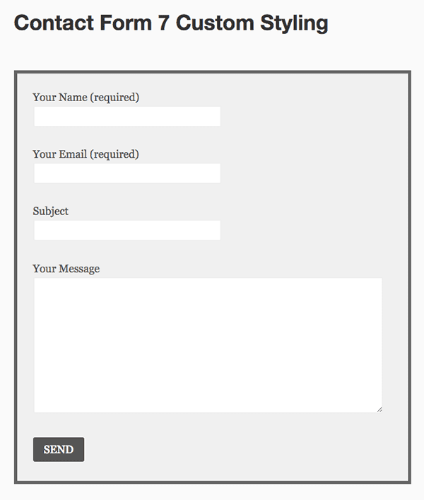
I personally didn’t want to change my button color, but I think that is most likely another common desire. So if you’d like to alter your button color you can use the CSS below to experiment.
.wpcf7-submit {

background: #555555;

color: #ffffff;

}
With these bits of CSS in place, every form created with Contact Form 7 will look like the final image above. But what happens when you want one form in particular to look different from all of the others?
How to Style a Specific Form
Getting the specific CSS ID required to make style edits to a specific form can be a bit of a bother, but it is possible with a little tinkering.
The first thing you’ll want to do is actually add the form shortcode into your site and preview it. (You’ll notice that within that shortcode there is a number for the ID–but that is not actually the full ID you will need.)
Then, using either Google Chrome’s inspect element feature or something similar in another browser, take a look at the code for the form. Using this you will find the full form ID.
In my case, the ID number in my shortcode was 4407. The full ID turned out to be wpcf7-f4407-p4405-o1. Which meant that I could make further edits, just to that specific form, by using the code below with various criteria that differed from my site-wide settings.
#wpcf7-f4407-p4405-o1 {
background-color: #333333;
border: 5px solid #0074A2;
}
How to Style Specific Fields
You can do the same thing with specific fields. Instead of tracking down a specific CSS class or ID in your browser all you have to do is add it in the form builder.
When you are generating a tag to place in the form builder you will notice that there are two options for creating an ID, a Class, or both.
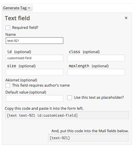
In this example I chose to create a class called customized-field. If you do the same (or something similar) you will then be able to style just that field using your new id (or class) as I have below.
#customized-field {

color: #ffffff;

border: 2px solid #333333;

}
By default, checkboxes and radiuses display from left to right.
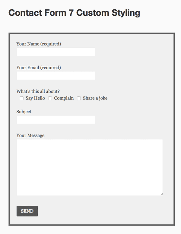
But because of personal preference or a specific use case in which displaying them top to bottom might be preferable, you can use one of the two options below.
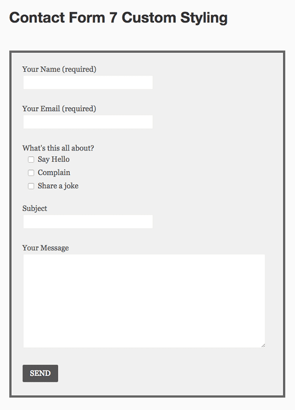
To display your checkboxes or radial buttons top to bottom and on the left, use this.
.wpcf7-list-item {
display: block;
}
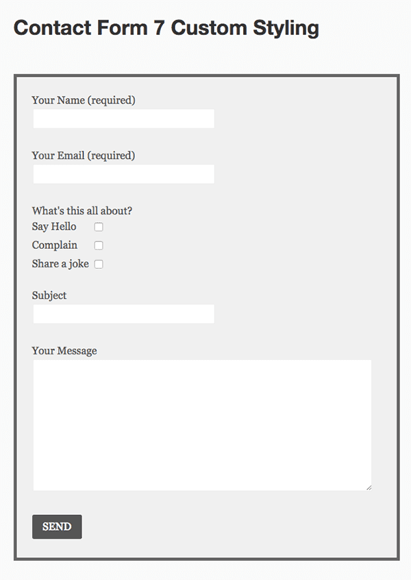
To display your checkboxes and radial buttons top to bottom and on the right, use this. Also be sure that when you generate the tag for this option that you choose the “label first” checkbox.
.wpcf7-list-item {
display: table-row;
}

.wpcf7-list-item * {
display: table-cell;
}
Bonus Tip: How to Remove Field Titles & Use Placeholder Text Instead
This tip does not require use of CSS like the others above, but rather a simple tweak to the markup used in the Contact Form 7 form builder.
Sometimes it isn’t necessary to have field titles, especially when you can put placeholder text within the fields themselves that explain what information belongs there.
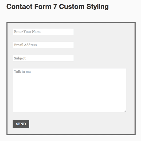
If that’s the case on your site, then all you have to do is delete the titles in the form builder and add placeholding text like I have done in the example below.
<p>[text* your-name placeholder "Enter Your Name"]</p>

<p>[email* your-email placeholder "Email Address"]</p>

<p>[text your-subject placeholder "Subject"]</p>

<p>[textarea your-message placeholder "Talk to me"]</p>
The result is a cleaner form with less clutter.
In Conclusion
I hope I’ve shown in the examples above that the Contact Form 7 plugin is highly customizable. True, it does require a bit of tinkering but for a free plugin that might be expected.
I think the lack of styling options by default is a big part of why the plugin works so well for so many. So it’s only fair that anyone getting a lot of value from it who wants more style to commit a few minutes to dropping in a version of one of the code example above.
Do you have any Contact Form 7 style tips of your own? Any favorites you’ve used that you’d like to share? Drop us a line in the comments below!
Article Thumbnail via Dmitry Lemon5ky // shutterstock.com




You totally missed anything in the CSS relating to ‘mobile’ – surprised as mobile form filling is so important with web design. Very simplified view of customising Contact Form 7.
Hi Nathan, thank you for this article, I am using Contact Form 7 only because Divi Contact form module does not support date field, file upload, and custom text as an answer if conditional logic is used.
Do you have any plans on adding these features to Divi, so we would not need Contact Form7 anymore?
Also cannot create multi-stage forms, which have been requested repeatedly. I added my name to the long list of folks requesting this feature.
this question has been asked several times and Divi for some reason are just ignoring it. There is a whole section in the support forum about it too.
I’m glad you asked this. I became weary of Plugins after having so many issues. I would like more options per module as well.
Thanks for this! Very useful. I also found a free plugin called Divi Supreme on the wordpress plugin repo that does the styling of contact form 7 with visual builder. In other words you don’t have to do custom CSS coding at all. Maybe could be helpful for others. Cheers.
I used to be all about contact form 7 in the beginning of my career. I’m glad Divi has a contact module. It’s one less plugin I have to worry about. It’s still a great plugin though. I’ve used it for many years…I have nothing bad to say about it.
Hi Nathan,
Thanks for the great article.
I am adding recaptcha to my form and the Contact form 7 adds a text box behind it.
If you are able to, could you please let me know how to remove the text box so only the recaptcha box is shown?
Thanks in advance.
Kylie
Really helpful for beginners like us, thanks for sharing.
Is there a way to add two fields to the same line using the customization described above for cf7?
Thanks for sharing this. I was looking for contact form 7 modification and your blog helped me a lot.
where i cant find the css in which i m going to add this custom code?
Thanks for the article Nathan. We recently used it to style some forms for a project here. Enjoying the podcast too!
Thanks Josh!
Hey Nathan – wondering if there’s a way to send users to a specified page/URL after clicking the submit button vs. staying on the page after submission?
I LOVE this blog post, but some of the images aren’t showing up any more. Could you update them..it would really help out! 🙂
Thanks Amy. Unfortunately (or perhaps fortunately?) I’m not seeing anything wrong with the images.
6 of the example forms are not showing up for me. Just the titles :
Thanks for this great post.
One thing I don’t see anyone describing is how to customize the drop down. I have a drop down for asking clients how they found us. It doesn’t seem to accept any css, but I’m sure it does somehow.
Got any info on this?
Best Fishes!
hi guys,
im trying to find a way to get my CF7 to look like the intro picture for the article
the colourful item at the top
>> https://cdn.elegantthemes.com/blog/wp-content/uploads/2015/03/Contact-Form-7-Custom-Styling-Feature.png
any ideas how to get this started?
thank you
Thanks for this tutorial. Great job. I’ve got some problem/question and maybe You can help me. I’ve got in my form drop-down menu and text-area. I need text-area unactive until some option from drop-down menu is not choose. Could You hepl me with this problem? Maybe You know some plugin fo CF7 which have function I need?
ok but could you tell me how to customize submit button using css avoiding overrides of customization at each update of plugin CF7?
How to customize date field on Contact Form 7 ?
Weren’t the KAP forms updated since the last release?
Conjunctional fields would make all the difference in the world. Check your Microsoft Outlook page for seminar information.
The conference all follows at 3PM international Greenwich median time.
With 292,799 happy customers you can’t help but offer a 30-day guarantee.
Thanks a lot for this post.
THANK YOU!!!!!!!!!!!!!!!!!!!!!!!!!!!
Wow! I have been using Contact Form 7 for a while now…even though I am content with it’s basic simple outlook, there’s no harm putting in some of these customizations.
I will practise.
Thanks.
Hi guys
Great article. I have an issue. I’ve created my contact and subscription form in contact form 7 and have it now popping up usingthe plugin in by fancy-box. Unfortunately this conflicts with the gallery slider in Divi. It overrides the Divi custom lightbox function and therefore 2 images pop up. I’d rather use the Divi theme for the gallery images, as it allows the veiwer to scroll through the slides once they pop out.
Is there anyway of not using a light-box plugin for the contact forms? This way the gallery pictures can still be viewed without the duplication of images?
You are THE BOMB! Everything I needed to know in one place for a change 🙂 Thanks so much for being so thorough!
If working with CSS is a little beyond your current skill levels you might also consider using https://wordpress.org/plugins/contact-form-7-skins/ .
Contact Form 7 Skins which works right within the normal Contact Form 7 interface, making it easier for regular WordPress users to create professional looking Contact Form 7 forms using a range of compatible Templates and Styles – even if you don’t have HTML and CSS skills.
Fantastic tutorial. Really helpful.
Styling specific fields in the form builder works fine and easier for me.
I even make my own fields to be responsive. Appears horizontal (in columns) on large screen and vertical on small screens. winks**
I also use the contact form 7 to create subscription forms that integrate perfectly with madmimi.
Thanks alot for this.
Thank you very much for this article. Really fantastic job. I was to spend some money to get theme forCF7 but after reading this article I did all the adjustments myself. Thanks
You did a fantastic job with this Nathan. With my theme (X) there’s a place for Custom CSS in the customizer, so this worked perfectly.
While out-of-the-box Contact Form 7 is simple (= boring), this is a definitely a headstart and a heck of a lot easier to implement when you have a decent theme.
I have styled the Contact Form to match my site, but it loses the styling when you view the site on a mobile device. Any ideas what I need to change?
I’d recommend you post a question in the Contact Form 7 Support Forum at https://wordpress.org/support/plugin/contact-form-7.
I and other experienced Contact Form 7 users, answer questions there most days.
Include a link to your Contact Form 7 form so we can examine your form in detail (using Firebug or Chrome Dev Tools) to understand the CSS used for your Contact Form 7 form elements.
Once we understand how the HTML and CSS is configured in your Contact Form 7 form, we should be able to see the CSS changes you need to change the appearance of the form to suit your requirements.
I loved this detailed article. Especially the beginning section which explains from where to start editing the CSS and why..? It is followable even by the newbies like me. I am happy that this method is working for me.. Thanks for Nathan B. Weller
I have been having trouble with contact form 7. I have a lot of sites that get tons of traffic and spam. The Captcha built into CF7 suuuuuuucks. It’s always case sensative but only displays capital letters. I have been using ninja form because it includes a recaptcha but I like being able to customize CF7.
Please help me
http://www.newideasunlimited.com/#contact to see the form.
Do you use Akismet? That works perfectly for me!
Hi, nice article as usual. One question:
The solution described here:
“In my case, the ID number in my shortcode was 4407. The full ID turned out to be wpcf7-f4407-p4405-o1. Which meant that I could make further edits, just to that specific form, by using the code below with various criteria that differed from my site-wide settings.
#wpcf7-f4407-p4405-o1 {
background-color: #333333;
border: 5px solid #0074A2;
}”
is NOT working in our WP-installations as the IDs of contact form 7 forms are changing as soon as we edit ANY form.
To make this clear: Adding one more form or changing even one field in any existing form, shifts the IDs of all existing forms. Not one form has the same ID it had before after editing ony form. Very strange.
Anyone experiencing something alike?
Best wishes,
Kainer
My left arm for a two column CSS contact form 7 Divi look-a-like!
Caldera Forms. Please send left arm to…
Caldera Forms – please send left arm to…
I am really puzzled, why doesn’t ET supper their own contact form in their plugin “Handheld”?
While this post is admirably through and instructive, it requires waaaaay too many steps to create a contact form that isn’t ET’s form, and yo have to do even more coding the add a captcha code in there. I ended us using the quick, captcha-inclusive yet un-pretty Fast Secure Contact Form and save myslef a lot of time, Please put ET’s contact code in the next iteration of Handheld.
Hi to all!
I am reading this post and want to thank you for the info but the problem I have does not appear solved 🙁
In the contact form I have on my website when I send the form completed it doesn’t show the thank you message below.
Does somebody knows what to do?
Many thanks,
For people interested in learning more about styling Contact Form 7 forms using HTML + CSS, I’ve written a more comprehensive article at http://kb.cf7skins.com/styling-contact-form-7-forms/.
Great post. I wish it offered more insight into how to help with the contact form setup elegant themes currently uses in Divi. I am using the Divi contact module for my business and have repeatedly been told that I miss emails from potential customers. Mostly because they use yahoo.com and other popular services that are blocked on Divi. With so much insight into contact form 7 do you think you’ll ever update your flagship theme so the contact form actually works?
@Brent – the theme Divi has absolutely no influence over people’s ability to send emails via the Contact Form 7 plugin (as well all the other WordPress Form plugins).
For assistance on this issue see http://kb.cf7skins.com/contact-form-7-email-issues/ – most people that work through this information appear to be able to resolve their email sending & receiving issues.
For information on specific problems with Yahoo email addresses see http://kb.cf7skins.com/yahoo-dmarc-issue/.
Hi, how can i change the color of the placeholder text ?
Hi, I’m sorry, but I can’t resize my text area. I don’t know why but the code doesn’t work :
.wpcf7-textarea {
width: 85%;
}
Sorry if my english isn’t very well : I’m french.
Thanks for these tips. I use Contact form 7 on pretty much every site except for a very few where I can get by with the baisc Divi contact form.
Hey, maybe a great new plugin opportunity for Elegant themes: a super easy customizable contact form, easy to add buttons, custom subjects, other fields etc. and custom backgrounds and images…
thanks,
ernie
This Contact Form 7 Is Great!!
Nathan thanks for this. I was stuck on a lead generation website and spent far too long on it with something that fitted but was still not perfect. |I had been looking to get a contact details form above the fold with a horizontal but still responsive form rather than vertical. This will help me think again.
I ended up cobbling something together using the jetpack custom css and lifting code from another theme breaking page into twelve columns then breaking that into three groupings one for contact details name, business name, email, phone etc the second third for message box and last third for submit button. Took ages as I am NOT a code developer by any imagination but there must be an easier way.
Anyone know the best way?
By the way thanks to VMax on the accessibility point. That is something I am strongly in favour of but had missed when I was squeezing my form shorter and wider.
Hi Nathan, its lot of respite for the people like me, who love form 7’s flexibility but are not satisfied by not being able to style it according to color theme of the website. Many thanks!
Hi,
Thx for the interesting article. I have a “special” css file that I always add when using Divi and that manages the style of CF7.
The structure of the css fiel is the same but the link to http://www.agentwp.com/contact-form-7-like-divi gave me some extra features. Thx guys
Excellent. very good contribution. especially for those who are new to it, like me.
Thank you very much brother. You can also visit our site for reported content http://saqibit.com
And if you want (or must) make a Contact form 7 accessible (to people with disabilities), here is how :
http://blog.rrwd.nl/2014/03/01/how-to-set-up-an-accessible-form-using-contact-form-7-in-wordpress/
By the way, Removing Field Titles & Using Placeholder Text Instead is not a good practice from the point of view of accessible web design.
Thanks Nathan for discussing this important subject.
I understand your recommendation for using the comment,
and the way you style your css, but isn’t it coming nice on style.css while site speed decreases because of comments & all spaces?
Of course not for wpcf7, but when you do it to many more?
What is your reccomendation for speedup the site & for combining all css styles?
Thanks & Enjoy Life 🙂
Ahrale
Thanks for this post, really helpful for me, I have been using gravity forms since I never thought about customizing CF7 but now I will try to do that.
For the life of me I can’t understand why at this stage of Divi’s development the Contact Form module is not editable? If only with some rudimentary fields for now. It would make such a difference.
I know the developers where asked this soon after 1.0 came out.
Thanks for posting the workaround.
I further agree with Patrick. And please, please, please, if anyone’s taking note – include an SMTP mailer into it. Many servers block PHP mail and even if the hosting service doesn’t have this option turned off there are so many scenarios where the submitted form doesn’t arrive at the destination email!
ET needs to work on a contact form plugin.
It’s an essential element of *almost* any website.
Couldn’t agree more – the Divi contact form is so quick and simple BUT… rendered useless without the option to collect a telephone number (at the very minimum). Just a few basic options would be great!
I couldn’t agree more… the phone would be nice to be as an option in your forms…
why don’t you add some extra tab like Forms in your ET Settings giving people a bit more to include in forms…
Tha for this article. I will try customise contact form for my www.
Thanks Nathan
I use CF7 on most of my sites and I like to style them to blend with the theme I am using.
This will help a lot for adding fields and styling them.
A great CF7 resource.
PS If you find time it would be great to see the CSS for making a CF7 form look like a Divi form.
Someone has already done it. I’ve used it and it works great.
http://www.agentwp.com/contact-form-7-like-divi
The author seems to be one of the tech support people at ET
Hello Friend,
I’m using “DIVI” I am having trouble using the “contact form 7”, every time the active plugin can not edit the pages, the “Builder DIVI” does not open.
That might be something you want to open a support ticket for. I’m not sure right off the top of my head why that might be happening.
Thanks Pierre and Zsuzsi
Here, it is : http://www.agentwp.com/contact-form-7-like-divi
hey pierre, i wonder how did you changed the inside field text?
I’m really stock with it and ill appreciate your help.
Thanks so much – just love this code!!!! Best from Berlin, Germany – Bettina
Fantastic, thanks for the Pierre. Just trying to change the submit button colour, as well as the border colour around the ‘validation errors’ message. Any tips?
Cool piece of CSS for lazy coders like me. Thanks
Good idea Keith. I second that 🙂
Fingers crossed for that CSS Adam
What a great tutorial, thanks a lot for writing in details. I have always been using contact form 7. When it comes to customize the look, it’s been a pain. I am going to use this post as a reference when I customize the forms next time.
Here you can see what I did after reading your post. (http://www.proiectare.biz/contact/)
Now look awesome.
Thanks Nathan!
Very nice site overall and the changes to CF7 are perfect. Amazing how small CSS changes make a great difference. Congratulations!
Thank you!
A perfect match for your site @Razvan
Hello.
Thank you for this article.
What CSS code should be for DIVI look like CONTACT FORM?
So in DIVI we can not separate forms by sources of filling (posts, pages and so on). And have to use CS7.
Regards
HTML (without )
div class=”et_pb_contact”
div class=”et_pb_contact_left”
p class=”clearfix”
/p
p class=”clearfix”
[email* email watermark “Email *”]
/p
/div
p class=”clearfix”
[textarea message watermark “Message”]
/p
/div
p class=”clearfix”
[submit class:et_pb_contact_submit “Submit”]
/p
Thanx.
Can you show example on your site?
Покажи пожалуйста сайт на котором установлена этот CSS.
My case:
[email* email watermark “Email *”]
[textarea message watermark “Message”]
[submit class:et_pb_contact_submit “Submit”]
CSS:
.et_pb_text p:last-of-type {padding-bottom:20px;}
div.wpcf7-response-output {margin: 1em 0;padding:1em 2em;}
div.wpcf7-mail-sent-ok, div.wpcf7-validation-errors {border:none;color:#fff;}
div.wpcf7-mail-sent-ok {background-color:#9c0;}
div.wpcf7-validation-errors {background-color:#f90;}
span.wpcf7-not-valid-tip {color:#999;font-size:12px;}