Given that over 30% of the world’s total population now converse via social media, you’d be forgiven for thinking that the humble email has almost drawn its last breath. Having said that, the personal nature of an email is something that social media channels arguably can’t provide. It’s still a great way to directly engage with your customers – especially through outstanding newsletter design.
In this post, we’ll explain why email newsletters are so great, discuss what goes into creating an effective newsletter, then get down to business of designing one using a popular solution. Let’s get started!
- 1 The Importance of Email Newsletters
- 2 The Essential Elements of a Killer Email Newsletter
- 3 The Top Third-Party Platforms for Creating Email Newsletters
- 4 How to Design a Killer Email Newsletter to Encourage Customer Engagement Using MailChimp
- 5 How to Add a Newsletter Sign Up Form in Divi
- 6 Conclusion
For the uninitiated, email newsletters are periodical emails containing information about the company or organization you receive them from. They can be as simple as a link to a new blog post, or as complex as a collection of discounts or deals during the holiday season – and anything else in between:
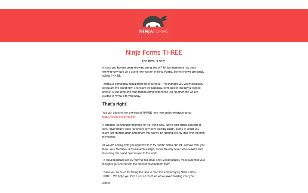
Ninja Forms prefer a minimalist approach to their email newsletters.
Although there are plenty of ways to engage with your customers, doing so by email has a number of benefits that are arguably too good to pass up:
- The nature of emails means you can converse with customers on a one-to-one basis, arguably with a more personal approach than messaging on social media.
- Email newsletters can give you the chance to build a community, enabling the reader to become invested in your business – and hopefully buy more in the process.
- You can offer readers exclusive discounts, which can make them feel important, and also helps to keep them interested in your services and engaged in your brand.
- They give you an additional opportunity to build and solidify your brand’s personality.
These reasons are more than good enough to consider email as a key means of regularly reaching your customers. However, what about the elements that go into creating a killer newsletter? Let’s break them down.
Creating an email newsletter isn’t just a case of typing a rough paragraph and attaching a link. It needs to be treated as what it is – a key cog in your marketing wheel. We’ve boiled down the elements of a great email newsletter to the following:
- Structure. Without structure, your newsletter will lack the focus it needs to do the job of converting readers.
- A captivating headline. 80% of readers never make it past the headline, so it needs to be powerful and compelling. Tools such as CoSchedule’s Headline Analyzer and Headline Power Words can help to supercharge a limp offering.
- Well-written content. As with your other online content, the rules of writing for the web apply, but body copy has its own foibles that you’ll have to pay attention to.
- Suitable visual elements. Visuals serve to enhance your text, although you don’t need to be a dab hand with a camera. There are plenty of legally free images available, although you’ll often want to optimize them using a tool such as TinyPNG before pressing them into action.
- A Call To Action (CTA). The all-important element. Depending on your structure, you’ll either include one or many throughout – and they’ll likely be contained within clickable buttons linking to your content, product, or service, rather than a request to reply to the email. Much like headlines, CTAs need special attention, as their quality could potentially make or break your marketing figures.
So, we’ve discussed the importance of email newsletters, and the elements that go into a stellar example. All that’s left is go about creating one, and there are plenty of options for doing so.
There are a multitude of ways to create your newsletter, with varying degrees of difficulty. Using your favorite word processor (or even a text editor such as TextEdit or Notepad) is the simplest route, and if you’ve already cultivated a list of email addresses, you may consider writing your newsletter directly from your email client. However, using a dedicated email marketing solution is much more convenient and professional all-around, given their creative tools, subscriber administration, and analytics options.
While there are a plethora of services available, our recommendations are MailChimp and AWeber – and we’ve explained why in a previous article. In a nutshell, they offer an unbeatable range of services for email marketers, and come with a proven pedigree for offering a top-notch service. What’s more, they’re both fully compatible with Divi and Bloom (we’ll get onto that particular aspect later on in the article).
Let’s take a look at each option in more detail.
1. MailChimp
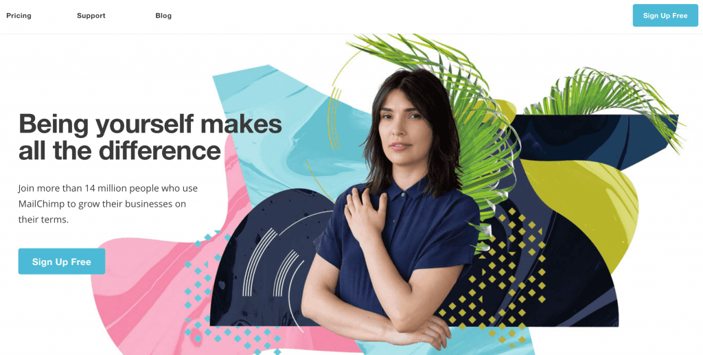
MailChimp is a perennial favorite of fledgling email marketers, and it’s easy to see why. The New Business plan is free, and enables you to send up to 12,000 emails to a maximum of 2,000 subscribers per month – more than enough to get started with. Delving deeper, MailChimp‘s built-in signup forms looks slick out of the box, and there are plenty of reports to pore over.
In addition, MailChimp offers a drag-and-drop interface for creating newsletter templates, and its premium plans are reasonably priced too.
Key Features
- Enables you to send up to 12,000 emails to 2,000 subscribers per month, for free.
- Includes a drag-and-drop newsletter builder.
- Fully compatible with Divi and Bloom.
Price: Free, but with higher price points available | More Information
2. AWeber
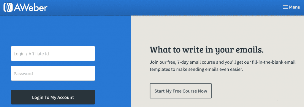
AWeber is a firm favorite of many email marketers, and there’s plenty of solid functionality included to rave about. Although there’s no free plan, you get a lot of value for your initial $19 per month. Not only can you create newsletters using a drag-and-drop builder, you also get a HTML editor and the option to write your email in plain text.
You also get access to over 700 pre-built templates, and 6,000 stock photos to use however you like within your newsletters.
Key Features
- Includes 6,000 photos within a stock image gallery.
- Offers detailed analytics.
- Fully compatible with Divi and Bloom.
Price: From $19 per month | More Information
Let’s get down to the nitty gritty: how to create your newsletter.
For this walk-through, we’ll use MailChimp – its free plan enables you to follow our guide without spending a penny, while the interface is a little easier to get along with compared to AWeber. We’ll choose a pre-set yet flexible template, with a very simple structure. (To see what you could do with a little creativity, check out MailChimp’s own showcase, or for more general inspiration, Awwwards often highlights truly stunning examples.)
What’s more, there are a number of articles on the web to help you design stunning (and high-converting) newsletters:
- Best Design Practices for Email Newsletters.
- Email Newsletter Design: Guidelines And Examples.
- 6 Design Tips to Make Your Email Newsletter Visually Appealing.
- 50 Of The Best Email Marketing Designs We’ve Ever Seen (And How You Can Create One Just As Good).
Before you start, you’ll want to set up a MailChimp account if you don’t already have one, and run through the setup options you’re presented with. Once you’re ready, your first port of call will be setting up your template.
Set Up Your Template
Once you’ve logged into your account, you’ll be presented with your dashboard. From here, you’ll be able to manage your campaigns, administer your subscriber lists, and create your newsletters. To get started, click on the Templates link in the navigation bar:

From the next screen, click Create Template on the left hand side. If it’s your first time using MailChimp, you’ll get a handy blue arrow showing you exactly where to navigate to.

The next screen contains all of the various layouts available. You can also select a pre-designed theme here, but for our purposes, we’re just going to choose the 1 Column template:
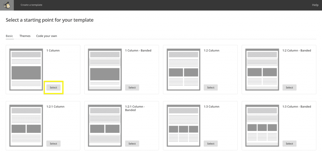
You’ll then come to the drag-and-drop newsletter builder, which offers similar flexibility to the Divi Builder. You’ll notice your newsletter on the left, and the elements (or ‘content blocks’) you can include on the right:
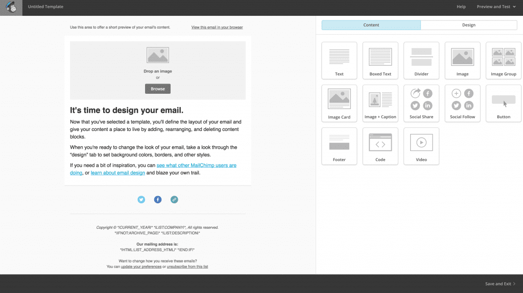
To edit a section, hover over it and select one of the icons. You’ll see an option to drag the section on the left, and edit, duplicate, and trash options on the right. To start afresh, trash the pre-existing content block:

Once you’re done, we can go about creating our headline.
Create Your Headline
Much like the Divi Builder, there are various content blocks for the different elements you’ll need. For our headline, we’ll keep it simple and use a Text content block. Simply hover over it and drag it to your newsletter. You’ll notice the right-hand side of the screen brings up a simple text editor:

The options for styling your headline will be familiar if you’re accustomed to WordPress – we’ve written a tentative headline, chosen a pre-set style called Heading 1 from the Styles drop-down, and centered the text:

Next up is optimizing the headline itself. For this, we’ll use the CoSchedule Headline Analyzer – a free tool that offers advice on how to improve an ineffective headline. Our example didn’t fare too well initially:
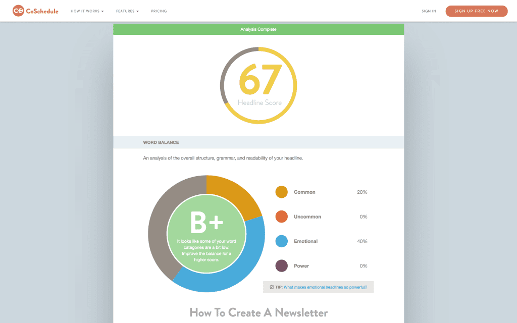
We’ll look to improve this score by adding a power word and analyzing the headline again. We’re faring much better now, given the tweaks:
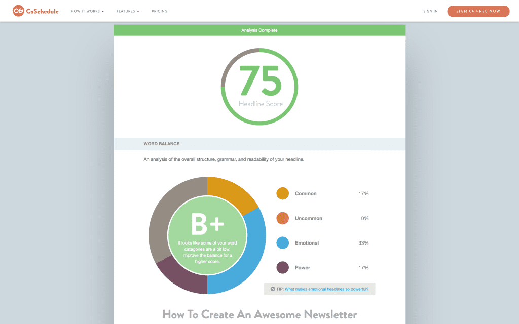
Once you’ve written a captivating headline, click Save & Close at the bottom of the editor, and move onto writing up your body copy.
Write Your Body Copy
Once you’ve grasped adding content blocks to your newsletter, you’re well set for creating the rest of your newsletter. In fact, adding body text involves exactly the same process as adding your headline – simply drag a text block onto your newsletter, then write your text:

We’ve used Lorem Ipsum to fill out text box out quickly, but you should take the advice we gave earlier and create something compelling and captivating.
Once again, save your changes, then we can move onto adding some suitable visuals.
Add Images
When it comes to adding images to your newsletter, there are more options available than with text. You can add a single image, a group of them, or add captions. Again, we’re going keep things simple for our example, and add an Image content block to our newsletter:
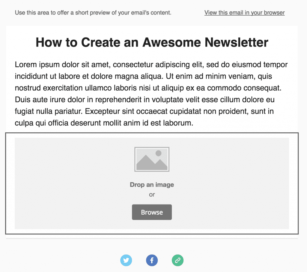
Choosing an image should be a more involved process than just picking one at random. For our newsletter, we’re going to choose something that will enhance the content from popular site Pixabay. That way, we wont fall foul of any copyright issues. We searched for “newsletter”, found an image we liked, downloaded it, and put it through TinyPNG to optimize the file size without compromising on quality.
Back in MailChimp, we can either drop the image straight onto the image content block, or browse for the file. If you try to upload an image that’s too wide, you’ll get a notification to fix it:
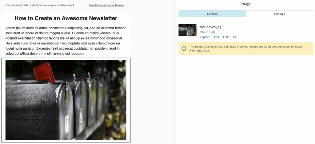
Once your image is set, click Save & Close, before tackling the final element – your call to action.
Add a Call to Action
Your CTA is the final piece of the puzzle, and we can add one using the Button content block. Like the other blocks, simply drag it into a suitable area of your newsletter:
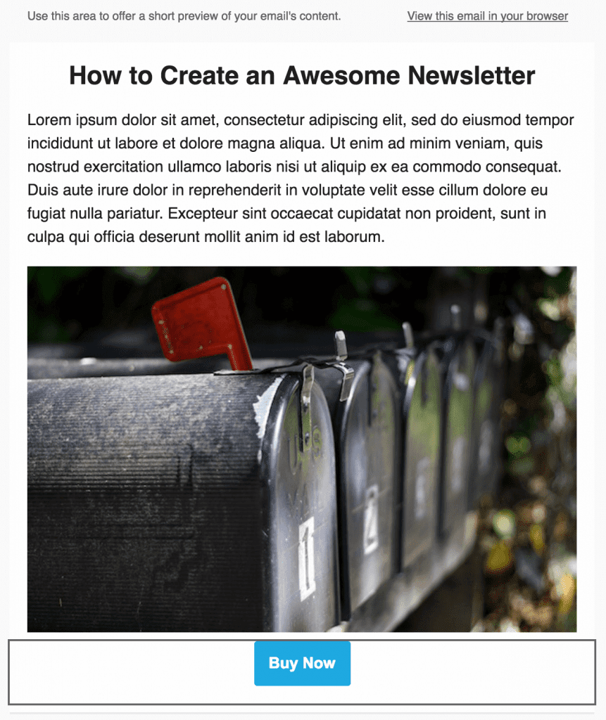
There are plenty of style options to choose from, along with some alignment settings, but we’re going to leave them be. For our example, we’ll offer a simple CTA, and add the link to our website in the Web Address (URL) field:
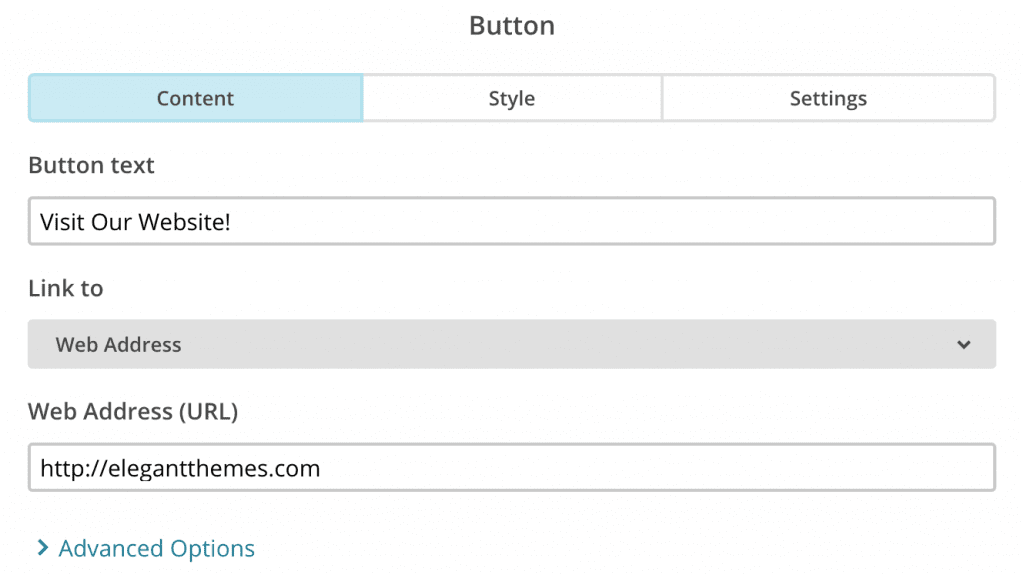
Furthermore, the Link to field contains a number of options, enabling you to link to an email address, or even a downloadable file.
Once you’re finished, click Save & Close one more time, then take a look at your finished newsletter using the Preview and Test link at the top right:
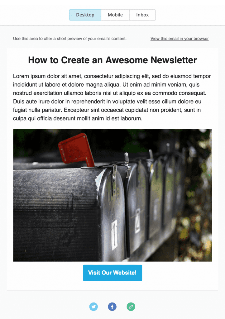
When you’re happy, click Save and Exit in the bottom right-hand corner, and then use the template you’ve just created to begin a new email campaign.
Congratulations – you’ve just created your first email newsletter!
It’s all very well having a killer newsletter to send out to your eagerly waiting subscribers, but how do you go about getting them in the first place? If you’re a Divi user (which you should be!), you’re in luck – it enables you to build simple yet beautiful subscriber forms using the Email Optin module:
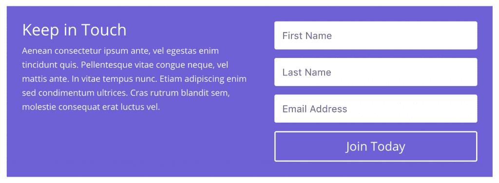
The module supports both MailChimp and AWeber in addition to FeedBurner, and offers a wealth of options within the module to tailor your form to your specific requirements. It’s very flexible, and baked right into Divi.
Still, some of you may be hankering after a little more when it comes to email opt-ins. Meet Bloom – our solution for creating stunning, high-converting email subscriber forms:
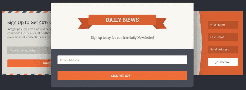
Bloom straps a rocket to the back of the Email Optin module, enabling you to get up and running with over 100 pre-built templates and display your form in six different ways (including an automatic pop-up based on time), not to mention a whole host of user actions. There’s plenty of functionality to get to grips with too, meaning it should be your go-to choice for growing your email list.
Conclusion
While some have rashly claimed that email is at death’s door, in reality the medium is more vital than ever for engaging directly with customers. To consider social media alone as your only form of communication is a narrow-minded move, as emails have a proven conversion track record.
In this post, we’ve shown you how to create an email newsletter using the templates within MailChimp. Let’s recap:
- Set up a suitable template.
- Create a compelling headline.
- Write captivating body copy.
- Add some suitable images.
- Add a call to action.
Once you’ve create your newsletter, you can add a subscriber form using Divi’s Email Optin module, and create high-converting forms using our Bloom plugin.
Do you have any tips for creating a killer email newsletter? Let us know in the comments section below – and make sure you subscribe to keep up with the conversation!
Article thumbnail image by gst / shutterstock.com.




Thanks for this information
John, thank you so much. I was always thinking of starting a newsletter, but I was not aware of the implications. Your article answer most of the questions.
Extremely helpful!!! Thank you.
As a church which seeks to value, include, and seamlessly integrate all generations and technological competencies, our Communication Team has the challenge of creating an awesome email newsletter that can also be printed and mailed to our non-digital, lovable Luddites.
This is a huge challenge as the most attractive elements of email newsletters (succinct, clickable content) seems antithetical to those of our members who cherish a long-winded, detail oriented, self-contained tome-of-a-newsletter.
And suggestions for creating a complimentary dually-distributed publication would really snag the brass ring on our particular carousel.
You’re welcome Chris 🙂
I can appreciate the unique challenges of your particular situation. I say, if in doubt, eschew ‘best practice’ and write for your audience!
Great article! are you planning another one that shows how to use Mail Chimp in conjunction with the Divi blog module?
Is there a particular issue you’re having that we can help you solve?
Thanks for this. As a MailChimp user for a bit more than a year now for my nonprofit group, I did learn several new things that should help.
Suggestion for a follow-on posting: There are so many newsletters out there that are, shall we say, not totally enthralling. So how about an article emphasizing how to turn a newsletter from ho-hum to totally awesome?
You went into some of that here, but more would definitely be appreciated.
Watch this space – we’ll see what we can do!
Yeah, thanks for tips. But where should i put a signup form on my blog? What helps to get more subscriptions? Is this a good idea to put it under each post? 🙂
I can speak from our experience here at ET. Based on our own success in building out our mailing list we recommend that you implement a pop-up email opt-in form on all pages. However, you should create multiple versions that are highly targeted to your most visited pages. For instance, if you have a blog post that is getting 50x the traffic of your other blog posts, then create an incentive that compliments the content of your blog posts–since that’s what got people to your site to begin with.
Example: if your blog post is about how to create a child theme then maybe your email signup incentive could be a free starter child theme for people to experiment with.
Creating opt-ins and incentives like this site-wide is a lot of work but also extremely effective.
Thanks for the useful article – such a great blog.
One thing I and others have been asking for for more than a year now is for Bloom to be able to connect to Mailchimp Groups – it would be so much more useful. Otherwise it’s not worth using. We need to target our newsletters to the right audience so I use groups in Mailchimp but Bloom only connects to a list.
PLEASE update Bloom to have this functionality – then I’d use it on every site. Thanks.
I’m not in charge of that area I’m afraid, but the development team are kept up to speed on user requests via comments, so keep your eyes peeled for future developments. Thanks for the idea Neal!
MailChimp is awesome, but it has a serious flaw – emails sent to gmail addresses end up in Promotion section, usually never to be read by their intended recipients.
Gmail seems to “dislike” MC, but it’s anyway dimishing value of such email campaigns as increasing number of people have gmail addresses nowadays.
We tried to work around it, but with no result and had to switch to another email provider.
That’s an interesting piece of information Sinisa – thank you for sharing!
which provider did you switch to?
John, great writeup! What do you think about this article which has data to suggest that plain text may outperform visual based email newsletters?
https://blog.hubspot.com/marketing/plain-text-vs-html-emails-data
We have done some internal tests on a list of 100,000 users (food client) and have found that in our 4 tests the plain text outperforms by double so far.
Hi, this is great information! I’ve been using Mailchimp and WordPress for awhile now but don’t understand all the functionalities. What I wonder is how do I get a link to my Subscribe Pop Up that I use on WordPress so I can post it say on Facebook or Twitter along with the picture of my free offer? That way people don’t have to actually visit my website to sign up (although I want them to do that too), they can sign up directly from FB and Twitter. Do you know or can you give me a link to a website that could explain it? Thank you so much!
Hi Wanda,
If I understand correctly, you want to integrate a signup form within Facebook and/or Twitter? As far as I’m aware this isn’t possible with Twitter, but I believe this’ll help you with Facebook: http://kb.mailchimp.com/integrations/facebook/add-or-remove-a-signup-form-on-your-facebook-page/.
All the best!
John
What we did was create a ‘Subscribe to our Free Newsletter’ page on our site, which includes the subscription form as well as the benefits of subscribing. Then, using Pretty Links Lite (plugin) to create a nice link like [mywebsite].com/FreeNewsletter, we use that on social media, regular emails, forum signatures etc. It works great and gets people to your site and hopefully gets them to stay and check you out, after subscribing of course. The plugin also has some nice reporting as well. Good luck!
John, thanks for the tips. I agree that, if formatted with the standards you outlined, newsletters are a fantastic means of engaging a target audience. Newsletters should also engage a group of authors as contributors. Unfortunately, the norm finds an individual with the task of creating and maintaining a newsletter. Why not encourage a group effort? Do newsletter software developers offer companies and organizations a simple interface that allows multiple users access to sections of their newsletter? This would especially be helpful for non-profit organizations that rely upon a single author to accumulate and maintain news on a weekly or monthly basis. Why not share the responsibility?
Hi Eric,
It’s a good question, and in fairness, I am sure there are ways to make this possible. If you’re talking purely on the content side, for example, then I’d say it makes sense to draft newsletters in say Google Drive first, for the collaborative benefits.
Cheers,
John
I have Aweber but I’m not conversant with it. Would love to see a detailed description like the Mailchimp one above using Aweber. I’m a lifetime elegant themes customer and love it.
Great Post.
It would make my year if you integrated with ConvertKit.
Are you planning to do that integration any time soon?
Cheers
Yes! We get a ton of requests for this and we’ve heard you 🙂
I don’t have a set date on that but it will be included in the next major release of Bloom.