So you’ve launched your very own podcast. That one move granted you the opportunity to offer memberships to your site visitors. A week later, you’ve got your slick registration page up and running. The next thing you do is promote the page on your Facebook wall, tweet the link, email your subscribers, and create a few ads. But it only results to membership sign ups far fewer than you imagined. You’re receiving a lot of traffic, but your conversion rate remains low. Why is this happening? Why are your prospects on the fence? More importantly, how can you drive more conversions out of those site visits?
Before jumping in on the possibilities, check out these stats:
- Only around 22 percent of businesses are satisfied with their conversion rates (source)
- Roughly 75 percent of businesses have an issue finding suitable expertise to optimize their landing page copy (source)
- Most sites don’t have a massive traffic problem; however, every site in the world has a conversion problem (source)
The stats show you’re not alone in the battle. Coming back to the possibilities, would you like to know the secret to lowering the bounce rate on your landing page and at the same time increasing your membership conversions? There’s no secret… you just need to take the good old route of content marketing.
It’s likely that you’re already doing some content marketing, but you need to do it effectively to see those membership numbers rise.
Here’s a roundup of some of the key measures you can take to get started on the journey towards higher membership conversions;
1. Use the power of visual storytelling
Research points out that most people have the habit of scanning web content, instead of going through each word. They usually stop at something that stands out, and if they don’t find an element that attracts their attention, they leave. The same applies to the content on your membership web page.
Visual storytelling is a great content marketing tactic to retain the attention of audience and get them to take action. It’s a challenge for the human brain to remember a block of text, but it was wired to remember memorable stories. Stories are in our DNA; we’ve relied on them for thousands of years for information.
For a membership landing page/site section, here’s how to use visual storytelling:
- Videos: Create a video based on the benefits of becoming a member (such as free access to podcast shows). Using videos on landing pages can increase conversions by 80 percent.
- Members in a live setting: If you’re selling memberships for a service which also includes weekly retreats, you can post images or collages of members in a live setting enjoying their time, which could be the perk that gets others to sign up. Put the spotlight on your members.
- Mascot: Why not use a cute character to get people to sign up? Mascots are quite effective at creating a buzz (M&Ms characters, Aflac Duck, etc.).
- Comics: Turn that boring landing page copy into something more interesting. Everything from cereal to jeans has been sold in comic form – why not your membership?
Note: Visual storytelling tools such as Meograph and Storywheel will make your job easier.
A great example is the landing page of Amazon Prime.

It has a musical video showing the perks of joining Amazon prime. The remaining real estate also has some visuals to entice visitors to sign up for Amazon Prime.
2. Entertain your target audience
It’s smart of certain businesses to entertain their audience with the content they create. It’s a unique way to differentiate yourself while providing site visitors a reason to sign up. Capturing the attention of site visitors by entertaining them can have an outsized effect on the performance of your landing page.
Simply put, the landing page will push the idea of signing up out to the audience, but it’s the influence of the content that will create a gravity that gets them to sign up. As people have diverse consumption habits when it comes to web content, content that’s meant to entertain will provide the following benefits:
- Makes you lovable: It’s so much easier to take action when something/someone makes you smile. That’s why Disney does so well with kids; the main role of the company’s content is to entertain its target audience through Disney characters.
- Reduces bounce rate: Publishing content that appeals to people’s emotions will keep them longer on a landing page as well as make way for retention and engagement. They may even refer the page and come back for more if the content really pulls them in.
- Entertains the publisher: Content that entertains isn’t just exciting for the readers; it’s also fun for the publisher. Take a break from the usual research and publishing routine and get your creative juices flowing by trying to come up with ways to entertain your audience (games, quizzes, etc.).
LEGO is one of the brands that has the winning recipe for consumer entertainment. Every storyline released by the company is followed by a serial-style movie that is posted on the website. Also, the company creates a microsite that features character explanations, polls, quizzes, online games, etc. Below is an example of LEGO Star Wars microsite.

As for memberships, LEGO is building a community through different channels. For instance, children can become members of the LEGO social network. Members have the ability to create personal pages, watch LEGO TV, win prizes, and interact with other LEGO fans.
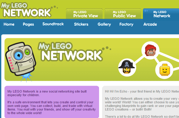
Then there is also a LEGO VIP membership program that gives 1 point for a few bucks spent at the LEGO store. Individuals with a VIP card receive a small reward when they reach 100 points.
People like to follow and do things that have improved the lives of others. Content marketing that includes social proof provides a compelling reason for visitors to click CTA buttons and links. For them, it is a path to success that people like them have taken in the past.
The research on implicit egotism revealed that despite what you often say out loud, most people will prefer things that subconsciously resembles them in some way. So when it comes to valuing the opinions of others, they place more value to the opinion of people they deem to be the most like them. In your case, these are going to be individuals who paid for the membership.
While there are several ways to include social proof in your content marketing strategy, below are the most popular ones:
- Reviews & testimonials: It’s no secret that majority of internet shoppers read reviews before making a buying decision. By adding a review widget on your landing page, you can make it clear to site visitors that your membership is the real deal. Or a member could leave a testimonial of the perks he/she has received since becoming a member of your site.
- Number of sign ups: On the landing page you can include the number of members or an accurate number that you manually update as more people take up the membership. When site visitors see that a lot of people are members, it would add more credibility to your offer.
- Key players: If you can get someone popular to talk about membership benefits, use that as a social proof. The key player could be a TV personality or even someone popular in your local community.
Basecamp implemented one of these strategies on its landing page.
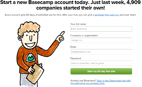
The subscription page shows how many people signed up for the platform in the previous week. The company also points out how many people have used the service in total, which indicates that thousands have put their faith in Basecamp. There is also a seal of approval reinforcing the quality of the platform from companies like Twitter and Etsy.
4. Address pain points
Regardless of where we feel pain, we want it to go away. And we’ll try everything to make it go away. That’s why addressing pain points through content marketing can be an effective strategy; alleviate the pain of your audience and you get more membership conversions.
Be the problem solver, the go-to resource. To uncover their pain points, ask a few of your site visitors about what is it about memberships that frustrates them. And then you’ll have some research on the pain points of your audience.
You’re not necessarily looking to solve every pain point; you’re looking to be able to address as many as possible through your membership offer. Use the content on your landing page to acknowledge or validate them; to be the company that tries to address pain points when most others don’t even recognize the needs of your target audience.
And marketing to these pain points isn’t about taking advantage of someone’s frustration. It’s about being able to provide something valuable, and explaining how you can offer value by understating your audiences’ problems.
Zappos has a great landing page for its VIP membership.
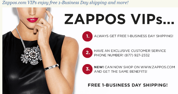
The content on the page addresses a major pain point of most online buyers – a week or two long shipping time or an extra fee for one day shipping. The company is offering free 1-day shipping to those who sign-up.
5. Personalize content
When it comes to buying a membership, prospects want personal interaction with brands. As a result, you need to create content centered around the main interests of your prospects. This would make them feel important and help establish a more emotional connection with your company. The call-to-action button should be personalized as well.
People can spend a lot of time mulling over a membership decision. What often nudges web visitors to become actual customers is often a voice that won’t always be there. Your voice should answer their questions, provide details on the benefits of signing up, and piece together a list of FAQs about the membership.
According to a research by ContentVerve, Fitness World, which has multiple gym outlets in Scandinavia, was able to increase conversions for a landing page where the goal was to get prospects to go through the payment page where they can choose a gym location and sign up for a membership.
Just adding a bit of personalization to the landing page CTA button increased CTR to the payment page by 213.16 percent. The fitness company just tweaked the copy from ‘Get Membership’ to ‘Find Your Gym & Get Membership’. Looks like the words ‘Find Your Gym’ had a significant impact on prospective gym-goers.
Note: Don’t expect personalization to do the job on its own if you’re missing other pieces of the puzzle. You still need to have a unique value proposition, a well-thought out template, and a captivating membership offer. Once these pieces are in place, personalization will help prospects cross the border.
Final thoughts
There are clearly more ways to increase membership conversions aside from the five highlighted above. It would be wise to use one or a combination of these techniques and tailor-fit them to suit the particulars of your membership landing page or website.
Compare the conversion rates of different strategies. What is it about your approach that makes one tactic more successful than the other? Make necessary changes to continually improve your conversion rate.
Now you’re ready to get started. If you have additional tips about how to increase membership conversions through content marketing, feel free to list them in the comments section below.
Article thumbnail image by: ideyweb / shutterstock.com


For the past few months, I have been facing such related problems of subscriptions on my blog. I believe that these valuable points will help me to do the needful and cope up with the conversion problems.
Thanks for good points. I am sure these points help me in developing a membrrship site for technical quizs
Very good and intertaining writeup!
I would go with content that solves a problem for the reader, this type stick itsel in search engines becaus people are looking for it!
Just putting the finishing touches to a membership site, so this came around at the right time, thanks!
As Jerry says, your Storyweel link is giving some cool free promotion to a jewellery designer 😛
Thanks for the write up. Telling the story is the #1 job. I think the Storywheel link is to the wrong place. Certainly weren’t the droids I was looking for.