WordPress developers spend so much of their time thinking about site optimization. Is it fast enough? Is the layout intuitive? Are the images the right size and resolution? Is the content interesting?
And while all of this is certainly important, not nearly enough attention is paid to site accessibility. Can everyone you want to gain access to your site do so easily? Once there, can they navigate without any problems? Do you offer solutions for those with disabilities?
There’s a lot to think about, so I won’t waste anymore time with intro fluff. Let’s get right to the meat.
Get Familiar with the Web Content Accessibility Guidelines
Also known as the WCAG, the Web Content Accessibility Guidelines outline everything you should be doing to make your site accessible to as many people as possible. Why would you want to do that? As per the guidelines’ abstract:
Following these guidelines will make content accessible to a wider range of people with disabilities, including blindness and low vision, deafness and hearing loss, learning disabilities, cognitive limitations, limited movement, speech disabilities, photosensitivity and combinations of these. Following these guidelines will also often make your Web content more usable to users in general.
Makes sense, doesn’t it? If you take the extra effort to make your site usable by those with disabilities, you broaden your reach considerably. In short, more people will land on your site and have a positive experience. And if that’s not good for your bottom line, I don’t know what is.
The first version of the WCAG were published in May 1999. It’s now on version 2.0, which was published in December 2008. It’s currently broken down into four key “principles” including:
- Perceivable: the site and the information on it must be presented in a way that users can perceive.
- Operable: the site and all of its navigation need to work under a variety of different circumstances.
- Understandable: the site, how its navigation works, and all of the information on it must be understandable to site visitors.
- Robust: the site must feature content that can be read and used by many different user agents, including assistive technologies.
These broad principles can be applied to any website online, not just those using WordPress, of course. And while I may speak generally about some measures you can take to improve any site’s accessibility, I’m going to do my best here to make my suggestions as WordPress-specific as possible.
With that in mind, the remainder of this article will be divided by the four principles listed above and offer specific ways you can achieve that principle for your WordPress site using plugins, external services, and more. While it may not be possible to hit every single guideline recommended in the WCAG, I’m doing my best to fit in as many as I can here.
Make Your Site Perceivable
Can your site visitors perceive all the elements on your site, regardless of disability? The WCAG offers these guidelines for ensuring you’re accommodating everyone:
Offer text alternatives for non-text content
So, photos can be described. Text can be turned into speech. And alternate text forms can be supported like large print and braille.
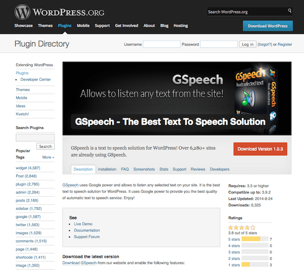
The Accessibility Widget lets you add a widget to your sidebar exclusively for changing the text size on your site. And the GSpeech plugin adds text-to-speech to any text on your site. You can even set an audio greeting for your visitors.
To add text descriptions to each of your images, you just need to make use of the “alt” tag. You can do this manually, but the SEO Friendly Images plugin adds the right title and alt attributes to all of your images for greater accessibility, of course, and greater search engine optimization.
Offer alternatives for “time-based media”
Audio and video recordings can be supported with text transcripts, captions, and/or an audio-only track describing video content. Audio content is supplemented with sign language.
Offer content that is easier to see and hear
Don’t just rely on color to denote an element you want users to pay particular attention to. Also, offer high contrast color schemes to aid those who are visually impaired. This can be accomplished using the WP User Stylesheet Switcher. All the site visitor has to do is click on a dropdown menu to select a high contrast stylesheet and the content will be easier to read.
You can also use a plugin like EsAudioPlayer to add a simple accessible audio player to your site so you can embed audio content and let those using text browsers download audio files. It’s also designed to work with screen readers, whose users can select the play and stop buttons easily.
Offer sufficient text resizing capability
From large text options to the ability to resize text up to 200% without compromising function, this ensures users can read everything clearly. Avoid using images of text. Plain ol’ text will suffice.
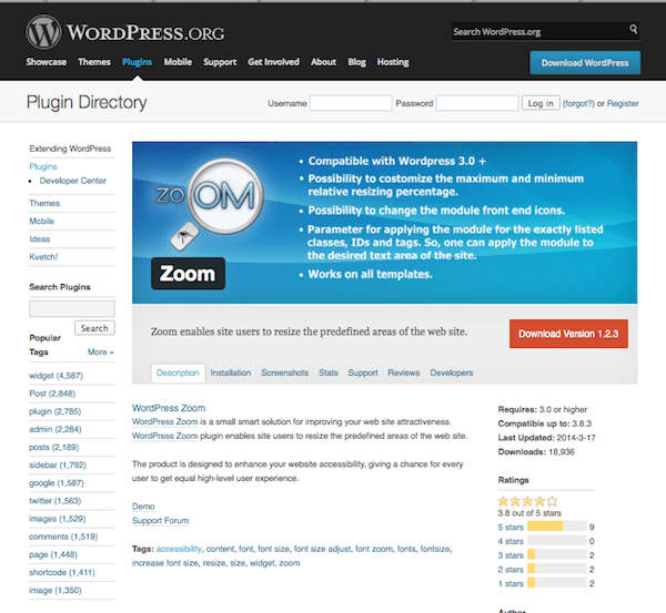
The Zoom plugin makes it simple for users to resize predefined areas of your site. With it, you can set minimum and maximum resizing percentages and apply it to specific classes, IDs, and tags.
Make Your Site Operable
Does your site work well in a variety of different ways? Can it be accessed from a number of different devices and does it account for assistive technology?
Offer greater keyboard accessibility
That is, you can perform just about every task on your site using a keyboard. You also ensure that there are no keyboard traps, or spots on your site where input via keyboard can’t be navigated away from using a keyboard. You can install Accessible Dropdown Menus to allow site visitors can access your menus via the keyboard alone. And you can use Accessibility Access Keys to create site-wide access keys to make for easier user navigation. This is particularly helpful for bypassing those keyboard traps mentioned above.
If time limits are in place, let users turn them off or allow for adequate extensions, unless there’s a real time component in play — an auction, for example. Also, moving content (auto-scroll or auto-updates) are to be presented either in conjunction with non-moving content or the function can be turned off.
Since autoscroll isn’t a feature that’s built into WordPress, you don’t have to worry about this one that much. In the name of accessibility, it might just be best to avoid plugins that offer this feature altogether. Infinite scroll — a feature that automatically loads new content when you reach a page’s footer — is sometimes built into themes. The auto update feature could possible throw off screen reader functionality, so be on the lookout for that as well.
Offer content that will not induce a seizure
Content on your site shouldn’t flash more than three times per second. So steer clear of manic animated gifs — though you should probably do that anyway!
This includes clear titles, sequential ordering, contextual linking, multiple link paths, and descriptive headings. A WordPress SEO plugin can actually be really helpful in achieving these accessibility points. You see, SEO requires that your content be clear and offer logical navigation, too.
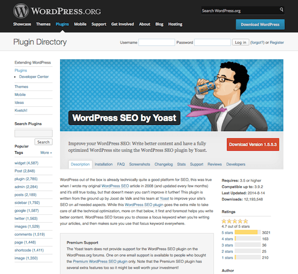
Try installing something like WordPress SEO by Yoast or All-in-One SEO Pack to add prompts to your post editor for customizing page titles, descriptions, metadata, and more. You’ll also want to create a sitemap, which the search engine will love, of course. But screen readers can also use them to allow for quicker site navigation. Use a plugin like Google XML Sitemaps to generate one on the fly.
Make Your Site Understandable
Is your site’s content and navigation clear? Can it be comprehended with little to no explanation?
Offer content that is inherently readable
It should be written in a clear and concise manner with the language clearly identified and word choice that could easily be read aloud by a computer voice. It’s also a good idea to define jargon, difficult terms, and abbreviations.
You can quickly add a glossary to your site using the CM Tooltip Glossary plugin, though you may need to do some CSS fiddling to get the tooltips large enough to meet accessibility standards.
Offer web pages that behave and look as one would expect
Site content fits its headlines and links. Navigation is predictable and looks the same on every page. Thankfully, WordPress is equipped to support logical navigation to start with. Though you can also play with custom menus to ensure you’re offering the most clear link options as possible.
Offer input assistance
If spelling or typing errors are made, offer suggestions or automatic corrections. Provide clear instructions for areas that require user input and implement a fool-proof “error prevention” system that lets users reverse, double check, and confirm submissions — especially when they contain financial or legal data.
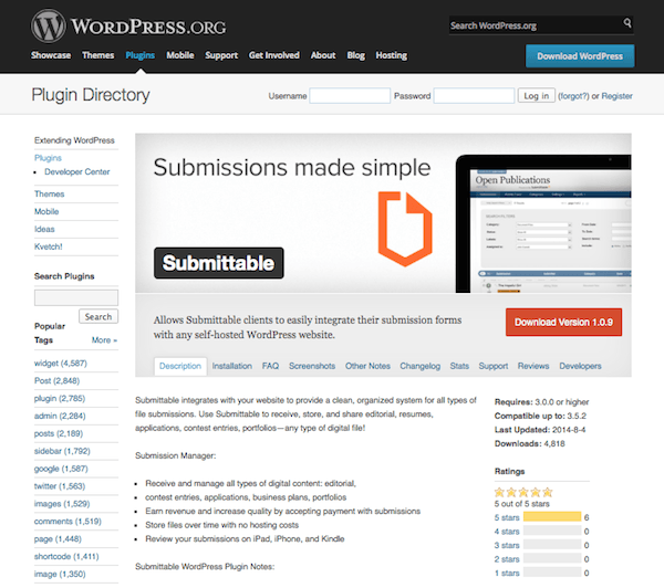
You might want to use something like Submittable in this case — along with its WordPress plugin to let site visitors submit a variety of file types. The automated system asks for confirmation before the submission is sent.
Make Your Site Robust
A robust site is one that has thought of everything. Does yours meet the needs of as many people as possible in as many ways as possible?
Offer compatibility with assistive technologies. That means your HTML is beyond clean with start and end tags, no duplicate attributes, and unique IDs. You need clear headers and paragraph elements so the content appears as it should on screen readers. Basically, fancy HTML should be avoided. Want to add style? Use CSS. Otherwise, let basic formatting serve your content well.
WP Accessibility
This plugin merited its own section here because it covers so many of the guidelines mentioned above and only takes one plugin to it. WP Accessibility offers a wide variety of features, all designed to make a site meet the WCAG by modifying your WordPress theme.
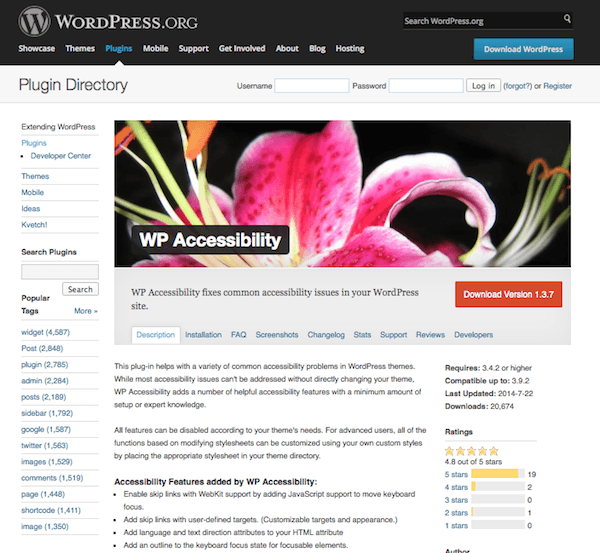
For starters, this plugin fixes several accessibility issues that are inherently present in WordPress. Many of these fixes are deep down in the code, but they make a real difference in how your site is presented to those using assistive technologies. For instance, it removes the tabindex from focusable elements, adds post titles to “Read More” links, and removes the target attribute from links.
It also adds several features like letting users skip links, adding an outline to the keyboard focus state, adding descriptions to images, and adding a toolbar specifically designed to give site visitors the option to switch between high contrast, large print, and grayscale theme views.
WP Accessibility includes several other features but it’s an all around great plugin that can help you fix several accessibility problems all at once.
Use an “Accessibility-Ready” Theme
If you’re committed to a theme already, then you’ll have to stick to the plugin, code-based solutions described above. However, if you’re just starting on a site’s development or you’re open to change, your best bet is to pick a theme that was designed with accessibility in mind.
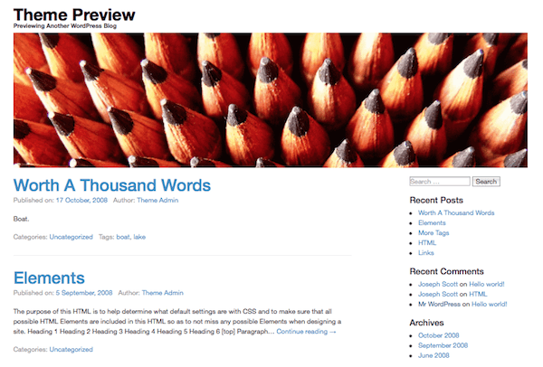
There are several currently available for free in the WordPress Themes Directory. Just be sure to select the “accessibility-ready” tag filter to get a view of what’s currently available. As of this writing, there are 11 themes to choose from including the Automattic creation, Twenty-Fourteen and WPstart.
Conclusion
Making your WordPress site accessible might seem like a lot of work at first, but the benefits are multi-faceted. For starters, you’re doing the right thing by making your content viewable and usable by the largest number of people possible. And second, you’ll automatically improve your SEO, which means increased site traffic. And both of those factors combined means a greater likelihood of site success.
The Web Content Accessibility Guidelines might feel overwhelming on first glance, but hopefully this will help you get started and start checking a few of those modifications off your to-do list.
Are you making efforts to make your site more accessible? Or are you a total rockstar and it’s already WCAG compliant? I’d love to hear your thoughts on the subject, including any challenges you’ve faced in the comments below!
Article thumbnail image by Bloom Design / shutterstock.com


Everyone keeps directing to the Github plug in for Divi Accessibility and it says the plug-in was discontinued permanently in 2020. Has anyone used the Divi Assistant plug-in from peeayecreative.com? Wondering if its any good?
I’m wondering when you’re going to up date this post. Accessibility checkers are finding a lot of problems with pages created with the Divi Theme Editor. Search fields without tags, no alt-image tags even though they are there, heading tags out of order… I’d love to get some help on these issues.
Is there an update on what needs to be done to achieve the upcoming mandatory WCAP 2.0 (AA) standard in 2025?
And how compliant is divi already?
As far as I can tell, Divi is NOT anywhere near compliant. I was shocked as I have relied on Div for years to stay up to date, however, I have done 2 different scans and they both failed miserably. This is with me doing everything I can, but most of the errors are with the Divi menu and other dynamic Divi modules. Hopefully, they will notice this thread and make some updates soon so I can continue recommending Divi to clients.
Anyone got an updated plugin for switching style sheets?
Hi,
thanks for the article. It was very interesting.
Do you have any recommendation for a responsive multipurpose theme that is accessibility-ready?
Thanks and best regards.
Thanks for the article – it was very interesting.
My perspective is from the VI-blogger – my partner is severely sight impaired and wants to start a blog. I am currently searching for themes which would be suitable for him (a dark background is the starting point) , but wondered if you knew of any themes that were customised totally for VI bloggers? Thanks, Katrina
This is a fantastic article! I was wondering if Brenda Barron had a recommendation for a contact form that was accessible? Any direction she could point me in would be very much appreciated.
Thanks so much!
Nice article!
BTW, it looks like the EsAudioPlayer link is wrong.
Best regards
Thanks for letting us know. I updated the post with the correct URL.
Great post.
SFI provides services to Hire WordPress Theme Developer, hire dedicated WordPress Developers.
Thanks for this post.
Great post, really this is very informative article .
Thanks for sharing these post.
New useful things to know. Are ET’s themes ready with accessible options?
Another informative post. Learn lots of new things from it. Surely your tips will help you to make my website more accessible. Thanks for the great share.
As you said in your intro… i spend most of my time on optimalisation, page speed, lay-out and more while totally forgetting about accessibility. Your post is certainly a wake-up call. Many thanks for that
Making an accessible site is challenging. These tips will be useful for me to make it. Text, themes, are important for a site.
great article.. Thanks
I want to know how can we provide a bar through which we can sort the products according to price of products, popularity of products and based on color… plz let me know this
Thanks in Advance..
have a great day
Very interesting article with great tips and guideline. The WP Accessibility is complete new for me. Thanks for share
Very interesting. did not know this. Thank you.
Hi there and thanks for the great article,
I was wondering what’s the difference between All In One SEO Pack and Sep by Yoast, please? I’m using AIO on my website (frenchyincali.com), but I have another project and I don’t know which one to use. Is there any major difference? One better than the other?
Thanks and cheers from Paris.
Jean
Hi, Brenda —
Very helpful and informative article.
Question: do you know if any of the ET themes are accessibility-ready? Thanks!
Thanks Brenda Barron
I could not hold back tears when I read this article that indicated that anything but show interest and great concern for the people with a disability in an attempt to integrate them with the electronic world and their dealings with modern technology and make their lives easier
I repeat my heartfelt thanks
Really great article. I will use few of the tips on a site that I am building for a gov organization.
Thank you.