In case you’ve missed it, we’ve recently launched a new design initiative where we provide y’all free, professional Divi layout packs every week. They’re fully functional and ready to use straight out of the .zip file, and that’s awesome.
But we also want to make sure that you’re aware of ways to add to the layouts to make your website even better for your users and visitors. For instance, Bloom is a fantastically customizable email plugin that comes with your Elegant Themes membership, and you can (and should) style it to match the layout packs.
Today, I’m going all the way back to our very first freebie, the travel website layout pack, to show you how to make Bloom take your visitors to a whole new world.
And if you’re not using one of our layout packs, that’s cool, too. I am going to be breaking down the process of how and why I did the styling like this, and you can apply the principles to your site’s design as well. Basically, we are going to be taking elements and assets that work already and slightly repurpose them for our new opt-in.
The First Steps in a Thousand Mile Journey
Okay, so using the plugin and styling is far easier than taking a thousand mile journey. So that was probably a bad metaphor. Whatever. You understand, right?
Install Bloom
The first thing you need to do is install Bloom. So head over to the ET Members Area to download and install Bloom. You can also follow the documentation there to get everything set up for your email provider (Mailchimp, Aweber, Emma, etc.).
It’s very easy (we made it, so of course it is!), and you’ll be ready to get your visitors globe hopping in no time.
Visualize the End Result
When you’re starting out, you should really have an idea of what you really want the final result from Bloom to look like. I suggest going to your site and finding either the most iconic element that you have or just your favorite element.
Using the travel blog as an example, I want to style the Bloom opt-in to match this section specifically:
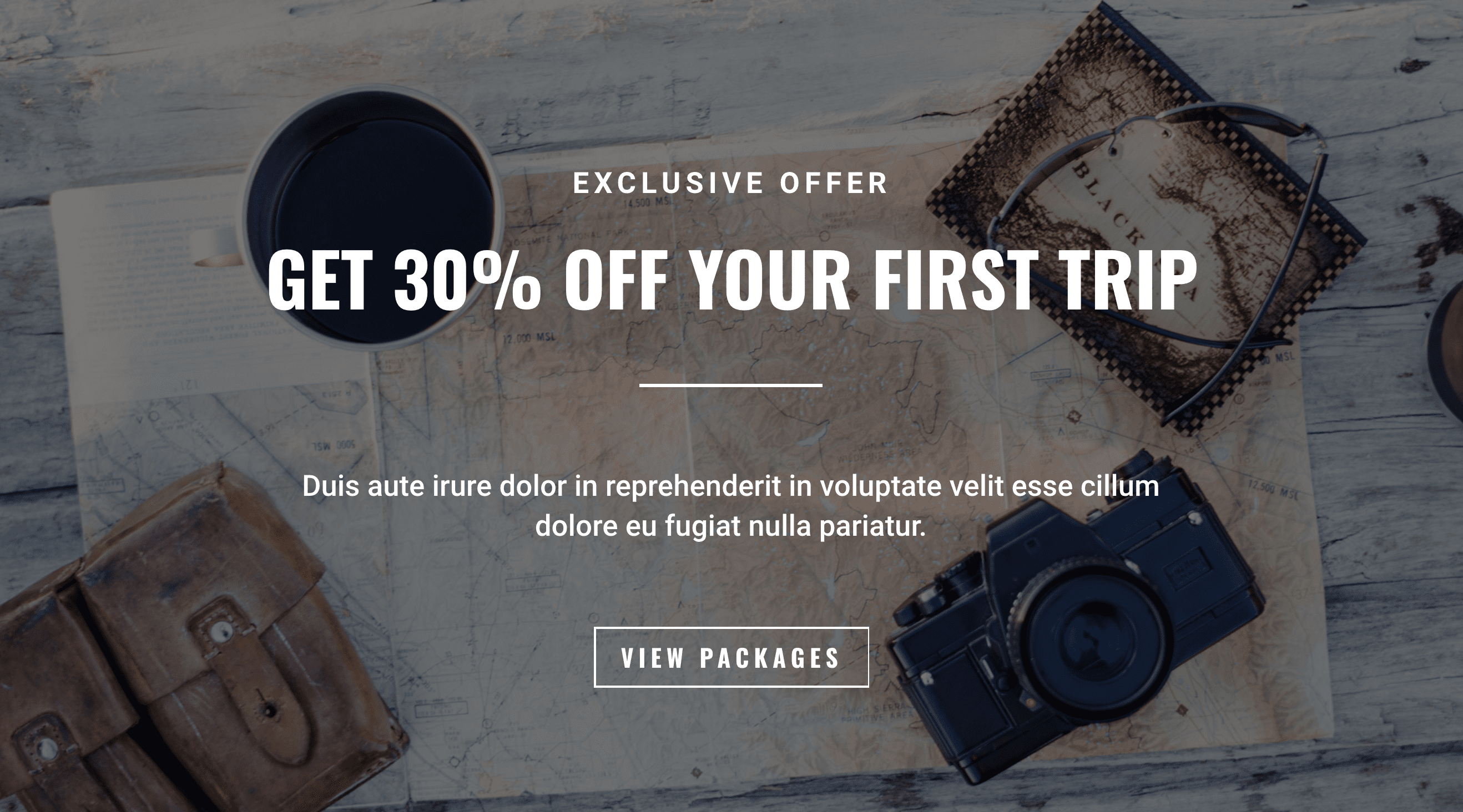
There is no rhyme or reason why I chose this part over anything else (because the design team did such a killer job on the whole layout) other than I like it the most. It reminds me of adventure and excitement–and that’s what I want to convey to people so they sign up for the email list.
Steps to Style Your Bloom Email Opt-In
When you’re first making a new Bloom opt-in, you have to pick which kind of opt-in you want to display. Bloom gives you a lot of options, but we don’t want to be mega annoying about it (i.e. no popups) since this layout pack is all about style and substance.
So we’re going to use the old standby, Below Post. You won’t run visitors off, and they have decent conversion rates that turn into lasting customers and relationships.
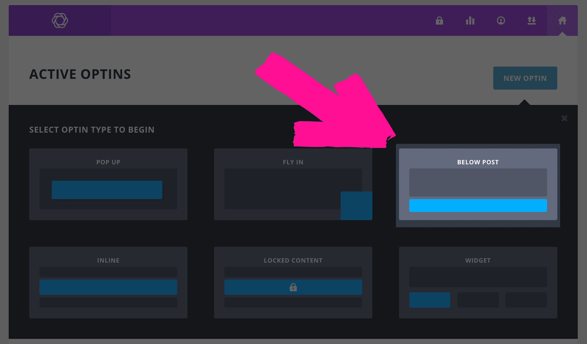
The next page is just naming and picking your email provider and list, so it has nothing to do with the actual design (and can always be changed later, by the way). So fill that out and move into the next section and pick a template.
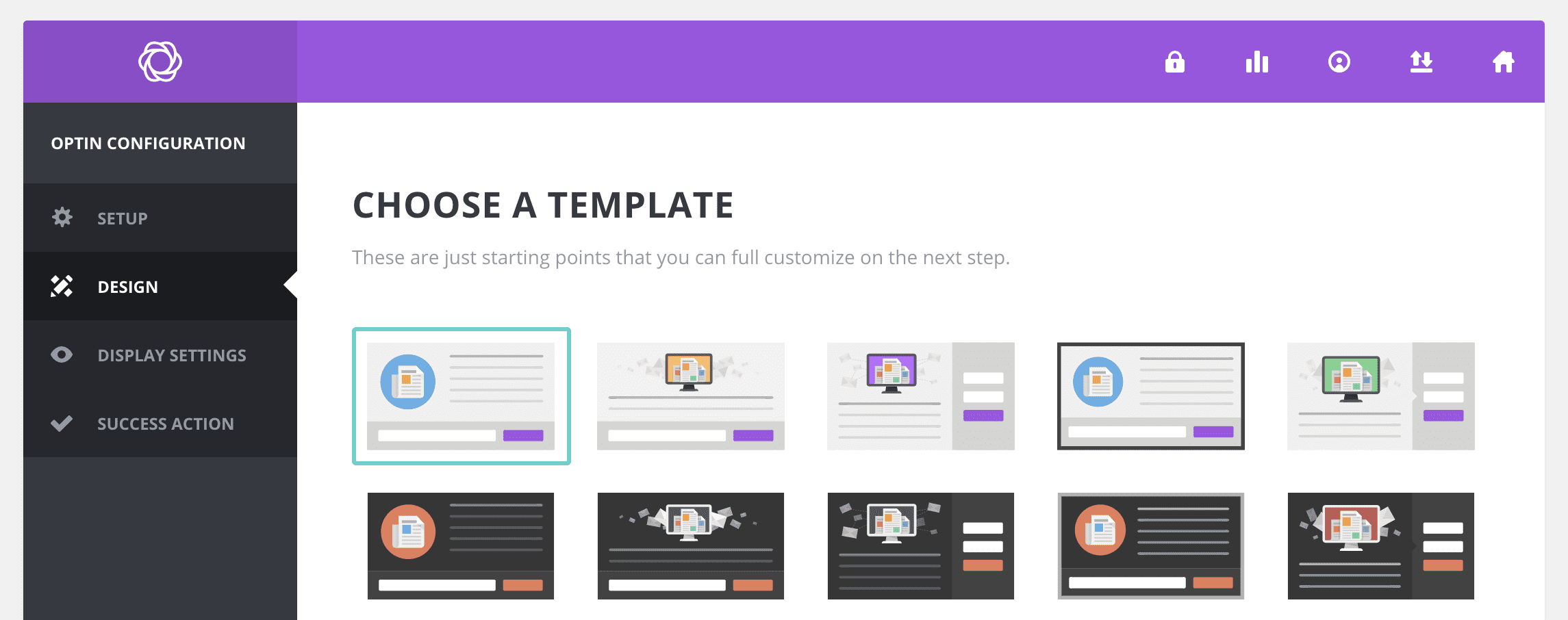
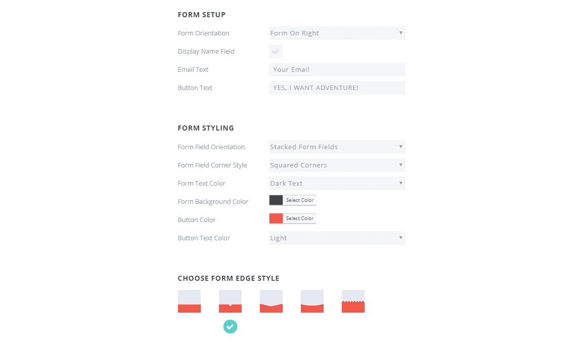
I decided to go for a pretty simple template, one with the fields to the right. Again, something simple that works to match the style of the site.
After that, you’ll need to find an image. If you’re using the travel layout pack, when you import the .json files to your Divi Library, all the images will be imported to your Media Library. I decided to go with travel-binoculars.jpg because it shared elements with the section I took inspiration from. I also think that travel-coffee.jpg would be a good choice.
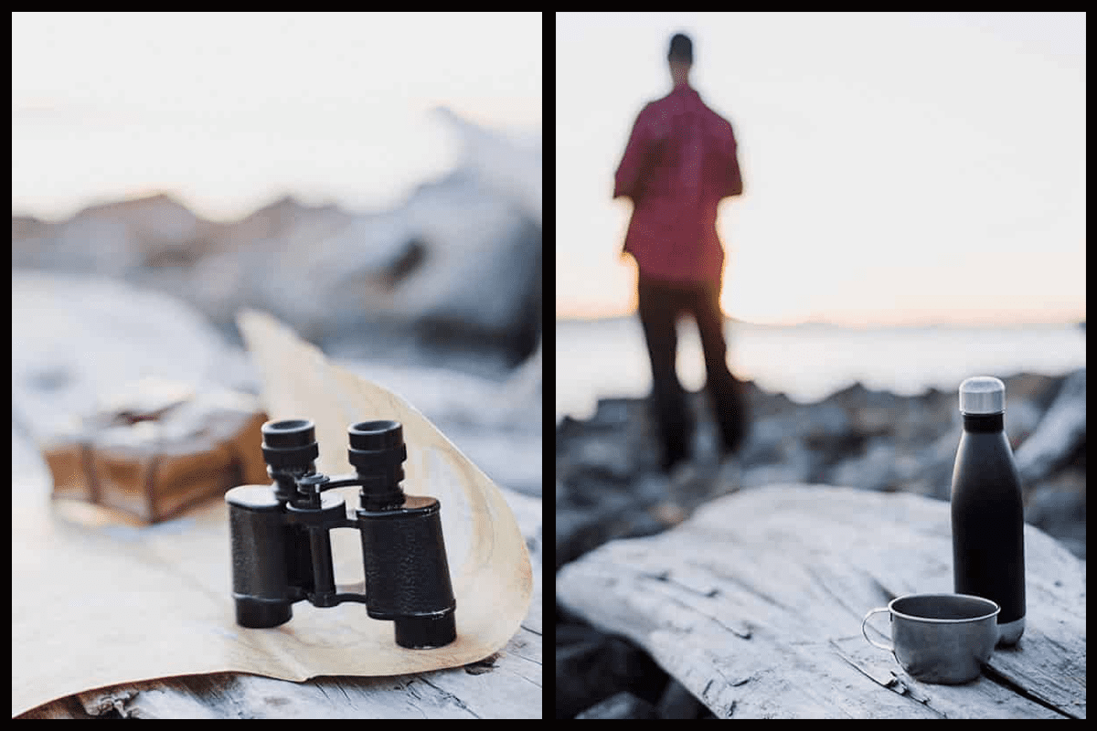
One thing to make sure is that you choose Image Left of Text for the Image Orientation dropdown. It will resize things to fit and be much prettier with our layout.
Styles, Colors, and Fonts
The overlays for the travel pack use #1d2633 as their color, which is what makes the images have that dark, transparent shadow over them. Even though Bloom does not currently allow for the transparency effect as a background, I still want to use that color for the Bloom opt-in.
For fonts, the travel website layout back uses Oswald for headers and Roboto for the text. We can do the same thing here to maintain continuity. The same for squared corners, and I think that the use of a full border with a single, white interior rectangle (the fourth option with color set to #ffffff) makes the opt-in pop just enough to be noticeable but not look out of place.
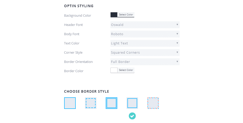
The only other change I think that should be made regarding color is the button itself: use #ed4441 to match the buttons already included in the free Divi layout pack.
One More Bloomin’ Tweak
The only other thing you will need to do is put a few minor tweaks into your CSS to match up font sizes and weights with the layout pack. Just copy and paste this into the Custom CSS box in the Bloom Design Page:
/* This snippet will target any paragraph text in the primary area of Bloom and style it without touching any other text on the page or in the plugin */

.et_bloom .et_bloom_form_header p {
font-size:20px;
}

/*This snippet will target only the h2 text within the Bloom opt-in form and size it at half of the normal H2 in the layout pack */

.et_bloom .et_bloom_form_header h2 {
font-size:40px!important;
}
And yes, I don’t like using !important anymore than you do, but in this case it’s a necessity because of how Bloom gets added to the page.
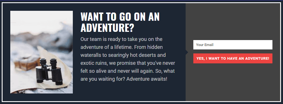
You now have a delightfully tasteful email opt-in at the bottom of each and every one if your posts that looks a little something like this.
Bloom Can Do It!
Hopefully, by walking through the travel layout pack in this post, you’ve seen how you can grab some elements on your own site and style your Bloom email opt-ins to match your site’s design. As you can see, just using the same fonts, colors, and even imagery in new ways can totally create something refreshingly new and vibrant without much work at all.
So pick your favorite element of your site (or grab one of our freebie layout packs!) and get to making Bloom work for you!
Article featured image by Sammby / shutterstock.com


Hi:
Is it possible to use Bloom for something other than an email opt-in? I want to use the functionality of a Bloom pop-up/fly-in to grab our audience’s attention when they visit our site, but I’m not trying to get people to join our email list, we want them to donate money, so we want a teaser to let them know about our building renovation project – which seems to fit nicely in one of of the Bloom templates with an image, but we want the button to take them to a web page where they can sign up to donate money to our fundraiser.
If Bloom is not the right solution for this, can you tell me which module or plugin I should be using in Divi to accomplish this?
Thanks so much!
+1 from me.
Bloom’s awesome, but there are times where I’d just like to use it for a popup or flyin message (“We’re closed over Christmas”, for instance), rather than install another plugin.
I’ve managed to hack that together using the CUSTOM HTML option rather than a mailing-list choice, but it would be great if it was super easy to have something like this in your custom html:
Okay, got it!
and that became a standard bloom button centred at the bottom that closed the popup. (Yeah, I know there’s the X in the top right, but the more obvious it is for users, the better!)
You’ve got a plugin that handles popups, fly-ins, multiple triggers and options and all sorts of other lovely stuff- why not allow it to just show a message, rather than be so focused only on mailing-list signups?
I’m glad you’re pointing out how annoying it is to style Bloom properly (you need to use a lot of !important if you want to divert more from the default design). It’s a great tool, but it’s very annoying to make it look the way you want it to look.
I have to agree. Although Bloom is a great tool, it does take quite a bit of CSS knowledge to get the field spacing to look good depending on whether you are creating a narrow sidebar optin, a popup or a 1 column optin and there are no helpful hints on the long page of choices to start with.
Awesome. Now if Bloom could only do MailChimp groups it would be almost perfect. Almost.
A Great Reminder B.J. and very nice explanation. I enjoyed it, thank you.