Cascading Stylesheets (CSS) enable you to create some fantastic effects if you have the relevant expertise. However, there are so many elements you can customize that mastering the language can be difficult.
Take CSS even and odd rules, for example. They’re little-known selectors that enable you to target even and odd elements on tables, lists, and pretty much anything else you can think of. In this article, we’ll talk about how CSS even and odd rules work, and how you can use them. Then we’ll teach you how to use Divi to replicate their effects for even better results. Let’s get to work!
An Introduction to CSS Even and Odd Rules

CSS even and odd rules enable you to target very specific elements.
The name for this type of CSS selector gives away its purpose. Even and odd rules enable you to target those two types of elements in almost any situation, and apply styles to them.
Take the example at the top of this section – the even columns all share the same text color, whereas the uneven numbers use a different one. That effect is possible because we used even and odd selectors to target each type of element and apply unique background colors to them.
Right now you’re probably curious about what the applications for such specific selectors could be, so let’s break them down using examples:
- Pricing tables. The best pricing tables use colors to pull your eyes towards the plans they want you to sign up for. In this case, you could use even and odd selectors to make specific plans stand out.
- To make extended datasets more readable. Imagine you’re trying to make sense of a long table full of data. With a little CSS, you can apply even and odds rules to create a contrast between the rows or columns to make things more readable.
- To highlight specific items within a list. If you include a long list in an article, even and odd rules can come in handy to highlight particular entries. Instead of playing with background colors, you can bold specific items, change their font size, and more.
To be fair, CSS even and odd rules aren’t something you often see in the wild. However, they’re easy to apply, so there’s no reason why they shouldn’t be a part of your arsenal. Let’s talk about how to put them into practice!
How CSS Even and Odd Rules Work in Practice
Tables are the most common use case for CSS even and odd rules because they’re elements with clear visual limits. Plus, tables tend to be made up of multiple elements, which makes them the perfect candidates for the selectors in question.
Here’s an example of a quick and dirty table with minimal styling applied to it. It’s easy to read, and it gets the information it needs to across, but that’s pretty much it:
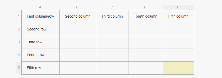
If we wanted to apply even and odd rules to it, here’s an example of how the CSS would look:
tr:nth-child(even) {background: #CCC}
tr:nth-child(odd) {background: #4D4D4D}
Here, tr refers to the HTML elements for each row on your table. The code above will set white backgrounds for all the even rows and grey ones for the odd numbers, just like this:
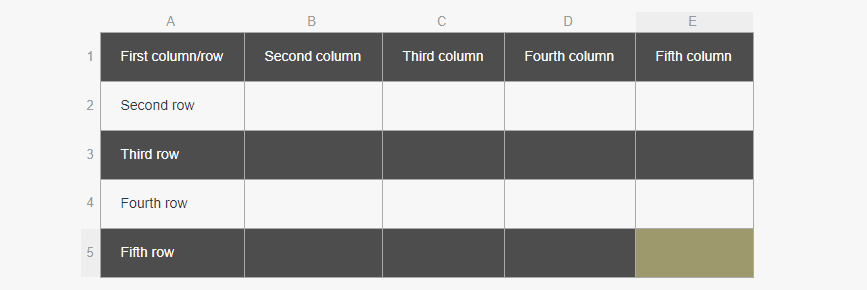
In this example, the green cell in the corner of the image is simply highlighted.
You can also target columns instead of rows, which comes in handy when highlighting unique plans in pricing tables. Here’s the same code as earlier, only with columns instead of rows:
col:nth-child(even) {background: #CCC}
col:nth-child(odd) {background: #4D4D4D}
Here’s what the result would look like:

As we mentioned earlier, you can use even and odd rules to target basically any element. The key is that it should contain sub-elements, such as rows or columns – otherwise, the selector wouldn’t know which ones to target. Lists, for example, include li HTML elements for each entry. Here’s an example:
<ul>
<li>First element.</li>
<li>Second element.</li>
<li>Third element.</li>
<li>Fourth element.</li>
</ul>
In this case, you want your even and odd selectors to target li elements specifically, so your CSS should look like this:
li:nth-child(even) {background: #CCC}
li:nth-child(odd) {background: #4D4D4D}
Of course, adding background colors to list elements isn’t a common practice, so you’d probably want to use other types of customizations. For example, you can bold the odd elements in your list to make them stand out:
- First element.
- Second element.
- Third element.
- Fourth element.
As you can see, there are no tricks to using even and odd selectors. All it takes is targeting the right elements, and you can implement any changes you want without affecting the rest of your page.
How to Replicate CSS Even and Odd Rules Using Divi
If you’re a Divi user, the module system enables you to add sophisticated elements such as contact forms, pricing tables, galleries, and more to any of your pages with a few clicks. What’s more, you get access to powerful customization features to personalize those elements.
When it comes to pricing tables, for example, it’s all too easy to replicate the effects of CSS even and odd rules without using any code thanks to Divi. Here’s an example of a barebones pricing table we cooked up with the Divi Builder:

Now, let’s say we wanted to apply different colors for each column, to add a little contrast to the table. Using CSS even and odd rules, we’d end up targeting entire columns with the same color, which would look terrible. With Divi, you can customize the specific sections you want to target. Let’s try adding blue backgrounds to the headers for the first and third columns. To do that, locate the pricing table module on the page you’re editing and click on its Module Settings button:

Now locate the specific column you want to target and click on its settings button once more:

If you jump to the Advanced tab, you’ll find a field called Pricing Heading. You can change that section’s background color with a simple line of CSS:
background: #0C71C3;
Now here’s what our table looks like:

If you apply the same change to the Developer column, you’ve basically implemented even and odd rules for that particular row:

The rest of the table looks good, but what if you also wanted to highlight some of the features of each plan? That’s something you usually see in pricing tables, so visitors can compare the features each plan offers. You could use even and odd rules targeting rows, and stagger your plan’s features so only the ones you want will stand out. With Divi, you can replicate that effect with simple plus and minus signs.
To do this, go to the settings sections for the column you want to modify. For this example, we’re going to target the Basic column once more. If you scroll down its main settings screen, you’ll find a text editor including the list of features you saw earlier:

As you can see, plus signs are preceding each element. If you replace them with minus signs, here’s what they look like on the front end:

If you stagger the plus and minus signs, you can implement your own even and odd design. Plus, you can play around with the text editor to customize things even further. Here’s what our table looks like after a bit more tweaking:

Naturally, you’ll want to be more picky about which elements to highlight in a real pricing table. That way, users will know at a glance exactly what each plan offers them and how it compares to the others.
Finally, remember that the Pricing Table module enables you to highlight specific columns, as featured tables:

To choose which columns you want to highlight, go into their settings and then jump to the Design tab. You’ll find the option right at the top.
Conclusion
CSS is easy to learn, but difficult to master. With some patience, anyone can create amazing designs and effects using the language. Even elements that aren’t so flashy, such as tables, can be brought to life using CSS in the right way – in this case, with even and odd rules.
If you’re not one for sitting around tweaking code until things look just right, the Divi theme enables you to customize nearly every aspect of your website using simple menus. Plus, you can preview your changes in seconds. With so many customization settings, it’s possible to replicate the effects of CSS even and odd rules reasonably easily.
Do you have any questions about how to use Divi to replicate even and odd rules in WordPress? Let’s talk about them in the comments section below!
Article thumbnail image by Ket4up / shutterstock.com







Divi should have a tables module.
Wow, I’ve been doing CSS for a while and didn’t know this was a thing. It will be perfect for a current project. Thanks!
No problem Harold. 🙂
Thank you for this article. I have just started with Divi and thing are getting better and better….
I am so glad I have bought Divi, the whole team, articles, video’s and updates are just great!
No problem Conny. Happy to help 🙂
I want to use this on my blog titles,
is that possible?
Hello Pepjin. I’m unsure as to what you are trying to achieve. Could you be more specific?