Subscribe buttons, we see them everywhere on practically every site. They come in different shapes and different colors but how do you create one that is irresistible and highly convertible? In this post, we’ll be helping you with that process by sharing 7 keys to creating an irresistible subscribe button. By following these tips your chances of turning visitors into loyal subscribers will be higher than ever.
1. A/B Testing
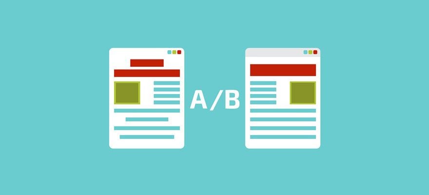
Image by Andrii Symonenko / shutterstock.com
The first tip we want to mention as a tip for subscribe buttons is A/B testing. No matter how good you think your subscribe button looks like or how many tips you’ve included in it; it always comes down to if the results you’re getting live up to what you’re expecting. And obviously; to know if your subscribe button, and subscribe form in general, is doing well, you need to have something to compare it with. That’s where A/B testing enters and allows you to observe which subscribe form is doing a better job. Make sure you have representative results when you test. Short-periods of A/B testing will only deliver some accurate results if you have a very high volume of visitors. It works pretty much the same as surveys do; the more people are involved, the better.
2. Contrasting & Well-Thought-Out Color

Image by Rvector / shutterstock.com
The next things worth mentioning is the color choice you use to make your subscribe button stand out. People naturally have a certain emotional response to different colors and it’s important to understand what this emotional response is and see if it’s in line with the content, products or services you offer. You don’t want to end up using a color that doesn’t appeal to people emotionally because that’ll change the likeliness of people acting upon that call to action. Let’s take a look at some different colors and the impulsive association of that color:
- Red: Energy & Urgency
- Blue: Trust & Security
- Green: Wealthy & Environmental
- Yellow: Optimistic & Creative
- Black: Powerful & Bold
- Orange: Warmth & Passion
- Purple: Calm & Serious
- Pink: Youthful & Feminine
So, there is no standard right color for your subscribe button, it just depends on which emotions you want to trigger with them.
3. Target Audience-Oriented Copywriting

Image by Hsynff / shutterstock.com
To make your subscribe button stand out, another thing that is highly important is the copy that you choose, not only for the subscribe button but for the copy that leads the visitors to that call to action. You can, for instance, use simple descriptions such as ‘subscribe’ or ‘submit’ but remember that your visitors come across these words very often on numerous websites. To make your subscribe button stand out; you can try to give your subscribe button more personalized and authentic copy that match your website. For instance, instead of using the words ‘subscribe’ or ‘submit’, you can use sentences like ‘Yes, I want FREE content in my inbox’.
4. Switch to First Person Speech
Image by Creative Stall / shutterstock.com
This tip is directly linked to our previous tip where we recommend using authentic copy for your subscribe button. Instead of using the word ‘your’ within your copy, you can easily make your copy more attractive and personalized by switching over to first person. For instance, instead of using ‘get FREE content in your inbox’, use ‘Yes, I want FREE content in my inbox’. By using first person, you are stimulating the thought process of your visitors. You’re putting them in a position where they can wonder how the content they’ll get will be beneficial to them. On the other hand, if you’re using the third person, it’ll feel more like you are pushing something towards them instead of them wanting something from you.
5. Strategical Position on Your Website

Image by Pro Symbols / shutterstock.com
Yes, you can place the subscribe button wherever and how many times you want on your website. But is that the best way to go? Probably not. Your visitors have a certain tolerance for the requests you have towards them. You don’t want to test their patience until they get annoyed. Rather, choose a strategic way to place your subscribe forms and buttons on your website. Make sure wherever you place them, it’s within the context. For instance, it makes more sense to place a subscribe button after having shared some relevant content within a blog post, than somewhere randomly. The chances are higher that someone who’s gone through a whole piece of content, would want to receive additional content in their inbox as well.
6. Time Urgency

Image by BSVIT / shutterstock.com
Another thing that’ll help you create a subscribe button that’ll result in actions is time urgency. People are curious creatures that don’t want to miss out on the good stuff, especially if it’s free. That’s why creating a certain sense of urgency can boost the conversions your subscribe form is delivering. You can, for instance, use copy that’ll give your visitors a sneak peek at what’s coming next. Whether it’s an update or free content they’ll get in their mailbox, by giving your visitors a sense of time urgency to subscribe, you can convince them easier.
7. ‘Less Is More’ Kind of Design

Image by eHrach / shutterstock.com
Last but not least; try to practice a minimalistic design that, of course, fits the rest of your website. There is no need to overwhelm your visitors with a busy subscribe form that contains all of the benefits you think it has. If anything, it’ll only confuse and distract your visitors. Instead, use a clean design that focuses on the core value that is brought by subscribing. Because there is indeed something like ‘trying too hard’. Having confidence in the value that you’re bringing will reflect on your visitors and it will influence their behavior.
Final Thoughts
Creating a subscribe button that does the job is more than just making sure it looks visually appealing. There are plenty of psychological aspects that play a crucial role as well. In this post, we’ve shared some tips that involve both aspects of a subscribe button; the appearance and the purpose. If you have any questions or suggestions; make sure you leave a comment in the comment section below!
Be sure to subscribe to our email newsletter and YouTube channel so that you never miss a big announcement, useful tip, or Divi freebie!
Featured Image by Mascha Tace / shutterstock.com



Some good tips on how to increase your conversion. I have found that positioning (higher up on the page) and headline (call to action) are two of the most important factors.
“Strategical Position”? Better is “Strategic Position”? When the noun “strategy” becomes an adjective it becomes “strategic.” While the word strategical is technically a word (I had to look it up to be sure) it became so only through common misuse, and is not commonly used. Inside the paragraph you say “choose a strategic way to place…”, so why not use “Strategic Position” in the paragraph title?
Point three is “Target Audience-Oriented Copywriting”, and improper or uncommon word usage will distract your audience from your message (like it obviously did me, sorry).
Your tutorials are superb and really helpful to me, and part of the reason I chose Divi as a new WordPress user. So keep them coming, and thank you!
Well done Gene… really appreciate your thoughtful comments and positive closing. Very refreshing.
Umm.. why no examples? ET blogs usually include visual samples when they post articles about design.
Won’t all these tutorials be useless when Gutenberg comes out?
No.
But Gutenberg doesn’t support shortcodes. So what will happen to all the designs we made with shortcodes?
Gutenberg does have a shortcode block.