No matter the topic or purpose, every website owner must think about conversion at some point. You could simply place your call to action somewhere on your website and hope for the best, but if you want to get the most out of your website and conversions it’s best set aside some time to focus on conversion design.
What is Conversion Design?
Conversion design, also known as Conversion Centric Design (CCD), is a design philosophy that focuses on creating an experience to drive visitors toward a business goal. Rather than just hoping visitors will respond to your CTA, it actively works to drive visitors through the sales funnel and to the desired result. It just makes sense – improving conversion design will improve conversion rates.
Conversion design is a form of marketing that combines design principles with conversion psychology to guide the design of your website. From this combination, principles have been developed specifically to push conversion using the design of your website. Let’s take a look at those design principles.
Seven Design Principles
There are seven design principles used with conversion-centered design. The first four are design elements:
- Encapsulation
- Contrast and color
- Directional cues
- White space
And the last three are psychological elements:
- Urgency and scarcity
- Try before you buy
- Social proof
These design principles can be seen in landing page design and can also be used with banners and sidebars, or anywhere else you want to focus on conversion.
Encapsulation
Place your CTA in a window or a frame. You can do this with shapes such as circles, and elements such as contrast and color to create directional cues.
Contrast and Color
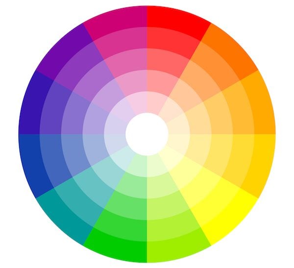
Image by opicobello / shutterstock.com
Make sure your CTA button has enough contrast to stand out. Start with contrast and test colors for the best performance. Also consider a form that pops off of the page. Some hold to color theory while others maintain that color is secondary to contrast. I recommend using A/B testing to see what works best for you.
For reference here’s a look at color psychology.
- Black: serious
- Brown: wholesome
- Red: danger, excitement
- Dark Blue: calming, trustworthy
- Light Blue: cool, youthful
- Gold: conservative, elegant
- Gray: integrity, mature, neutral
- Green: comforting, growth, positive
- Metallic: elegant, wealthy
- Orange: positive
- Pastels: sensitive, soft, youthful
- Pink: youthful, warm
- Purple: royal
- White: pure, clean, honest
- Yellow: positive, caution
You can use these colors with contrasting combinations to create drama or the feeling of safety. The goal is to attract the right kinds of attention.
Directional Cues
Direct your visitors through your pitch to your call to action. Use visual cues to point visitors in the right direction. Direct their focal point using cues such as pathways or arrows >> with a label to give them directions. People or animals looking in a certain direction prompts readers to look in that direction.
White Space
Remember to use whitespace. This is the empty area around an object which allows all of the elements to stand out and not get lost in the crowd. Too many items crammed together will make each item too difficult to see. Whitespace gives the design some room so the visitors can focus on what you want them to. If their eyes only have a few things to focus on they’re more likely to see what you want them to see and click on what you want them to click on.
Urgency and Scarcity
Add some urgency. Sometimes people tend to overthink and drag their feet before making a decision. If they know the offer will always be there they won’t be in a hurry to take you up on it unless they need it immediately. Let them know the offer won’t always be there.
This can be something as simple as showing how many of a product is available in stock, when the price will increase, how many seats are available to an event, how long before a package deal expires, etc. This information needs to be placed near the CTA button. Make the urgency real. Don’t give them 90 seconds to decide but then start the counter over. Be realistic.
Try Before You Buy
Give visitors a preview of the product. This could be a slideshow with high-res images, a video, a sample chapter from an e-book as a PDF download or as a blog post with a CTA (with the post showing on the landing page), etc. This makes your product more credible. This will give them more confidence in your product and help them make a decision, which will in turn keep you from dealing with returns, bad comments, etc. Be creative in your presentation for the sneak peek.
Social Proof
Properly displaying social proof is critical for conversion design. It backs up your claims by real people who’ve used your products. It adds authenticity, credibility, and believability. It shows that you have a following and others believe in you and your product. Social proof can also be tricky to use though. If used incorrectly it can hinder conversions. Customer testimonials must look and feel real and honest and not like you’ve cherry-picked only what you want to display.
Why Use Conversion Design?
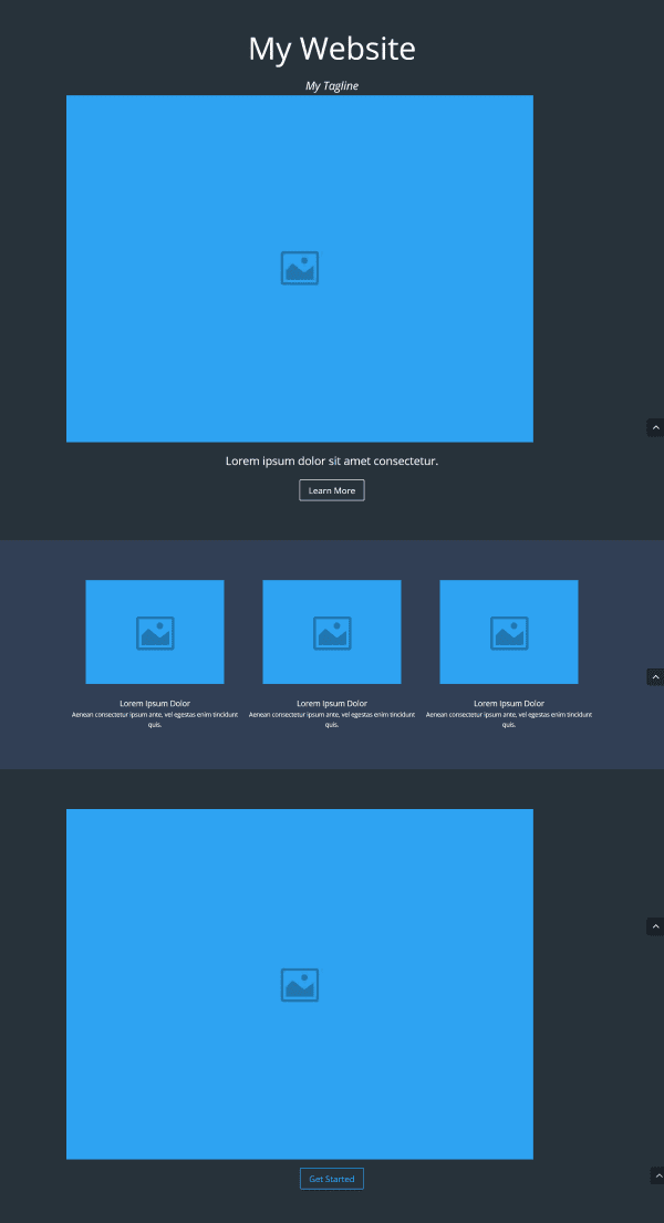
A quick Divi landing page
Clutter is your enemy. It causes your readers to become distracted and not pay attention to your offering. Many website owners use a design that they like and then try to add a CTA. The problem is often the design wasn’t created with conversion or a CTA in mind. Remember Where’s Waldo? Don’t make your CTA Waldo!
Using conversion design principles, you can design the website with conversion in mind and it won’t feel like you’re tacking it on after the fact. Conversion design reduces the clutter and lets your visitors see what you want them to see – your CTA.
Some Points to Consider
A good campaign will have an attention ratio of one, meaning it will have one intended action with no distractions. If there are 19 other links then the attention ratio will be 20:1, giving readers 20 possible clicks and one intended click. You want a ratio of 1:1, giving them one possible click with one intended click. With fewer links to distract the reader they are more likely to notice your CTA and respond favorably.
Web copy also plays an important role in conversion, but great copy will be ignored if the design is distracting, cluttered, confusing, too flashy, or just plain ugly.
Your CTA should be above the fold. It should catch your reader’s attention but not be a distraction.
The most important aspect of a landing page is what conversion rate you end up getting. Landing pages have one purpose – to convert. So it should probably fulfill that requirement, don’t you think?
Sidebars often contain CTA’s such as newsletter signups, ads, social links, RSS subscribers, or even comments. But not every website will benefit from a sidebar. Some readers don’t even notice them. Just like any CTA, it should be above the fold. It should be eye-catching, so you’ll want pay attention to color and contrast. If you use your sidebar correctly it will drive your CTA.
Part of conversion design is testing for performance. Every element of a conversion must be tested and improved. If it’s not converting visitors into customers then the design must be reevaluated.
How Divi Can Help with Conversion Design
Divi is a great theme for conversion design. It makes designing for conversion fast and easy. Keep in mind that every page has a purpose, therefore every page has a focus of conversion. Divi’s built-in layouts have this focus pre-built into them.
If you want to rearrange your page elements then simply drag and drop until you have the layout you want. The layouts are clean and easy to edit. For more information about using Divi to design for conversion see the article How To Design For Conversion Using The Divi Theme.
Testing Conversion Design with Divi Leads
Divi’s newest feature, Divi Leads, can help improve your conversion design through testing the performance of your page’s elements. By testing sections, rows, and modules you can test your conversion design in landing pages, sidebars, and more. In this section, we’ll take a look at testing some conversion elements and see how the test results can improve the design.
In these tests, I’m using newsletter subscriptions as the CTA. When designing newsletter forms it’s best to keep them short and clean. Don’t ask for their first and last name, address, etc., if it isn’t crucial to your campaign. Just ask for their email or first name and email. The more fields they have to fill in the more they will feel overwhelmed and ultimately less likely to convert.
A quick note about these test results – I’m simulating the tests just to show you the charts. In reality I would want more data before making a decision. The more data you have, the more accurate the test will be. Also, many things could be considered a conversion. It depends on the goal of your site.
Conversion Design in Landing Pages
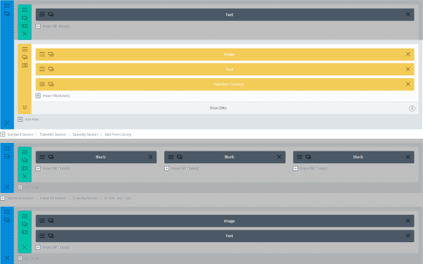
I’m using Divi’s standard landing page layout and then replacing the Call to Action modules with a text box that contains shortcodes for Bloom. I realize that Divi includes an email optin module, but I want to use Bloom’s design features. Divi’s email optin module, Bloom, or any newsletter signup form will work. You could even test them all against each other to see what gives you the best conversion.
I want to perform several tests. The first is to place the image and optin form side by side vs over and under. The winner of that test will move on to the next test.
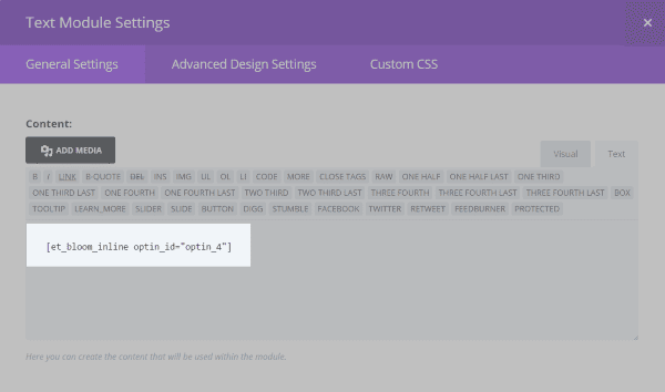
Adding the Bloom shortcode.
After placing all of my modules I went into each module and placed the shortcode for my Bloom newsletter subscription form.
Row 1

Row 1 places the form under the image. I decided that this form allowed readers to sign up for an event, so I also placed a number counter to show how many seats are available. This way readers will know they have to sign up quickly if they want to attend.
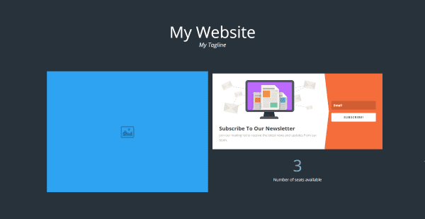
The result is a clean layout that draws attention to the signup form.
Row 2

Row 2 places the signup form under the image with the number counter under the form.
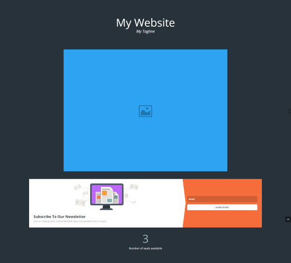
The page is clean and draws attention to both the image and the signup form. Now I just need to run the test for a while and see which of the two layouts get me the best conversion.
Results
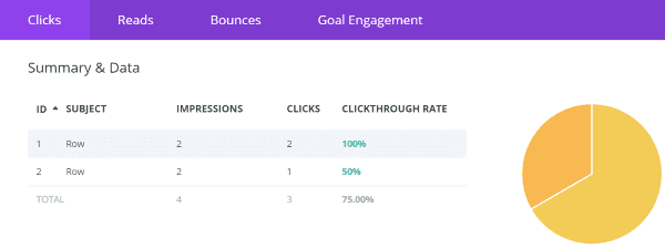
The click rate shows that row 1 was more popular than row 2. With the same number of impressions, row 1 received twice as many clicks, giving row 2 a higher bounce rate. Row 1 is the obvious winner in this case. Next, I can continue to test the design by using different colors for the form, different text, different form layouts, etc.
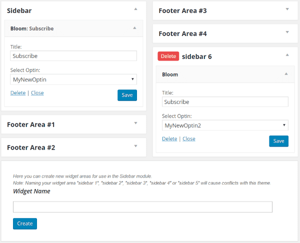
Fortunately, we can use Divi Leads to test a layout with sidebars, too. Divi has an interesting layout feature when it comes to sidebars. You can use the regular sidebar, or you can choose a layout with its own sidebar. You can also turn off the sidebar (by deleting the module or adjusting the settings to not be visible on certain devices), so you can test which works best for your layout. Another advantage to using a layout with its own sidebar is you can build a sidebar for specific pages and posts.
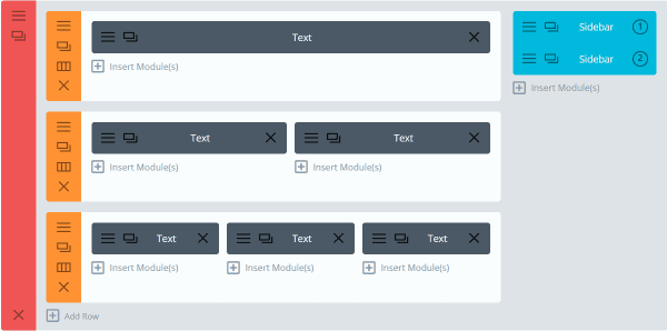
For this test, I loaded a blog layout with a right sidebar. I then set the Divi post settings page layout to not include a sidebar. This is great for testing sidebar locations and elements. In this test, I’m continuing to test the email forms.
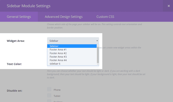
The settings within the sidebar allow me to choose which widget area I want to use. This way I can load different widgets within the various widget areas and test between them. For the first sidebar, I chose Sidebar. For the second sidebar, I chose Sidebar 6.
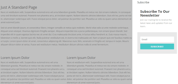
I created several different email signup forms, each with different colors and styles. Then, I created an A/B test to see which newsletter signup form was the most successful. I’m using Bloom (which has its own A/B testing feature) but I’ve chosen to do the A/B testing with Divi Leads so I can make changes with other widgets.
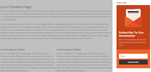
Even though all of Bloom’s built-in designs will look great, you can still A/B test your own styles, colors, fields, etc. to see what works the best.
Results
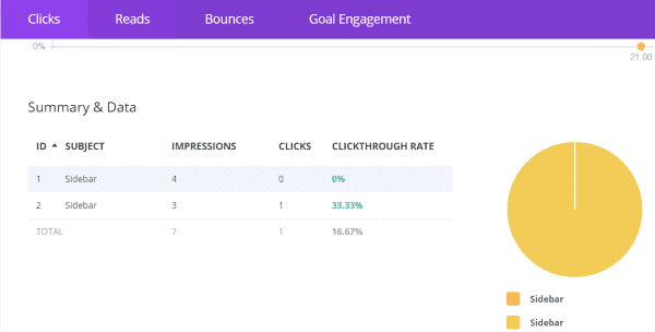
The second sidebar had fewer impressions but more clicks.
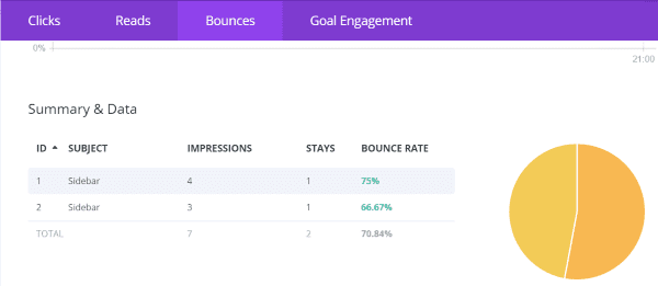
We can see that the first sidebar had a higher bounce rate. I ended the test and used the second sidebar. I’ll continue to test and use the sidebar that gets me the most conversions.
Once I’ve determined which form I want to keep, I could test the entire section against a section with the sidebar on the left or against a section without a sidebar but with the form within the section to see which performs better. Ultimately, my design and layout choices will be determined by conversion.
Final Thoughts
Conversion design is easy with WordPress and Divi. Divi Leads give you the tools to improve on your designs. Using conversion design principles, you can use Divi Leads to test your designs and get the best conversions possible.
Your turn! Do you incorporate Conversion Design principles into your WordPress website? Do you have anything to add? Let us know in the comments.
Article thumbnail image by Vadym Nechyporenko / shutterstock.com


I was only wondering about A/B testing sign-ups this morning, and voila! Thanks for this, Randy. 🙂
This is a really neat feature.
Thank you for the great post. I had an important question, anyway. Can you reassure us that using Divi Leads would not affect SEO, in terms of so called “duplicate content”?
In other terms: the fact that we display almost the same content to the users to test which element drives a better conversion rate, could be considered by the search engine as a duplication of the same content, and as such affect the ranking of that page? I would be very grateful if you could answer to this question.
Again, I find your article very interesting. Thanks a lot..Lillo
thanks for a really nice guide, does Divi leads support A/B testing?
Yep. Divi Leads supports A/B testing and multi-variant testing.
Just wish my customers would be as interested. When they fiddle with things without even thinking of the impact on conversions.
Studies have shown people are more convinced by arguments that tap into their innate “loss aversion”. So maybe you could make a case for how bad design decisions are actually costing them money?
That was just what I needed! Thanks! I was worried about conversion related with the design and your post is great. I can not wait to change everything!
Hope it goes well!
Love the article, wish I knew where to do the AB Testing.
This might give you some ideas on where to start!
http://www.elegantthemes.com/blog/community/10-conversion-rate-optimization-techniques-you-can-test-with-divi-leads-divi-nation-short
Useful article. Especially the thing with color psychology. I will try this with my new website. Thank You
Great article about conversion design. I’ve based my web design business (though young) on these principles and always love hearing more about how to improve conversions!
Thanks Jeremy. Good luck with your business. As you know, conversion design can be a highly specialized topic and well-worth investing time in.
Great article with great examples to try out. I haven’t used Divi leads yes so this would be an excellent start on my own website.
Thanks Ram! I am pleased with how easy Divi Leads is to use. You can just let it run in the background and come back to it later.
Is there a way of measuring bloom conversions on google analytics. The fact that you can’t direct a subscriber to a thank you page means I can’t record the conversion in analytics.
Also, is there a way to have bloom select MailChimp groups on a list for opt ins?
Hi Amanda,
As far as I know Bloom only records conversions via its own stats tracking. Additionally, there is not currently a way to select MailChimp groups, just lists.
The good news is that these features are on our future updates list. Probably things we will be revisiting after the launch of Divi 3.0.
Best,
Nathan
Oh that’s wonderful Nathan, thanks so much. I’m really loving testing out all you shared in the post.
Divi 3.0….any idea how long for this?
I’m not allowed to give an exact date at the moment but it’ll still be a few months.
hope it will include Material Design
😉
I have to fake it now with custom css.
The FAB (floating action button) is paramount in Material Design and it fits perfectly in the ‘CTA’ design philosophy since the design strategy allows for only one FAB per page, hence FAB=CTA
Thanks Nathan
Hi Amanda,
You can monitor a conversion without having to send the user to a new page with Analytics.
For this, you just have to send a ga event after you process the action you want, here the subscription to the newsletter. I don’t know if there is a hook with Bloom, but if not, we can track the click on the Bloom form submit and execute
ga(‘send’, ‘pageview’, [page], [fieldsObject]);
(replace [page] by a name)
It will simulate a visit to a virtual page called “page” here. You just have to track a goal on the visit of this virtual page.
Hope it’s clear
Bastien, Thank you so much for passing on this info..
I was going to do some more digging into ga events to see if there was something to record the action, but you have saved me the trouble.
Thanks a lot, off to so some self educating.
I definitely resonate with design aimed at conversion–otherwise you’re left with an online brochure! I have to test out these new Divi features, though. So glad to see this article as it’s laid out very clearly and I like the methodology. Nicely done, Randy!
Thanks Erik!