Nowadays, it’s not enough to reel in visitors to your site, you also need to ‘wow’ them as soon as they hit your home page. After all, there are likely thousands of other sites offering similar services or content to yours, so why should they take notice?
Splash pages are an elegant solution to this problem. They can act as calling cards, or even help you increase conversions if used properly. In this article, we’ll explore the concept of splash pages in modern web design. Next, we’ll introduce you to some examples of different splash pages, before teaching you how to replicate them using Divi.
Let’s dig in!
What a Splash Page Is
Simply put, a splash page is a section of your site that visitors see before entering the main version. They’re usually heavy on the visuals, possibly with a Call To Action (CTA), and act as a conduit to the rest of the site. Here’s an example of a modern-looking splash page, courtesy of L’Avenir Dental Clinic:

While splash page usage has declined somewhat (partially due to User Experience (UX) concerns), they do offer some great benefits such as:
- Drawing the attention of your visitors to a particular message or design element.
- Enabling you to communicate critical information to your viewers.
- Providing an opportunity to increase your conversions by presenting them with prompts to subscribe, or similar.
Although their prominence has waned, the concept of a splash page has evolved to incorporate full-screen headers these days, as they can provide many of the same benefits as standalone splash pages.
That being said, traditional splash pages are still viable for some applications such as:
- Creating a beautiful visual prelude to the rest of your site.
- Posting legal disclaimers for websites that require them (think adult content or gambling).
- Choosing your preferred language.
- Sharing important news with your visitors (although we don’t encourage this route unless it’s truly important).
- Prompting users to subscribe to a mailing list, thus driving conversions (be aware of the UX considerations though).
- Offering premium membership access to your membership site or course by setting up a paywall using a plugin.
With that out of the way, let’s explore some outstanding examples together, and find out what sets them apart from the rest.
6 Examples of Awesome Splash Pages
For this section, we’ll focus on splash pages with exceptional design, outstanding usability, or both. As we alluded to, many splash pages are presented as full-screen headers. Let’s kick things off with an example to highlight this modern take on splash pages.
1. CoLofts
The CoLofts website showcases a full-screen header with a muted background that highlights its logo. For all intents and purposes, this header acts as a splash page. It’s there for purely aesthetic reasons, and the only navigational function it includes leads further down to the rest of the page.
2. Make It Perfect
Our next example – Make It Perfect – showcases a retro trend in splash pages. It includes a loading bar, which feature rarely on modern websites these days, and with good cause. Average internet speeds have gotten faster and our patience worn thinner with long loading times. Ideally, this site wouldn’t need it, but the loading bar is still an attractive take from a bygone era.
3. Ape Unit
This splash page (courtesy of Ape Unit) offers a good mix of usability and design. In fact, you could say the entire main page is a succession of splash pages leading to various case studies. If you’re a design professional, take note – this is one of the most unique portfolios we’ve run into lately.
However, it’s not without its drawbacks – a lot of people could potentially be more comfortable using a traditional navigation system. In our opinion, merely adding a hamburger menu would improve the site’s usability.
4. Labcase

Labcase is one of the rare websites that do animated splash pages properly. Firstly, you’re greeted with the site logo, then you’re shown a very concise summary of what the product is, before moving onto the rest of the site.
On paper, this doesn’t sound like the best of designs, but it works. Everything – from the minimalist logo, to the fonts they use, and the timing of their animation – hits the spot. Animated splash pages don’t offer any benefits from a usability standpoint, but if done right, they can look great.
5. Harbr Co.
In other cases, such as Harbr Co., designers have opted to take the concept of animated splash screens one step further by using background videos. When put together with full-screen headers, background videos make for very attractive splash pages. The biggest downside to this technique is that you may drastically increase your loading times if your videos aren’t optimized.
6. friiio
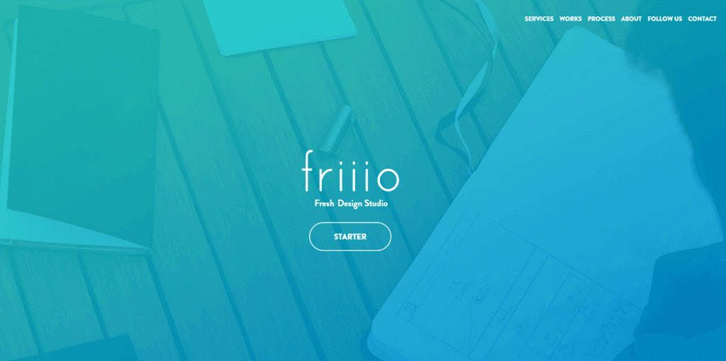
As far as we’re concerned, the best modern splash pages need to offer a good mix of usability and design. Due to this, we’re big fans of websites that take the concept of splash pages, and mix them with traditional navigational methods such as calls to action and links to other sections of your site – much like friiio.
We’ll admit, the above example isn’t a traditional example of a splash page. However, that’s not necessarily a bad thing. It’s clearly inspired by the splash pages of old, but adjusted to include modern web design trends. Consider this type of hybrid design for your next project if you enjoy the aesthetic of splash pages, but are also a big fan of keeping things usable.
How to Build a Splash Page Using Divi
Divi includes a predefined Splash Page layout, which can save you some time when creating one. To load it, create a new post in your WordPress dashboard, then enable the Divi Builder. Next, click on Load From Library:
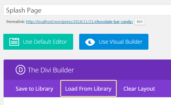
From here, choose the Splash Page layout by clicking on Load:

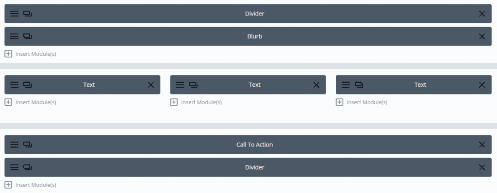
The Divi Splash Page layout consists of a Divi Blurb module – which uses the Divi logo by default – and three separate Text modules. There’s also a CTA at the bottom (which should lead to your home page) and two dividers, which we can ignore for now:
When seen live, it should look like this:
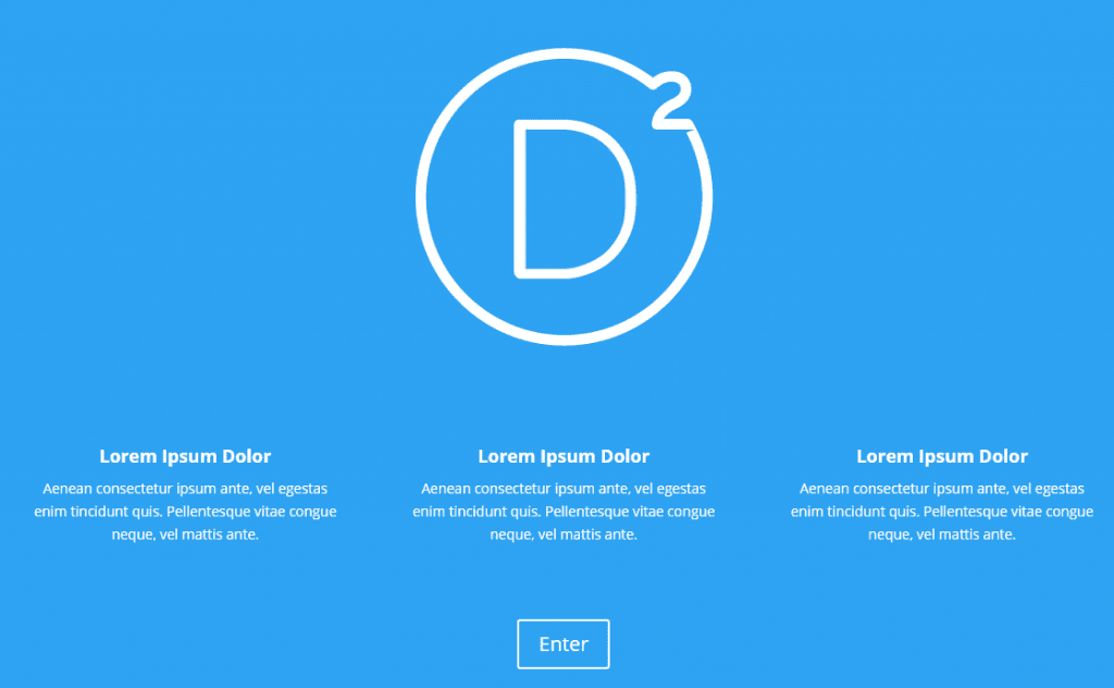
All it takes is a few minor changes to make it your own (using the options with the module’s settings). It’s the perfect way to deliver relevant information before the home page:
On the other hand, if you’re fond of a more modern-looking splash page, simply create a Fullwidth Section using the Divi Builder, and add a Fullwidth Header module:

The Fullwidth Header module includes settings to make it full screen, add a scroll down button, and an overlying logo – all of the elements you need to create a modern splash page:

Conclusion
Splash page usage has lessened in recent years, and they’re definitely not a perfect fit for every website. Despite that, web designers have managed to turn the concept on its head, reimagining the splash page’s role in modern web design.
How you choose to implement your splash page is up to you, but if you’re using Divi, take note of the following steps:
- Check out the predefined Splash Page layout that ships with Divi, and tweak its settings to perfection.
- Alternatively, use the Fullwidth Header module, turning on the Fullscreen and Scroll Down button options, then adding a logo.
How important are splash pages for your website? Subscribe and share your thoughts with us in the comments section below!
Article thumbnail image by RedlineVector / shutterstock.com.









I am new to Divi. Trying it out before deciding whether to buy it yearly or for lifetime or even at all. I wanted to start with a splash page to catch attention of visitors. So I found myself on this page and your tutorial does not match what I see when I try to follow your instruction. I don’t get a load form library option when I start a new post after clicking on the Divi builder. When I then do find a pop up with add from library there is nothing there to add!
How frustrating to just get something as simple as a splash page.
I tried the full width header approach and that is barely any better. There seems to be no way to position the logo image or text sensibly on the background image.
This isn’t seeming very useful so far, I dread to think what this system is going to be like when I want to do something complex!!
Dave
Great review of splash pages. As a graphic designer, I feel this is awesome way to present.
Glad you like it Doug!
What are your thoughts on Video splash pages?
The proof is in the data – if they lead to increased conversions, they’re good! They won’t necessarily work for every audience, but testing and measuring is the key.
Some of us who have been designing websites for over twenty years remember the ‘entry tunnel’ concept by Designer David Siegel. Whatever happened to ‘fish food’?
What is a good time on site and bounce rate for a splash page? Just curious!
How long is a piece of string? 😉
I love splash pages, it sets the tone for the rest of the site. You can also gauge the personality of the organisation from the splash page, I normally continue with the site or leave it right after seeing the splash page.
Good post – has started me thinking.
Not too sure how to use this in SEO terms especially. Do you want this page to come up in search results or do you promote it through other means?
Do you have a separate URL with a link to the home page or what?
Love to learn more.
Thank you for this post.
I think that’s more a decision you have to make for yourself Martin, rather than a question to which there is an objective answer.
I was really impressed by the first example…the dental clinic. I checked and it seems to use java code which doesn’t run with some basic blocking plugins set up (such as my Firefox install). I like to avoid code that will have compatibility issues. I’ll bet such animation could be done entirely with just CSS.
I do, however, make heavy use of splash pages with Divi. There’s no SEO problems if the splash page scrolls down to the content on the same page.
I’ve created a splash page on my site using this that I think turned out pretty well. I had trouble with divi leads since it doesn’t redirect to thank you page so I opted to not use that this time.
I’d really like to see a tutorial for implementing some codepen scripts into a divi module…
http://codepen.io/
Some examples:
http://codepen.io/TimPietrusky/pen/eHGfj
http://codepen.io/stacy/pen/VmydOL
http://codepen.io/davidkpiano/pen/VmMWZW
prepare it and embed it with iframes with proper positions while declaring the iframe in the code module 🙂
Thanks I’ll take a look at these and see if we can do them.
What is the difference with a Header Hero ?
I’m afraid I don’t know what you mean Lycia; could you be more specific?
hi
is splash page works with the 13floor theme ??
thanks
“Although their prominence has wained…”
I believe the word is ‘waned’