There’s a reason why more than 60% of the websites known to use a Content Management System (CMS) have chosen WordPress. It’s an easy-to-use, extensible, and completely customizable solution that doesn’t require a learning curve the size of the St. Louis Arch.
However, WordPress is also open source software – meaning that it’s free. As a result, some people think it’s not suited for corporate use. But in reality, nothing could be further from the truth. Companies that are household names have chosen to use WordPress to keep visitors up to date on current events, trends, and what’s happening with their business.
In this article we’re going to show you 13 corporate WordPress blogs and highlight what makes them great.
1. Vogue
The well-known women’s fashion magazine Vogue uses WordPress to manage its content. It’s a great first example because it dispels the notion that WordPress isn’t meant for sophisticated usage.

The blog is mainly in linear format, making it easy to navigate. It also doesn’t overwhelm visitors with sidebars and subcategories. Still, there’s an essence of classiness about the layout that’s a perfect fit for the overall mission of the magazine.
So why’s it great? With its large, vibrant images and sparse text, Vogue is a great example of how to utilize white space. It mirrors the sleek, professional vibe that Vogue oozes at every turn, and makes the website easy to browse and navigate.
2. BBC America
BBC America is another example of a great blog that uses WordPress. Older fans of British programming who remember watching shows like Doctor Who on public television years ago are grateful for the existence of BBC America. The network brings to cable and satellite subscribers the opportunity to enjoy some of the best in Western entertainment.
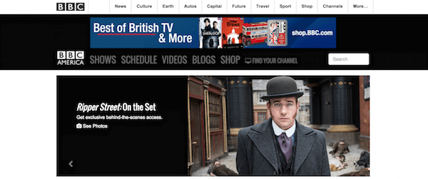
It features some of the more common bells and whistles, but not in a way that seems either too plain or too overpowering. The slider at the top gives visitors the opportunity to see what’s most important, at least according to the editors. The menu enables easy navigation to categories of interest. The blog is presented with a linear layout so, once again, it’s simple to understand for first-time visitors.
So why’s it great? By making use of the slider and menu features, BBC America enables the reader to go straight to the content they want, without having to sift through programs they have little interest in. Making your website navigable is of highest importance.
3. Van Heusen
The clothing label Van Heusen also uses WordPress for its website. It takes its commitment to WordPress a step further, though, by using WordPress VIP – an enterprise solution for content management systems that includes cloud hosting and support.

WordPress VIP also offers users hundreds of plugins. One of those plugins is immediately visible to first time visitors: a pop-up that asks the visitor to enter an email address to receive promotional offers. This is one of the main ways that Van Heusen builds its mailing list.
So why’s it great? Learning where to place an email pop-up, and what it should look like, to gain the most subscribers is clearly something Van Heusen got early on. Clean and simple, it is unobtrusive and professional.
4. Sony Music
Sony is a household name for a number of reasons, not the least of which is its contribution to musical entertainment. Sony Music operates a blog, powered by WordPress, that keeps fans informed about what’s going on with some of their favorite recording artists.

The blog is relatively simple, with the main section taken up with recent news and associated labels. Visitors can simply click on the scrolling slide displaying their favorite artist and be taken immediately to a page that will provide them with further information about the entertainer, as well as giving them the opportunity to buy recordings.
So why’s it great? Sony actually has very little on its front page apart from the eye catching main scroller. It’s easily navigable and presents a beautiful photograph of some of the greatest musicians – past and present.
5. IZOD
The sportswear brand IZOD uses WordPress to prove that less really is more. People who visit the blog for the first time will quickly realize that there isn’t a whole lot on the front page, but there doesn’t need to be.

The website designers have concluded that three or four window panes of information are more than enough for people who arrive at the site’s home page. Similar to Van Heusen, they utilize the pop-up on their front page to increase their number of email subscribers. At the time of writing, people can click on one of three large images to shop golf, polos, or the company’s favorite looks.
So why’s it great? IZOD really focuses on its images to draw visitors in, with barely any copy on its front page aside from a few navigation labels.
6. PlayStation.Blog
There are few online fandoms more dedicated to their hobby than gamers. That’s why Sony knew it would be important to present a blog that would appeal to the gaming community.

PlayStation.Blog does just that with WordPress. The home page is busy, but that’s okay in this case because gamers are accustomed to being a bit overwhelmed. One of the best features of the blog is the noticeable “Feedback” tab on the right that gives visitors an opportunity to tell Sony what they think about the company or the website. That’s a commitment to customer service that won’t go unnoticed.
So why’s it great? Sony have really focused on their target audience here, with a busy vibrant front page that highlights the sheer number of events and games that are currently happening on the playstation. In general, people visit the Playstation blog for news, and the layout really reflects that.
7. Forbes
Forbes has long been regarded as one of the “go to” sources for financial or business-related news. It’s no surprise, then, that the company chose WordPress as its CMS.

What’s great about the site is the way that Forbes monetizes it. People who click on links from external sources to Forbes articles aren’t immediately taken to the article. Instead, they’re taken to a page that presents an advertisement and the user is only allowed to skip the advertisement and visit the page after a few seconds.
So why’s it great? Forbes’ redirection of traffic is a great example of monetizing content without being too overbearing. Including a skip feature (that counts down quite quickly) is a must with this strategy, or visitors will become annoyed and navigate away. It is also clearly branded as Forbes, meaning people won’t think they’ve hit the wrong website while navigating to Forbes.
8. Xerox
Who hasn’t heard of Xerox? Although the company isn’t quite the staple that it once was within the business community, thanks to digital cameras and all-in-one printers, it’s still a viable brand name that maintains a presence online.
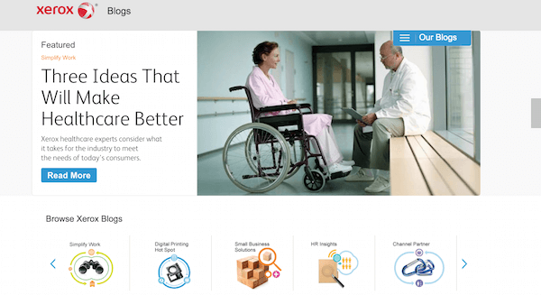
One of the ways that Xerox maintains that presence is with a blog powered by WordPress. It’s an especially clean layout, but what stands out best is the side scroller just below the header that allows visitors to click on a “specialty blog.” People who are interested in productivity enhancements, digital printing, or small business solutions can click on the icon of choice and be taken to a blog that offers relevant information.
So why’s it great? The segmentation of blogs through an attractive slider means that site visitors can easily narrow and locate the specific information they’re interested in. Having it in an eye catching and prominent place endears customers to the brand even further.
9. Time, Inc.
Time Magazine has been a staple in American journalism for decades. However, its parent company manages other news magazines as well, including Fortune and InStyle. That company also manages Time, Inc – a blog powered by WordPress.
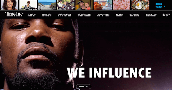
What stands out about this blog is the row of thumbnail photographs at the very top. Those photos represent news that might be of interest to people visiting the blog and are presented with no headlines or text – unless you hover over them. People who are interested in reading more about a particular subject can simply click on the appropriate thumbnail.
So why’s it great? Immediately when you navigate to the site you are hit with color and movement. By having a video that automatically plays the reader is draw in, and splashes of color continue all the way down the front page.
10. The New York Times Company
The New York Times is more than just a newspaper. It’s also a company. As such, it has job openings, provides financial information to investors, and has a store. The online presence for that company is managed with WordPress.
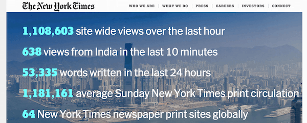
The blog is a great design because it manages to fit all of the important links on one page without causing any confusion for visitors. The site also has a fixed header bar so that people who scroll down will still be able to access the top-level menu items.
So why’s it great? The New York Times site is a surprise to most visitors, as there is not one news story immediately visible on the main page. Instead they present you with a list of facts overlaying a striking visual.
11. GoodGame Studios
What’s better than a fun video game? A fun video game that’s also free.
GoodGame Studios is the producer of free video games that people can play online. It uses a WordPress blog to advertise some of those games.

The blog is awesome because the first impression a visitor gets when visiting it is: “This is a blog about gaming”. It features embedded cartoon images, but still maintains an atmosphere of professionalism. It also presents two links at the top of the page that will take visitors straight to its games.
So why’s it great? This site really reflects that it’s for the people who play its games – from the bright primary colors to the large advertisement for their latest game. Their aim – to get you playing games – is perfectly clear from the minute you hit their site.
12. Inside BlackBerry
BlackBerry has a series of official blogs and they’re powered by WordPress. It’s easy to navigate to any one of the various blogs offered by the company. They’re listed at the very top of the page.

The menu is an excellent example of a navigation tool that’s based on categories, which are used by WordPress to segment various blog posts by subject. It’s usually very easy for WordPress administrators to create a menu from the blog’s categories, but this blog shows that it’s also a very powerful way to create an easy navigation tool.
So why’s it great? One thing Blackberry does well it to present its social media icons very visibly and in more than one location. That means BlackBerry values the importance of connecting via social media, and wants the customer sharing their experience at every possible moment.
13. Reuters Blogs
Reuters is well-known for being a news service. However, it also offers opinion. The news company presents its opinion columnists on a series of blogs powered by WordPress.
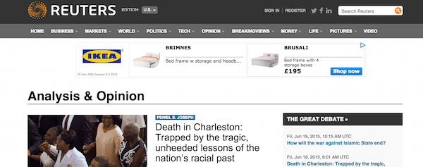
There’s quite a bit to like about the Reuters blog. It has a concise, but readable interface enabling people to quickly navigate to their favorite columnists. It also has a category-based menu at the top.
So why’s it great? One of the best features of the site is something that’s common to a number of WordPress blogs – a section that lists the “most commented” blog posts. That way, visitors who want to jump right into a hot conversation can do so.
Wrapping Up
So there you are, a list of 13 great corporate WordPress site and something little that each of them do to make their website really stand out. The main thing to take away from this is to think about your audience. What will make them visit and stay on your page – vibrant imagery, uncluttered and professional, bright and busy?
Have you got any favorite corporate WordPress websites? What makes them great? Let us know in the comments below!
Image Credit: Vector Goddess / Shutterstock


good theme but how to install them
Hi Maya, these are not themes but examples of blogs built with WordPress.
Forbes, Sony , Xerox, Time are my favorite .
They really design it very well and also the message is very clear and crisp.
I think Huffington Post also uses WordPress. I am looking for a theme that has Post pages in their style. Maybe Elegant Themes can sometimes work on something like that..
Great list of corporate blogs. Most of the blogs you have shared in your blogs are new to me. Surely I’ll go through these blogs. Thanks for the awesome share.
Your selection is great. I like Time and Sony Music the most. But overall, this is a great list.
Great list – it just shows how powerful WordPress is, yet simple to use at the same time. Gives you the confidence to pick WP as your CMS and stick with it!
Based on my interests, I like PlayStation Blog, Forbes and CNN sometimes.
With so many huge brands going for word-press, no wonder this open source and seemingly modest CMS, couple of years back, has come of age. This speaks volumes about the strength and flexibility it acquired over the years.
This is a great list to show prospective clients when they say, “isn’t WordPress just for small companies?”
It is comforting (and humble?) to know that these 13 also made WordPress a part of their lives.
CNN,s sites are all WordPress.. ac360, main CNN site and all.
OK, OK.
But none of these companies runs wordpress in its main website.
Why?
It really depends on what you’re doing. I find WP to be a good fit for smaller websites with minimal content requirements but as soon as you start building bigger corporate websites with double digit page counts, content that needs to each other with a bunch of taxonomies, have multiple post/content types with custom fields, or simply need better asset management, WP starts to break down pretty quickly.
Hi David!
In your opinion what kind of CMS fits that kind of companies better?
Could be that some of those sites are doing stuff that is non WordPress that only a piece of the site is WordPress only. That is not a bad thing though.
Good and resourceful! But why isn’t many banks using WordPress to power their information/news site? Can we point to lack of awareness or some other breed of developers who doesn’t fancy WP discourage them?
Security being the number one reason. Banks are huge and pay millions to big agencies or security firms to custom build multiple dedicated servers and build their sites using languages different from PHP. They interact with legacy scripts to transfer funds and other currency. They manage millions of users on multiple databases from different locations around the world and sometimes different companies(Stock markets and mutual funds). With that said, setting up an information site or blog using PHP and mySQL with an open source platform on their custom servers would be extra effort that wouldn’t make much sense. WordPress is awesome, but its incompatible with this type of business.
I like the Reuters blog. Where is the template for that available?
It’s a custom theme designed for them, and it’s not for sale.
/*
Theme Name: Reuters Landing Page
Theme URI: http://blogs.reuters.com
Description: Reuters Blogs landing page
Version: 1.0
Author: Michael Pollett & Rob Sumner
Author URI: http://www.coreware.co.uk/
*/
That is what I found on the site..
Corporate Blogs are one of the most important tool for gain customer loyalty and for the feedback of the customers, and of course WordPress is the best choice.