An award-winning blog serves up information to readers like a five-star restaurant. Taxonomies are the menu advertising “food” to both guests and SEO spiders. Categories and tags are part of the active ingredients that make your bouillabaisse bubble with tasty morsels of nourishment that your readers crave.
Simple tools like plugins can make your WordPress website’s blog content super-accessible. Your goal as a publisher is to increase the number of people who visit your website year over year with original, exciting content. However, I will suggest that while your content must follow the taste of your readers, your basic WordPress physical structure remains consistent.
Consider your blog layout like comfort food. Key ingredients like perceivability, operability, understandability, and use of assistive technologies, are discussed as part of the Web Content Accessibility Guidelines (WCAG 2.0) relating to the technical aspects of WordPress theme accessibility. I want to suggest, in comparison, tools and tips that make your page, your post, and your blog content super-accessible. Let’s use a restaurant menu as a model.
Assess the Physical Structure
People who sit down at a table in a restaurant and look at a menu know why they are there and what they want. Your home web page, if not the entire site, is like a restaurant menu.
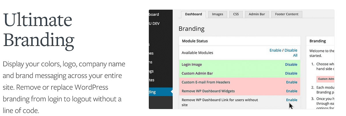
Physical access and consistency are critical because your readers already know why they are viewing your pages. The fact you have, for example, a consistent and recognizable color palette and font family, helps identify your “brand”. One tool that helps organize colors, logo, and overall online presence is Ultimate Branding v1.8.1.5.

In terms of basic layout, consistent use (or perhaps a more significant non-use) of, for example, a left-hand or right-hand sidebar not only identifies your “brand” but gives your readers a more predictable, comfortable “feeling” as they focus on your content.
However, a general website’s silo architecture doesn’t have to be boring because your chosen topics are organized into separate areas or pages. If you want to change the look and feel of one or more of your WordPress pages or posts while keeping the overall structural consistency of your website, use Multiple Themes v7.1.

Using assistive technologies like GSpeech v2.0.1 not only reflects well in terms of WCAG 2.0 mentioned above, but also adds both novelty and convenience to your pages. Consider using a text-to-speech plugin, not only for your readers but also as an aid to editing your content. Zoom v1.2.6 is a plugin that enables your readers, in a similar assistive way, to customize the size of a predefined area in your website.

Consider using WP Accessibility v1.4.3 as an overall check of your online presence. I have this plugin as my personal pick because of minimal setup time, and reliability in finding and correcting many common accessibility issues.

The above tools and tips address the physical appearance of your website in terms of recognizable branding, theme, and pages. Returning to our restaurant theme, it’s much like looking at a fancy, leather-bound menu or simple, laminated listing of Today’s Specials. The accessibility of content listed inside the menu is also important because the way you describe your food determines whether or not your reader or a search engine web crawler will want to “consume” it.
Have a Logical Structure
People read a restaurant menu to decide what the restaurant is offering. The faster a person understands how a restaurant menu is organized, the faster they find what they want to eat. In a similar way, search engines use content layout to determine page ranking, which in turn provides greater accessibility to your content.
Accessibility is not just about adjusting for a reader’s impairment. Search engine web crawlers (commonly called spiders) rank your website and make your content super-accessible by collecting the best information (in terms of originality, content value, and freshness) in the fastest, most direct ways. You need to include navigational guides and contextual directions in your content to help your reader and the search engine crawler find their way to your target.
There are several excellent plugins that help make your content super-accessible. Yoast SEO v2.3.4 and SEO Ultimate v7.6.5.7 are two very popular tools every WordPress publisher should consider using to help super-charge their website and the presentation of their content. Simple changes like adding a breadcrumb trail – the navigational aids on a web page that track where a reader is located in a website – helps readers and search engine web crawlers find their way through your content.
Consider Pretty Link Lite v1.6.8 (and the premium Pretty Link Pro) or adding a Link Library v5.9.9.8 as additional ways to “dress” your hyperlinks and improve access to your data. A plugin called WP Post Navigation v1.2.3 also adds navigational markers “Previous” and “Next” to the Edit Page in your administrative area.
You want to avoid search engine penalties if you are considering using SEO plugins or adding page structures that cross-link your content. Some of these third-party plugins offer easy-to-use features that enable you, for example, to activate selectively the index or follow functions associated with layout components. Look for this capability in, for example, Yoast SEO v2.3.4, under SEO/Titles & Metas, in specific tabs for Post Types, Taxonomies, Archives, and Others.
From a bird’s-eye view, super-accessibility is all about knowing where you are, where you have been, and where you want to go. Yoast SEO v2.3.4 and other plugins like Multisite Sitemaps v1.1 by WPMU DEV automatically generate sitemaps for search engines. The WPMU DEV plugin has the additional benefit of automatically creating and updating these maps for every website in a WordPress network.
Organize Content Into Taxonomies
Sometimes a restaurant has separate menus for breakfast, lunch, and dinner. In fact, many restaurants offer a separate wine listing! Separating your material to make your content super-accessible is part of the silo architecture I mentioned in the first section about physical layout. You can also logically organize your general “post” content into hierarchical categories and informational tags that match your content and your business. These logically ordered lists are called taxonomies.
Taxonomies can make content super-accessible, much like a more-specialized restaurant simplifies their offering with a price fixed menu and a complete but pre-selected multi-course meal. Imagine a search engine spider accessing the website owned by a small French restaurant. The restaurant has a streamlined listing of only a handful of specially-selected entrees, making it far easier to index.
You can use plugins like Types v1.7.11, Custom Post Type UI v1.1.2, or Pods v2.5.4 and their premium add-ons to add or replace the more general “post-type” object with a custom post type (commonly called CPT) designed specifically for a custom website. This is an advanced example of super-accessibility because the WordPress installation is changed to exactly match the needs of a business or expectations of a reader.

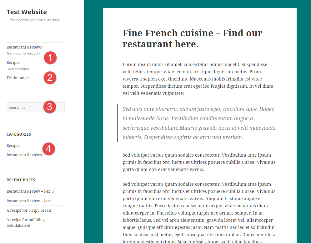
Exhibit 1: A sample web page with custom post types
Exhibit 1 shows how a reader would see listings of either recipes or testimonials, rather than a generic post-type category or tag label. This graphic is a combination of several different features. Listing #1 and #2 are the new post types. You would typically not include, for example, the generic category widget at location #4 if you modified your theme with CPTs. The search box #3 can also be modified.
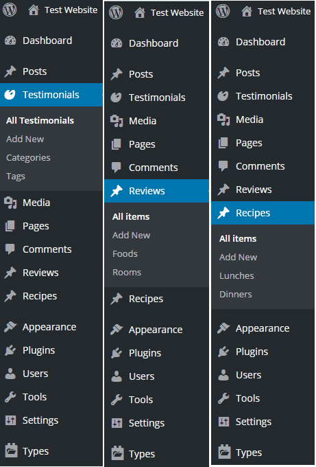
Exhibit 2 below shows different examples of the same Administrative Panel after a “Post” post-type, Testimonials, (with categories and tags) and Custom Post Types, Reviews and Recipes, are added. Notice how the CPTs have their own taxonomy as compared to the typical Categories and Tags listed under Testimonials.

Exhibit 2 – Samples of a customized Administrative page
I have used plugins and their theme-modifying tools to add custom post types, labeled Recipes and Testimonials, to this website. Notice how both the web page and Administrative Panel pages are modified. The new taxonomy associated with each new post type includes advanced features based on the design of the plugin you use. Developers can now build customized applications based on unique data types. This advanced approach modifies how you handle your data, changes your theme, the way your readers see your content, and the way search engine spiders crawl your website.
Last but not least, niche software products like Gwolle-GB 1.4.4 or Visual Recipe Index 1.2.8, specifically designed for the food-serving industry, might help our restaurant improve access to their content. Leverage the experience of other designers – don’t forget that super-accessibility is giving people not only what they want but what they expect. As previously mentioned, help readers focus on your message by providing them with a consistent and familiar scheme or layout. You expect to read a menu when you go to a restaurant!
Summary
What is often taken for granted or overlooked are the keys to making five-star cooking super-accessible: simple ingredients, original composition, and clear presentation. It works the same way with WordPress websites. I have suggested tips and tools that will make your content available to larger numbers of readers.
Super-accessible content is like bringing out the flavors of familiar comfort food. If you keep your meals fresh and balance your ingredients, you will leave your readers, and search-engine crawlers, returning for another serving. Bon appétit.
How do you ensure your content and website is super accessible? Let us know in the comments!
Thumbnail image by Ikon_Grafix / shutterstock.com


Hi Tom!
This is a wonderful article. I enjoyed it lot while reading. I like the point “Organize content into Taxonomies”. Yes you are right, Taxonomies can make content super-accessible and more specialized.
Thank you for sharing.
Regards,
Sreekant
Please fix the images links on this, and other, pages. The site is losing value with each broken link.
The main reason I routinely visit a site is a direct result of its substance and not the site structure. I couldn’t care less if the eatery I frequently eat is unattractive for whatever length of time that the nourishment being served is perfect and tasty.
While the site layout is a contributing factor to the overall impression, the content is something you should focus on. A visitor who knows what he is looking for will not hesitate to go elsewhere when he feels that you do not have what he needs. So do not overdo your design, focus on informative and engaging content.
Great article, very informative and easy to understand. I really appreciate..!!
@Tom ewer
In every fields content is the boss. If content is not attractive then you can’t get visitors.
Content should be unique .
Regards
Priyanka
Great article 🙂
…….
Now all the Divi theme tutorials and resources are available at one place. Currently we have over 450 tutorials in the directory and we’ll add more each day. Hope you guys find this website helpful.
http://divi.tutsdirectory.com/
Thanks.
Great article!! Thanks for the information.
The only reason I regularly visit a site is because of its content and not the site structure. I do not care if the restaurant I regularly dine is unsightly for as long as the food being served is clean and delicious.
Fantastic article !
I have just one suggestion… many people friend of mine here in Spain ask me why you don, t translate your tutorials in Spanish to make it easier for a lot of spanish people ( not only spain also all southamerica ) you could increase your customar 😉 thanks
When I read your section on Ultimate Branding, I thought, “Hey, wow, this looks great! This is just what I need for my clients.”
Then I went to their site and checked the pricing. And gagged.
I’m sure this is not a problem for many developers (AND their clients), but good grief! $19 or $25 A MONTH?
If it were that much a year, I’d certainly be interested, but to charge that much for each month is just out of my comfort zone.
I might be alone in this feeling – but I don’t think I am – I am very negative about any business that wants to charge me every month, especially when they don’t deliver anything extra each month. Hosting service I can understand. They DO give me something every month.
But for a plugin or addon, I get it ONE time and then they want to charge me each month? No thank you.
“BUT WAIT!” they will wail. “You get SUPPORT and UPDATES…” Ppptthh.
If the plugin doesn’t work when I first get it, then I don’t want it. If it’s so obscure that I can’t figure out on my own how to make it work in less than half an hour (without calling support), then I don’t want it.
WordPress has spoiled us. It’s free. Free themes and plugins have spoiled us. We expect free. Value-added themes and plugins have shown their worth, and sometimes we buy one. Or three.
If someone can tell me how this Ultimate Branding could possibly be worth $300 a year, it would be good to hear. But for now, for me, it’s not worth it.
Do you suggest that we create custom post types for different taxonomies such as ‘reviews’ or simply classify them using tags/categories?
Fantastic article, just in time before my website launches. The zoom plugin will be a great asset for blogging and will be a welcome feature. And the gspesch addon.
Keep up the great blog.