Twenty Seventeen is the new default WordPress theme, recently released with WordPress 4.7. If you haven’t yet looked at the Twenty Seventeen theme then it is about time you did because believe me, you’ll be impressed.
From the point of view of someone who doesn’t generally use free themes, Twenty Seventeen has been a real eye opener. Aimed at businesses, Twenty Seventeen offers a sleek and sophisticated design that has been created to make an impact on customers and clients, and the WordPress community itself.
In this article, we will look at what the Twenty Seventeen theme has to offer in regards to businesses and blogs. We will discuss the key features offered and what can be altered using the new and improved customizer. By the end of this article, you may well be ready to give Twenty Seventeen a try. Or at the very least be better informed about this free WordPress theme.
A Static Home Page
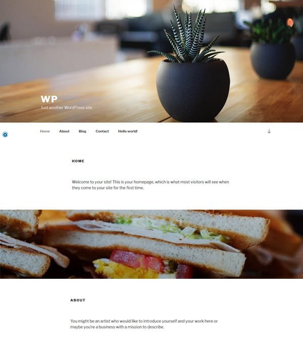
Twenty Seventeen really stands apart from its predecessors with its business focus. This is reflected in the option of a static front page that offers multiple sections. Perfect for displaying important aspects of a business site.
The static homepage provides four content sections. You can select pages to be featured in each area. This enables you to customize your front page to promote the different pieces of content on your site and display information relevant to your audience’s’ needs.
When using Twenty Seventeen in this way, it’s important to add strong featured images to each page of your website, as the featured images are displayed along with each section of the static home page layout. These large images, combined with the parallax effect Twenty Seventeen features, results in a creative and eye-catching home page design.
The static front page provides a great opportunity for businesses to make a good impression. Professional, stylish and modern, with space for all the key information you may need displayed, the design looks anything but free and basic.
A Blog Home Page
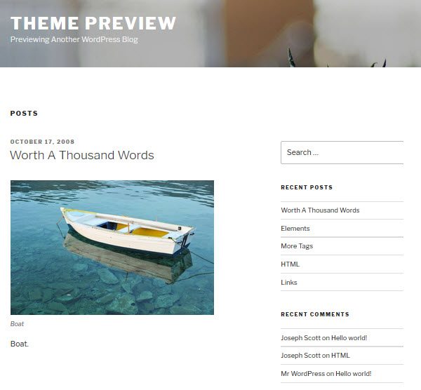
To use a static front page on your WordPress website you will need to create the page and then select it from the customizer. Otherwise, by default, the Twenty Seventeen theme will simply show your latest posts in a typical blog home page format.
Many will use Twenty Seventeen as a theme for a blog. And it isn’t a bad choice. The large header image and spacious layouts, with the option choosing a two column layout, give a clean and refreshing appearance, as well as a great user experience. However, to simply display your latest blog posts on your home page doesn’t really allow Twenty Seventeen to its show off its full potential.
Header Media
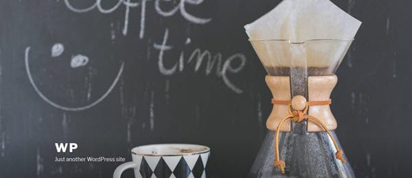
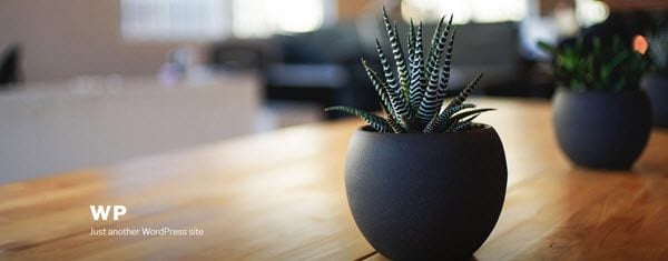
A real standout feature of the Twenty Seventeen theme is the header area. Twenty Seventeen displays a full-size header image at the top of your site, grabbing the attention of arriving visitors. This feature will be especially useful for those in visual industries, who want a large header image to display a photo or image of their work.
Upload a number of header images, then select ‘Randomize Uploaded Headers’. This will display a different image at random each time the page is loaded. This could work well to hold the attention of recurring visitors, as well as demonstrate various examples of your work.
The header also supports video content. Thanks to this, you can easily upload a video and have it playing on your home page. Alternatively, you could enter a URL of any YouTube video you would like to play. The video can be paused if your audience doesn’t appreciate moving images. Regular images can be uploaded and used as a fall back if your video is slow or fails to load.
This impressive header media functionality can have a strong visual impact on visitors. This really helps Twenty Seventeen stand out from default WordPress themes of the past.

Twenty Seventeen supports two menus. Your primary navigation menu defaults to be displayed at the top of the page under your header media. However, as a user scrolls down the page, the menu will stick to the top of the page, keeping it on show at all times.
A social menu can also be displayed at the top or bottom of the page. This menu can easily be integrated with all major social media platforms. These menus can also be placed in widget areas, helping you tailor your site to the needs of your viewers.
The Customizer
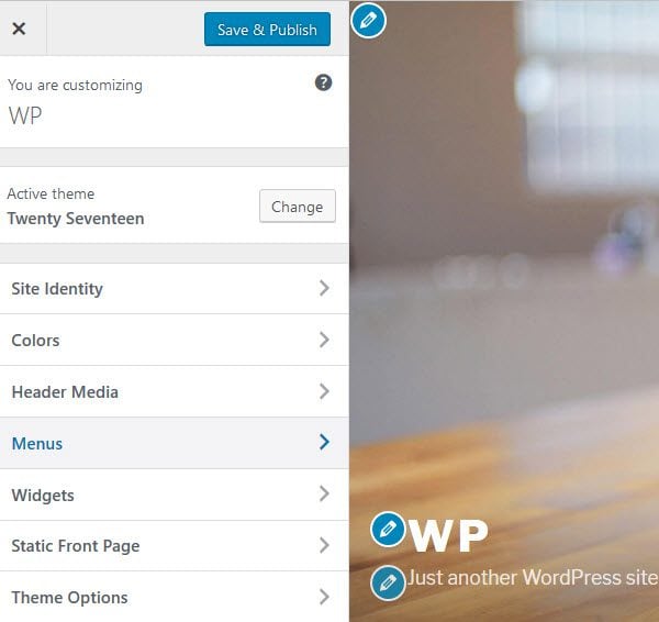
Support for the customizer is another aspect of Twenty Seventeen that has seen the default WordPress theme really up its game. The appearance of your site can be edited through the customizer. Customization work takes place on the front end, in real time. This makes configuring and customizing the theme relatively straightforward. It can also be a fun, relaxed, and frankly extremely fast and effective way of working for beginners to those with extensive WordPress experience.
The customizer now includes a new feature called Visible Edit Shortcuts, a great enhancement for WordPress 4.7. A blue pencil icon for each element is present on every page. If you want to edit a specific element, simply click on the relevant icon. The customizer will then open up on the particular element, ready for customization.
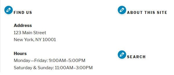
It is within the customizer that you can select a static front page, choose the content for each section of the front page, and configure your header media, menus and widgets. So far so good, so let’s have a look at what other customization options are available.
Site Identity
Under the Site Identity section of the customizer, you can set the site title and tagline. Alternatively, you could remove them altogether. Besides this, you can upload and select a logo and site icon for your WordPress site. Twenty Seventeen will be used by thousands, so it is important to take advantage of these customization options to help give your site more of a unique edge.
Color
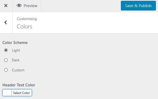
The customizer allows you to change the color scheme, as well as the header text color. Choose from two preset color schemes, light or dark, or select a custom option. For the header text, you can pick from an unlimited selection of colors. This helps you match your site’s style with your existing branding. Again, the customizations of your site’s color schemes help your site stand out from the crowd and enables it to display some originality.
Widgets
A sidebar and two footers make up the widget areas. You can add, organize or delete widgets all from within the customizer. By default Twenty Seventeen uses text widgets in both footers, displaying info about your business and contact information. There’s also a search box so visitors can search your WordPress site. The contemporary layout of the footers and sidebar make the content easy to access for your audience, not to mention easy on the eye.
Additional CSS
Many of us like to customize the appearance and layout of our sites by editing the underlying code. The option of adding additional custom CSS is provided in the customizer, for those who wish to use this feature.
Responsive Controls
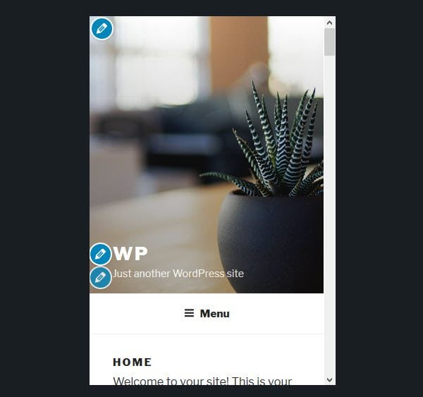
Displayed at the bottom of the customizer are the responsive controls. These allow you to test how your pages will look on tablets and smartphones. It is extremely important to check that your site is usable on different screen sizes.
If a website is not fully responsive, it can lose visitors and potential customers. Google also favors mobile friendly sites when ranking pages, something that should always be taken into consideration.
Dummy Content
The Twenty Seventeen theme includes dummy content, giving users a better sense of what can be done with the theme, how it can look, and how it can be used. This can be particularly helpful for beginners or those who lack creative flair and is another signpost to how WordPress 4.7 is trying to really cater for the masses.
TheTwenty Seventeen preview also gives a good demonstration of the different typography options of this theme, as well as displaying the list types, forms, and table formatting.
Ready to Start Using the Twenty Seventeen Theme?
In my humble opinion, this theme shows a shift in the right direction for WordPress. The creation of a theme for businesses, with enhanced visuals, and an improved ease of use opens WordPress up to a new user base, while still catering to bloggers.
If you are still skeptical about using Twenty Seventeen then all I can say is give it a try. I think you’ll be pleasantly surprised.
What’s your take on the new Twenty Seventeen theme? Please share your thoughts in the comments below.



Very good overview article.
I was looking at twenty seventeen to use as a change of theme for a friends blog. Very impressed with it but it had one major flaw (in terms of what my friend wanted). His blog is a multi author one with various categories. There is no by author shown along with the blog posts (or if there is, its very well hidden as I could not see it?).
Thanks for a great review! I’m actually testing Twenty Seventeen at the moment – not having ever tried a free theme before, it caught my eye due to the promotion of the fact that’s it’s the first version that’s aimed at business sites, not just blogs etc.
I DO have one issue I can’t overcome on my own as I am not a developer & don’t do the CSS thing :(.
SITE LOGO
I cannot make it to to appear at the size I want it.
Note, I’m also creating the same site using a different theme (paid).
No problem with the logo there though.
The size problem only showed when I saved (each) site to my iPad screen as an icon.
The Twenty Seventeen version of my site logo is almost illegibly small in the icon square. Yet my other site’s logo is fitting beautifully there.
Both logo files are identical for each site. 500px X 500px.
Secondly, with the Tw17 site, when looking at the site on my MOBILE the logo is actually too big – it takes up far too much room at the top of the page – pushing important content down too far on my mobile screen.
It site doesn’t seem to resize properly for the phone user although it’s ALMOST ok.
VIDEO
I love the ability to easily use a video in my header in the Tw17 site and it works well on my iPad – but of course on my iPhone there’s no video showing – however it would be good if the theme gave you the (normal) option for mobile viewing – to add an image to be used instead if the video – rather than nothing therevat all. Spoils the look & feel of the site.
GOT ANY SUGGESTIONS?
Unless I can resolve these issues I’m going to give Tw17 a miss I think.
All up, I think it’s a good theme, I just don’t know whether it suits my design & user experience expectations (yet 🙂
Good article and interesting theme. Please note, that the sidebar in 27 is only available for posts and NOT in pages. To use sidebar and widgets in pages you need to modify the theme quite heavily.
Personally I think the theme is a step forward for WP as it now offers a modern business website template out of the box.On the other hand I wonder why they used the 27 template for this which stands in a long tradition of WP default templates that a majority of users used to know as blog based templates that could be easily turned into page based templates.
Doing this in reverse now with the new 27 philosophy has become more difficult and will probably leave many casual users behind that have no need for a business page theme. I guess that freelancers and agencies will most likely not use 27 for their clients websites either, there are much better and more versatile themes available for this, free as well as paid ones. I hope WP will not give up it’s unique strengths and not try to become another Joomla or Drupal.
Personally, I don’t see it as WordPress abandoning their blog based approach so much as it is WordPress evolving its default theme to represent what most people use WordPress for today.
Hi Joe,
Thanks for the excellent article.
Without reading this, I wouldn’t have bothered checking out the Theme!
John
Thanks, John, that is good to know.
Can you get the advantage of both worlds by using the Divi Builder on 2017 so as to gain the advantage of the header feature?
As far as I know you can use the Divi Builder plugin on the 2017 theme. Not sure how much control you’ve have over areas like the header though.
For basic sites, the 2017 Theme offers all they’d need and more. The varying of header images from a given subset you upload is alone a remarkable option. I’d like to see some of this functionality added to Divi, also.
Good article and good description of topic, I am user of Divi and with the make my projects from scratch. But this new theme that can focus easily to the field of the company seems very interesting. I releeré your article with calm and above all prove the theme to see if it really fits in with my needs.
Thank you for the great work
Thanks, it’s definitely worth a look.