An impressive resume may be enough to get you through the door in any other industry, but qualifications aren’t the only thing that prospective employers will look at when considering new hires for a web design project.
In fact, you might even say that as far as web design and development are concerned, we’re a much more practical crowd – and as such, more often than not, it’ll be your portfolio that does the talking to land you that awesome new gig.
The importance of a stunning portfolio can hardly be overstated, so without further ado, let’s take a look at twelve great examples, and go over what makes them so good.
1. Studio Marani
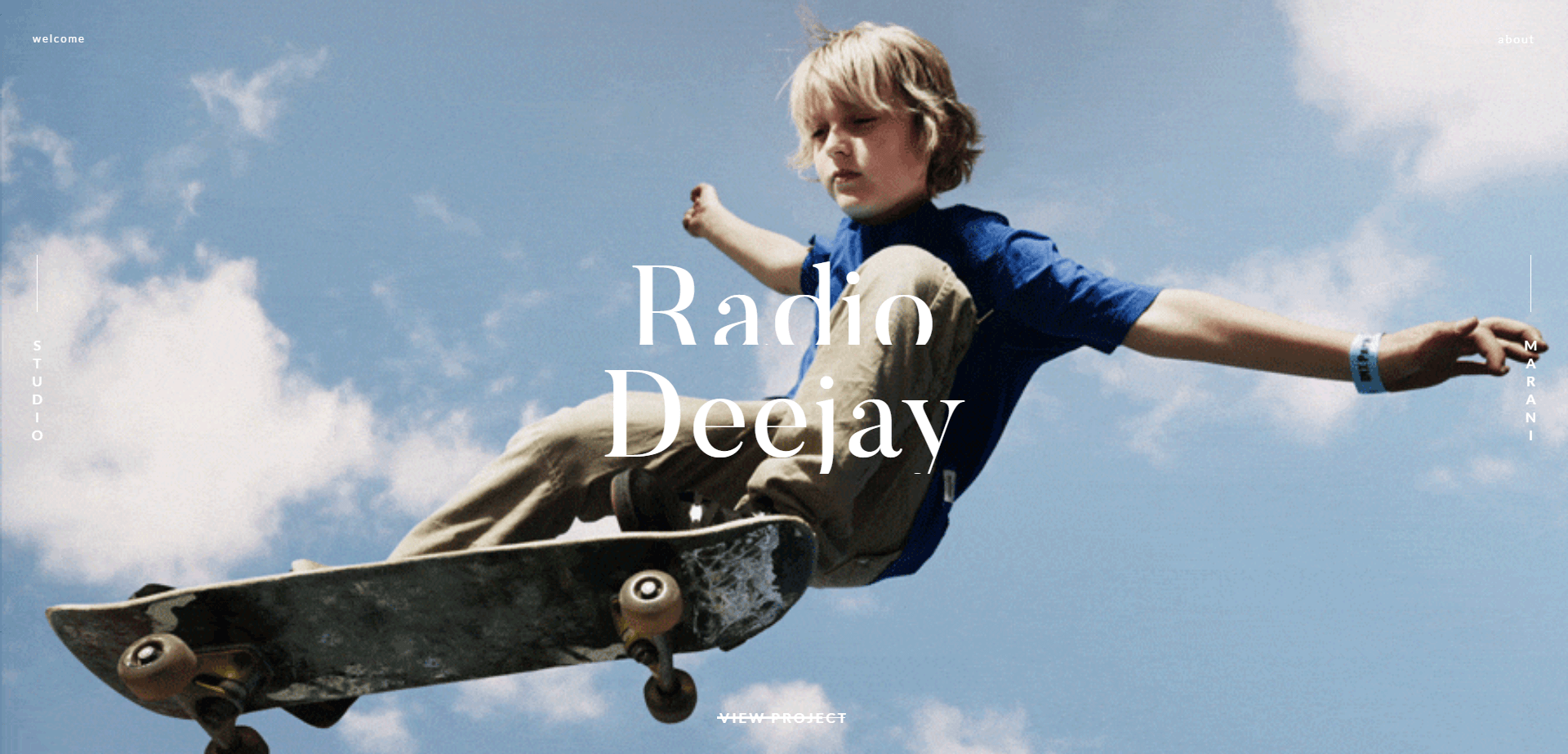
Studio Marani is a Milan-based communications agency, and while they may not be directly involved in web design work, their portfolio is a perfect example of a great showcase. When you open their site, you’ll be able to navigate through their featured projects by dragging your mouse. Each project has its own video background, which only shows small, measured movements so as not to overwhelm the viewer, and clicking on their details will bring you to individual case studies.
A lot of time in web design and development circles, we would advise you to avoid creating sites that depend solely on this kind of complex interaction, or that abuse features such as transition animations and video backgrounds. However, when it comes to your portfolio, we believe that a little flair is warranted – and Studio Marani certainly has a knack for it.
2. Poignée de Main Virile
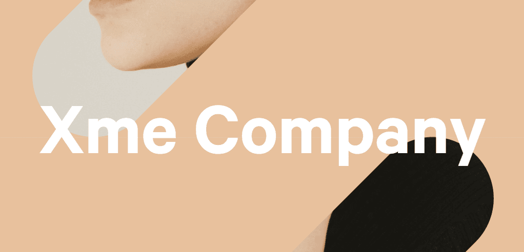
This portfolio might be written in French, but you don’t need to speak the language in order to appreciate its style. This graphic design and creative studio has crafted quite an eye-catching site using a combination of minimalistic design, pastel colors, and simple transition animations.
You can access its individual portfolio pieces right from the homepage, where they rotate every few seconds, replacing the last with a new background color and two small glimpses of a featured image. This particularly simple animation is an elegant way to catch the eye of the viewer, and convince him to click on the piece in question and find out what it’s all about.
The portfolio pieces themselves include only the general information for each project, but they make up for it with lots of images for every aspect of their design. If you take only one thing away from this list, let it be this one: use high-quality images to showcase your work .
3. Rezo Zero
Rezo Zero is a digital creative studio with a more traditional portfolio website than our previous picks. For one, they’ve actually included a traditional sidebar on their design (how retro of them), although it does have an opening animation which looks pretty slick.
As far as their portfolio itself goes, it’s comprised mostly of case studies, with a few archived pieces on the side. The case studies themselves are pretty great, with lots of details, small icons signifying whether any given project was designed for the web or mobile (a really small touch we really liked), and even a few renderings of how the project looks on a mobile screen. To tie it all off, each case study includes a quote from the client in question at the end – which gives the whole thing a nice personal touch that including the testimonial on a separate page (surrounded by a bunch of others) wouldn’t have achieved.
4. Dac Davyn
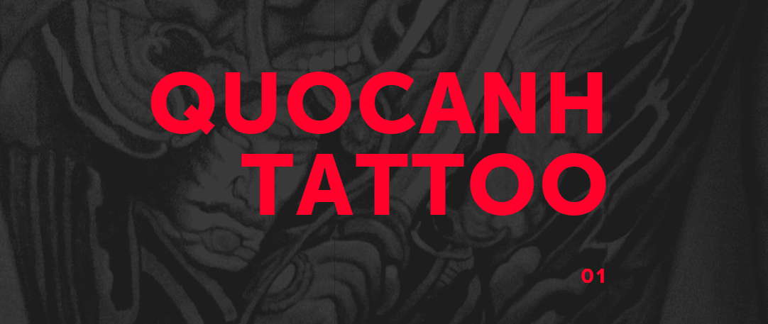
Dac Davyn Guyen is an interactive designer with an amazing portfolio, which really showcases his talents. The Quocanh Tattoo project, in particular, is a great piece with its strong contrasts and bright red lettering which won’t let you turn your eyes away.
As far as the showcases themselves, this portfolio provides an excellent example of how to only choose the very best in images. Each of the screenshots shown here is stunning, and is displayed as part of an entire layout, enhancing their unique design. The interspersed mobile displays also add a nice touch, and lets clients know the designer in question knows how to handle mobile as deftly as regular displays, which is always a plus.
5. Cihad Turhan
Cihad Turhan labels himself as a creative web developer on his website, and after having taken a look at it, we’re left with no choice but to agree with his own assessment. On top of his work as a developer, he’s also got some solid design chops, and his portfolio showcases both talents in quite a unique way.
As you make your way down his homepage you’ll be greeted with a cool little section, showing both code and the graphic effect it achieves. Further on, there are examples of his regular work, with a few simple statistics shown in a friendly and accessible manner.
His portfolio itself doesn’t include a lot of screenshots for each product – in fact, it only shows a single screen – but they’re animated with a simple 3D effect, which more than makes up for it thanks to the coolness factor. Most importantly, he’s made sure to tag all of the technologies used in each project, which is a great detail to include from a development standpoint.
6. Kenji Saito
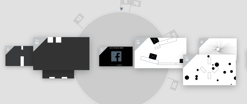
Kenji Saito is a creative front end developer who’s taken a singular approach to his portfolio page. The entirety of his portfolio is comprised of CodePens, which isn’t something I’ve seen before – but hey, if you’ve got the CSS chops, it’s a pretty cool way to display it.
Clicking on each of the small windows on his page will load the corresponding page at full-width, and there are over 70 unique pens at the time of this writing.
7. Irene Demetri
Irene Demetri is a freelance interactive designer with a modern, clean looking portfolio that we love. Each section of her homepage has its own small little interactions, from the drop-down menu, to the icons for each section.
Her portfolio itself is shown on a unique vertical slider, with little information available aside from the languages used, and the devices each piece was created for. However, the project images themselves more than make up for any lack of detailed case studies, and they even include staged screenshots of the designs using multiple devices.
8. Guillaume Juvenet
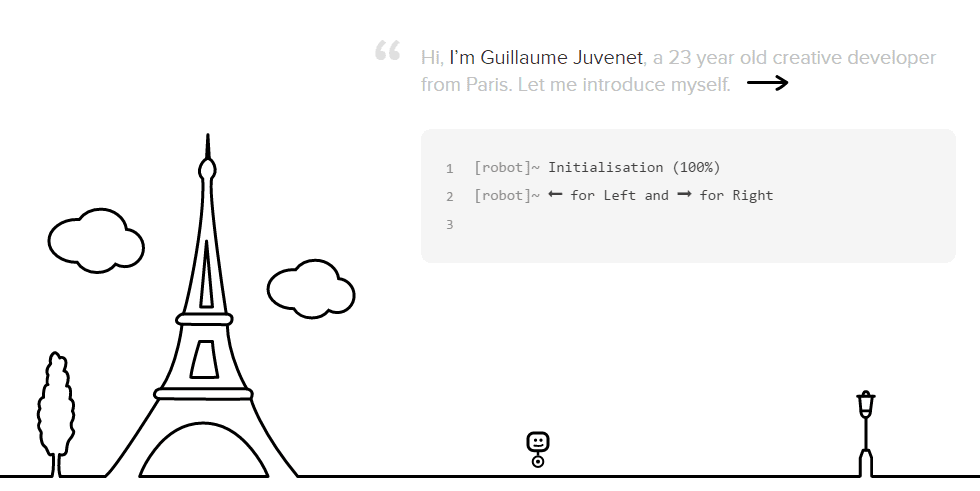
Guillaume Juvenet is a creative developer from Paris with a very whimsical portfolio, striking a very different chord from the norm. Seriously, take a moment and check it out for yourself, because it’s pretty fun.
In order to navigate through Gillaume’s portfolio, you must move a little one-wheeled robot through the screen, and as you advance through each one, you’ll uncover new information regarding his qualifications. The screen containing his technical skills even includes a little interactive code window.
The section regarding his works is a little lacking, only providing links without any accompanying images for each project (for those you’ll have to go to their individual sections) – but with such a unique portfolio, it’s impossible not to pay attention.
9. Mike Kus
After that brief detour, let’s circle back to more traditional portfolios. Mike Kus is a UK-based designer, specializing in UI and branding, and his homepage is a perfect example of a modern-looking portfolio based on card design.
It doesn’t break the mold in any way, but what it does, it does expertly – and with attention to detail. His contact page is a good example of how to pick a good personal shot, since it blends seamlessly into the page, and the quality gives an aura of professionalism.
As far as the portfolio itself, mousing over each card will produce a pleasing overlay effect with additional information, and clicking on a project will throw you right into its project page – all filled with colorful, attractive imagery.
10. One Design Company
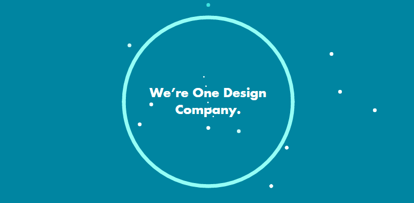
One Design Company’s page is another example of a traditional portfolio page, with a few touches to give it an extra boost. Starting right from the homepage, the use of friendly colors and simple animations pull you into the card-based portfolio.
The projects themselves use a similar design, with high contrast headers and interspersing explanations about their design process, alongside high-quality images. It’s a design you’ll see repeated among a lot of portfolio pages because it’s simple and it works.
In fact, the whole page has a simple corporate feeling to it, which is not a bad thing, necessarily. A lot of pages use similar layouts because they do serve to inspire a feeling of professionalism, which is exactly what a lot of customers are looking for. One Design Company’s page shows that you don’t need to sacrifice creativity in order to have a professional looking portfolio.
11. Maria de la Guarda
Maria de la Guarda is a UX and visual designer with a very simple yet thorough portfolio. Each project page includes only a simple introduction to the project, alongside an overview of which kind of service she provided, and the rest is filled with handpicked images to showcase the best parts of her design.
The portfolio itself is yet another card based affair, but we can’t fault the choice, since it works so well for imagery-based pages. One of our favorite touches is the reminder at the bottom to leave your email address if you wish to receive page updates – a pretty nice way to hook clients if you can convince them to sign up.
Conclusion
An impressive portfolio will open a lot of doors that a resume alone perhaps couldn’t – which is not to say that you shouldn’t continuously work on improving your qualifications; just remember that the path to success lies in a healthy balance of both learning, and having actual experience under your belt!
As far as what constitutes a good portfolio, it should incorporate the following characteristics:
- Informative: provide all your relevant contact information and qualifications.
- Visually appealing: as a designer, your work should be front and center.
- Concise: your first test projects might not make the cut unless they happen to be truly exceptional.
Is there something that you feel every designer should include in their personal portfolios? Subscribe to the comments section below and share your opinion with us!
Article thumbnail image by Pretty Vectors / shutterstock.com









Glad to see our website in your list ! Thank you for the mention Tom 🙂
No problems – a worthy inclusion. 🙂
Thank you for the mention! We aren’t actually using a theme as we do have our own open-source CMS (roadiz.io) developed but we’re happy that our ideas to display a portfolio are inspiring to you!
No problem – regardless of your CMS, it was still a worthy addition!
love these website very much! teaching so many skill about showscasing
Thanks for your kind words!
I’m astounded that many portfolio sites rely on grid and hover graphics that are not displayed on mobile. If you think users need a title and description on desktop – well they need it also on mobile. iOS does not support hover, but there is CSS code that will display the title – making a click on the image more intuitive.
I think there’s more work to be done in order to make mobile viewing consistent with the desktop. Thanks for your contribution!
Sorry to see how the exhibits of the best graphics and selected development are only some beautiful games of ” know-how” but too ends in themselves . websites than ever propose , and never could be proposed to clients of their site should make it their image and their business . Beautiful exercises , little creativity and elegance
Wow. Those are incredible.Such a departure from, oh, everything else I get to touch. Just so clickable scrollable and enticing. Thanks for the post, Ill be crawling around those sites for days, likely on the code side shaking my head longingly…..
Dehn, I would say to go one step further. If you like the look of a particular website, view the source for hints of any plugins used. Who knows, you might be able to use it for your own sites!
Thanks for your comment!
Many of these have odd navigation, too much going on, and/or loading graphic animations. This is not the age of Flash anymore. As a creative director, I want to see your content/work right away and we want an easy way to see it. Mike Kus’s site is this best example of the bunch.
Yes, you have to remember that a web designer’s portfolio has two goals: to showcase their work, and to showcase what they could achieve. In some cases, their portfolio turns into almost a concept piece.
Thanks for your comment!
I don’t think a single one of those sites used Flash…
Those sites were made by web designers/developers. They’re much more likely to get a job by having a site that actually shows off their skills.