In today’s eCommerce landscape, high traffic can no longer simply be the promise of business success. Hence this post will indefatigably focus on the idea of conversions, not traffic generation.
Because your traffic is not effective if it consists of people who don’t want to make a purchase. In other words, you’re failing to convert visitors, an issue that affects many eCommerce stores worldwide.
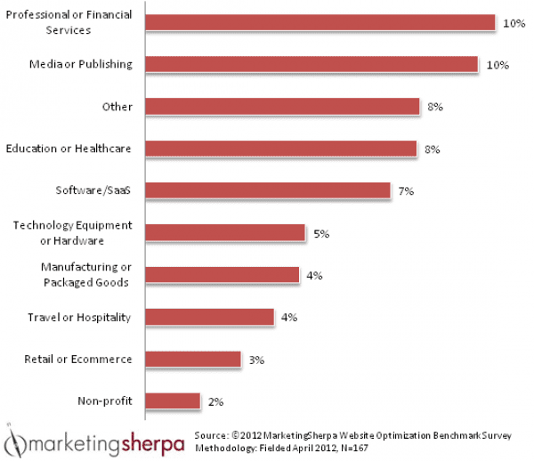
The average conversion rate for eCommerce stores is 1-3 percent; these numbers are likely the most common. But it’s important that you don’t get bogged down worrying about the average (you’re going to be eaten alive if average is your goal). Instead, you should focus on working towards a conversion rate that’s better than the standard or what you currently have.

Image Source: MarketingSherpa
How do you improve conversions? By improving product copy? By simplifying the checkout process? By optimizing images?
The answer to all these questions is yes. But this is conventional advice. Instead of always implementing the exact “by-the-book” tips to improve conversions, you can do something different.
I’m not saying you should disregard common conversion boosting approaches altogether. But it doesn’t hurt to mix it up and take new measures to achieve your goals. While the basic stuff will apply, you have to consider all the new dynamics.
That’s why you need to know about neuromarketing.
For those new to the concept, neuromarketing is the science that is used to determine why consumers behave in a certain way, and how the consumer brain relies on shortcuts to process the plethora of information it is presented with on a given day.
Imagine being able to understand why a particular CTA or image on your product page motivated the consumer to make a purchase.
According to research, neuroscience provides new information about responses (emotional) by measuring brain activity when consumers evaluate products or advertisements. This is related to cognitive science, where the response of the consumer to marketing strategies is understood on the level behavioral psychology.
Why Neuromarketing is important for eCommerce?
In eCommerce, cognitive biases can be used to make consumers choose your product over competing products, which in turn should increase conversions, increase subscribers and reduce shopping cart abandonment. Big brands have been leveraging this tactic for years to influence purchase decisions.

Image Source: Total Customer
In order for marketing to influence the consumer’s brain (and ultimately decision), it has to appeal to certain behaviors, styles or ideas within a buying context. The consumer will then associate these elements with the service or product being marketed to them.
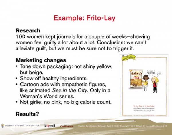
The use of neuromarketing by PepsiCo’s Frito-Lay to better appeal to females is a classic example. After researching women’s feelings related to guilt and snacking, it produced new flavors, new packaging, and a new marketing campaign, making all the effort to get women to consume Frito-Lay snacks.
Juniper Park, the ad agency that handled the initiative, used neuromarketing by analyzing how the female brain compared to the male brain, and what perception it made of salty snacks, so the marketing could be adjusted accordingly.
The research revealed that the communication center in the female brain was developed to a greater extent, which meant that it could process pieces of information and advertisements with more complexity. The hippocampus as well as the emotional and memory center of the brain was larger in females.
Frito-Lay and Juniper Park also wanted to avoid alleviating the guilt factor by playing up healthy ingredients and taking away anything that could have been considered as insulting, like pink packaging.

Image Source: SlideShare
The company then used all this information to achieve its goal – encouraging the desired behavior.
How to leverage neuromarketing to boost eCommerce conversions
These examples and the reasoning mentioned above demonstrate the importance of neuromarketing in modern business strategies. Instead of just boosting page views, we can influence purchase decisions to increase conversions, and make long-term customers.
Below are 4 proven measures that you can take to make your eCommerce site and offerings more appealing.
1. Leverage the power of reciprocity
The concept of reciprocity means that you provide something valuable (without expecting anything in return) to the visitor so that they feel compelled to return the goodwill. This can work better than rewards because in the latter there is a risk of shoppers feeling they are being manipulated to make a decision by being offered a free gift or discount with strings attached.
In a study titled “Embedded Persuasive Strategies to Obtain Visitors’ Data: Comparing Reward and Reciprocity in an Amateur, Knowledge-Based Website”, it was revealed that twice as many people submitted their information when they were provided information first; they were under no obligation to submit their information. They converted at double the rate of people who were requested to submit their information before they could receive information.
eCommerce businesses can offer:
- A free eBook (direct download)
- A partner/loyalty program (provide benefits without asking anything)
- A free demonstration (of how the product/service will make their lives better)
- A free trial (without requiring credit card information)
- A fun questionnaire or quiz (to find the interest/style/desire of the customer)
Uber’s recent women partner program is a good example.

Image source: Uber
They’ve created a separate landing page detailing how the company provides a flexible earning opportunity to women around the world, and its aim to economically empower 1,000,000 women by 2020. This should trigger the emotional center of people looking to empower the female gender, and they’d be motivated to use Uber often.
2. Talk in the language of your audience
The consumer brain seeks familiarity when shopping for products and services online. It’s hard-wired to recognize a less-than-seamless user experience. Do your target customers see people like themselves or the language they can relate to when browsing your online store? Or do you leave them potentially confused by changing your design and copy now and then?
Elements that interrupt a familiar pattern can be taken as flashing red alerts by the consumer’s brain. That said, red alerts that offer something valuable or enhance the online experience make the consumer brain behave in a positive way. A sense of urgency can also move a “lazy” brain into action.
ThinkGeek does a great job at creating an environment that its visitors can aspire to or relate to.

Image source: ThinkGeek
The design is going to appeal to the audience who follow the geek culture. Imagine if the brand changes this design often; consumers won’t be amused. The current design is ideal to evoke emotions and appeal to the customer’s feelings.

Image source: ThinkGeek
Now take a look at the copy from one of their product pages. It’s crafted in a way that will answer all instinctual questions from the potential customers. The style and tone makes people recognize the geeky surroundings of the web store, and adds more joy to the decision-making process. The copy along with the design adds greater weight to the final impression.
3. Display “social proof”, but in the right way
When leveraging social proof as a neuromarketing tactic, you want to make it seem legit to consumers. But a lot of eCommerce sites get the placement (and sometimes the copy) wrong.
For instance, some online retailers will create a separate landing page and label it as a “testimonials” page. That’s like asking people to go to that page. But what if they’re just interested in browsing the home page? That’ll defeat the purpose of having a separate page with social proof.
A better choice would be to integrate social proof into the entire website, so that every claim is supported by a valid reasoning. It can be put in quotes and placed in the footer or the right side bar – but it should appear right next to the CTA/claim. The best placement is in visual form right beside the claim.
As for the copy, using numbers like 200 or 200,000 can make the proof appear improbable; the non-conscious mind of the visitor can have doubts when seeing readings ending in zeroes. A better option would be to include actual numbers in claims, like trusted by 200,278 people – these numbers look precise and plausible.
Without considering these factors you could find yourself displaying social proof in a way that will not interest any of your audience.

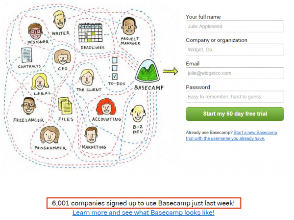
Image source: Basecamp
Basecamp has an odometer-style counter showing how many companies signed up to use its product last week. The numbers are updated whenever a new company signs up, offering strong social proof with live motion.

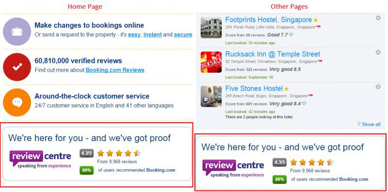
Image source: Booking.com
Booking.com’s social proof in the form of a review center is placed all over the website. It’s at the bottom on the home page and in the right sidebar on other pages. It supports the claims made by the company, and reassures customers they’re going to book their accommodation from a high-profile website. The image includes reviews, ratings, and how many users have recommended the use of booking.com to search and book accommodation.
4. Create scarcity to convert “loss-averse” leads
Loss-averse demographic refers to shoppers who prefer avoiding losses for gains of any kind. Scarcity can be used to appeal to this demographic; offering a limited edition version for a product or making a hot item available for a limited time will ensure that potential customers see the “loss” they’ll face if they fail to make a quick purchase decision.
The premise here is that expressing the outcome of not taking action as a loss will convert more potential shoppers (those who’re browsing your site) into customers. However, the copy for loss-averse statements should be well-thought out. For example:
- Buy this phone now and save $50 – This is a generic statement that could be taken as a decoy by the consumer’s brain.
- Buy this phone before 30th October and spend the extra $50 on the stylish headgear – This is a better statement. Loss-averse copy doesn’t always have to be about savings.
When there’s an opportunity, you should frame the alternative to buying (with the help of scarcity) as a loss. The approach will keep potential scaling issues in check and increase the perceived value of the product/service being marketed. The pain of losing a cent is greater than the joy of gaining a cent (though a cent is a cent).
Jimmy Choo leveraged scarcity in an interesting way. It created a treasure hunt contest (named as the “Jimmy Choo trainer hunt”). A pair of Jimmy Choo trainers were left in various locations throughout London and consumers were asked to follow the campaign; those who arrived at a location before the trainers were gone would receive a prize of a pair in their preferred size and style. Clues to the location were left on the brand’s social media pages including Facebook, Twitter and Foursquare.

Image Source: WaveMetrix
Those who acted early won the prize, while those who missed out realized that this type of competition rarely happens, so they developed a real desire to compete and get it the next time. Jimmy Choo enjoyed a 33 percent uplift in sales because of this competition.
Final thoughts
Until you understand why your audience reacts to the different elements on your website in a certain way on a neurological level, you will be unable to influence their purchase decisions.
By understanding their behavior and leveraging the tips mentioned above, you’ll be in a better position to build relationships and engage customers for a long-term. Just remember to keep the consumer brain in mind when developing your marketing strategy.
What are your thoughts? Have you applied any of these neuromarketing principles on your site? Feel free to leave comments.
Article thumbnail image by venimo / shutterstock.com.


“Until you understand why your audience reacts to the different elements on your website in a certain way on a neurological level, you will be unable to influence their purchase decisions.”
This is risibly false. “Neurmarketing” is just the latest trend in the pseudoscience that has long been a part of marketing.
Education Essay : just a spam
Joel Mielke : just a troll
What great comments!