Every year, the WordPress team releases a new default theme. This upgrade usually shows off some of the latest features the platform has to offer, and the 2021 default WordPress theme is no exception.
The entire goal of the Twenty Twenty-One theme is to provide the best possible experience for users of the Block Editor. In this article, we’ll talk about what it has to offer and show it to you in action. Let’s dive in!
An Introduction to the 2021 Default WordPress Theme
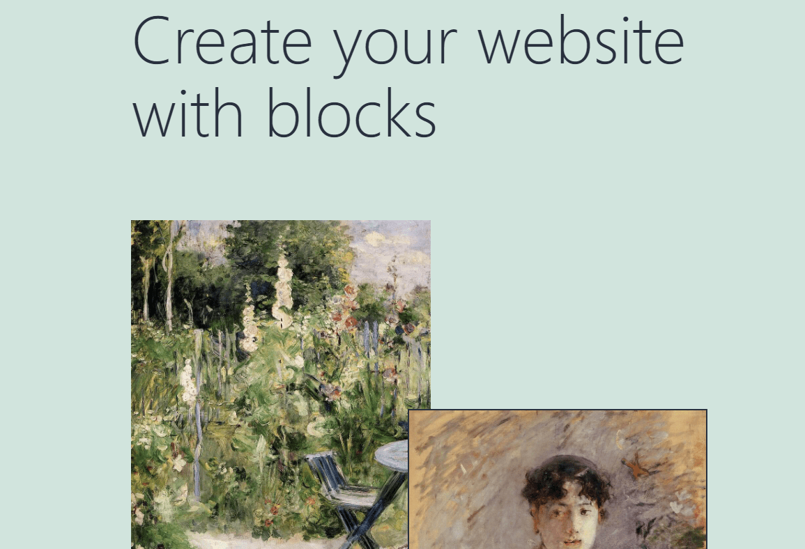
Twenty Twenty-One shipped with WordPress 5.6 on December 8, 2020, so we’ve had a little time to see what it has to offer. It uses a modified version of the Seedlet theme with nested CSS variables, local font with a neutral style, and a limited color palette. The theme’s modern design features several new block patterns with layered images reminiscent of a Pinterest board, which makes it ideal for portfolio websites.
At first glance, the theme doesn’t really pop from the screen, but it’s not meant to. Its main purpose is to provide you with a canvas that you can easily build upon using the Block Editor. However, it also includes several interesting features such as:
- Title tags
- HTML5 elements
- Custom header logos and backgrounds
- Two navigation menus (one in the header and a secondary menu for the footer)
- Gradient presets for blocks
- A custom cover block
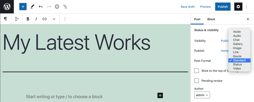
- Multiple custom post formats
Among those post formats, you have links, galleries, quotes, statuses, videos, and even chat:
The theme also supports some of the latest features that the Block Editor offers, including the previously mentioned block patterns. Additionally, there are multiple pre-built color palettes bundled in, which you can access via the Customizer.
Since Twenty Twenty-One is so unassuming at first glance, let’s go right ahead and check out how it works in action.
The Twenty Twenty-One Theme in Action
Twenty Twenty-One ships with four pre-built pages that you can use as templates for your website’s core content. In this section, we’ll check out each page both from the front and back end.
Home Page
As we mentioned before, the 2021 default WordPress theme’s home page template uses block patterns that make it look very much like a Pinterest board:
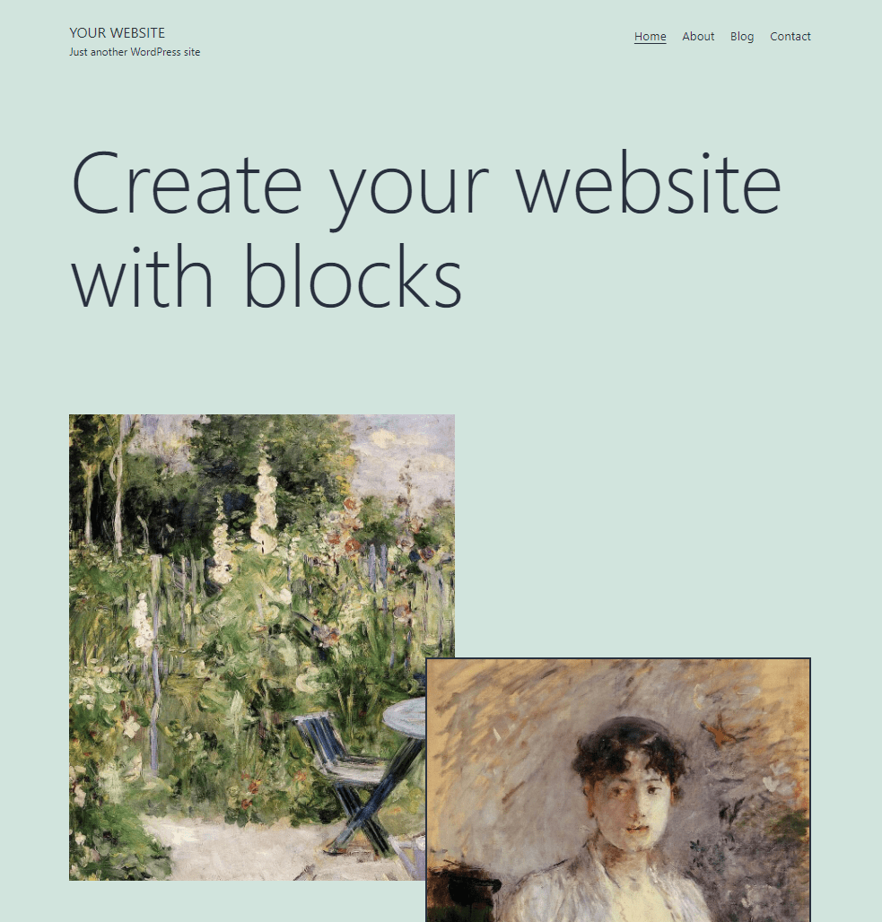
The design of the home page is very simple. You have a minimalistic menu with a simple underscore mouseover effect and a hero header. The really interesting part of the design is the section that you see below.
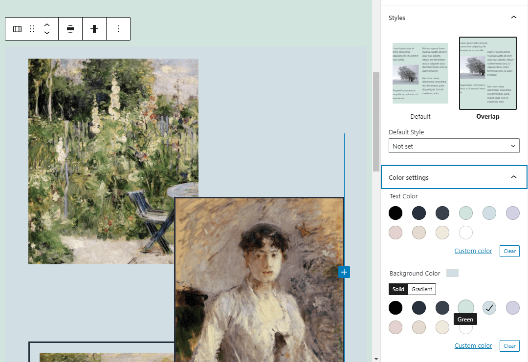
This area includes two columns with an overlapping style, which is what enables the image on the right to come out on top of the two on the left:
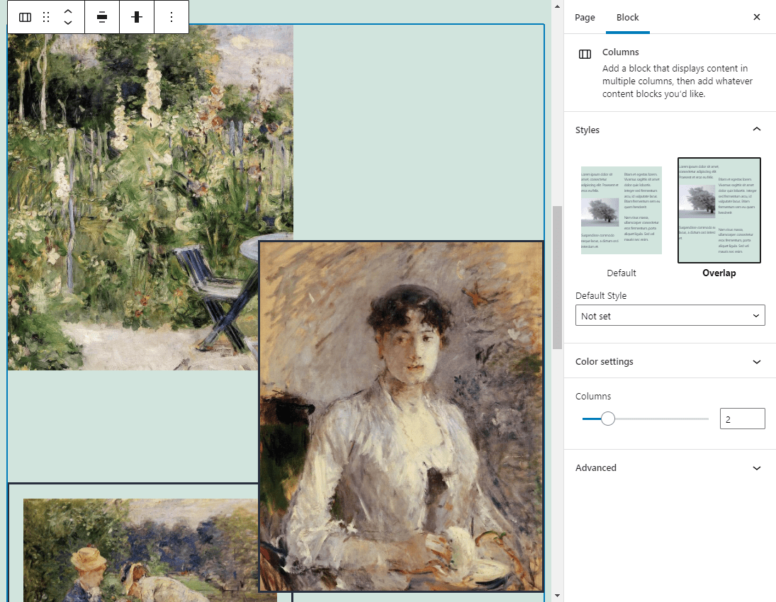
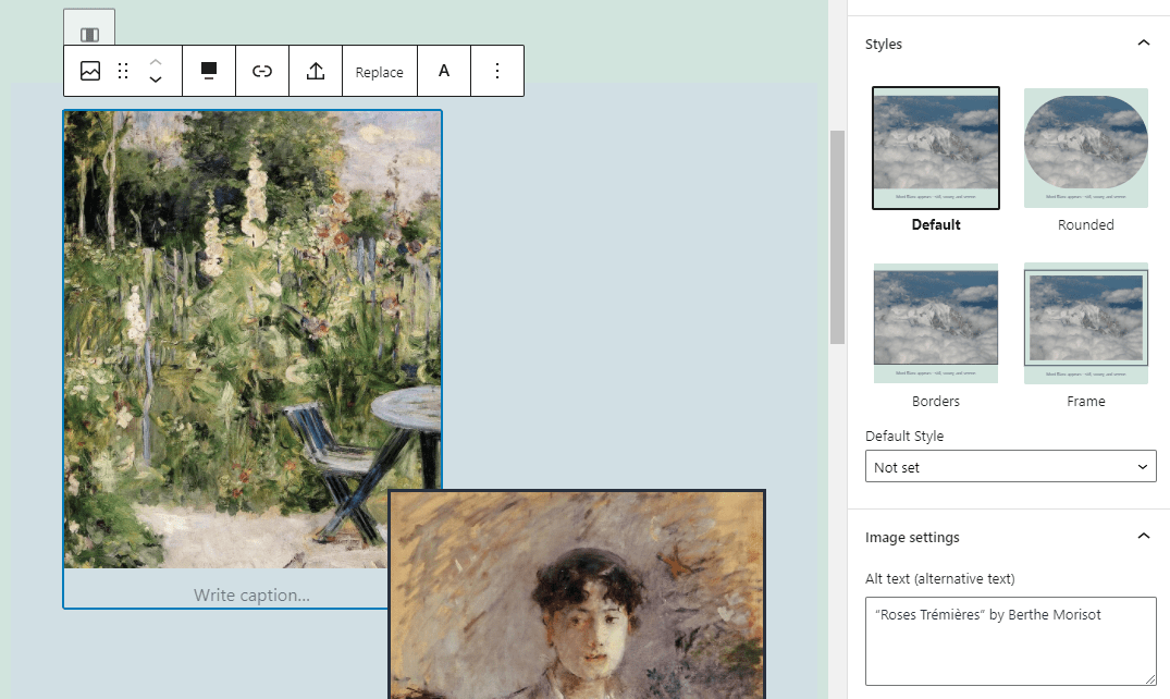
You can easily replace images, add borders to them, or change their style from the Block Editor:
The editor also makes it easy to switch the default background color of the entire page or individual sections with a few clicks:
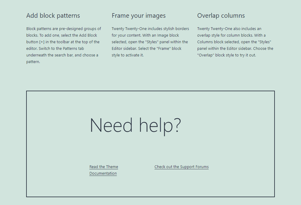
If you scroll down a bit further, you’ll see a three-column section that includes some basic information about the theme. These columns mention overlapping styles and image frames, which we already talked about:
The last column talks about patterns. As we mentioned before, the Twenty Twenty-One theme comes with a set of pre-built block patterns. All the elements you see on the home page are available as patterns:
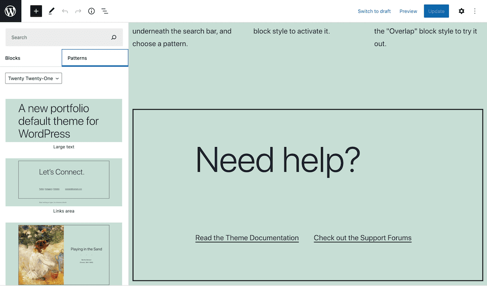
Using patterns, you can expand on the theme’s default sections to create a more comprehensive portfolio.
About and Contact Pages
You can access Twenty Twenty-One’s default About and Contact pages from the main menu at the top of the website. By default, both pages are very barebones and include just a couple of headers:
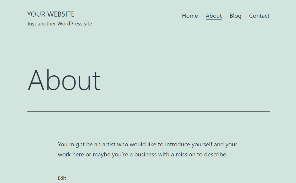
The About page is the perfect place to test some of the patterns the theme lays out for you. For example, the Media and text article title pattern is perfect if you want to include a photo of yourself and a brief biography:
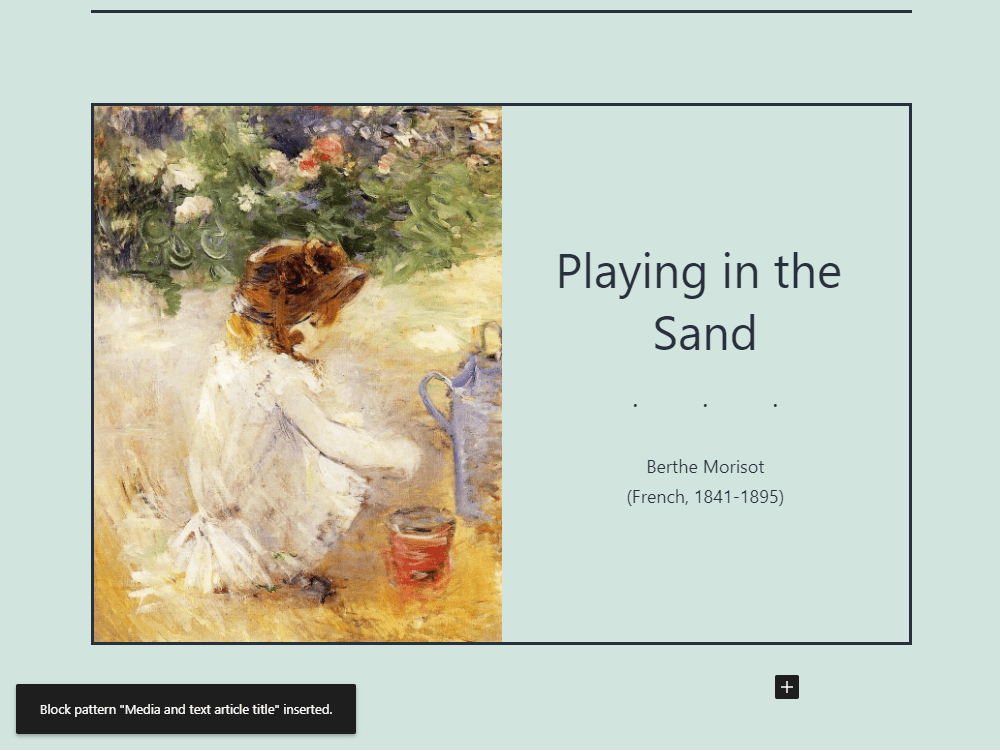
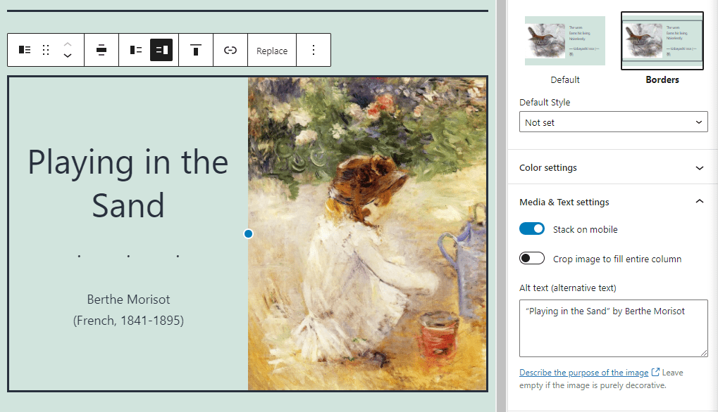
Each of the theme’s block patterns includes multiple styles and layouts. With this particular example, you can switch the position of the image, modify the pattern’s borders, and even set the graphic to stack on mobile devices, making it easier to view on smartphones and tablets:
On the About page, you can also show off some of your best work using the Two images showcase or Overlapping images and text patterns, which come with the theme:
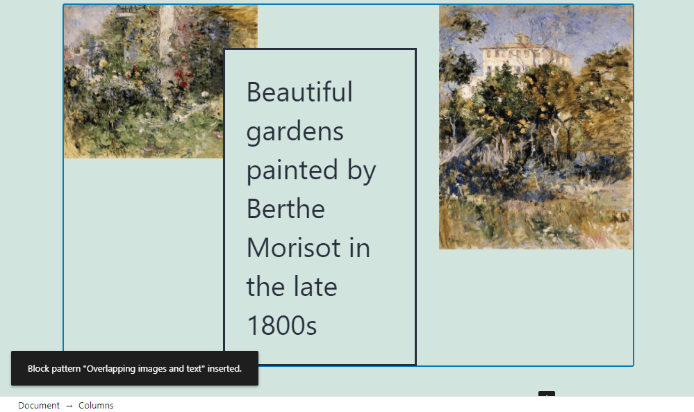
As you can see, images play a key role throughout the 2021 default WordPress theme. The Block Editor makes it easier than ever to place media precisely where you want it to appear. Now, you can even overlap elements without having to manually add custom CSS.
One functionality that is missing from the Twenty Twenty-One theme is a contact form for its default Contact page:
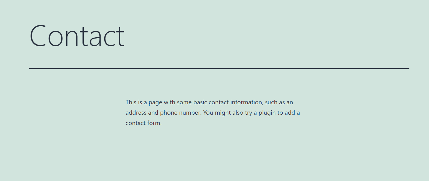
However, that’s not a feature that we would normally expect to find in a default WordPress theme. Considering the many great WordPress contact form plugins available, you likely won’t miss it in the theme.
Blog
One of our favorite aspects of Twenty Twenty-One is its blog style. The theme uses very understated fonts that are easy to read and its Blog page lets each featured image draw the attention that it deserves:
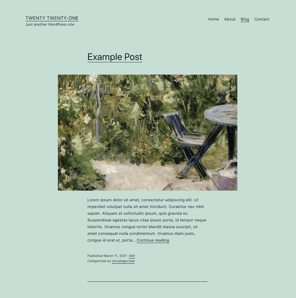
However, navigating multiple pages of blog content can be tricky. The theme places a search bar at the bottom of the site by default to help your users find the posts they’re looking for. To improve navigation, you might consider moving the search bar to the top of the screen, next to the menu, and including a Recent Posts widget in a sidebar.
Overall, if you’re looking for a theme that’s perfect for a creative portfolio website or a personal blog, Twenty Twenty-One is well worth considering. Likewise, you may want to check it out just to play around with the new block-related features it has to offer to get a taste of what may be to come in future WordPress releases.
TT1 Blocks and Block Experiments
Although our main focus here is on the 2021 default WordPress theme, we also thought it might be useful to point out its companion theme, TT1 Blocks:
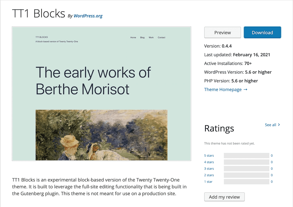
On the surface, these two themes look pretty much the same. The difference is what’s happening under the hood. TT1 Blocks is an experimental block-based theme. Similar to the Gutenberg plugin, its purpose is to give WordPress users a chance to tinker with upcoming features before they’re merged into core.
By installing TT1 Blocks, you can enable Full Site Editing. This is the next step in the development of the Block Editor. It lets users build parts of their sites outside the main content area with blocks. In other words, you can try your hand at creating your own block-based navigation menus, headers, footers, and more.
Note that it is not recommended that you use TT1 Blocks on a live site. We suggest installing it on a local or staging site to experiment with.
Conclusion
Usually, WordPress default themes are ideal from a performance standpoint and decent foundations for simple websites. However, a lot of users switch to other options as soon as possible because they want access to more features or to use a more flexible theme.
With the 2021 default WordPress theme, that might change. Its modern design and seamless integration with the Block Editor make it a fantastic solution if you’re comfortable using that tool. If you’re working on a portfolio or blog, we recommend that you check out Twenty Twenty-One.
Do you have any questions about the Twenty Twenty-One theme? Let’s talk about them in the comments section below!
Featured Image via Soloma / shutterstock.com




I agree with Gilles 100% – I have Divi and have no desire to look elsewhere plus the support I get is second to none in my view. I wonder what support is offered for the twenty-twenty one theme?
Hi Brian – Like other free/default themes, Twenty Twenty-One only receives support via the WordPress forums. Premium support is definitely a huge advantage to using a paid theme like Divi.
Well, I appreciate your overview of the twenty-twenty one theme, but I must confess that (for me), right out of the box this is one of the ugliest theme I have ever seen. This terrible default background color makes me feel like we are back to the very early websites. If this default theme intends to demonstrate the power of Gutenberg, this is a fail, in my opinion.
Fortunately, we have Divi to create great looking websites!
Thanks for weighing in, Gilles! The default design certainly isn’t for everyone – but Divi is a great alternative! 🙂