Columns are a key component in most modern websites and page builders. Fortunately, the WordPress Block Editor enables you to use both columns and rows so you have full control over each page’s layout. However, although the builder adds rows automatically, you’ll need to choose where and how to add columns using the Columns block.
In this article, we’ll show you how to add this block in WordPress and how to configure it. Then we’ll go over some tips so you can get the most out of your columns, as well as some Frequently Asked Questions (FAQ) about the block.
Let’s get to work!
Subscribe To Our Youtube Channel
How to Add the Columns Block to Your Page or Post
To get started, open the Block Editor for the page or post that you want to work on. Click on the plus sign icon below the last block you added (1), or use the menu at the top of the screen, and select the Columns option (2):
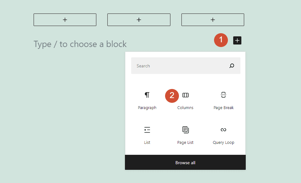
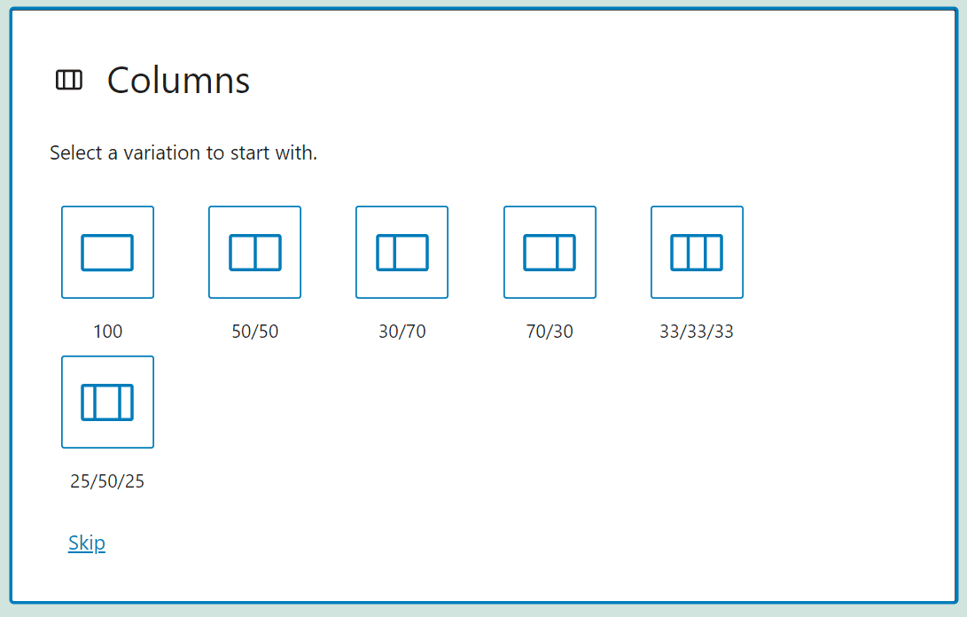
The Block Editor gives you several options for how many columns you want to include within the row you select:
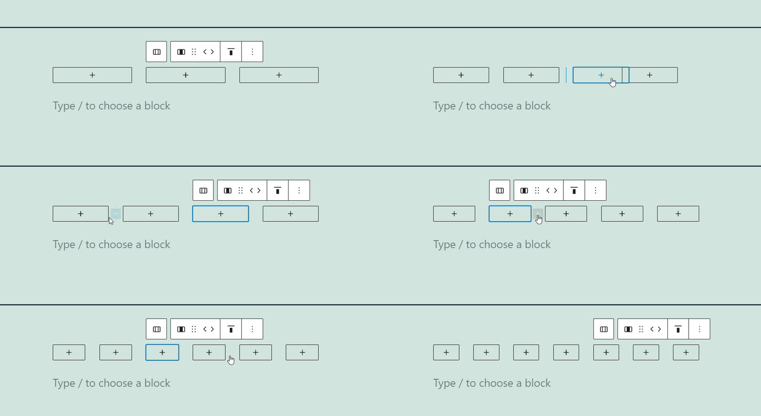
By default, the Block Editor only lets you choose presets that include up to three columns within a row. However, once you place one of those presets, you can click on the plus signs between them to add further elements to the row:
The editor treats each column as its own “section”, so to speak. If you have a row with three columns, for example, you can add individual blocks within each of them to create a pricing table:
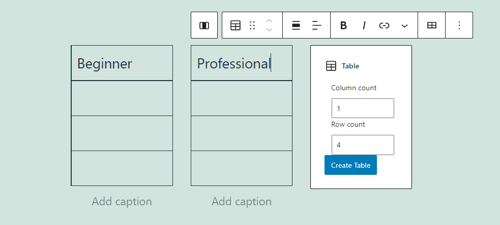
You can add any of the blocks available within the editor to each column that you’re working on. Once you place the blocks you need, you might also want to spend a few moments customizing your columns’ settings.
Columns Block Settings and Options
When you mouse over a row with columns in the Block Editor, a formatting menu will appear over it. That menu includes options for moving columns around (1), changing their alignment (2), and modifying the row’s width (3):
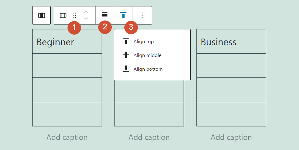
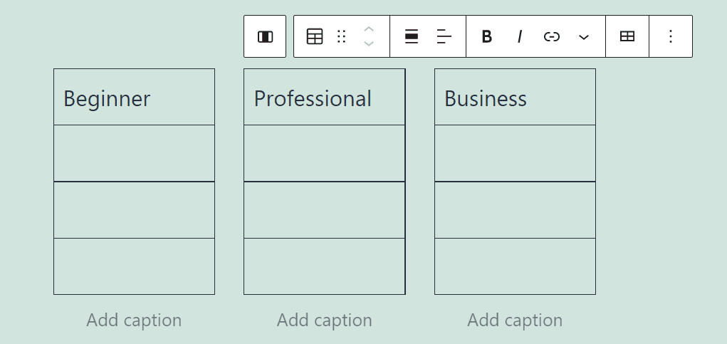
The formatting menu you see will change as you add blocks. When you mouse over a column that contains a block, that element’s formatting menu will replace the default one.
For this example, we added Table blocks to all of our columns. When we mouse over any of them, here’s the formatting menu that appears:
There’s another set of options that enables you to customize the Columns block, beyond just the formatting menu. To access it, select the row that includes the columns you want to edit, and click on the gear icon in the top-right corner of the screen (1). A sidebar will pop up, including options for changing that row’s color (2), padding (3), and column widths (4):
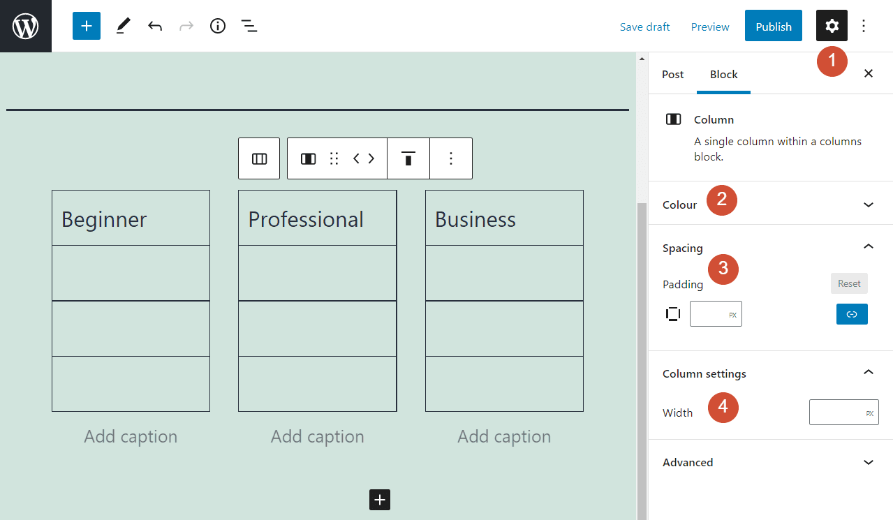
The color settings enable you to change the color of the text and links within the row, as well as for its background. Keep in mind that the settings you choose here apply to all of the columns in the row. However, you can supersede those options by tweaking the individual block settings within each column.
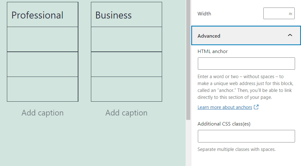
If you want to customize this block even further, you can also set HTML anchors and additional CSS classes from the Advanced tab in the settings menu:
That’s everything you need to know about how to use and configure this important block. Now let’s go over some tips to help you use columns effectively.
Tips and Best Practices for Using the Columns Block Effectively
Columns are a versatile element in web design. You can use them in just about any situation you want, as they help provide structure to any page or post.
Visually, columns help you break up long stretches of paragraphs, and place lists, tables, and even images side by side. Here’s an example from one of the default WordPress themes, using columns to achieve an overlapping effect with Image blocks:
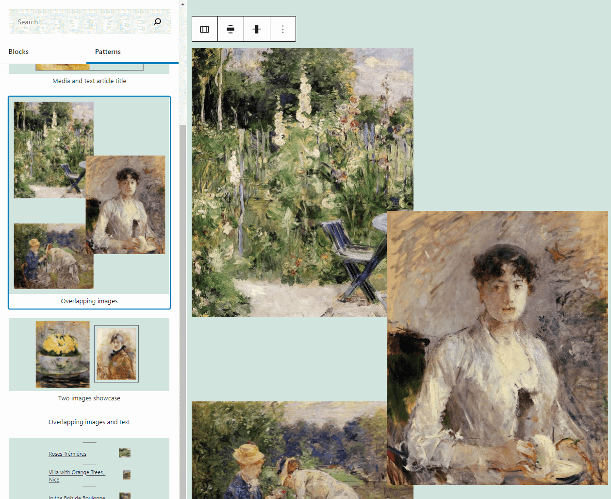
In most cases, you won’t want columns to overlap. However, there are no rules set in stone for how to use columns. As long as the results look aesthetically pleasing, you should feel free to experiment using this block.
Frequently Asked Questions About the Columns Block
By now, you have a solid grasp of how to use columns in WordPress. To make sure that you’re not missing anything, let’s go over some commonly asked questions.
Can I Use the Columns Block with Page Builder Plugins?
By definition, page builder plugins (such as Divi) supersede the default WordPress Editor. That means you won’t get access to the Columns block. However, most page builder plugins include their own takes on rows and columns, so you may get to use similar features. Here is our list of the best page builder plugins available within the WordPress ecosystem.
How Many Columns Can I Add in a WordPress Page or Post?
The Columns block enables you to add up to three columns within a row using presets. However, you can add further rows manually. Keep in mind that if you add too many columns, they might not have enough room to display their contents properly.
Can I Use the Columns Block Within Widgets?
WordPress enables you to customize widget areas, such as your footer or sidebar, using the Block Editor. That means you get access to all the same blocks you would when working on a page or post. Keep in mind that since you’re probably working with reduced space, using multiple columns in widget areas can make your content look crowded.
Conclusion
Rows alone aren’t enough for a modern page builder tool. The option to create and customize both rows and columns offers you full control over the placement of each element on your website.
The good news is that the WordPress Columns block is remarkably simple to use. You can add as many columns as you want within any single row. Moreover, you can place any block you want within a column, and customize its content, style, and more.
Do you have any questions about how to use this WordPress block? Let’s talk about them in the comments section below!
Featured Image via Mitya Korolkov / shutterstock.com





Leave A Reply