When WordPress 5.0 brought in the Gutenberg editor it also brought a few new features to WordPress. Several of those features are seen in the form of blocks. One of those blocks is called Cover, which places a covered image with several customizable features within your post or page content.
Of course, WordPress still includes the option to specify a featured image for pages and posts. This raises several questions. Are covered images and featured images the same? If not, what are they and how are they used? What’s the difference? In this article, we’ll discuss covered image vs featured image in WordPress and answer each of these questions.
Covered Images
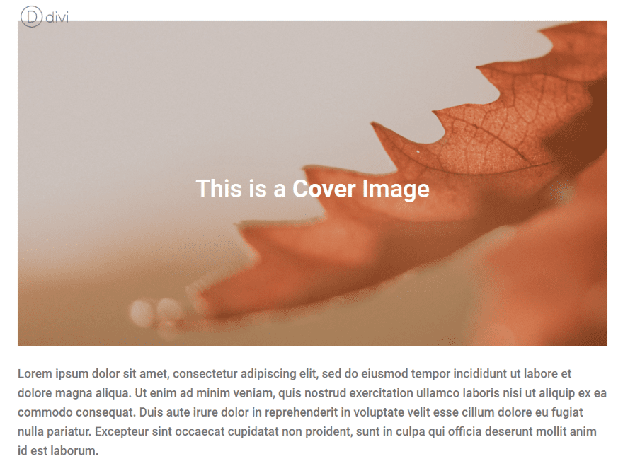
A cover image is a large photo that’s usually placed at the top of a page or post. They’ve also been called header images. They represent the content. It’s the first thing the reader sees when viewing the content. It helps set the mood or describe the article visually so the reader has an idea of what to expect. They can also be used throughout the page or post to help introduce the next section.
Cover images are easy to add to your content in Gutenberg and they include some styling features that are not natively available to the featured image.
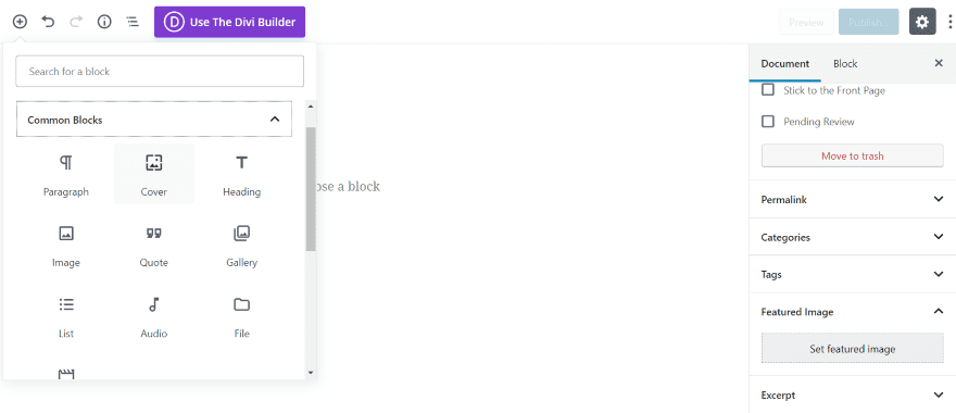
Gutenberg includes a new block called Cover which lets you create a cover image for your posts or pages. You’ll find the block within the Common Blocks tab in the blocks list.
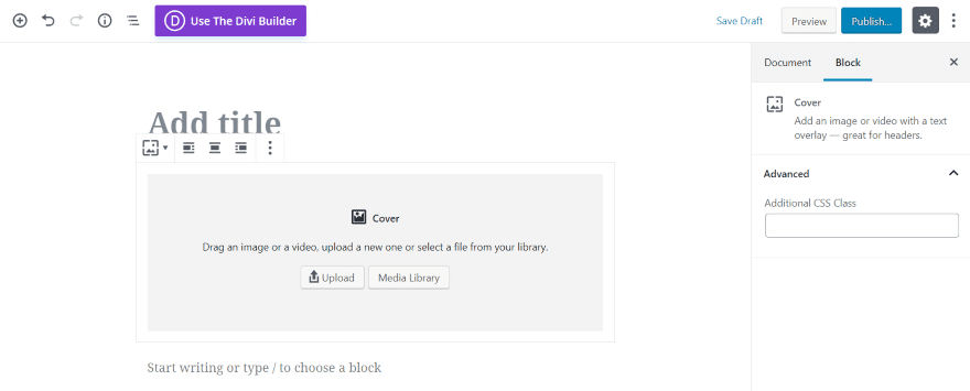
The Cover block lets you add an image with an overlay and text. Upload your image or select your image from the media library. You can also use a video if you want, which will play behind the text and overlay. This is great for creating eye-catching headers. This is something that can’t be done with a featured image without using a third-party plugin.
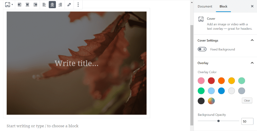
Once you’ve added the image or video you’ll see features for the text, fixed background settings, and overlay. It has some alignment settings above the image.
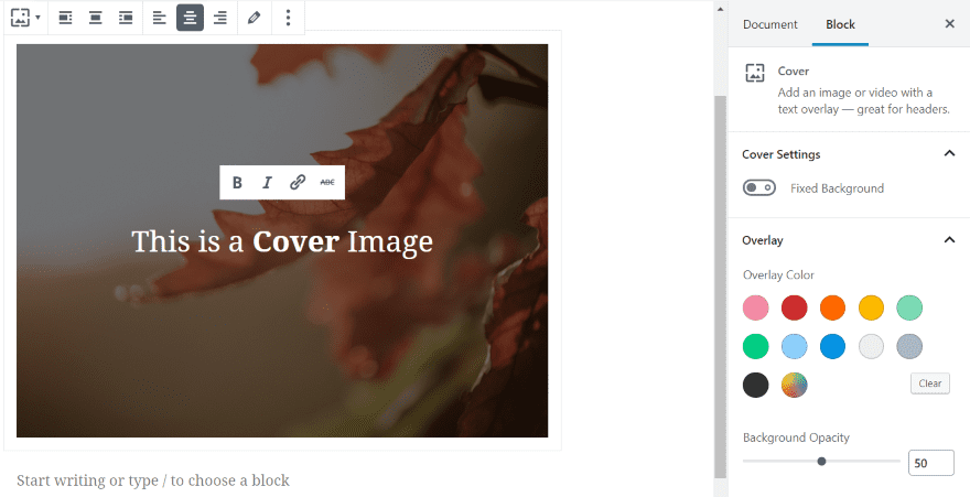
To add the title, simply place your cursor where it says “Write title…” and start typing. It also has options to use bold, italic, add a link, or strikethrough the text. In the settings above the image, you can align the text.
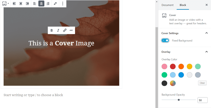
Fixed Background adds a parallax feature for images. The image remains in place while the text scrolls. This feature isn’t available for videos, but all of the other settings are.
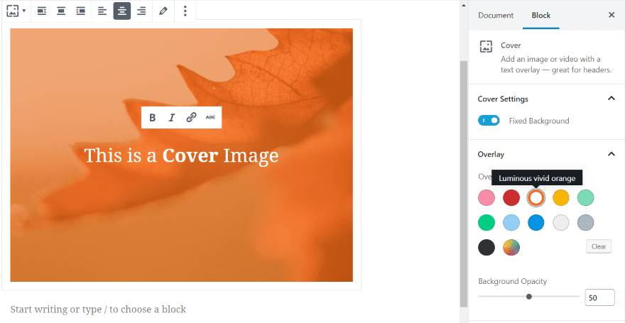
Add an overlay color by selecting the color you want from the choices, or select the multi-colored circle to select a custom color.
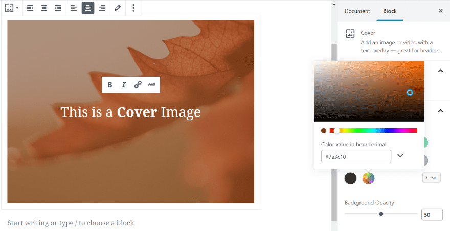
The custom color includes a color picker with a slider, and it shows the color value in hex or in RGB.
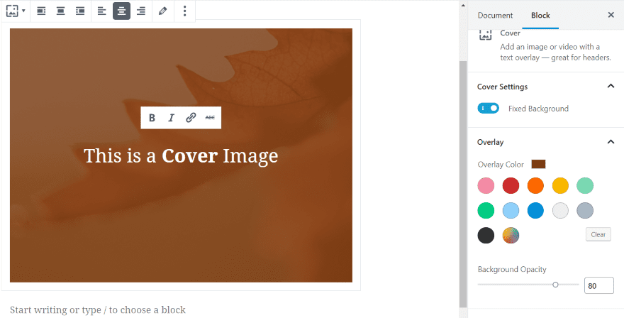
Background Opacity changes the amount opacity of the overlay, allowing you to choose to show more of the image and less of the overlay’s color, or more of the overlay and less of the image. In this example, I’ve set the opacity to 80. You can tell there’s an image there, but you can’t see much detail.
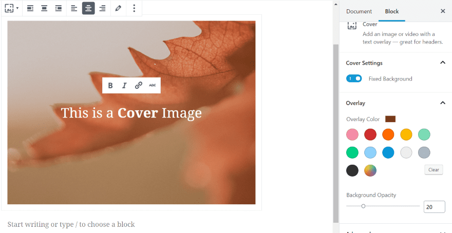
In this example, I’ve set the opacity to 20. A lot more of the image can be seen but it still has a touch of the overlay’s color showing.
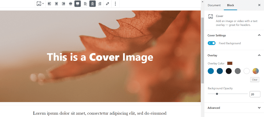
The image also has a full-width option in the settings at the top of the image. This is great for creating image or video headers or creating beautiful section introductions.
Cover blocks open up a lot of design possibilities by giving you the ability to add images with text, overlays, and parallax. The image/video, text, colors, and parallax help set the mood of the article and appeal to the target audience. You can use multiple Cover blocks throughout the content to introduce new sections (which are typically identified with header text) or just add some visual appeal to page links or products.
Featured Images
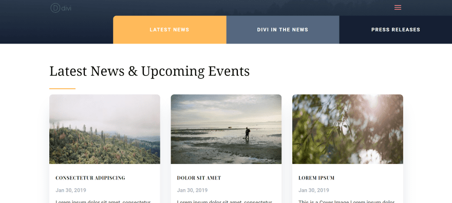
The featured image supplies the post thumbnail. These thumbnails are displayed anywhere that shows a featured image such as home pages that show blog posts, blog archive pages, and on single posts. The featured image represents the article itself. They’re used to help spark interest and inform the reader as to the type or purpose of the article.
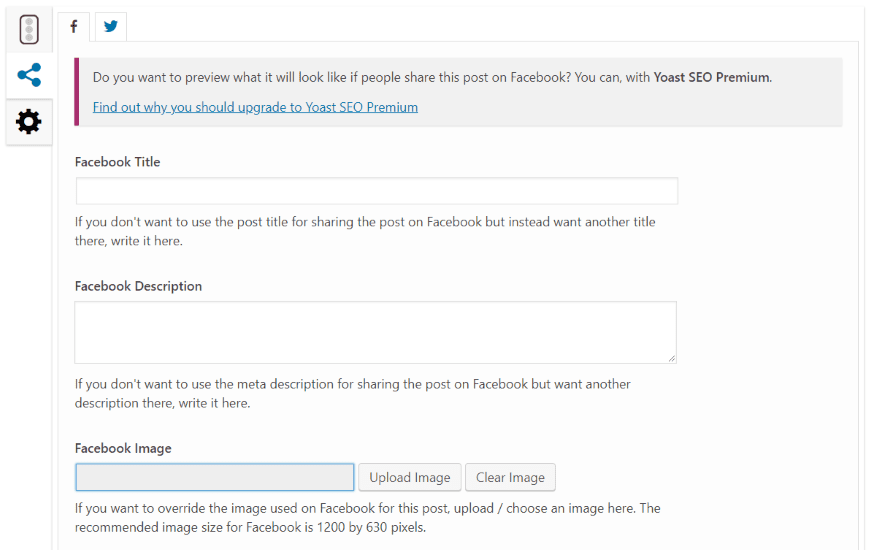
They also used as the default image that’s shown when the content is shared on social media unless that image is overwritten manually using a plugin such as Yoast, as seen in the example above.
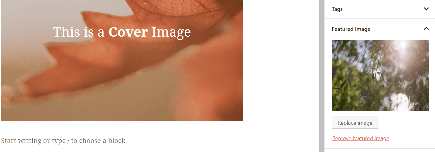
The featured image is added in the post or page settings. Click Set featured image and choose or upload your image to the media library.
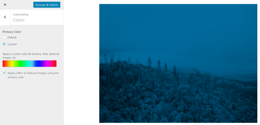
Themes such as Twenty Nineteen include an overlay for the featured image. You can choose the colors it in the theme customizer under Colors. Blue is the default color, but you can use the slider to select any almost color.
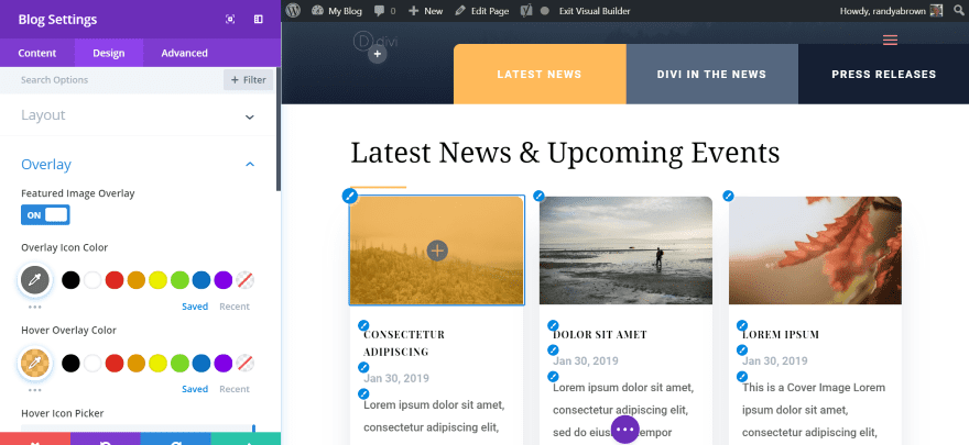
You can also adjust the featured image overlays when using page builders such as Divi and Extra. In this example, I’m adjusting the featured image overlay icon and hover overlay color for the blog module.
Using Cover Images and Feature Images Together
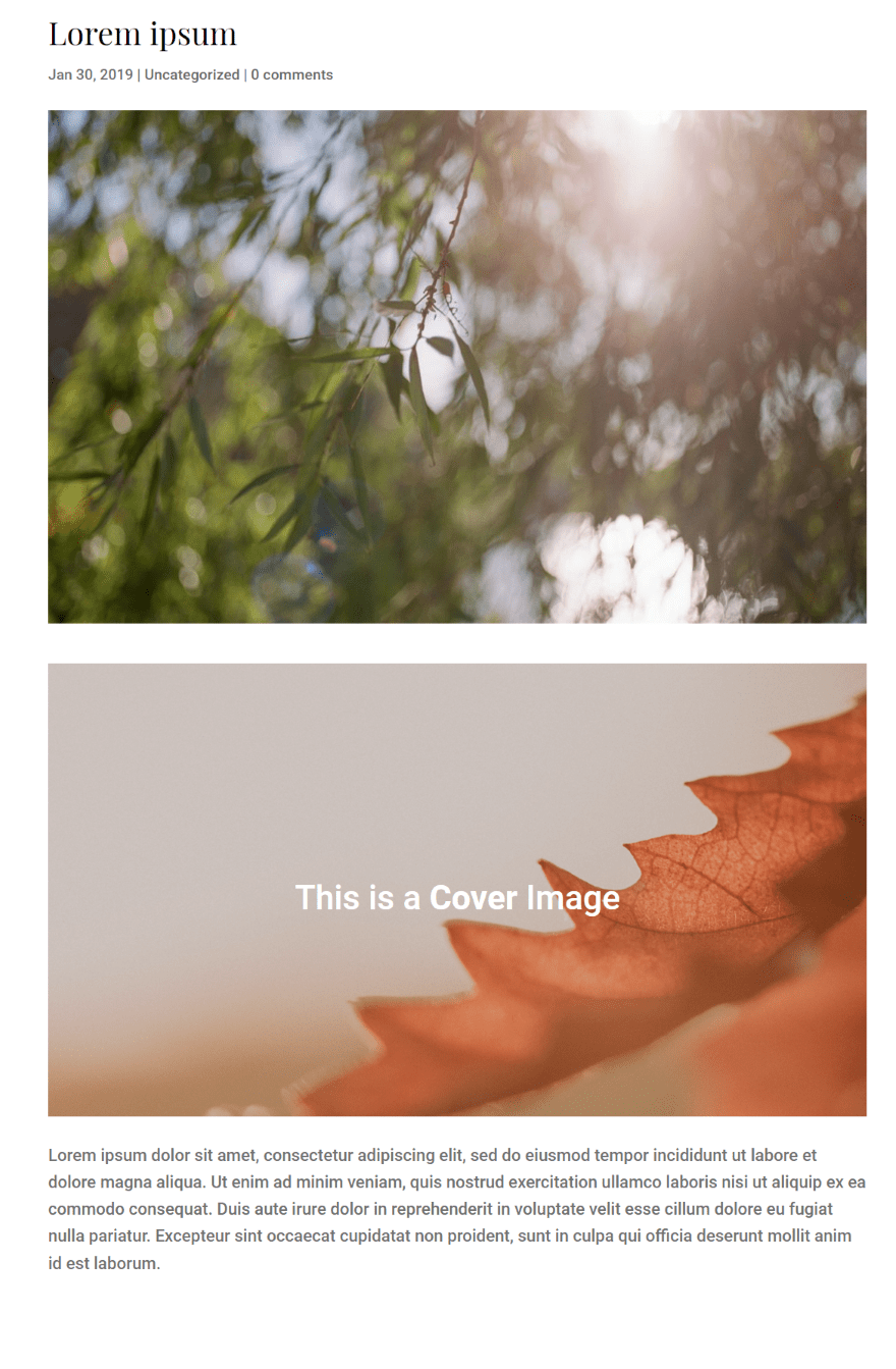
You can use the cover image and featured image together on the same page or post. In this example, I have both showing within the article. Ideally, they wouldn’t sit next to each other like this, but this is just to show they can appear within the post. There are times though when you’ll want to use the cover image as the featured image.
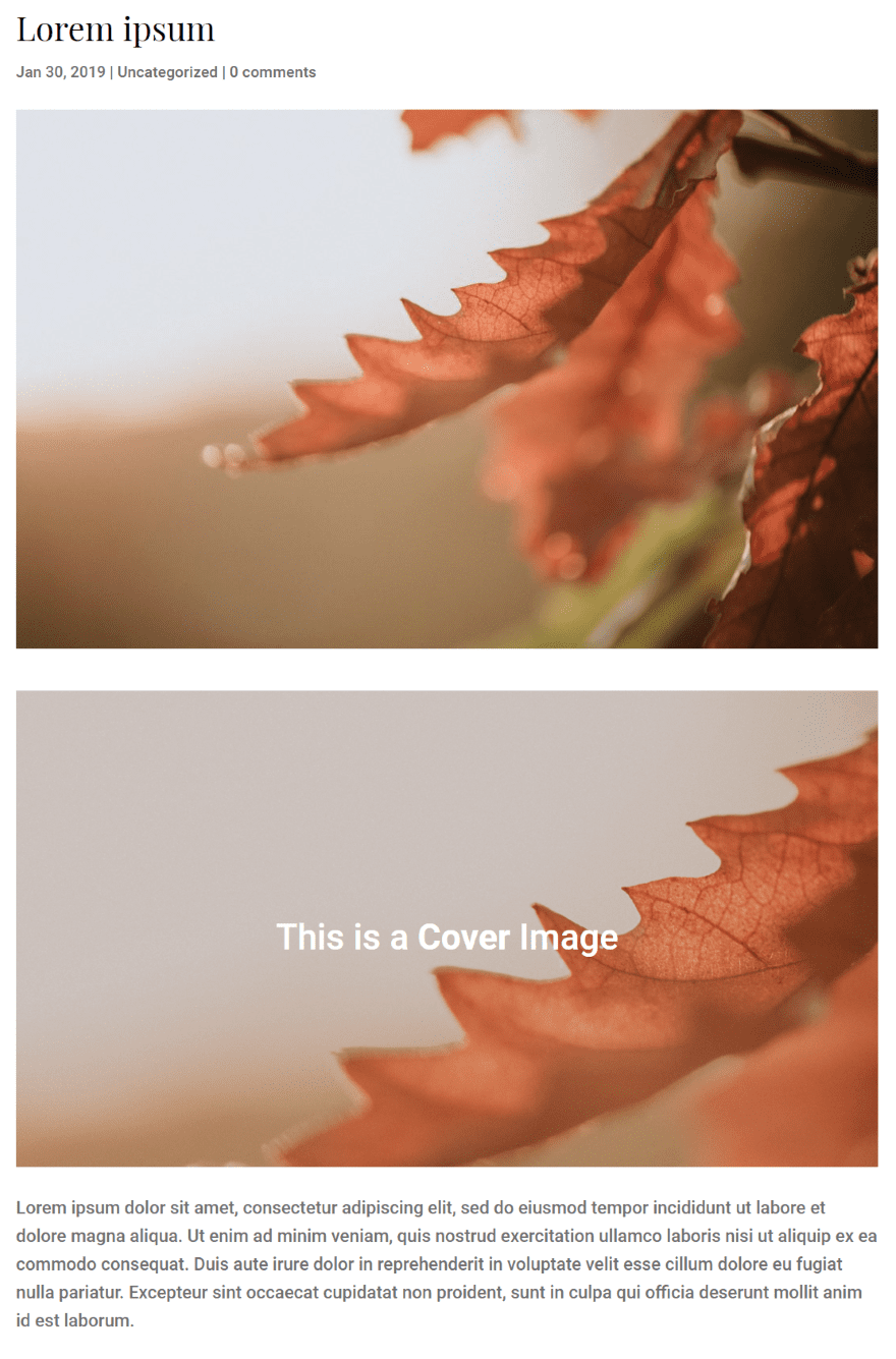
If you use the same featured image as the cover image, the images will show up twice within your content. It’s actually showing two different things: a featured image and a cover image, but you’ve selected the same image for both.
Fortunately, there are several things you can do to use the same image for both without the image appearing twice. Some themes, like Divi and many others, allow you to exclude the featured image from the content.

If you’re using Divi or Extra, in the dashboard menu go to Divi (or Extra) > Theme Options > Layout and disable Place Thumbs on Post in the Single Post Layout tab. This option is also available in the Single Page Layout tab, so you can customize the settings according to your needs.
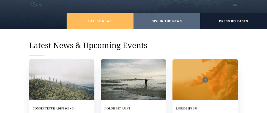
In this example, the featured image is the same as the cover image. I’ve added a hover overlay, which I’m demonstrating by hovering over the post on the right.
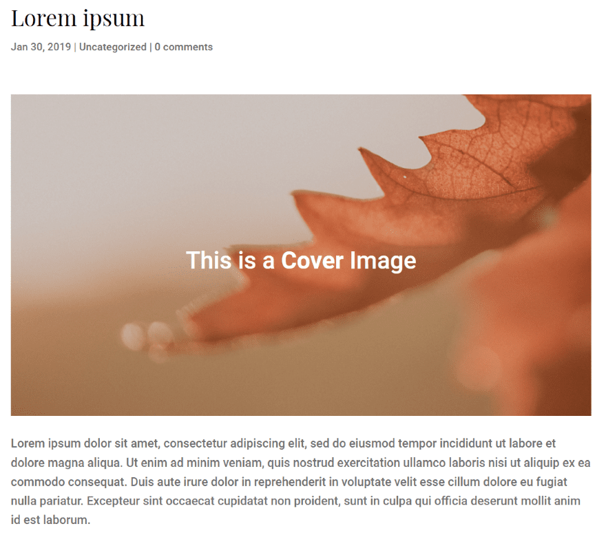
The post itself only shows the cover image. The featured image doesn’t display within the post’s content.
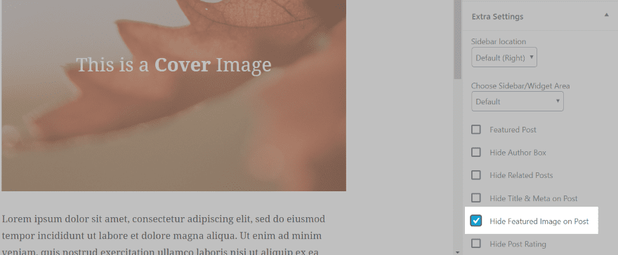
Extra includes an option to hide the featured image on the post individually. This gives you more control over how WordPress handles featured images on posts and pages. In the post settings, click Hide Featured Image on Post.
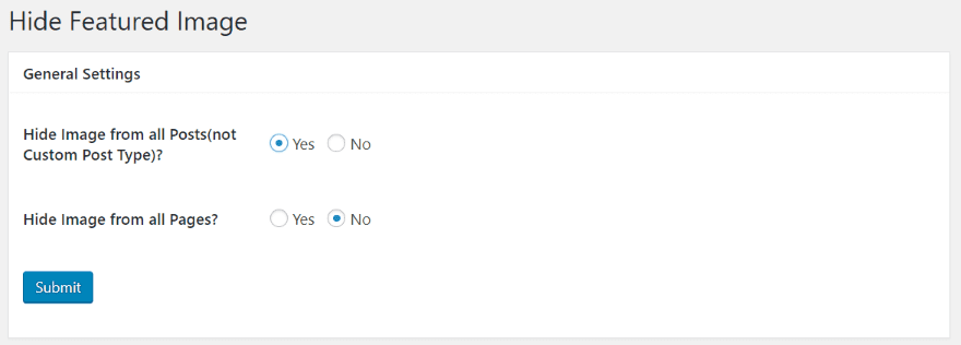
You can also hide the featured image on the post with a plugin such as Hide Featured Image, a free plugin in the WordPress repository. Choose to hide all featured images on posts or pages, or hide them individually on the pages and posts themselves. At the time I tested the plugin it wasn’t compatible with Twenty Nineteen, but it worked great with Twenty Seventeen and others.

It adds an option to pages and posts to hide the featured image. This is great if you want to show the featured image by default, but then hide it on pages or posts that use a cover image. This gives you more design control for displaying featured images.
Ending Thoughts
That’s our look at covered image vs featured image in WordPress. At first, they seem to be the same or similar, but in practice, they’re very different.
Featured images attract the reader to the article. An article will only have one featured image on the site, which will show anywhere that displays thumbnails for posts, but it can be replaced for another image to show on social media using plugins such as Yoast. Some themes such as Twenty Nineteen, and builders such as Divi, include customizations for featured images.
Cover images are actually part of the article and can help improve engagement with the posts. The article can have multiple cover images or videos throughout its content. They’re great for providing visual design and for separating sections of the article if you want to use images instead of just header text. Cover images are especially interesting because of the full-width, text, parallax, and overlay options that are built into WordPress. I love that it can display videos. Until Gutenberg, having these features required a plugin or a page builder.
Covered images and featured images are great for adding visual design to your content. They have different options and purposes, and you can use them separately or together.
We want to hear from you. How do you use covered images and featured images in WordPress? Let us know in the comments.
Featured Image via karnoff / shutterstock.com



Note to author and editor: The correct usage of terms is: *Feature* [image] and *Cover* [image] not featured and covered.
Well explained, Thanks for sharing Valuable info, bookmarked the page
Thanks for explaining this. This will be helpful for me.
Thanks for explaining the difference. I think worpdress 5 has got lot of features for which we used to have lot of plugins (that’s why developers are not liking it).
thanks for sharing and i wish you keep sharing of more interesting and helpful content
This is just one of the many useful additions that Gutenberg brings to WordPress. As much as the community hates on it (because change is hard for most), it is bringing often-used features into the core which is much needed.
Gutenberg may be rough around the edges now, but given time, it will end up being more beneficial to current and future users of WordPress.
Really got good insight into difference between Featured images and Cover images .
I would like to suggest changing ‘covered image’ to ‘cover image’ in the title and first couple of paragraphs.
I agree, since the two terms mean exactly the opposite! Does it cover something, or is it covered by something?