WordPress themes are a staple of the platform, and a key part of what makes it so user-friendly. Since version 2.1, every major release has shipped with a new default WordPress theme, which provides some insight into what’s next for the Content Management System (CMS).
In this post, we’ll discuss the role default WordPress themes play, review the past twelve of them, and take a look at the latest, Twenty Twenty-One.
Let’s get to it!
Subscribe To Our Youtube Channel
The Purpose of Default WordPress Themes
New WordPress installations need a theme, even if it just serves as a placeholder until users can choose new ones for their sites. Default WordPress themes fill that role.
However, they also offer much more. For instance, default themes provide a high level of compatibility with the platform that makes them useful for troubleshooting common errors.
Additionally, each new default theme implements the latest web design practices to keep the CMS looking fresh. It also sets a precedent for upcoming features the Make WordPress team is planning.
For example, back in 2014 and 2015, WordPress default themes started incorporating responsive design. This change later expanded to the back end, and is now a staple of quality WordPress web design. So it’s fair to say that looking at the evolution of the default themes can provide insight into what’s next for the web’s most popular CMS.
A History of Default WordPress Themes
Below, we’ll walk you through all of the default themes WordPress has ever featured. Note that the oldest two no longer receive regular maintenance, and so we can’t recommend them for use on your site. However, the newer themes are free, highly customizable, and well suited to a variety of site types.
Without further ado, let’s take a look at the default WordPress themes throughout the years.
Classic
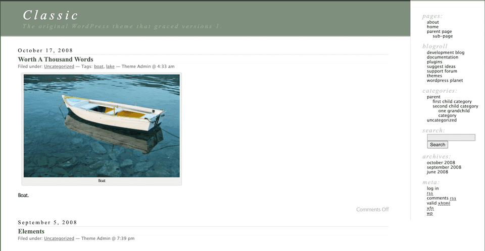
Prior to version 1.2, WordPress shipped with the Classic theme. That puts this theme at its peak in 2003 and 2004. Although it would have made for a high-quality site back then, Classic certainly shows its age now.
In this theme you can clearly see WordPress’ origins as a blogging platform. The sidebar features navigation meant for large post archives, and the rest of the page is primarily dedicated to displaying long-form content. There’s no fancy header styling to be found here.
On top of that, the original WordPress theme is not responsive, hasn’t been updated in over a year, and is probably too basic for most users these days. Still, it’s worth looking back on to remember how the platform started and see how much it has evolved.
Default (Kubrick)
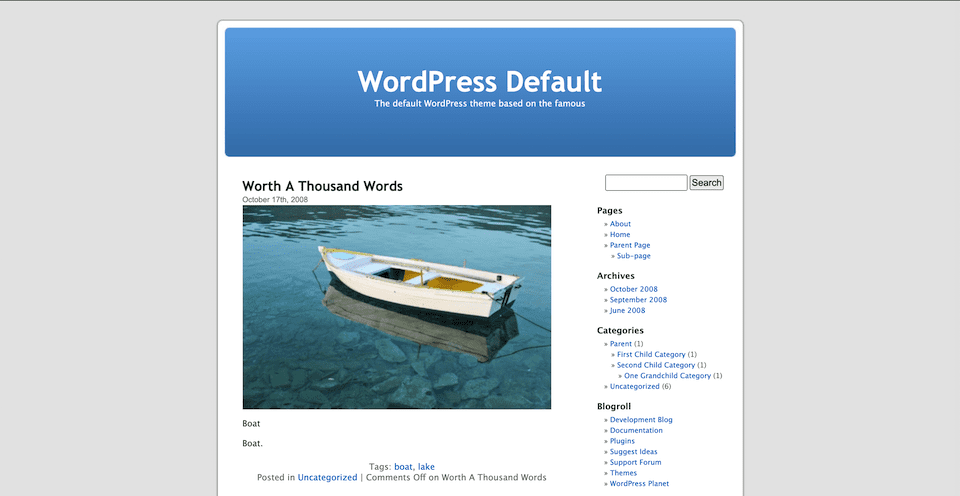
Default, also known as Kubrick, garnered much more attention than its predecessor. This is what most users think of as the first default WordPress theme.
Again, this theme was made for blogging, and that shows in its design. Post content is placed front and center, and navigation is relegated to the sidebar. However, it did offer a lot of flexibility to publishers in a variety of niches. So much so, in fact, that this theme stuck around as the go-to WordPress design for five years, from 2005 to 2010.
Kubrick is no longer receiving updates and is not mobile-friendly. So you probably won’t see it on any high-end sites these days.
Twenty Ten
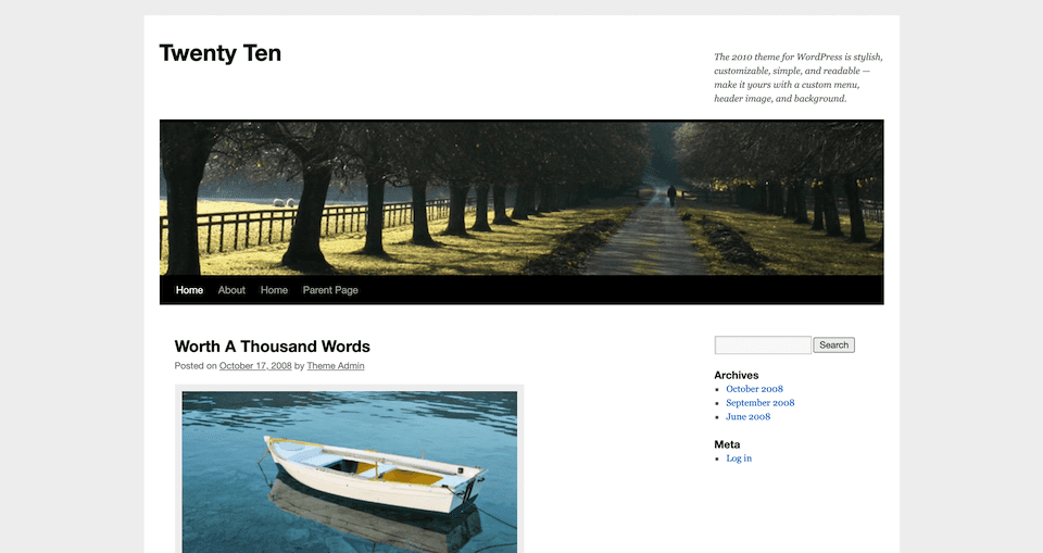
In 2010, WordPress starting releasing a new default theme with every major version. This enabled the platform to keep up with more rapidly-changing design trends.
Twenty Ten brings a handful of changes, including a header image and top bar navigation. WordPress 3.0, which this theme shipped with, also introduced the concept of widgets, which gave users more control over their sites’ designs without requiring coding knowledge.
This theme is still actively maintained. However, as you might expect from a theme that came out when smartphone usage was still somewhat minimal, it’s not responsive.
Twenty Eleven
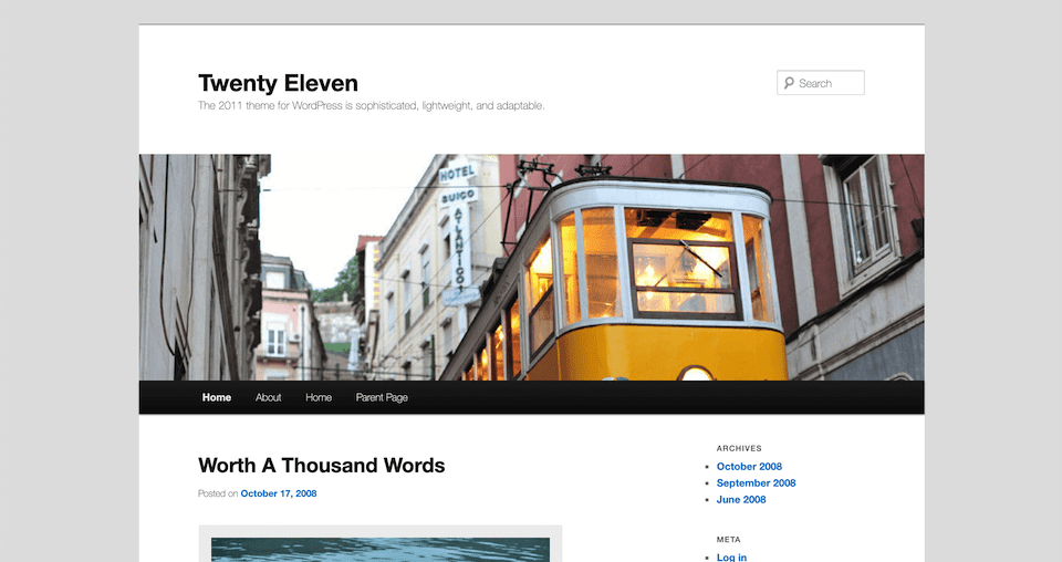
At first glance, Twenty Eleven doesn’t seem all that different from Twenty Ten. It features a similar header image, navigation menu, and sidebar with plenty of space to feature blog posts. However, it brought many updates to the platform, including:
- HTML 5 compatibility
- Improved custom page layouts
- Performance improvements
- A new widget
This is also the first theme to use a mobile responsive design, which would prove to be a crucial development over the next several years.
Twenty Twelve
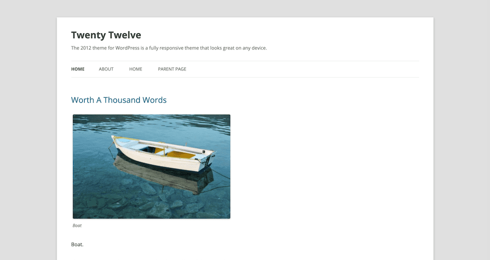
Speaking of responsiveness, that was the primary focus of the Twenty Twelve theme. This was important for helping WordPress keep up with the rise of mobile internet use.
However, that’s not the only way in which Twenty Twelve pushed the boundaries of traditional WordPress theme design. It also signaled WordPress’ departure from its identity as a blogging platform, and its new status as a fully-featured CMS capable of supporting all types of sites.
Twenty Twelve included a customizable home page and enabled users to set up a site that didn’t feature a blog. It’s still actively maintained and available in the Theme Repository.
Twenty Thirteen
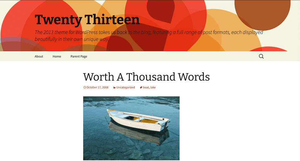
Twenty Thirteen is one of the most distinctive default WordPress themes. Its flashy header and striking typography earned mixed reactions from users.
This theme remained responsive while pivoting back to WordPress’ foundation as a blogging platform. It wasn’t as popular as Twenty Twelve, perhaps because it’s slightly less flexible in terms of layout. However, it also brought widgets to the footer area.
If you’re interested in using this theme on your site, it’s still actively maintained and suitable for a variety of niches.
Twenty Fourteen
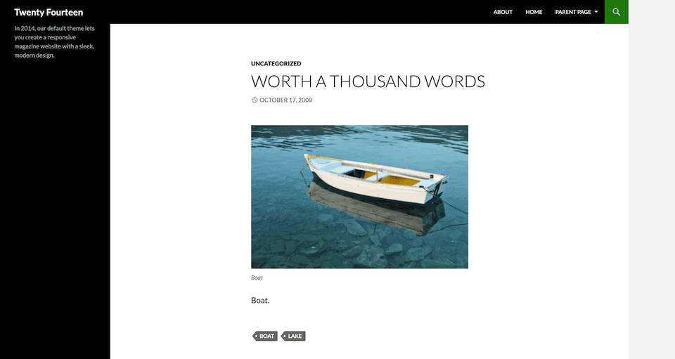
As the first magazine-style default theme, Twenty Fourteen made some waves with its design. It included extensive navigation options in both the sidebar – which migrated to the left-hand side of the screen – and the header. Featured images were also a standout element of this theme.
Twenty Fourteen was ideal for multi-author sites. It held to some of the past trends of content-heavy sites with its emphasis on posts, but also acknowledged the significant changes the blogging industry underwent between 2003 and 2014. This theme is still a viable choice for online publications.
Twenty Fifteen
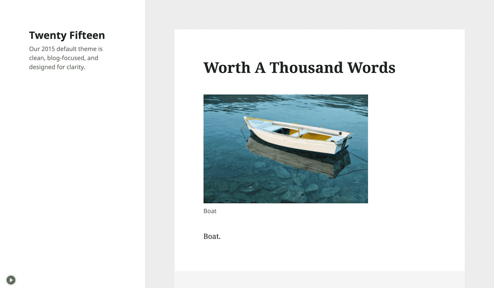
After a few more intense theme designs, Twenty Fifteen returned to the minimalistic vibe that was prominent in Twenty Twelve, Kubrick, and other earlier default themes. It was created to be flexible and work well with the Customizer, from which users can change its color scheme and other elements with ease.
Twenty Fifteen also took into account the ever-growing prominence of social media. It includes new social icons and also lends itself well to short-form blog posts. With plenty of white space, visitors can scroll through your content distraction-free.
This theme still receives regular updates, and is well worth considering if you want a free theme with a streamlined design.
Twenty Sixteen
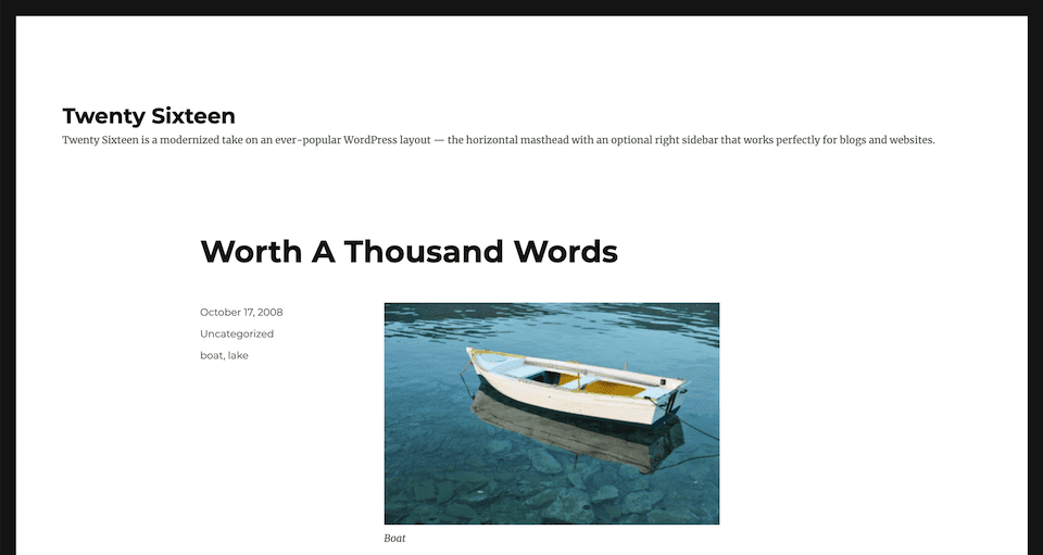
With Twenty Sixteen, we got another content-focused default WordPress theme. However, it did bring back multiple widget areas, and enabled users to easily showcase related posts at the end of their articles.
Apart from that, there’s nothing too remarkable about Twenty Sixteen. It’s excellent for mobile-first blogging, and is still in use on over 300,000 sites. So clearly many users feel that it’s suitable for publishing their content online.
Twenty Seventeen
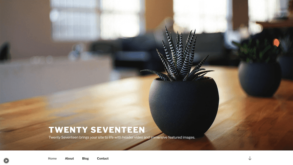
Twenty Seventeen’s expansive header makes it another highly-recognizable default theme. It was built with business sites in mind, and has the media capabilities to capture customers’ attention and draw them in. In addition to more traditional images, the header background can display video to make a striking statement right from the start.
This theme also sports a full-width layout that keeps visitors scrolling. Apart from business websites, it’s well-suited to professional portfolios and other sites that want to share a clear and direct message. More than 1 million users have this theme running on their WordPress installations, which speaks to its appeal.
By now, it goes without saying that Twenty Seventeen is still being updated regularly and works like a charm on mobile devices. It’s undoubtedly still one of the top free themes for business sites.
Twenty Nineteen
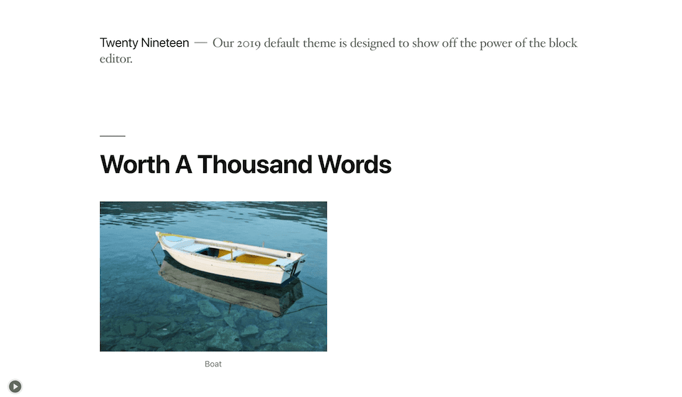
There was no Twenty Eighteen theme. The WordPress team was busy working on the new Block Editor, and so development of the default theme was delayed.
Perhaps unsurprisingly, the Twenty Nineteen Theme went in a highly minimalistic direction, with the goal of showcasing the Block Editor’s functionality. It offers the highest degree of flexibility among the default themes to this point.
This theme did not rise to the level of popularity as its predecessor. However, if you’re looking for a template that you can make your own, is block-compatible, and will work for just about any site, you may want to consider this one.
Twenty Twenty
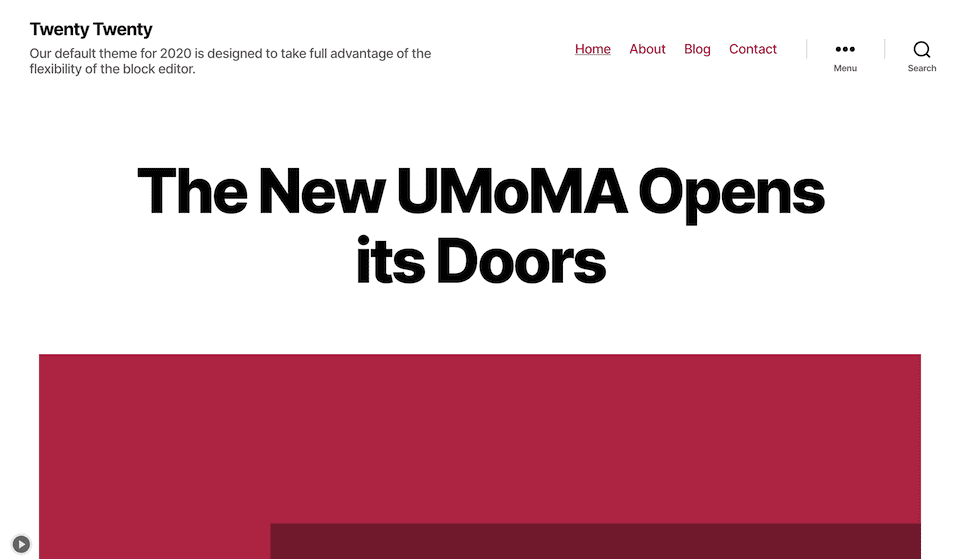
WordPress continued to seek flexibility and Block Editor compatibility with Twenty Twenty. It’s easy to customize, and makes an excellent foundation for child themes if you’d like to use it on client sites.
On top of that, Twenty Twenty made some strides towards better accessibility. For example, it will automatically set the text color for optimal contrast with your selected background.
This theme also introduced group and column blocks for improved layout design. Additionally, it enables editor styles to help you get a better idea of what your content will look like on the front end while you’re creating it.
Twenty Twenty-One
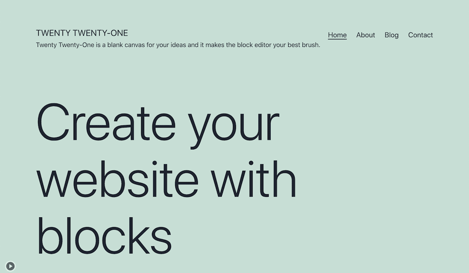
That brings us to the present day, and the Twenty Twenty-One theme. Advertised as suitable for portfolios, business websites, and blogs, this flexible theme includes new block patterns and builds on the advancements made by Twenty Nineteen and Twenty Twenty.
Twenty Twenty-One was built on Automattic’s Seedlet theme. It offers multiple color palettes for you to choose from, nine post formats, and dark mode support. It also makes an ideal parent theme
Additionally, it’s worth noting that there’s also a Twenty Twenty-One (TT1) Blocks theme. This experimental block-based version of the default theme is compatible with Full Site Editing (FSE), the next major feature on the docket for a future WordPress release.
Conclusion
WordPress themes are an integral part of the platform. Understanding the default themes that have been available throughout the years can help you gain a better sense of where the platform has come from, and where it’s headed in the future.
There have been many default WordPress themes throughout the years, from Classic to Twenty Twenty-One. Most are still regularly updated, and many can make a strong foundation for your next (or first) website.
Do you have any questions about the default WordPress themes? Ask away in the comments section below!
Featured Image via Chilly Design / shutterstock.com



I am new to Divi, in order to get the best out of it which default theme would you recommended that gives you the most flexibility. Thanks Tina
Hi Tina, good news! If you’re using Divi then you don’t need one of these themes. It’s already much more powerful and flexible 🙂
Twenty Fifteen is my favorite one. It looks good when you choose the blue color scheme of it.
Thanks for sharing, Andrej!
Will Divi follow this path? Integrating with the block editor and expanding it?
FSE is basically Divi and apparently will be faster.
I’ll hope that divi adapts to this tools.
Hi, Mike! I personally can’t speak to what Divi’s future will look like, as I’m not privy to those plans, but following the blog is a good way to stay up-to-date on the latest features and releases 🙂
Thank you for the reply, Will.
Best regards
Woo! Seeing all these topics has made me remember so many things. The truth is that I really like Twenty Twenty and Twenty Twenty-One on an aesthetic level.
Thanks for the compilation Will
Thank you, Pablo! It is kind of fun to look back every now and then and see how things have changed.
Really great experience for me with DIVI, it is giving control on allmost every element without limits. Once you know how to use DIVI, customization is very easy. And also DIVI needs some more instant blocks and menu s, like other builders. And again I’m lucky to have lifetime membership. Thank you DIVI..