Next to the About Page, the Contact Page on any website is likely to get the most traffic. No matter where people come to your site from, they are very likely to be on the lookout for a way to get in touch with you. They might want a phone number, an address, an email, or even where they can find you on social media. Each visitor is unique in how they want to reach out, so it is in your best interest to make sure that your Contact Page is as clean and concise as possible.
What Does a Contact Page Need?
The obvious answer here is contact information. However, the trick is streamlining that information, creating a frictionless experience for the visitor, and making sure that you aren’t providing too many options for them so they become overwhelmed.
In general, your contact page needs to contain:
- Real-world contact information such as street address, phone number, and hours of operation (for each location you have)
- Digital contact information such as email address, website URL, or live-chat availability
- Social media and community contact information such as what networks you’re on (and regularly check) or where to find your forums
On top of that info, it’s a very good idea to give people an idea of what kind of contact is appropriate. What kind of inquiries do you respond to, what inquiries may not justify a response, and what inquiries will be automatically trashed?
- Messages asking about products, services, or customer support of some kind are great
- Potential (legit) partnerships and working relationships are welcome
- Emails offering advertising opportunities likely get trashed, same for asking to buy link placement, etc.
- Announcements and cold emails on unrelated products or press releases will be ignored
Setting ground rules like these can help your contact page be more user-friendly, and it can keep your communication workflow uncluttered and you closer to Inbox Zero.
How to Set Up the Best Contact Page
One of the more contentious — or maybe debated — inclusions on a contact page is the actual Contact Form itself. Really. Some people see a contact form as a brush-off. As a way for the business to provide the illusion of connection, but in reality, simply filing the messages away and not actually reading them. But for the most respected businesses, these contact forms are heavily used and create a lot of trust with their customers. They can also be the starting point for so many automations that could help your business save time and make money. Choosing the WordPress contact form plugins with the best features can make this happen with ease.

On the other hand, the contact form provides a near frictionless method for your visitors to contact you. In many cases, simply having a contact form near the top of the page is an easy way to invite people to reach out.
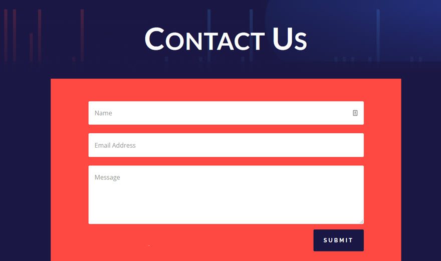
If that is the primary drive of your Contact Page, then a form is the way to go. However, if you prefer a more filtered stream of contact, then an easily-filled form might not be what works for your team.
What URL?
Generally, two URLs are used for a contact page.
- https://example.com/contact
- https://example.com/contact-us (or contact-me)
Neither is better than the other, but in our opinion, we like /contact better because it’s simpler. You could always do a 301 redirect for any other common slugs, too. If someone is simply trying to reach that page itself, /contact will be the way they do it.
We use /contact here at Elegant Themes.
Our Contact Page
In fact, this is the current contact page we use:
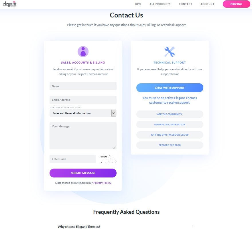
On one side of the page is a contact form. Because we want our members to contact us as easily and quickly as possible. We want to keep friction at a minimum so we make the form prominent and include a category, too. Additionally, we also have a tech support live chat that users can initiate with a press of a button to the right.
Now, under the Chat with Support button for live chat, are our social and community resources. The way you present these will differ from the way we do it. Because the nature of your community. We have a community forum, a Facebook group, and a blog with an active commenting community. So rather than simply point you at our Twitter or Facebook pages, we want to make sure that people head to where the most interaction happens.
Additionally, we have a Frequently Asked Questions section at the bottom of the page, and that fills the need of what we mentioned above regarding what users should and should not contact for. The answers for many questions are available on the same page, saving both the user time and our support team.
Layout
The layout of your contact page is incredibly important, too. You absolutely under no circumstances want to bury your information. You want it presented as clearly as possible. However, you also don’t want to overwhelm your users. In general, we think two layouts work the best.
The first is the above-the-fold card layout. You have clean boxes that are clearly delineated from one another, and the user can easily find the information they want.
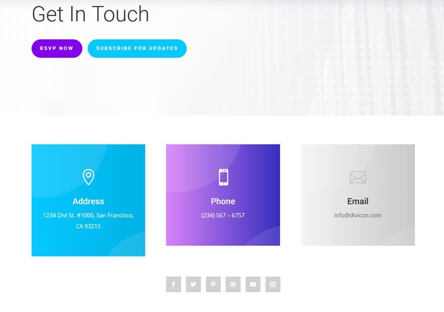
Whether they are on mobile or desktop, the information is readily accessible and easily clickable. Additionally, the social media button are prominent without overshadowing the more pertinent contact information. However, if social is your primary way of communication, this might be reversed.
The other way we recommend to lay out your contact page is to highlight the contact form by making it the most featured part of the page. If you want people to reach out, this is the easiest way to do so. Also notice in this layout pack that the social media is far more prominent than in the other, in placement color, and size. That will indicate to the viewer that those platforms are just as viable as email (the form) to reach out to you.
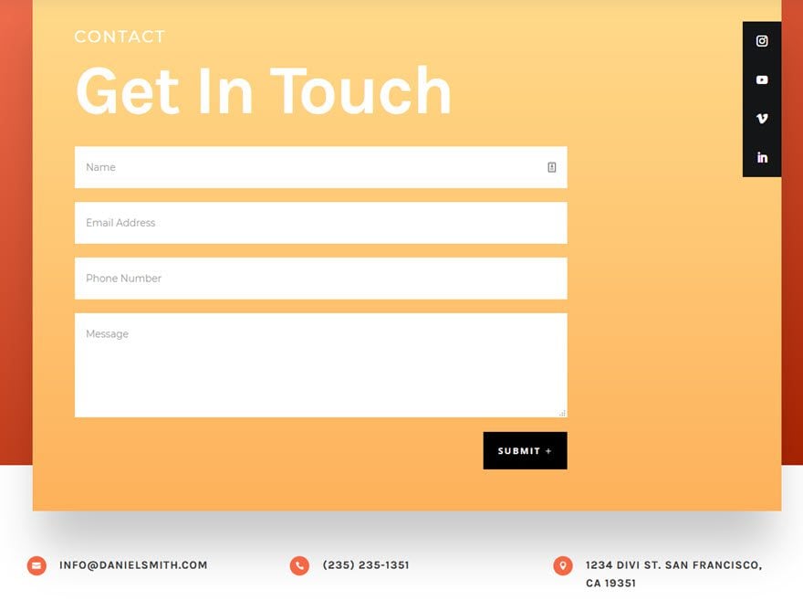
The technical information is at the bottom, including an email, phone number, and address. But because they’re lower on the page, they are less likely to be used as a primary form of contact.
Additionally, you will notice on both of these layout types that the page is clean otherwise. In all our examples in this article, there is no extraneous information. Everything about the page serves the single purpose of your audience or customers reaching out to you in the simplest way possible.
One Last Thing: Incentivize The Contact
Finally, we want to encourage you to incentivize your customers and users to reach out to you. Sure, they might reach out when something is wrong, but that can make for a wearying inbox day after day. If you provide your customers a reason to reach out, you may get some praise sprinkled in there.

Give a discount for reviews of podcasts on Apple Podcasts and letting you know. You could provide coupons or offers in exchange for testimonials which are easily displayed with these plugins. Whatever you do, it’s possible to create a reason for people to reach out and become engaged more with your brand and you as an individual. You could solicit feedback for an entry into a drawing, and recognition is a great incentive for some people — highlight them in some way for showing how they’ve highlighted you.
People are social animals. We want to talk to each other. Sometimes, it just takes a little push to get the conversation started.
Wrapping Up
If you want the best contact page possible, the number one rule is to keep it simple. You want straightforward, uncluttered information available as soon as the user hits the page. Whether you use a contact form is up to you, but make sure that whatever method you prefer your customers use is the most prominent on the page. Many people make the mistake of using a contact form as their main element, but they prefer people to use the live chat. In that case, highlight the live chat and move the contact form below the fold. It might take some experimentation, but finding the best contact page for you can increase customer happiness and brand engagement a lot.
What do you do to make your contact page useful to visitors?
Article featured image by LanKogal / shutterstock.com


Great article but ironically several weeks ago I used the Elegant Themes Contact Us page to send a query and never got a reply…. I think you should include a paragraph in there about the website owner’s commitment to actually replying to, or at least acknowledging, use of the contact form.
Cheers
Thank god I just found this contact us page as I was just tired of scrolling through dull looking contact us pages. I wished I would have found this page some time earlier.
Thanks again.
Another important aspect is a good tracking implementation for the contact form. Its possible to add hidden fields to a contact form that get auto filled by tracking parameters that are passed over marketing channels like Facebook or Google.
Especially when running large marketing campaigns on multiple platforms its important to get the tracking right to see the effectiveness of the marketing campaigns.
Couldn’t agree more – “If you want the best contact page possible, the number one rule is to keep it simple”
I have seen so many websites that make it so complicated and confusing that you go all out of your mood to reach out to them! Nice Article… Thanks for Sharing.
Thank you for the great post. I like a way you describe the content. The points you raised are valid and suitable.
Juan
Great article, I love the idea about a call to action or incentive for customers to pick up the phone, it’s not something i’d considered putting on a contact us page but actually it makes a whole heap of sense.
Is there any way you can make anchor links to contacts easier, I have to refer to instructions every time I make any changes.
with other sites not mentioning any names you have an anchor bar which you drag and drop into position, so easy to set up.
Hello
Very good idea for a contact page.
I have a doubt when you will do a tutorial on customizing the DIVI blog.
In which effects can be used on images and texts (type hover, slide, etc).
DIVI is created for wordpress and wordpress is a platform for blogs
I notice you have a different type of captcha on your website form. How can we use this instead of the current one (of adding numbers together). Thanks.
And it would be great to have other options on the contact form – such as upload option etc.
Hello,
Thank you for these usefull hints.
I am using DIVI’s contact page and I am disturbed to receive spams despit the captcha system.
Couldn’t we use Google efficient reCaptcha system ?
Thanks
Pierre
I find your “contact form” module very convenient but without a fundamental component for some uses: the possibility of attaching documents; for example a possible “work with us” form must give the possibility to attach a curriculum vitae.
“You could provide coupons or offers in exchange for testimonials.”
You should probably clarify that this is not allowed if you’re requesting testimonials on Google (and potentially other platforms). This is strictly banned in the T&Cs and can get your listing with Google removed if found to be incentivising users to leave reviews.
Great info, B.J. And I have a ‘contact us’ problem that seems to plague all of my clients, and here’s how I deal with it. I hope that this trick can help others similarly plagued.
There’s a growing type of spam where people are paid to scan websites, either manually or semi-automatically, for the ubiquitous contact-us block. They fill out bogus information for their contact info, except perhaps for the email address for unsuspecting respondents, and then they spam the free-form “Message” field with their pitch, which is usually “better SEO, better website, get to be #1 on Google, etc.”
The key to thwarting this is not Captcha, because these are not bots, they are actual people so they pass the human test. The key lies in the fact that the Message field is free-form, allowing them to spew their garbage. So here’s what I do for my clients:
1. Remove the message field and instead install a drop-down with stuff applicable and common to that client (I want to book an appointment, I need a massage, etc.)
2. Limit the message field to a very small number of characters; enough that a client could get something reasonable in there.
#1 is proving to be the best option because it not only smacks-down the spam, it also helps guide my customers prospects and clients into being succinct in their requests. AND there is no need for Captcha anymore! It’s just not worth it for a spammer to try to get through.
We need to upload files in the contact form. Do you have in mind implement this feature? It’s strongly necessary for clients who need to show any issue.
I don’t speek english, sorry for my english.