Is your website not performing well on mobile devices? Poor layout or slow loading times can cause users to leave your site before they even engage with your content. In today’s mobile-first world, a responsive website is no longer just an option—it’s a necessity.
Whether you’re starting fresh or improving an existing website, a responsive site is essential to reach a broader audience and improve engagement across all devices. A responsive website doesn’t just look professional—it functions seamlessly on screens of all sizes.
With Divi, you can easily build a responsive website without any coding. This guide offers a step-by-step approach to creating a responsive website using Divi, so you can enhance user experience, adapt to all devices, and boost engagement.
Start Building with Divi Today
- 1 What is Responsive Design? And Why It’s Important
- 2 Why Use Divi to Build Your Responsive Website
-
3
Step-by-Step Guide: How to Build a Responsive Website with Divi
- 3.1 1. Get Domain and WordPress Hosting
- 3.2 2. Install and Activate the Divi Theme
- 3.3 3. Use Divi Quick Sites to Generate Your Responsive Website (in minutes)
- 3.4 4. Check Your Designs with Divi’s Responsive Previews
- 3.5 5: Customize Your Content and Designs for Each Device
- 3.6 6: (Optional): Implement Custom CSS for Advanced Responsiveness
- 3.7 7. Test Your Responsive Site
- 4 Get Started Today
What is Responsive Design? And Why It’s Important
Responsive design is a web design approach that automatically adjusts a website’s layout, images, and content to fit different screen sizes and devices. Whether viewed on a desktop, tablet, or smartphone, a responsive website ensures that users enjoy an optimal experience without zooming, scrolling, or resizing.
Responsive design is essential in 2024, as mobile traffic dominates the web. A responsive website helps you reach a broader audience while providing a seamless user experience across all devices. Google also prioritizes mobile-friendly websites in search results, so having a responsive design can improve your visibility and prevent you from losing valuable traffic.
Common Challenges of Responsive Design
- Inconsistent Layouts Across Devices: Maintaining a visually appealing design across different screen sizes can be challenging.
- Manual Coding for Device Breakpoints: Traditional responsive design often requires manually coding media queries, which can be time-consuming and complex—especially for those without coding skills.
- Performance Issues: Unoptimized images and media can slow down loading times, especially on mobile devices, frustrating users and increasing bounce rates.
- Testing Across Devices: Ensuring a website looks great on all devices requires continuous testing and tweaking, which can be difficult without the right tools.
With Divi, you can tackle these challenges effortlessly. Divi provides pre-made layouts, responsive editing, and real-time previews, so you can design beautiful, mobile-friendly websites without coding or extensive testing.
Build Your Responsive Website with Divi
Why Use Divi to Build Your Responsive Website
Divi is one of the most powerful tools available for building responsive websites. Here’s why Divi is the top choice for web designers:
Built for WordPress
WordPress is one of the most popular platforms for building websites, and for good reason. When it comes to creating a responsive website, WordPress is an ideal choice due to its flexibility, ease of use, and vast ecosystem of themes and plugins designed specifically for responsive design.
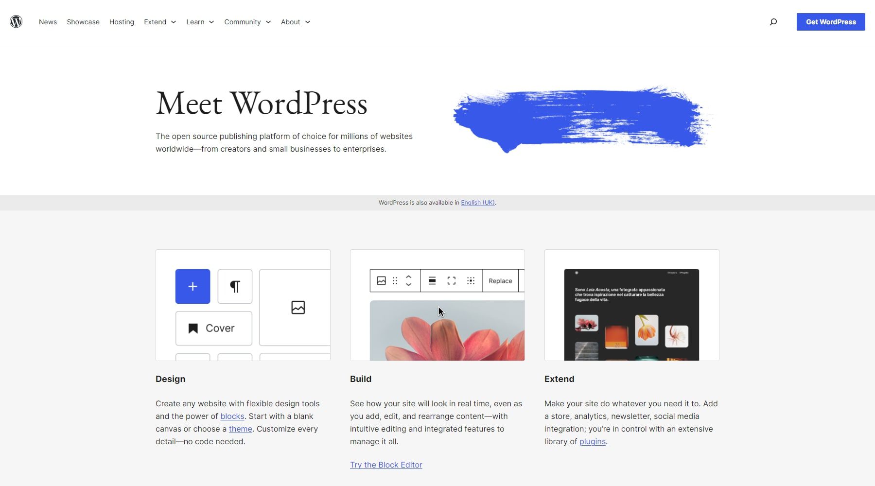
However, to truly unlock WordPress’s full potential for responsive design, you need the right theme and tools, and that’s where Divi comes in. While WordPress provides the foundation, Divi takes your website to the next level by simplifying the responsive design process and giving you the flexibility to create stunning, mobile-friendly websites with ease.
No Coding Required
Divi’s drag-and-drop builder enables you to design professional, responsive websites without any coding. Simply drag elements onto your page and customize them visually, making it easy for both beginners and experienced designers to create a mobile-friendly website.
Pre-made Responsive Templates
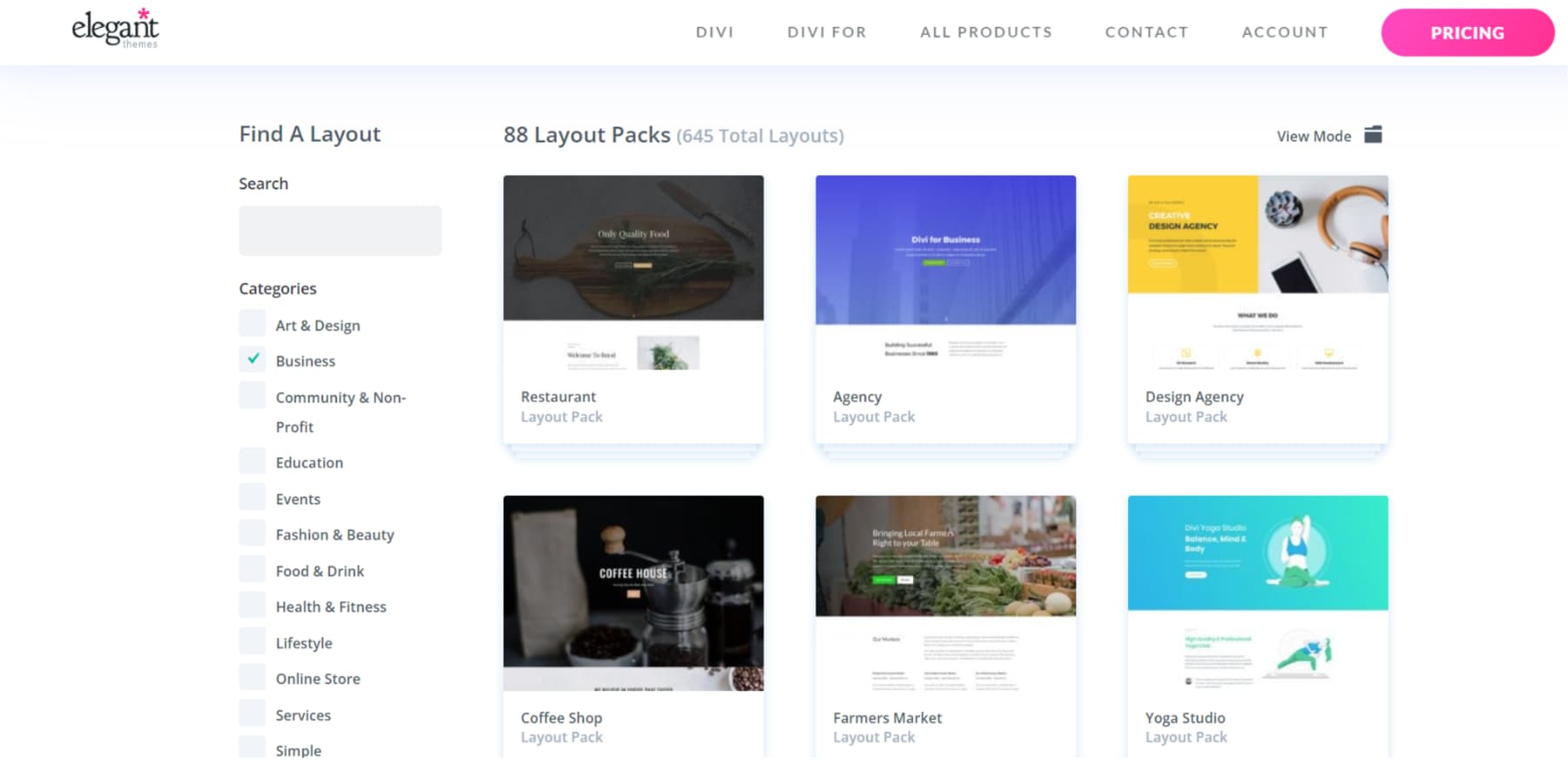
Divi offers thousands of pre-made layouts and responsive templates, allowing you to start building your site with a design that’s already optimized for mobile devices. These templates help you save time and effort, eliminating the need to build layouts from scratch.
Powerful Responsive Design Tools
Here’s why Divi stands out as an all-in-one solution for responsive design in 2025:
- Responsive Editing: Customize the appearance of your website on different devices (desktop, tablet, mobile) directly within the Divi Builder. Tailor layouts, images, and content for a seamless user experience across all screens.
- Responsive Previews: Preview your website’s design on various screen sizes without leaving the builder. Make real-time adjustments to ensure your site looks great everywhere.
- Custom CSS Inputs: Add custom CSS for specific breakpoints using media queries. This allows for advanced control and precise refinement of your design on different devices.
- Global Elements and Styles: Apply global settings across your website for consistency while customizing specific elements for different devices to maintain a cohesive yet flexible design.
- Fluid Grids and Column Structures: Use Divi’s fluid grid system to create layouts that automatically adjust to different screen sizes, ensuring your content remains visually appealing and well-structured.
- Adjustable Fonts and Typography: Customize fonts and typography settings for various devices to maintain readability and visual hierarchy across all screen sizes.
- Built-In Media Queries: Divi includes pre-set breakpoints that can be fine-tuned using media queries. This feature offers precise control over how your website adapts to various screen sizes.
Overall, Divi has made it easy to ensure your site looks beautiful and performs seamlessly across all devices.
Step-by-Step Guide: How to Build a Responsive Website with Divi
1. Get Domain and WordPress Hosting
Every website needs a domain and a hosting provider before you can build your responsive site. If you already have one, you can skip this step.
Domain
Your domain name is the web address for your website (e.g., elegantthemes.com), so it’s important to choose one that represents your brand and is easy for people to remember. Ideally, your domain should provide a clear sense of what your eCommerce business is about.
Once you’ve decided on a domain name, look for a reputable domain registrar to secure it. Namecheap is a popular choice, or you can take advantage of discounted domains through hosting providers like SiteGround.
If you already have a domain, you can link it to your hosting provider by updating the nameservers.
WordPress Hosting
Your website needs a dependable online home, and that’s where hosting comes into play. Since we’ll be working with WordPress, selecting a top-notch WordPress hosting provider is essential. A reliable host will simplify site management while ensuring excellent speed and security performance.
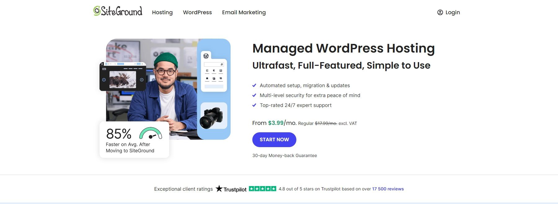
SiteGround provides WordPress hosting plans starting at $3.99 per month, making it a cost-effective choice. Setting up WordPress hosting with SiteGround is easy.
Check out the video below to learn how to set up your domain and hosting.
2. Install and Activate the Divi Theme
Divi is available for purchase from Elegant Themes, with options for an annual license at $89 or a one-time lifetime license for $249. Once you’ve made your purchase, you can download the theme and install it on your WordPress site by following these simple steps:
- Go to Appearance > Themes in your WordPress dashboard.
- Click on Add New, then Upload Theme.
- Choose the Divi .zip file you downloaded and click Install Now.
- Once the installation is complete, click Activate to make Divi your active theme.
Watch the video below for a detailed walkthrough and additional information.
Once the setup is complete, you’re ready to begin building your site. If you want to familiarize yourself with the process before starting, check out our tutorial on using the Divi Builder.
3. Use Divi Quick Sites to Generate Your Responsive Website (in minutes)
Once you’ve installed the Divi Theme on WordPress, you can easily start building your responsive website. With Divi Quick Sites, your site can be created automatically, so you don’t need to start from scratch.
Launch Onboarding Wizard
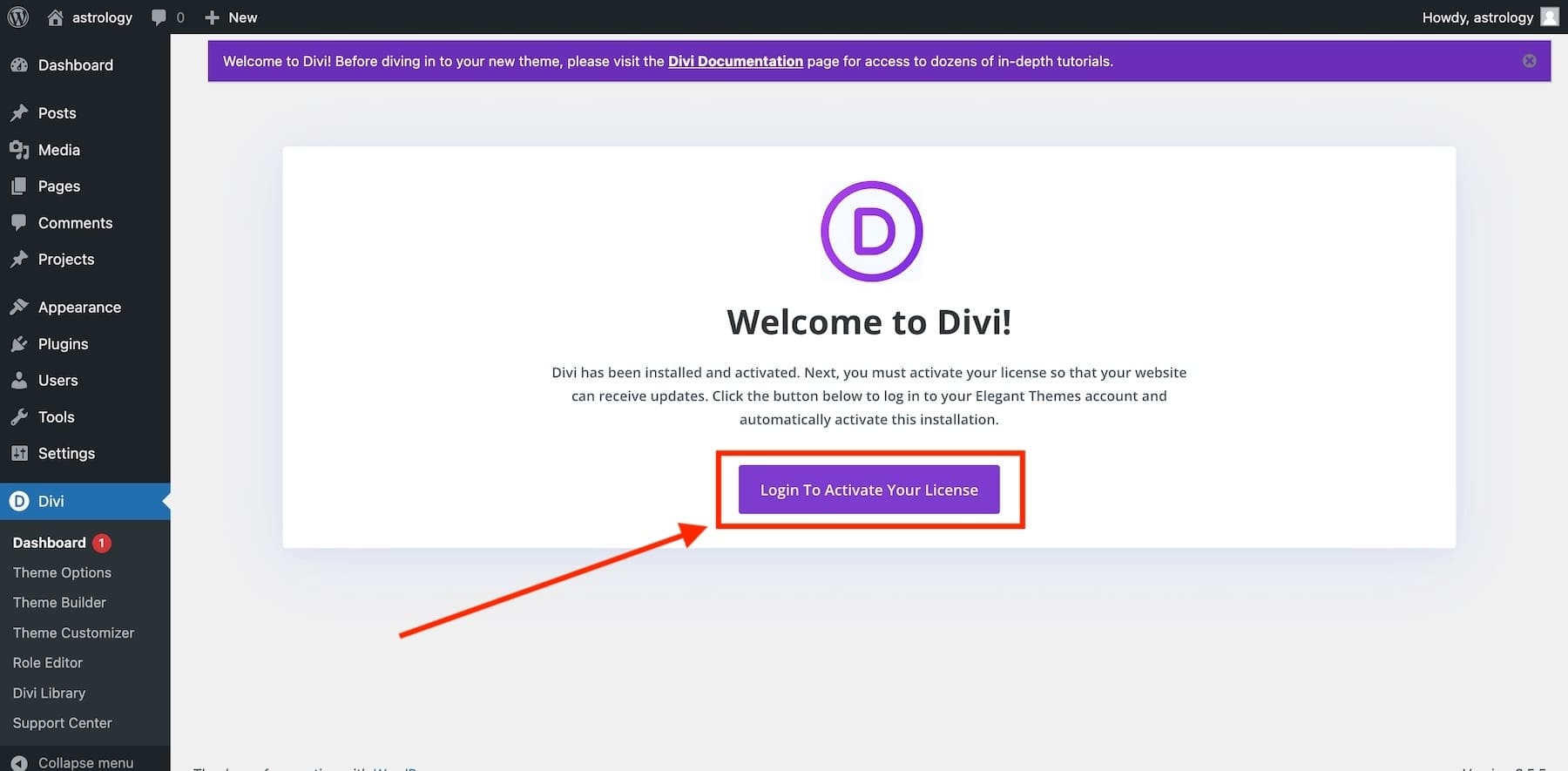
Once you’ve activated the Divi Theme in WordPress, you’ll be guided through the setup with Divi’s onboarding wizard. Just click the button to log in and activate your Divi license.
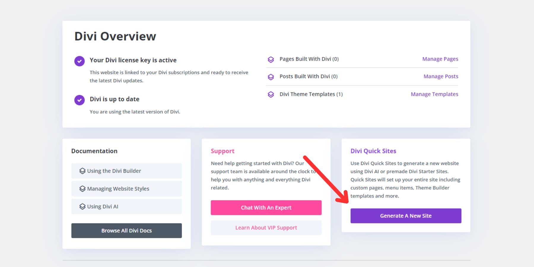
Once logged in, you’ll land on the main Divi Dashboard. From here, you can manage your site, access helpful documentation, seek support, and create a new site with Divi Quick Sites. To get started, just click ‘Generate A New Site’ on the dashboard.
Create Your Responsive Site with a Starter Site (or with AI)
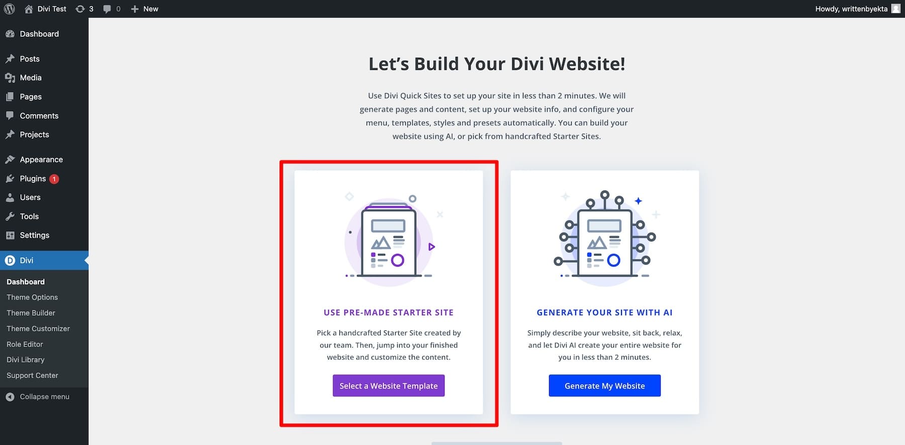
Next, you can create your responsive website using a pre-designed starter site or Divi’s AI website builder. Divi provides beautiful starter templates—simply click ‘Select a Website Template’ to begin.
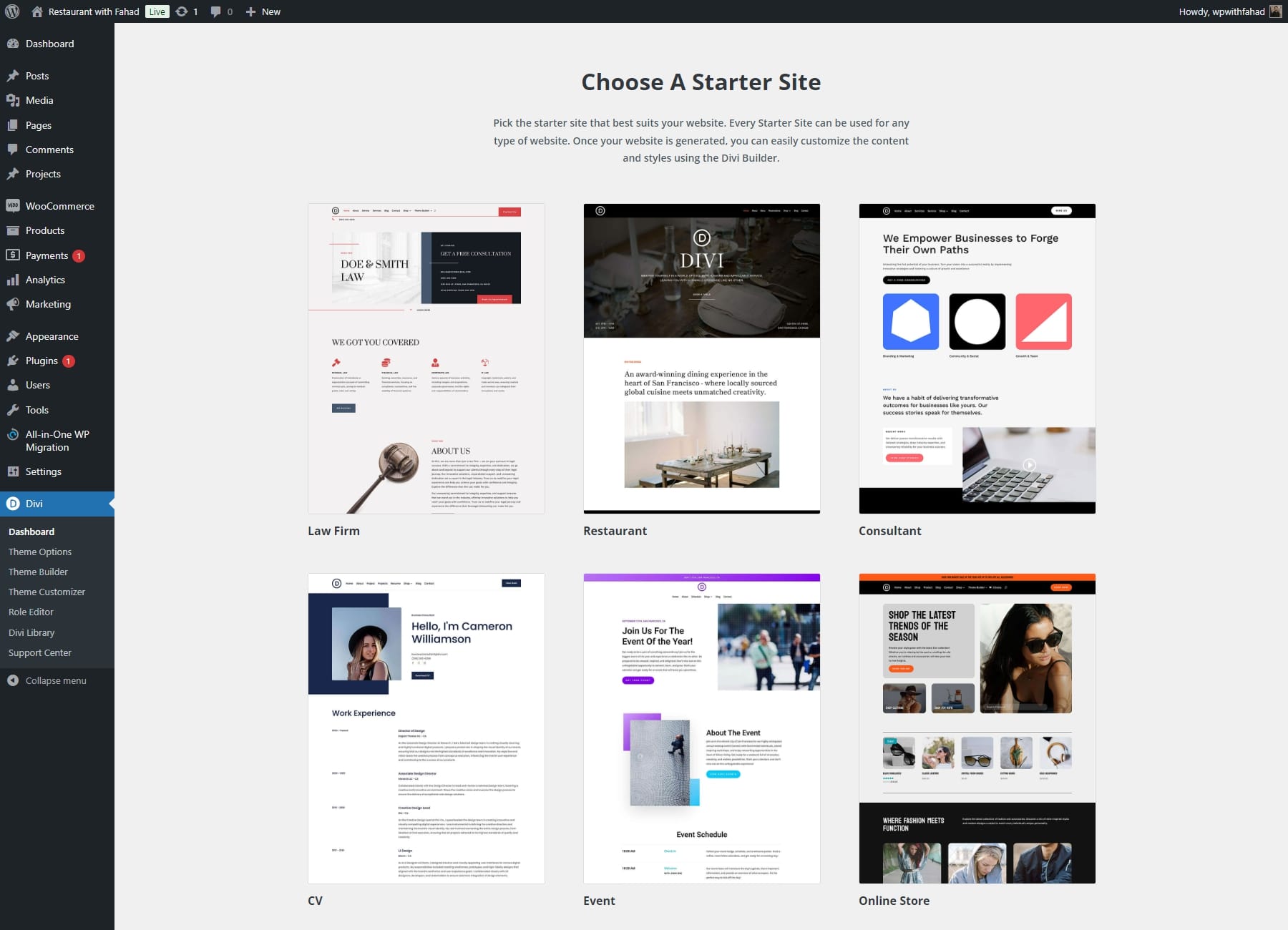
You’ll find various responsive starter site templates on your screen. Pick one that suits your needs. Don’t worry if the template’s colors, fonts, or images don’t match your brand—you can easily customize these later.
Divi Quick Sites guides you through setting up your website by collecting essential details like your Site Name, Slogan, and Logo.
- Enter your site name and slogan, and upload your logo.
- If you have a logo, upload it to add it to your site automatically.
- Choose the pages you want from the Starter Site or create custom pages if needed.
- Once everything is set, click ‘Generate & Publish My Website’ to complete the process.
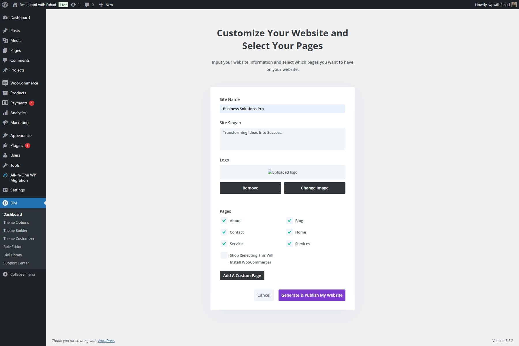
NOTE: Selecting the Services page will install premade templates for showcasing your consulting offerings (service descriptions, pricing, etc.). In this case, the Shop page can be omitted since our focus is on client consultations rather than an online store.
After you enter your website details, Divi Quick Sites will build your site in under two minutes. Based on your input, it will automatically generate all the necessary elements, including pages, templates, styles, and navigation bars.
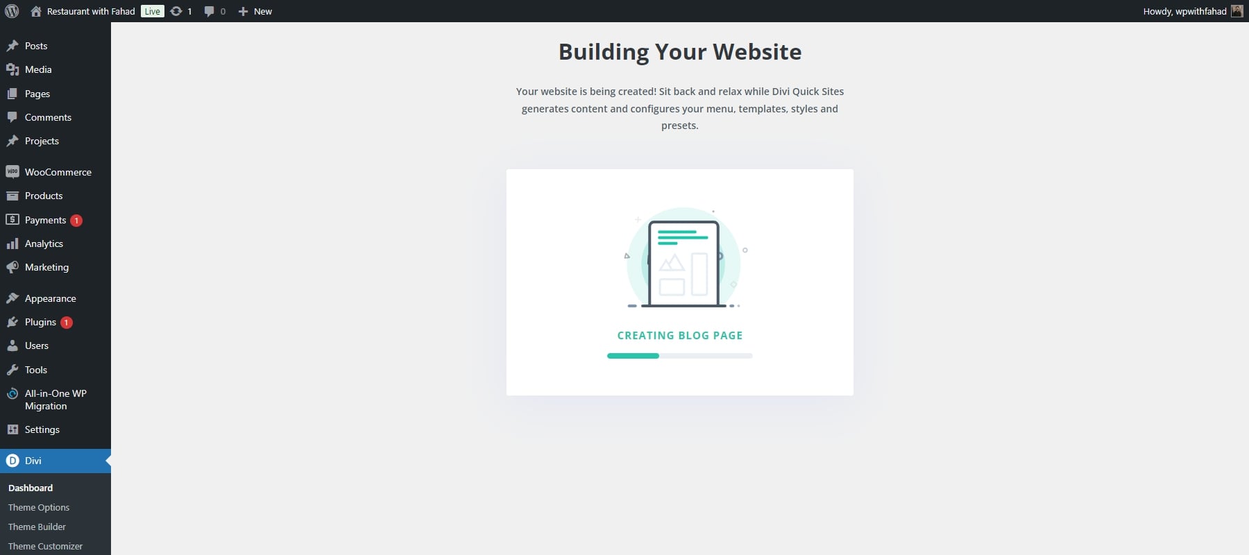
Once your site is complete, you’ll be directed to a confirmation page stating, ‘Your Site is Ready!’ You’ll also find a list of the website pages and theme templates created, along with links to tutorials and documentation to help you begin working on your newly established site.
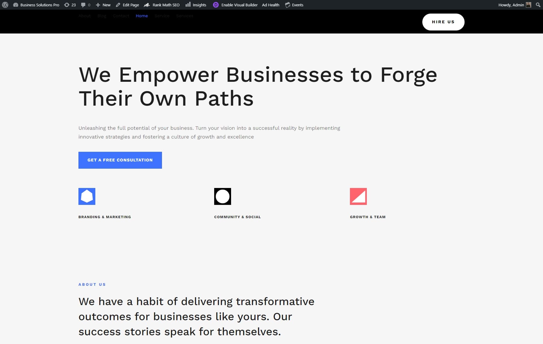
Though Divi Quick Sites are built to be responsive, you may still want to make a few personal adjustments to fit your vision perfectly. Divi’s visual builder lets you switch between desktop, tablet, and mobile views in real time to see exactly how your site will look on each device. You can also change the preview dimensions to suit your preferences.
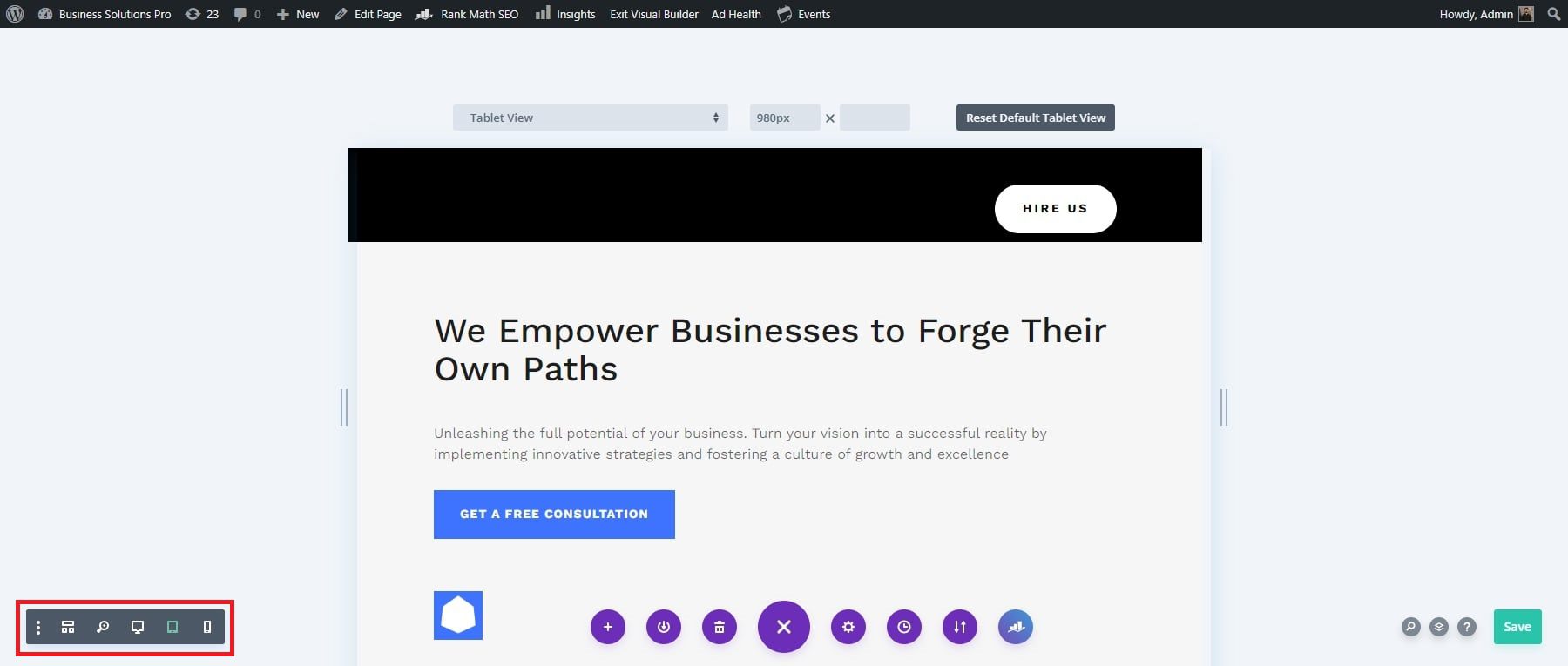
4. Check Your Designs with Divi’s Responsive Previews
Now that you’ve chosen a responsive template, it’s time to preview it for various devices. Divi’s built-in responsive editing tools make this process simple. You can tailor your website’s appearance on desktops, tablets, and mobile devices directly from the Divi Builder, ensuring a seamless user experience across all platforms.
Preview Site on Popular Devices with View Presets
You can use popular device presets to see how your page will look on different devices. To view these options, click on the initial dropdown menu. This will present you with a selection of various Apple and Android devices.
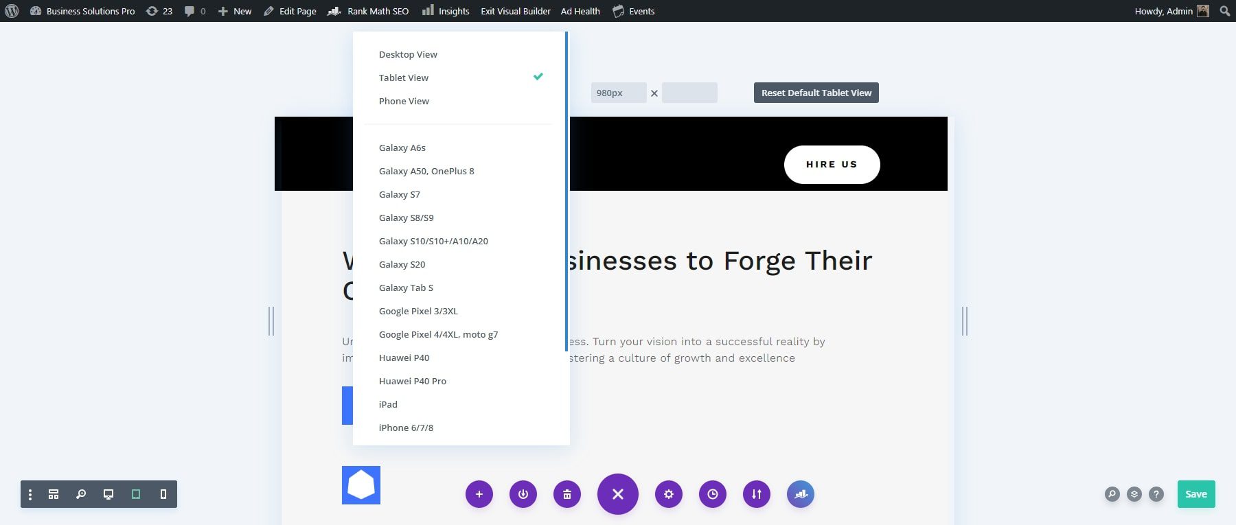
Preview Site Using Customizable View Modes
Besides the default and device preview options, you can set a custom width for your preview. Divi also offers a click-and-drag resizing feature for easy adjustments. To resize, click and drag from the left side of the preview area. As you drag, the width will update automatically in the dimension fields.
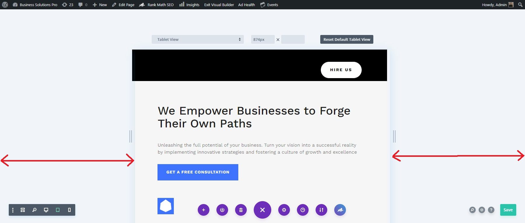
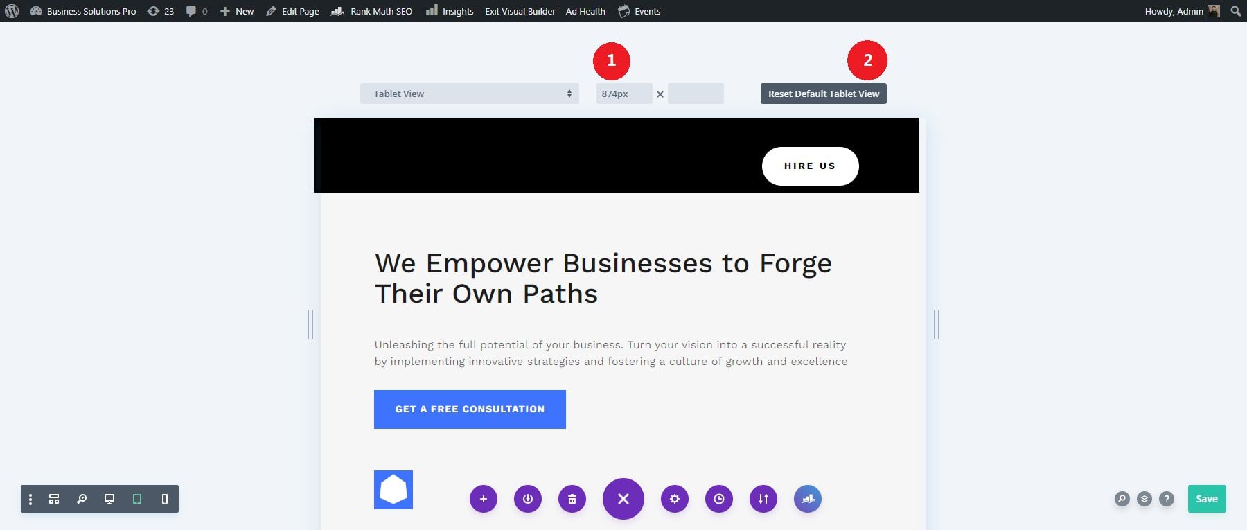
You can customize your responsive preview by manually entering specific width and height dimensions. Just click on the dimension fields and input your desired width and height.
Once you’ve set the size to your preference, click the ‘Make Default Phone View’ button to save this as the default preview width. To set dimensions for the tablet preview, go through the same process, click the ‘Make Default Tablet View’ button, and see the changes simultaneously.
Check Your Designs Above the Fold
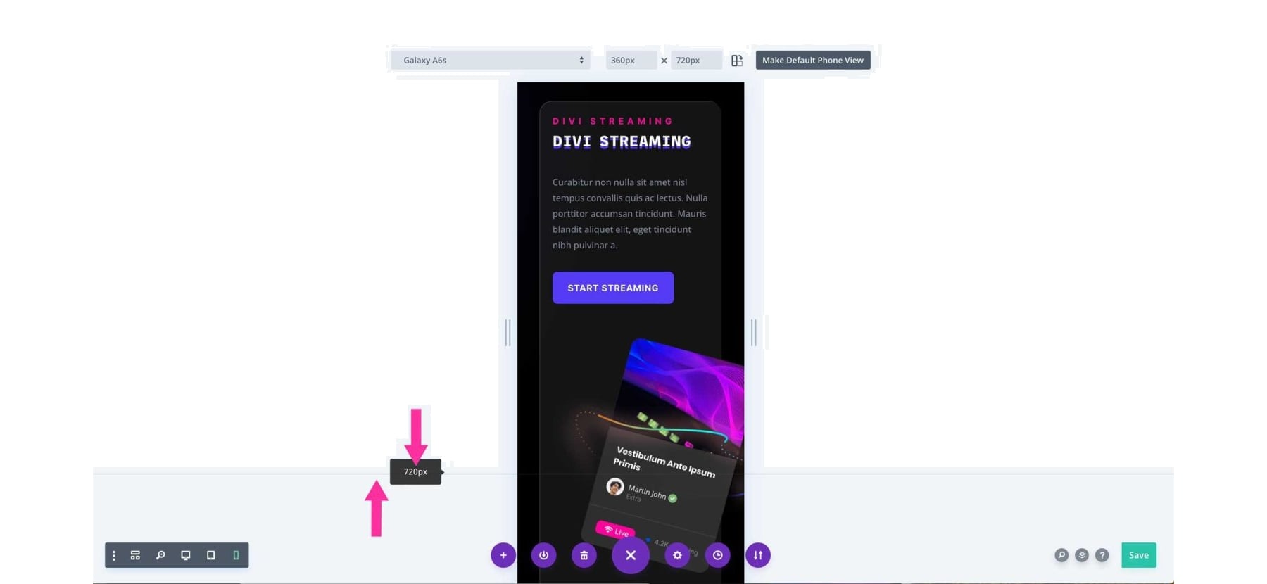
Divi’s responsive preview system includes an ‘above the fold’ indicator, which helps you see how the top portion of your page will appear to visitors without scrolling. This feature is particularly useful for positioning crucial content at the top of your design. The indicator adjusts according to the device preset you select.
Toggle Portrait and Landscape View Modes Easily
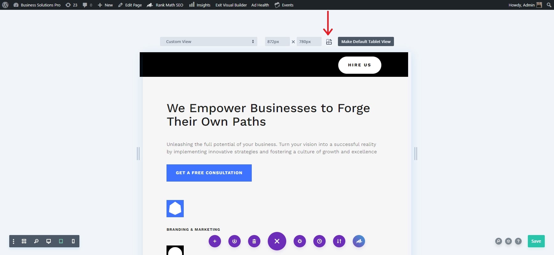
Divi’s responsive preview system lets you view your designs in portrait and landscape. To use this feature, click the icon next to the dimension fields. This will toggle the page orientation, showing how your design appears depending on whether the device is vertically or horizontally. The active orientation is highlighted with a darker color.
5: Customize Your Content and Designs for Each Device
Your Divi website will already be responsive so there shouldn’t be a need for extensive customization. However, it is important to make adjustments to your content and designs for each device (desktop, tablet, phone) to make sure they are to your liking. I would focus first on text and images. This will elevate your website’s look and performance across all devices.
Optimize Text for Readability Across Devices
Text readability is critical for user experience. Divi provides responsive typography settings, allowing you to individually adjust font sizes, line heights, and letter spacing for desktop, tablet, and mobile devices. To optimize your text, first enable Visual Builder and click on any text module.
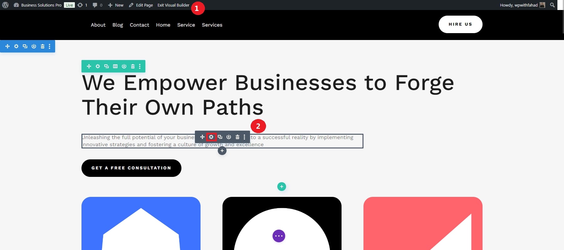
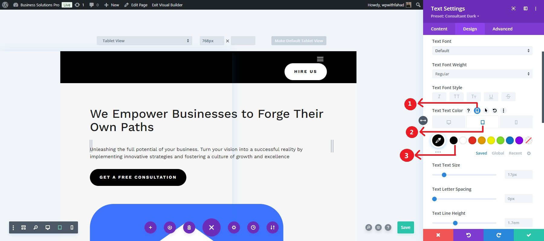
Use the responsive options to adjust different text attributes for different views, such as text color, text size, letter spacing, and line height. We can start by assigning text color for different views and then move on to other attributes. By clicking on the responsive options, you will be allowed to set up colors for different versions. Here is an example of setting up text color for the tablet version.
Then, you move on to the text size. You will click on its responsive options before assigning values regarding the text size for different views. Like the text color, here is an example of setting the text size value for the tablet view.
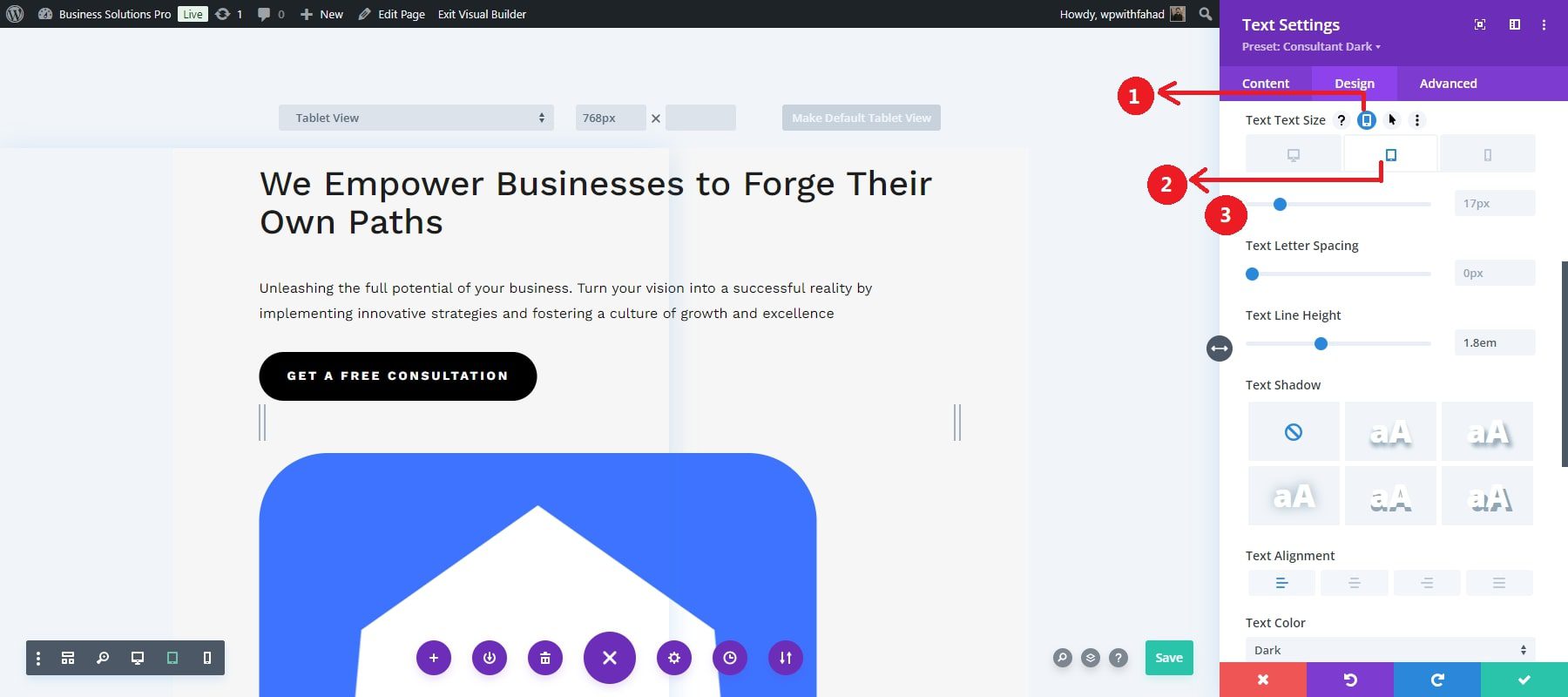
Repeat this for letter spacing, line height, and other attributes, respectively. This level of control ensures that your text is prominent in the desktop version and adjustable for a smoother fit on smaller screens, such as mobile phones.
Just like the text modules, you can also make your website titles responsive by changing them for different versions. To understand it better, you can go through the video below:
Resizing of Images
Divi enables you to adjust your images, videos, and other media elements to fit various screen sizes without losing quality or disrupting the design. It allows you to serve different image sizes based on the device type, ensuring your website loads faster on mobile devices while delivering high-resolution images on larger screens.
Go through the sizing in the design tab of your particular image module. By default, you have a force full-width set and a customizable height to work with. However, you can disable the full-width set and have more attributes to work on, such as the image width and module alignment.
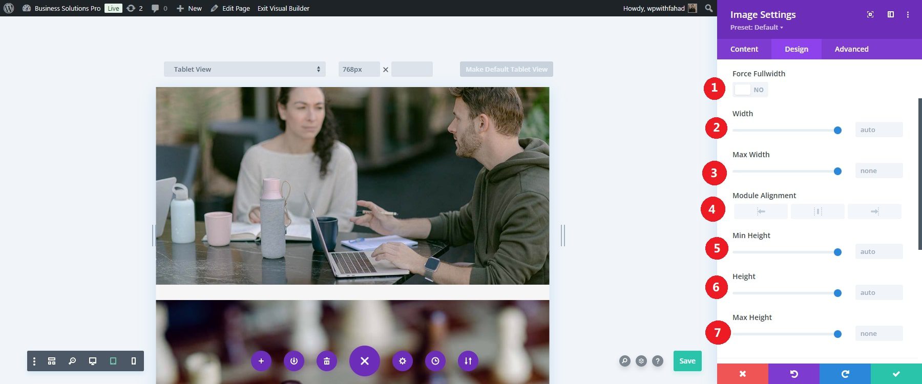
Focus on each image attribute individually. In our case, we will set the max width to 80% on the tablet version. The module alignment is set to be in the middle. The lesser width and centered image will take less space on the homepage and make the image much more attractive on smaller devices.
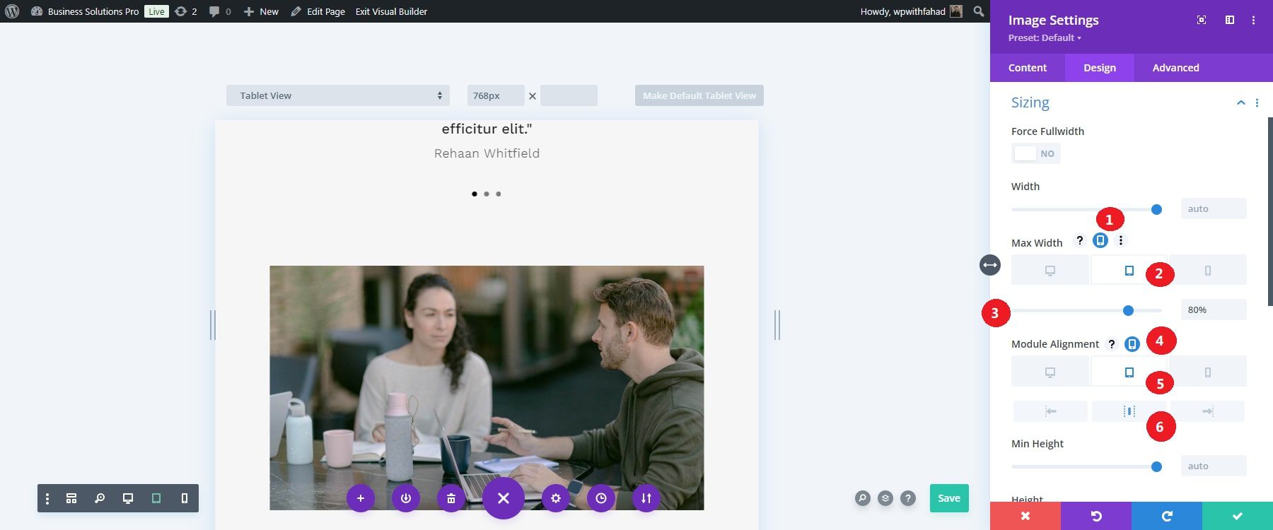
Serving device-optimized images enhances the visual experience and minimizes load times, which is particularly important for mobile users with slower internet connections.
Don’t Forget to Compress Image Files
While dynamic resizing helps with responsiveness, you should also compress your images to reduce file sizes without compromising quality. This is essential for improving website performance, especially on mobile devices.
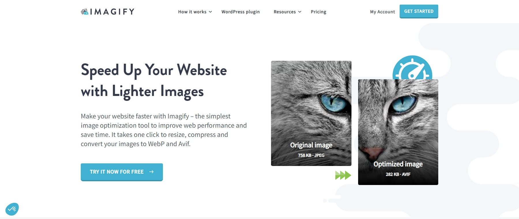
Divi integrates with plugins like Imagify, which automatically compress images when uploaded to your WordPress media library. Alternatively, you can manually compress images using tools like TinyPNG before uploading them to your website. For more information, check out our list of best image optimization plugins.
6: (Optional): Implement Custom CSS for Advanced Responsiveness
While Divi provides a wide range of built-in tools to make your website responsive, there are times when you may want to take finer control over your website’s appearance on different devices. This is where custom CSS and media queries come into play. Divi offers several places to add custom CSS without digging deep into your website’s files. You can apply custom CSS to individual elements or globally across your entire site. Each Divi module (like text, image, or button modules) has a Custom CSS tab where you can add CSS that applies only to that specific module.
Add Custom CSS to Responsive Design Breakpoints
Divi makes adding custom CSS at various breakpoints easy. In our case, we will give a visual example of the Custom CSS boxes available for a call-to-action module. Move to the element and select the tablet icon to view the three primary responsive design breakpoints for CSS input boxes. This action will display the tabs for the three responsive design views.
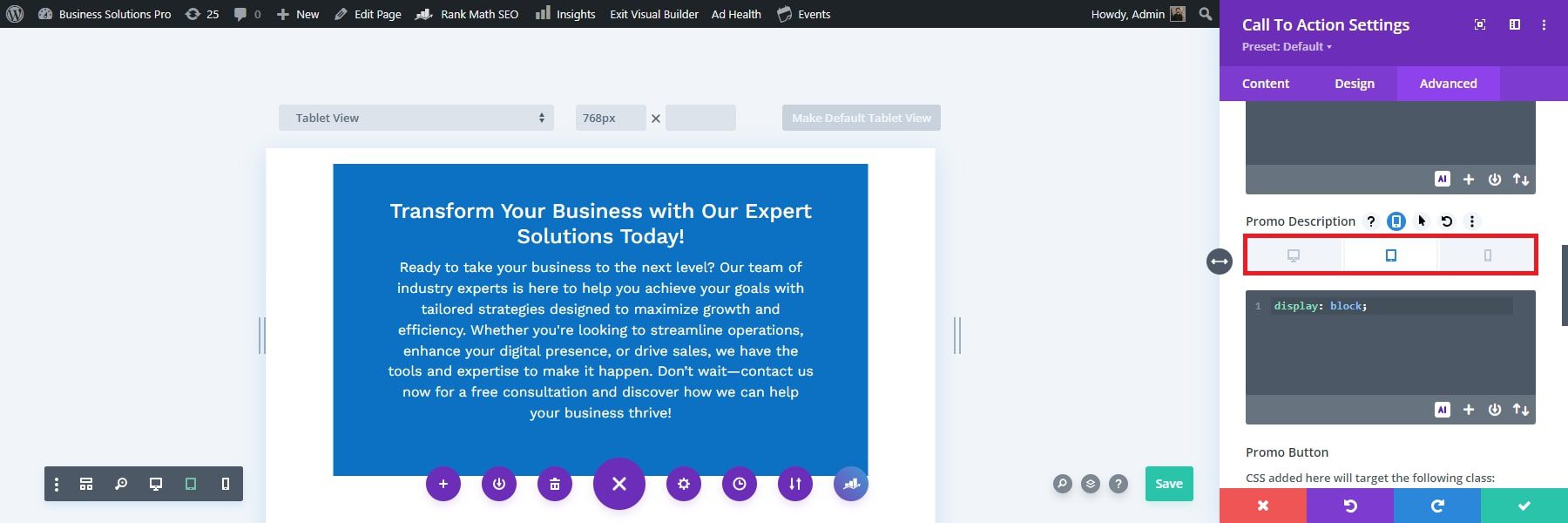
Use the tabs to apply styles to each view and adjust the CSS for different device displays (desktop, tablet, and phone).
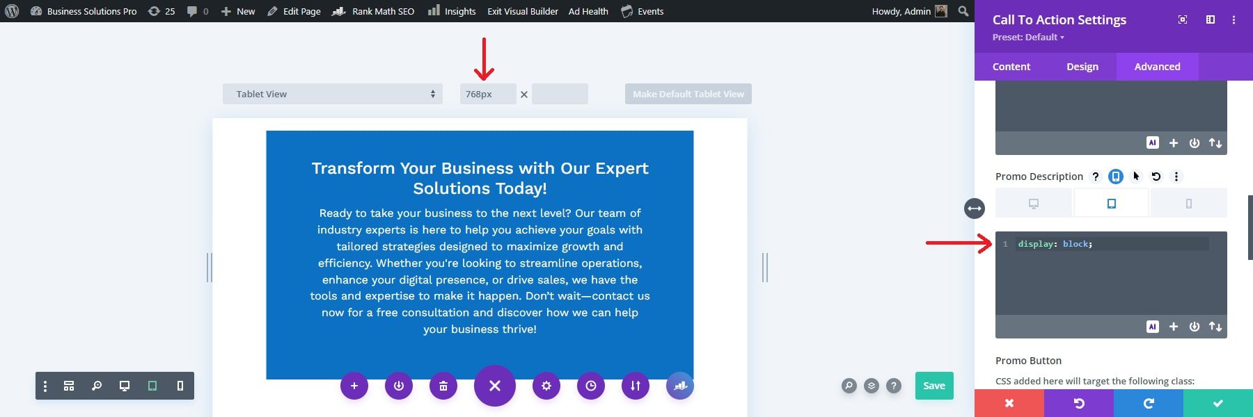
For instance, if you want the promo description to span the full width of the module on tablet and phone but not on the desktop, select the tablet tab under the Promo Description input box and add display: block;
When you choose the tablet tab, the Divi Builder View Mode will switch to Tablet View Mode (with a width of 768px) to provide a real-time preview of how your design will appear.
7. Test Your Responsive Site
After implementing your responsive design with Divi, previewing and testing your site across different devices is essential to ensure everything looks and functions perfectly. Divi provides built-in tools that allow you to view your design across multiple screen sizes, and there are external tools like Inspect Tool in Google Chrome to offer even more in-depth testing across real devices and browsers.
Leverage Divi’s Responsive Previews
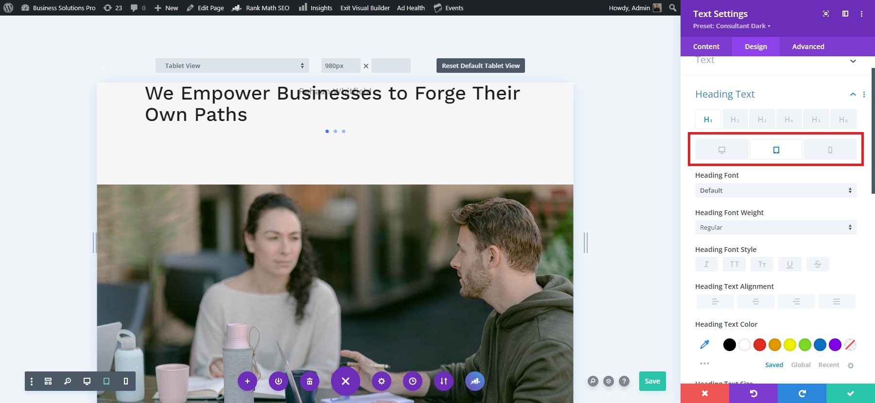
You can access the Divi responsive preview system from any module, column, row, or section in the Visual Builder. For instance, to use it in a text module, click on the module, go to the Design tab, and scroll to the heading font settings. Hover over the heading font option to see the responsive view menu, then click on the tablet or phone icon to switch to the corresponding view.
Use Chrome’s Inspect Tool for Responsive Testing
While Divi’s responsive preview mode provides a solid understanding of how your design adapts, Chrome’s Inspect Tool offers a more detailed view of your site across various screen sizes. Here’s how to access it:
- Open your website in Google Chrome.
- Right-click anywhere on the page and select Inspect, or use the shortcut Ctrl+Shift+I (Windows) or Cmd+Option+I (Mac).
- Click on the mobile device icon in the Inspect toolbar to switch to a responsive view.
- Use the dropdown menu to select from pre-configured device options like iPhone X, iPad Pro, or Android devices.
To test across even more devices, you can use external tools like this tool to check how your site behaves on different devices and browsers. These tests will ensure that your design is fully responsive, regardless of the screen size or device.
Get Started Today
Creating a responsive website in 2025 is essential to ensure a seamless user experience across all devices. With tools like Divi, designing a website that looks great on desktops, tablets, and mobile phones has become more accessible than ever. Divi simplifies the process with responsive templates, customization options, and built-in tools for fine-tuning your site’s appearance and functionality.
By prioritizing responsiveness and usability, you can ensure your website meets the needs of today’s diverse web audience.
Ready to create your first responsive website? Start with Divi and enhance your online presence. Check out our curated selection of plugins and tools to help you build a fully responsive website that delivers a seamless experience across all devices.



Leave A Reply