GIFs are good for more than just memes. A GIF in the right place can convey additional context, and it can help you drive your point across in seconds. The challenge lies in knowing when and how to use GIFs to enhance your writing, without coming across as unprofessional.
In this article, we’ll talk about why you should be using GIFs, then go over five ways to use these animations to enhance your writing. Finally, we’ll go over how to create basic GIFs for your site.
Let’s get to it!
Why You Should Be Using GIFs on Your Website
Graphics Interchange Format (GIF) images have been around since 1987, and it’s easy to see why they haven’t gone out of style. Although GIFs are not the only image format that supports animation (you also have SVGs and WebP images), they’re pretty much the best when it comes to complex ones.
GIFs are essentially short recordings classed as images, using frames much like film would. In most cases, GIFs include shorter animations in a compact file size that makes them perfect for the web.
It’s this versatility that has made GIFs so incredibly popular during the past few years. As “meme” culture has hit the mainstream, so have formats such as GIFs and stickers.
In many ways, GIFs enable us to convey complex thoughts or emotions in a way that’s easy to understand, the same way emojis do. They’re good for more than just memes and reactions, though, which is precisely what we’ll talk about in the next section.
5 Ways to Use GIFs to Enhance Your Writing
Writing for the web is a lot different than with other formats. For one, attention spans tend to be shorter. To counteract this, you need to make sure your writing is as engaging as possible. This is where media elements such as GIFs come in.
1. Illustrate Complex Instructions in Tutorials
We publish plenty of tutorials about WordPress and web design. One of the hardest parts of writing a tutorial is making sure you offer the right guidance for everyone to follow along.
Visual aids play a significant role in the process. Without any media elements, tutorials can be hard to follow. On the other hand, you don’t want to use dozens of screenshots for the simplest explanations, as it can “dilute” your writing.
When it comes to GIFs, they’re great for showcasing instructions that would be hard to follow through text alone. While there might be some confusion with a screenshot, a GIF shows you precisely what you need to do to follow along:
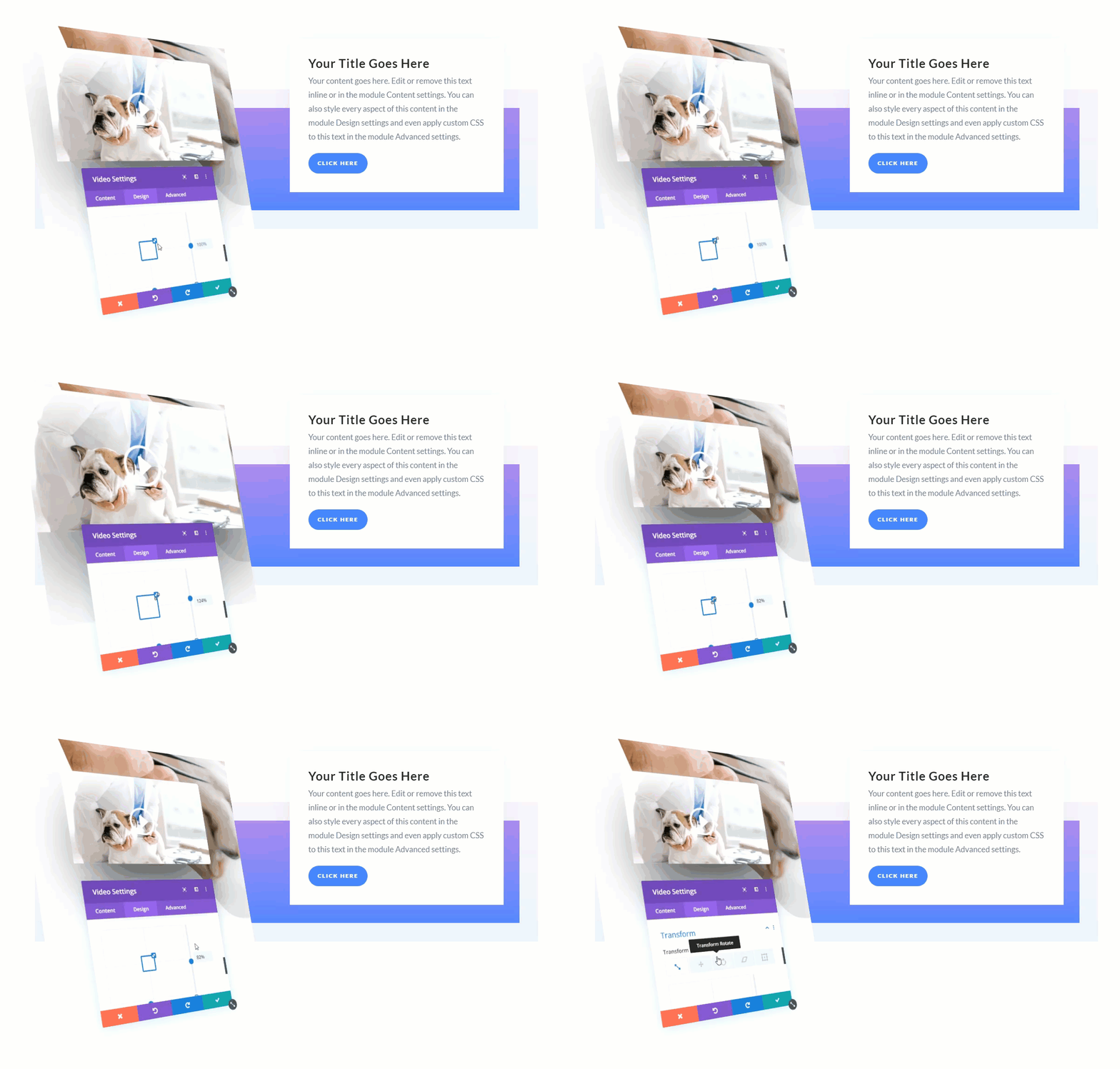
Using them in “choice” situations is also beneficial due to file size. They tend to weigh a lot more than “regular” image formats (such as JPEGs and PNGs). We’ll talk more about this aspect later.
2. Show Finished Designs in Action
Screenshots are often “good enough” to show finished designs. Depending on what you’re working on, you can take as many or as few as needed, and they can give other people a pretty good idea of what the finished product looks like.
However, this isn’t suitable for every use case, particularly for dynamic web projects. Usability also plays a massive role in the way users feel about websites or apps. In many cases, it’s hard to convey how intuitive those designs are via still images.
GIFs, on the other hand, let you share brief bursts of interaction. You can show teammates how specific elements work, how testers interact with them, and more:
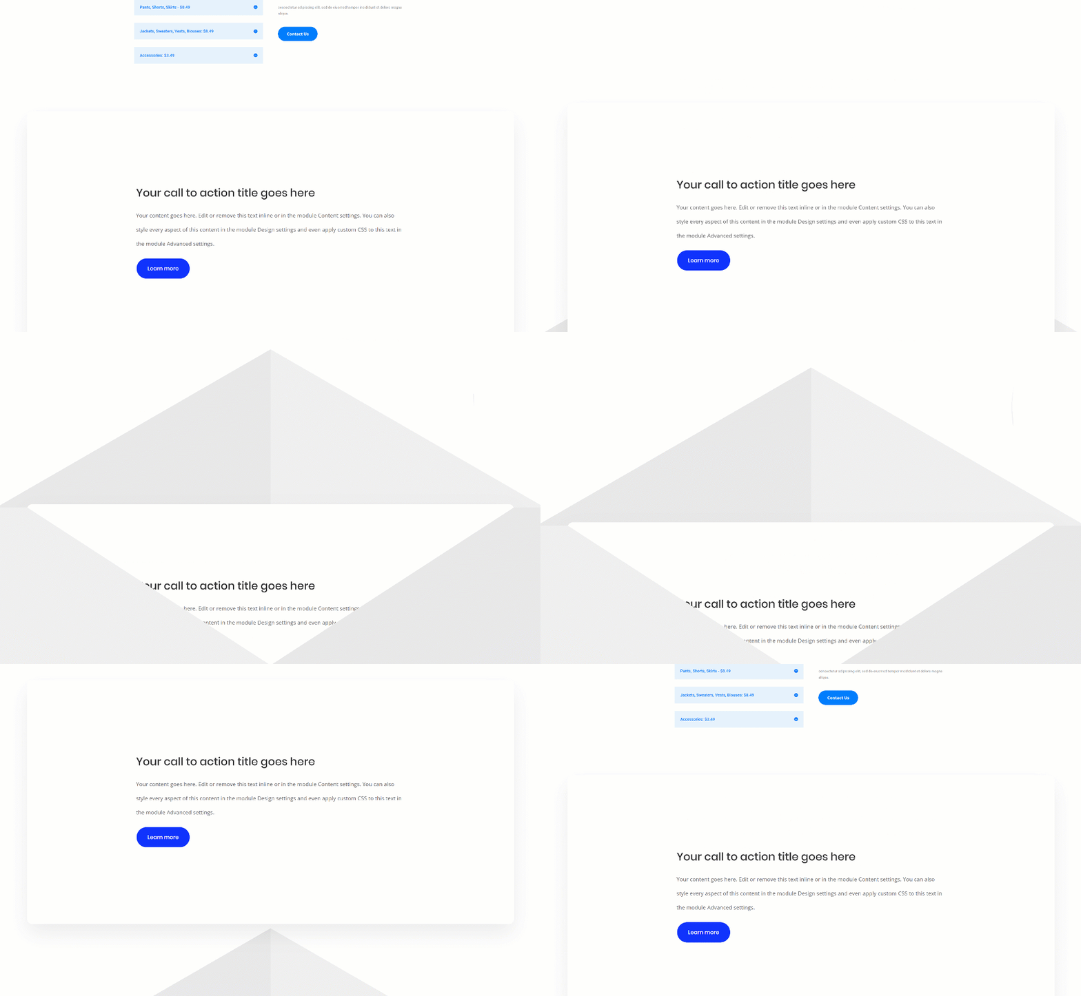
This level of detail enables you to zero in on usability problems. If you’re working on a tutorial, you can also use it to show the finished product in action.
You’ve probably noticed that some types of content tend to get better engagement on social media. Animated or dynamic content in particular gets a lot of attention.
Using GIFs on Twitter and Facebook can more than double or triple your average engagement rate. The reasoning here is simple – there’s a lot of noise on social media and animated content tends to stand out visually.
There are a lot of ways to use GIFs on social media. However, the two best use cases for social media are:
- Including short animations that showcase the products you mention.
- Using GIFs to share your reaction to news or comments.
As with many elements, you can certainly “overuse” GIFs. You don’t want to be the account that looks like it’s trying too hard to be cool, or doesn’t get the context in which it’s acceptable to use GIFs.
In most cases, we associate GIFs in social media with levity, so you might want to save them for less serious comments or discussions. If you want some inspiration, check out some Twitter accounts that are killing it when it comes to marketing.
4. Animate Your Data
One of the hardest parts of writing for the web is finding ways to make data engaging. Tables go a long way towards helping readers sort through features and numbers, but you can always go a step further.
For example, infographics enable you to tackle statistics and numerical data in a way that’s not only easy to understand, but incentivizes sharing:
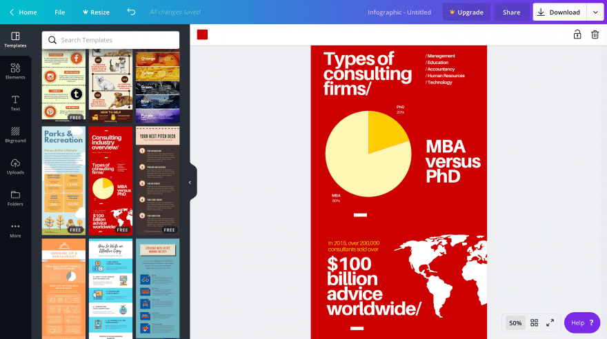
With GIFs, you can make those types of graphics even more engaging. For example, you can use animation to showcase progress in trends, how numbers go up and down, and more:

Image source: Giphy.
However, it requires you to be comfortable working with both graphs and screen recording or animation software. We’ll talk more about what software options are at your disposal in a minute.
5. Use GIFs to Drive Home a Point
Perhaps the most natural (and fun) way to use GIFs is to drive home a point. You’re likely comfortable using GIFs this way in your day-to-day life. For example, when you’re telling a funny story or making a comment on social media, the right GIF can make the delivery that much better.
If you’ve been on social media for a while chances are you know exactly how to use GIFs to enhance your delivery. However, writing for an audience isn’t the same as having a conversation with friends.
Ideally, both types of writing should be highly engaging. However, you run the risk of overusing GIFs far more quickly when it comes to writing for a website. With friends, you have more leeway to pepper a chat with animations, whereas in a more professional setting, your audience is likely wanting to read your thoughts and viewpoint.
In short, to maximize the impact of your GIFs, use them sparingly. That way, they’ll help you drive your point home even more effectively.
How to Create Simple GIFs to Enhance Your Writing
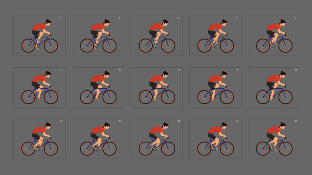
Animations of course work by displaying image after image in quick succession, creating a (hopefully) fluid motion effect. GIFs are no different – what you’re seeing is one bitmap image after another, loaded in your browser.
In theory, you can put together GIFs by creating multiple bitmap images and cobbling them together. However, most GIFs these days are computer recordings. In most cases, you either record your screen or another video source, such as your TV:

Image credit: Giphy.
The results usually look fantastic and there’s plenty of easy-to-use software that enables you to create your own GIFs:
- Screen to GIF. A simple screen-recording tool that’s perfect for tutorials and to showcase finished designs.
- GIPHY GIF Maker. The popular GIF database also includes a tool that lets you create animations from short videos.
- Gifmaker.me. With this tool, you can create GIFs using images, which works great for data presentation.
Creating GIFs is simple, from a technical standpoint. If all you’re looking for are animations you can use to drive home a point, there are literally millions of options online.
Learning how to use them properly is another matter, though. GIFs have a tendency to weigh a lot given their inherent design. Compared to other formats such as JPEGs, compressing GIFs is also much more difficult (although sites such as GIF Compressor do a great job.)
Your best bet is to make sure any GIFs you use are succinct. If an animation goes on for too long, it’ll impact your page’s loading times. Depending on how complex what you want to show is, using an embedded video might be a better alternative.
Conclusion
If you want your writing to be as engaging as possible on the web, you need to use graphics. This means photos, screenshots, infographics, and of course, GIFs. Attention spans tend to be shorter for online content, so it’s essential you find ways to keep your writing as engaging as possible.
Learning how to use GIFs properly can have a significant impact on your writing. Here’s what we recommend to help you use these animations the “right” way:
- Illustrate complex instructions in tutorials.
- Show finished designs in action.
- Increase your engagement in social media.
- Animate your data.
- Use GIFs to drive home a point.
What do you think is the best way to use GIFs for online content? Share your ideas with us in the comments section below!
Article image credit by Studio Zero / shutterstock.com




Thank you very much for this great article. i was looking for a very short video solution to illustrate article on my websites. i didn’t think about GIF before read your article. That will fit my needs perfectly. you make my day !