


One of the best jokes about being a web developer is that you spend 20% of your time coding. And the other 80% searching the internet for solutions to problems you run into. It’s not terribly untrue, either, if a bit hyperbolic. Tools like Can I Use cut that searching time down considerably.
What you search for has changed, though. The old question was whether some browser was too old to handle your code. The question now runs the other way. A feature landed a few months ago, and you just watched someone build something clever with it. Have the browsers your visitors actually use caught up yet?
Subscribe To Our Youtube Channel
What Is Can I Use?
This tool answers one question: does a given technology work in the browsers your visitors use? It lays that out in a simple, easy-to-read chart, which makes design and development decisions a lot quicker. Alexis Deveria primarily builds and maintains it, and Lennart Schoors designed it. Can I Use is an open-source project, and anyone can contribute to it, even by adding a small piece of info to the database.
It is also still actively maintained. That’s worth saying out loud about a free tool that has published support tables since 2008. The maintainers update the data continuously, and the site’s own News feed carries new entries as browsers ship them.
Using the tool is simple. With a simple search of a property, parameter, or feature, caniuse.com will tell you precisely what browsers and versions support that technology. It also lets you know about variants of the property you’re looking for. That way, you know which kinds of media queries, for instance, are supported by which browsers.
And to what extent. The compatibility charts show more than a yes or a no. They also show how completely a browser handles it, which matters when certain versions only support part of it. That middle category matters more than it sounds like it should, and it’s where most people misread the table.
Why Should You Use Can I Use?
For starters, because you want to give your clients, customers, and visitors the best experience possible. That decision comes up constantly now. Do you reach for a container query, a nested selector, a native popover, or a scroll-driven animation? Or do you fall back on the older workaround you already know how to write?
The reason you can’t answer that from memory is that features don’t arrive everywhere at once. One browser ships something, then another. The gap between the first and the last runs anywhere from a couple of months to the better part of a decade. Two real examples, both ordinary CSS you might reasonably want today:
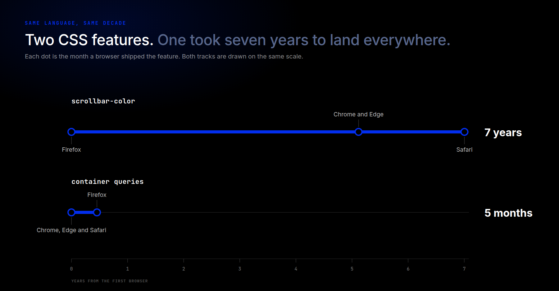
Container queries went from the first browser to the last in about five months. Firefox shipped scrollbar-color in December 2018, and Safari didn’t finish the set until December 2025, seven years later. Same era, same language, wildly different answers. There is no instinct that gets that right, which is precisely why a lookup table exists.
That’s also why “it works on my machine” is such a weak test. You’re one browser, usually a current one, usually on a fast desktop. The number of browsers actually in use is huge. Tablet, mobile, and desktop all run varying versions, and the device often holds someone back rather than any choice they made. It’s worth checking whether your new site, or your existing one, really serves the people visiting it.
How Fast Does The Web Actually Move Now?
It’s tempting to assume the browsers are simply shipping more than they used to, and that’s why keeping up feels harder. The data doesn’t really say that. Look at web-features, the open dataset Google, Mozilla, Apple, and Microsoft all use to track this. The number of new features arriving each year has held fairly steady for a decade. Somewhere in the range of fifty to seventy-five a year, with CSS accounting for roughly fifteen to thirty of them.
What changed is how long you have to wait for the rest of the browsers to catch up.
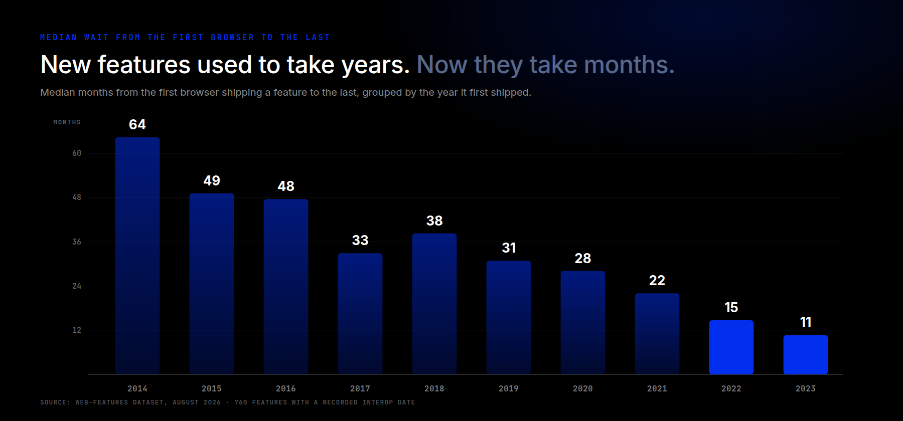
Features that first shipped in 2014 waited a median of more than five years for every major browser to catch up. The 2022 crop waited about fifteen months. By 2023, under a year. Same platform, producing at roughly the same rate, converging four to five times faster.
Two things follow, and they pull in opposite directions. On the good side, that modern feature you read about last spring is far more likely to work today than its 2015 equivalent would have. On the other hand, everything interesting now sits inside a much shorter window. That window is exactly where you read about it, watch a demo, and want to use it. Uncertainty didn’t disappear. It moved into the same few months that supply all your inspiration.
Which is a long way of saying the tool is more useful now, not less.
How To Use Can I Use
The website’s workflow is absurdly straightforward, and the UI is about as easy to read as it gets.
Enter whatever technology you want into the search field. The best results come from the specific syntax you use in your code, not from a human-readable description. Search prefers-color-scheme rather than dark mode switching CSS.
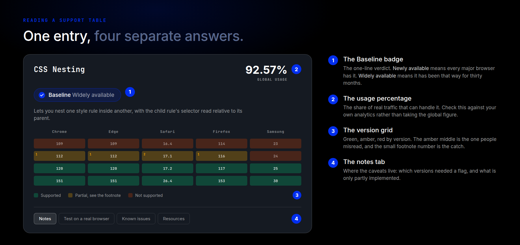
From there, a single entry gives you four separate answers, and they’re worth reading in order.
The Baseline badge sits directly under the feature name. It gives you the one-line verdict: whether the feature works across all major browsers and has done so long enough to count as safe. More on that in a moment.
The usage percentage, in the top right, is the number most people actually came for. It reads something like 90.66% + 1.91% = 92.57%. The first figure shows full support, the second shows partial support, and the total is the share of real-world traffic that can handle the feature. Use the % of dropdown beside it to change what that percentage measures.
The version grid is the colored table itself. Green means supported, red means not. The olive middle shade means partial support, usually with a small numbered footnote pointing at the catch. Those footnotes are the part people skim past and then get surprised by. In the CSS Nesting table above, several versions supported the feature only behind a browser flag. One range wouldn’t allow nesting type selectors without a leading symbol. That’s the difference between “supported” and “supported the way you’re about to write it.”
The description under the badge tells you what the feature actually does. That helps when you’re researching something you’ve only seen in a demo.
What The Tabs Are For
Below the grid sit the tabs, and the first one earns its place. Notes is where the caveats live: which versions needed a flag, what’s only partially implemented, and what the footnote markers in the grid are pointing at. It’s less technical documentation than a reminder: a colored chart can’t show you everything.
The rest are worth knowing about. Test on a real browser hands the feature to a live testing service. That beats guessing at how a partial implementation degrades. Known issues list confirmed bugs. Resources collect specs, demos, and write-ups, and it’s usually a faster route to a working example than a search.
One last control worth knowing: the Filtered and All toggle above the grid. By default, you’re seeing a trimmed set of browser versions. Switching to All shows the full history. You won’t want it often, but it’s the difference between “Safari doesn’t support this” and “Safari didn’t support this until two versions ago.”
What Baseline Adds To The Picture
Baseline is the newer, simpler answer, and it didn’t exist when this article first ran. The major browser vendors maintain it together, and it has exactly two stages. Newly available means every major browser now supports the feature. Widely available means it has been that way for thirty months, long enough that people on older versions have mostly caught up.
That’s a genuinely useful shortcut, and if the badge says widely available, you can usually stop reading and go build the thing.
The two tools answer slightly different questions, though, and the difference matters for client work. Baseline tells you whether a feature is settled. The usage percentage on the same page tells you whether it’s settled for your visitors. Those come apart at the edges. A newly available feature can still miss a real slice of an audience that hasn’t updated. Another can fall short of the baseline while covering 97% of the people who visit your particular site. Baseline is the general answer. The percentage, checked against your own analytics, is the specific one.
How To Find What Browsers Your Audience Uses
So far you know which browsers support any given technology. But how does that apply to your users? Google Analytics tells you which browsers and operating systems your visitors actually use.
In Google Analytics 4, open Reports, then Tech, then Tech details. The report opens on Browser by default, which is exactly what you want.
That gives you the breakdown of users and the browsers they use to reach your site. For most sites, Chrome and Safari sit at the top. Chrome because it’s the standard among desktop users and the default on most Android devices, and Safari because iPhones and Macs default to it.
The dimension dropdown at the top of that table is where the real detail is. Switch it to Browser version and you’ll usually find a wider spread than you expected. Plenty of people run whatever version their device last allowed. Switch to Device category or Operating system to see how much traffic is mobile against desktop. That often explains the version spread on its own.
Two dimensions are usually enough to make the call: which browsers, and how old. With that in hand, go back to caniuse.com and look at the same feature again. Now the percentage means something specific to your site, not a global average.
It’s worth doing this once per client rather than once per feature. The answer rarely changes month to month. And knowing a client’s audience skews three versions behind can save you an argument later.
Wrapping Up With Can I Use
So the next time you’re exploring Divi and one of its newer features, or reading a CSS tutorial, check caniuse.com first. It still takes time for new tech to reach every browser, and the honest answer is that it takes a lot less time than it used to. That’s good news and a catch at once. The shorter the wait gets, the more likely your next idea sits right in the middle of it.
Worth saying: Divi’s own building blocks lean on CSS that settled years ago. Its flexbox and CSS grid layout tools sit on features every modern browser has supported for ages. So the questions above apply mostly to custom code you add yourself, not to what the modules put on the page.
Check the badge, check the percentage against your own analytics, and read the notes. It’s a thirty-second habit that saves the kind of bug you only find out about from a client.
What have you found to be the best usage for Can I Use?
Article featured image by fatmawati achmad zaenuri / shutterstock.com





Leave A Reply