Hopefully you have had a chance to download our latest theme, Divi. As mentioned in the Theme Launch Post, we will be writing a Divi-related post on our blog every day for the next 12 Days of Divi. Be sure to tune in each day for the next twelve days to get your hands on tons of Divi-related tips and resources! If you haven’t checked out Divi yet, then click the link below to view the release post with all the juicy details, and for your chance to win a free Lifetime Membership!
Understanding The Section Settings
Sections are the biggest building block in the Divi builder. You can think of them as horizontal stacking blocks that can group your content into visually distinguishable areas. In Divi, everything you build starts with a section. This content wrapper has various settings that can be used to do some really awesome things.
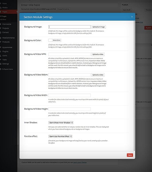
Background Image – If defined, this image will be used as the background for this module. To remove a background image, simply delete the URL from the settings field.
Background Color – If defined, this image will be used as the background for this module. To remove a background image, simply delete the URL from the settings field.
Background Video MP4 – All videos should be uploaded in both .MP4 .WEBM formats to ensure maximum compatibility in all browsers. Upload the .MP4 version here. Important Note: Video backgrounds are disabled from mobile devices. Instead, your background image will be used. For this reason, you should define both a background image and a background video to ensure best results.
Background Video WEBM – All videos should be uploaded in both .MP4 .WEBM formats to ensure maximum compatibility in all browsers. Upload the .WEBM version here. Important Note: Video backgrounds are disabled from mobile devices. Instead, your background image will be used. For this reason, you should define both a background image and a background video to ensure best results.
Background Video Width – In order for videos to be sized correctly, you must input the exact width (in pixels) of your video here.
Background Video Height – In order for videos to be sized correctly, you must input the exact height (in pixels) of your video here.
Inner Shadow – Here you can select whether or not your section has an inner shadow. This can look great when you have colored backgrounds or background images.
Parallax Effect – If enabled, your background image will stay fixed as your scroll, creating a fun parallax-like effect.
Full Width Beauty
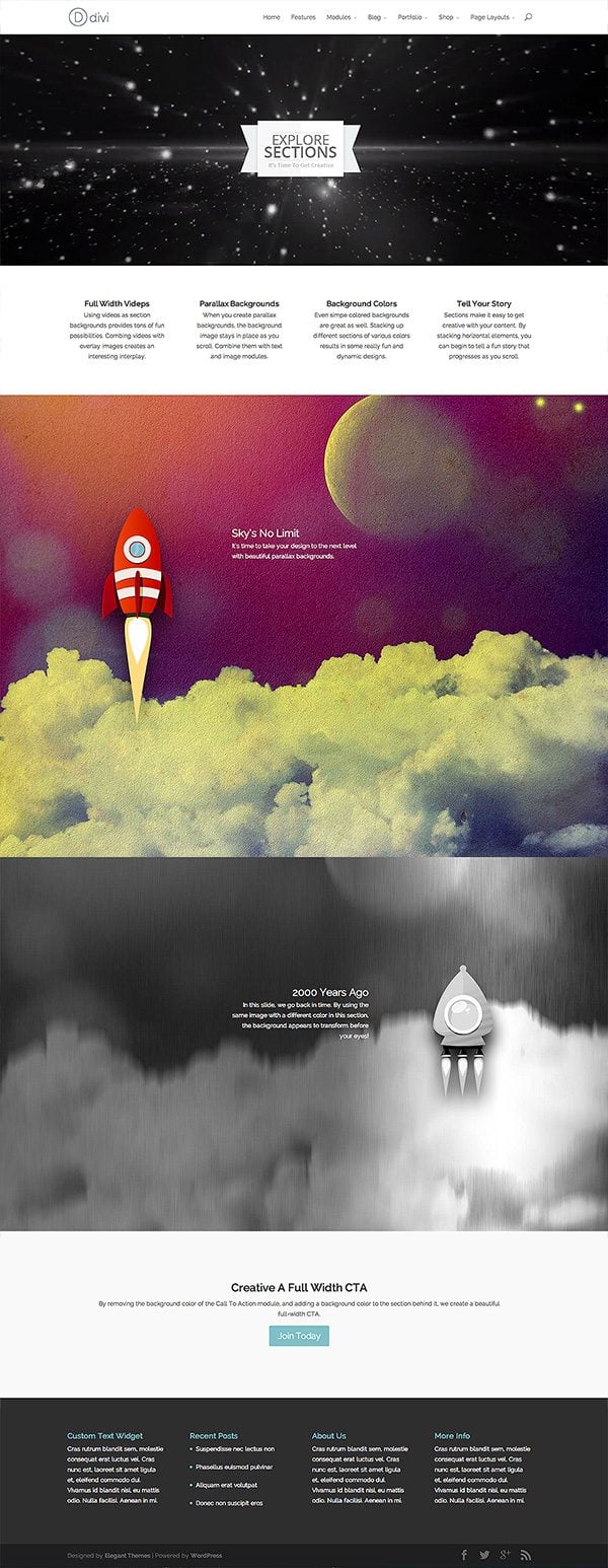
Using the section settings and the various background variables, we can create some very unique and engaging layouts. To illustrate some of the cool effects that can be created, I built out this page.
Video Backgrounds
In the first section of the page, I explore the interplay between video backgrounds and static images. By defining a background video of zooming starry space, a vortex-like feel is created. Within this section, I place a single image module with my logo. This creates the appearance that the logo image is flying through space! This is the beginning of our page’s story.

Parallax Image Backgrounds
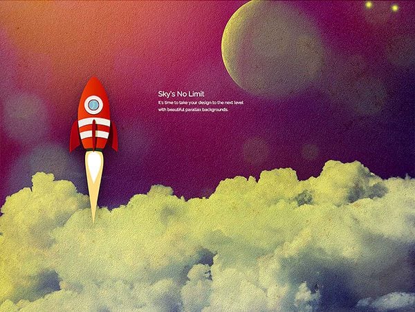
The “Parallax Background” option is a great way to make your page fun to browse. This option makes your background image stick in its place as you scroll, which makes it look like everything around it is “passing by” on top of it. In our second slide, I add a skyline background image. On top of it, I add an image module and text module. My image is a rocket with a transparent background, and as you scroll down the page it creates the illusion that the rocket is flying through the sky.
Background Transition Illusion
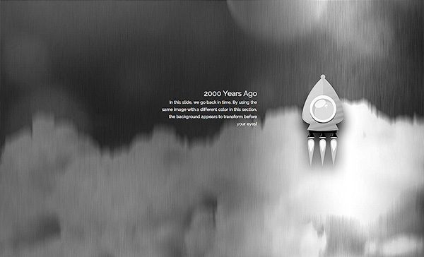
In our third slide, I added a second parallax background image. For this image, I used the same exact image from the slide above it, except in this version I modified the image and turned it black and white. Because both this image and the image above it are stuck in place, and because they have the exact same elements within them, the image appears to transform from color to black and white right before your eyes! This slide continues our page’s story, taking us back in time.
Creating The Appearance Of Full Width Modules
In our final slide, I only defined a simple background color. Because there are no background videos or images, only the color shines through. Within this section, I added a single Call To Action module. What’s unique about this slide is that I have turned off the background color of the CTA module. This erases the boundary between the module and the section, giving the CTA module a new “full width” appearance. Using this technique is a great way to give prominence to important modules, such as your call to action.

I hope this shows you just how creative you can be with sections. I have added an entry about Sections to the Divi documentation, along with a full video screencast that outlines the process. Don’t forget to check out the Divi Documentation for a full list of tutorials.



i have used the divi but i have small problem i used the slider with background video both mp4 and webm but ipad and iphone cant see the video what should i do
Having trouble with the link to the demo site — getting a 404.
Hi, I’m not a coding or website builder expert or anything, everything I do know is just self taught, but I ‘am’ an expert at Google searches lol I used the instructions in this link to successfully change the height of my full width slider for all those wanting to know how to do this: http://www.divithemeexamples.com/change-the-height-of-a-single-slider-in-divi/
Aimz
Hi ET Team
Like so many others I am here looking for ways to REDUCE THE HEIGHT OF THE FULL WIDTH SLIDER. I tried adjusting all my pictures to various sizes before settling on 2000 x 800 pixels but the full width slider has just stretched my pics and made them far too big!
PLEASE, is there any easy and official way to reduce the height of the full width slider? It is driving me mental.
I have found nearly every other aspect of working with the Divi Theme Builder an absolute dream. The info is so easy to find either via your website or via YouTube.
Thanks team
Hi Karla, I used the instructions in this link to successfully change the height of my full width slider, hope it’s of help to you 🙂 http://www.divithemeexamples.com/change-the-height-of-a-single-slider-in-divi/
Aimz
Much like many others here – looking to find out how to manipulate the slider height. Tried the manipulate the CSS code in style.css as per the suggestion above, but it was unsuccessful.
Hi, I just found this page doing some research for a site I’m building with Divi and noticed the example url is broken. oops!
I’d love to see it, if it still exists somewhere.
Thanks!
I can’t seem to put a video in without sound. I don’t want my video’s sound to play in the background is there any way of doing that?
Thanks
Hi Garrett, I’m trying to do this too (stop sound from playing on a background video). Did you find a way to do this?
Hi ! I’m also looking for how to remove the sound from the background video. have you found anything ?
Hi, I was trying to check out the Full Width Beauty page, but the link you provided goes to a 404 page… (http://www.elegantthemes.com/preview/Divi/full-width-beauty/). Would you update it with a correct link please? Thanks
Can i use bigger size logo for divi.?
Hi,
My problem is…
I installed the Divi Theme and used the page builder. But when I’ve use the sliderwidth, this just doesn’t open the options for change or add new slider. Just doesn’t work. All the website works, accept that tool. Do you know what happens? What can I do?
Regards!
The preview page isn’t available anymore. I wanted to (re)look at it since it was a great one!
Greetings,
I am using the Divi theme and it doesn’t seem to display correctly in Firefox AT ALL. Please point me in the direction of what I need to do to fix this.
Thanks!
If you need help with anything, please open at ticket in our support forums so that our team can assist you.
How does decrease the height of particular full width slider?
Like many people here, I’m trying to figure out the best way to adjust the height of the full-width slides. When I use a video background, the slide is not scaled with the video, and a large part of the video is hidden. Is this simple a problem with the dimensions of the source video I’m using, or is there something else I can do to make the slide taller.
In addition, I feel like Divi needs a simple “full width image” module without having to use slides for this purpose. Does this exist and I’m just missing it?
Thank you!
I should add that I am trying to build websites inside the confines of Divi, without modifying php code, which I am perfectly capable of. If you tell me that what I want isn’t possible with Divi’s native settings, I’ll start modding. I prefer not to, because then I end up with my own fork of the theme.
Also looking to decrease the height of the full-width slider…and maybe make the menu transparent…so the image bleeds through on the top?
Hi guys, First of all, Thanks for that awesome theme! I`ve been using it for a few months now. It was great at the beginning at it becomes even more fantastic with every month! 🙂 Now I have one question. 🙂
I use the full width slider on our website http://www.sqinsh.com. I would like to increase the size of the slide pictures within the slider. Is there any way to do this? Probably I have to increase the size of the entire slider, is that right?
I am not a great coder. 😉 That`s why I use your theme. 😉 Can you give me some tipp, how I get them larger?
Thanks a lot! 🙂
Cheers, Florian
It would be nice to see an option where you can open the link from a CTA button in a new window
+1
+1
I would like to see this too! (open the CTA in a new window)
I also want to have an option to open the link in a new window in CTA button.
+1
+1
The link to the page with the builder effects no longer works. Is it still live somewhere?
Nick, you created a masterpiece! This theme is the only reason I dared to move away from my old host and try something new 🙂
I have one question – what dimensions do I use to create a fullwidth header image? I am playing with banners and am not sure which category to pick in the graphics creator.
908X400 300X250 728X90 428X60 160X600 and the list goes on…
I love this theme. I am not a big code guy, and perhaps I don’t understand something. Many people have asked about how to change the height of sliders… specifically, to reduce it. I need to do that too.
Why is there no answer here? Why no link? As good as this produce it, it is no help if we can’t do some fairly basic resizing of elements on the page and the spaces between them.
Please publish instructions for reducing height of sliders and changing space between sections/rows/modules. Sometime we don’t want yards of background between…
Same problem. How do we 1) Adjust the height of the slider in the Page Builder slider layout and 2) What is the ideal size of images uploaded to the fullwidth slider?
Awesome theme. Just a quick question.
When I have a slider, like in the home page of my site, my slide image increases a bit just before it changes to the next slide, and it pushes all the content down a bit for a split second during every change. How can I fix this?
I am very thankful to you if you help me. I am creating a blog using divi but I have some issues in layout
When I add side bar then there is some extra space on the left and right.
–Question is how to remove these spaces
When I insert blurb in a four column row how to reduce their distance because they left extra space and this seems awkward .
I am editing a site through MAMP, I am trying to make a full width slider under the navigation, so that I can put a slight opacity on the nav while still seeing the header slider flush to the top of the page. Any thoughts? Would love to figure this out ASAP as this is holding me up because I have tried everything.
if you have a background image – how do you put the text in say a white background so that it is very easy to read?
Hey Nick! I’m loving Divi – amazing.
I’m getting a 404 for your URL (http://elegantthemes.com/preview/Divi/full-width-beauty/)…
Looks you better append every article with a warning box – please post technical questions in the forum! LOL Come on guys JEEEZ!
Yes, the demo link seems to have been demolished. Was really looking forward to seeing the ‘live’ preview of what you built out
Is it possible to adjust the full width slider’s height on DIVI? I want to create a full width slider but just 8cm tall with a quote in it…
I would like to know this as well. Currently, for my site, I feel the height of the full width slider is far larger than needed. It will take some time to figure out how to adjust the CSS, without potentially ruining the mobile optimization.
what is the best size for the background image? i have a big trouble with this slider.. when i set 2 slider one with backgroun img and one whothout, the background image going deform and resize.
and another problem is headline and test.. when i use any of theme the slider heigh going bigger.
NOTE : Duplicate content above :
Background Image – If defined, this image will be used as the background for this module. To remove a background image, simply delete the URL from the settings field.
Background Color – If defined, this image will be used as the background for this module. To remove a background image, simply delete the URL from the settings field.
I am hoping there’s a way that my scrolling top image can connect to the full width header below it and scroll together in the parallax way. At the moment it leaves a space in-between the two: http://66.147.244.98/~miremoln/home-2/
Can you help?
Thank you!!!
How do I change the CTA button colors in both the light and dark settings? I want to have a CTA as you’ve described here, without a background, but I don’t want the button to be teal or the grayed out color. If you happen to see this post, I’d sure appreciate the help. I’ve tried this code and it isn’t working for me, so clearly I don’t know what it should be — I’m new to CSS. Thanks.
.et_pb_bg_layout_light .et_pb_more_button { background-color: #82c0c7; color: #fff;}
I’ve experienced glitches with paralax effect when used on pages with image sliders on them. Even your example page listed here (with rockets) is not working properly in my Safari, while it’s performing just fine in Firefox.
Is there any way to control the maximum size of a slider? I love the other Divi options, but the sliders are just so big.
I’d like to use a small opening page on my site – where you can see the section below the slider right away. As it is, the slider takes up the whole page that people initially see (they may navigate away before even knowing that they can scroll down).
Thanks,
Ryan
I started using Divi couple weeks ago and tried to put a background video.
The video is in .WebM and works well on Chrome but doesn’t display on IE and Firefox, the browser put a link for downloading the video only.
If I use the MP4 the video stays black on Chrome.
Hope someone have an answer to my problem.
Thanks
Artiom Valat
PS : DIVI <3
Any plans to update the Elegant Page Builder plugin to match the one used in the Divi theme?
A few others asked this too – How can I change the max height of the home page Fullwidth Slider?
Would love to know the CSS for this.. if it’s a simple fix 🙂
Thx!
Jason
I would like to change the height of the homepage fullwidth slider too!
Thanks,
Victoria
To change the height of the full-with header slider on the homepage just add the value height in the following code in the style.css
Original code:
.et_pb_slider .et_pb_slide { display: none; float: left; margin-right: -100%; position: relative; width: 100%; text-align: center; -webkit-box-shadow: inset 0 0 10px rgba(0, 0, 0, 0.1); -moz-box-shadow: inset 0 0 10px rgba(0, 0, 0, 0.1); box-shadow: inset 0 0 10px rgba(0, 0, 0, 0.1); }
I added height like this:
.et_pb_slider .et_pb_slide { height:330px; display: none; float: left; margin-right: -100%; position: relative; width: 100%; text-align: center; -webkit-box-shadow: inset 0 0 10px rgba(0, 0, 0, 0.1); -moz-box-shadow: inset 0 0 10px rgba(0, 0, 0, 0.1); box-shadow: inset 0 0 10px rgba(0, 0, 0, 0.1); }
Thanks so much for this. This is a novice question, where do I find the style.CSS box to enter the code?
Thanks!
It does make the height smaller which is great but then the text and the buttons of the slider cut off and are not aligned with it. How did you fix that?
Awesome Nienke! Thank you so much! The hair pulling is over… my client’s text was blowing out the height of the slider and it looked awful – now it looks great again! 🙂
LOVE Divi – thanks ET – I no longer need to waste hours trawling for a new theme that ends up frustrating me in any case. I’m hooked. I’ll be buying a lifetime subscription next time around 🙂
but it reduce only bottom height of full width slider, not it’s top height so will you help me in that??
If you need help with anything, please open a ticket in our support forums so that our team can assist you.
What are the dimensions for the full width header? How do I add a custom header? (Simple, please, I no speak geek). Very excited about this theme!
Thanks,
Gail
Forgive me if I’ve missed this, but is there a way to narrow the height of the slider so it’s not taking up most of my home page? Thank you for any assistance you can offer!
How can I change the max height of the home page Fullwidth Slider?
I would also really like to know this! Anyone?
I love the background image. I found the rocket, where can I find the purple sky moon image? Would love to use this 🙂
Great job on the theme
You can purchase them from shutterstock.com
Nice 🙂 I found the rocket one, do you have the ID number for the other one. Thanks
Nick, et al., Divi is totally awesome. I’ve used a lot of your themes, but this one is by far the best. I just had to write in and say so!
mlwj
Is there a way to adjust the height of the sliders in this theme?
This isn’t the best solution, but I was able to adjust the slider height by editing this line in the css to include height:
.et_pb_slider_fullwidth_off .et_pb_container { width: 100%; height:600px;}
(this was for a small slider in the middle of the page, not for the large, full width slider though)
As you pointed out, not the most ideal solution because it changes the height of every slider you would use. This is because you are changing the code for standard sliders.
Easiest way to create a separate, custom slider that does not interfere with the main slider code is to create a new CSS Class. All I did was put the following into the CSS Stylesheet a line below the code you referenced above:
.slider2 .et_pb_container {width: 100%; height: 600px; }
When you create a new slider module, scroll down to “CSS Class” in the settings box and write “slider2” (or whatever class title you choose in its place above, just make sure it’s consistent). You can thereafter put the customized 600px tall slider (or whatever height you desire) next to any standard slider on the same page.
What do you mean by “t a line below the code you referenced above:” in your reply above?
I used
.slider2 .et_pb_container {width: 100%; height: 400px; }
in my child theme and it didnt do anything.
Thanks!
changing the height to 300px the text of the slides header loses the vertical alignment. What is the parameter to align text vertically? (google translate)
amazing…thanks for sharing…every time i can see stunning,amusing and beautifull themes…awesome…!!
Stunning! Thank you so much for your creativity, hard work and generosity. ET rocks!
Can a section’s label or ID be referenced by URL?
This templates is ok. I am here be recommendation of my friend. He use elegantthemes many years. Just because I can win Life time membership I will hold on for now. But I must say from the last time when I check few templates, I can see a lot of new ones. Well Done.
I’m amazed at the generosity of this company… giving us the 12 days of Christmas for such an awesome template is beyond awesome! Thank you so much!
Hi!
Great work!
A few questions:
– is it possible to create the homepage like any other page or you have to use one of the four premade layout? Where I can see the blog homepage of Divi?
– what happens when you use Divi instead of Chamaleon in a premade site like for example http://www.infiniteart.it? Have you to do all the work again?
Thank you!!!
F.
Again, very impressive effects!
Request/Suggestion: Please add all files related to Divi and all “12 days of Divi” tips (like the ones on this page) to the download file.
This way new customers have it all and I won’t have to save all pages to my favorites for when I get around to using this theme.
Nick, can you tell some tips about size and dimension of backgrounds and images using in homepage? I found what 1080p backgrounds (from ET) and similar size pics loading slowly and not suitable to use in homepage.
I would love to see more customization options for the navigation bar!
Divi is great! Superior in many ways. It makes content the prime citizen of your website.
One Flaw: on iPhone images are sliding in too late. You scroll over their positions before they have a chance to appear/to be seen.
Divi flexibility continues to amaze!
Enough to keep me inside experimenting and away from the white beach 50 meters away on this perfect summer day on the West Coast of South Africa!
Thanks Guys!
Awesome effect & theme, I like this so much, thanks a lot~!
Divi WordPress theme has given new direction to WordPress theming – Specially premium segment. Great work by ET team.
Love how the background of the rocket image covers the whole screen. I am using the background image in the slider setting in a full width section but I am unable to get the image to cover the whole screen. What am I doing wrong?
Awesome!
http://www.newportweddinglimos.com created in DIVI. The example site is unique. ET has beautiful stock images. I’ve figured out the artist for many of them (Larissa Kulik – search for her), but is there a resource for the starry video, rocket ship, planets, etc.? I use 123rf.com (inexpensive) for most of my images, but never thought of looking for background videos. Any suggestions?
Your site looks beautiful using Divi!
If we gals use Divi as our theme, does that make us Divas????? 🙂
OMG! I’ve been looking for a theme that behaves like this!
The “Background Transition Illusion” is invaluable!
The ’12 days’ theme rollout/support is really a fabulous idea — great customer support, interesting starting point ideas, ways to create interest in the new theme. Love it!
What’s the preferred size dimensions of the actual video bg file to achieve the best results?
That depends on the content of your section, which effects the height of your section. The taller your section, the taller your video should be.
Do you anticipate adding the functionality to let users stack the sections vertically as well?
It would be a great addition to this theme, and would enable users to truly do whatever they want, and also style sections individually, while placing them side-by-side.
Excellent theme!
Being able to style individual sections that aren’t full width would be a fantastic addition.
This effects are simply stunning! Thanks for the trick.
It took me sometime to know the power of the section building block but since I discovered it, it turns Divi a million possibilities! Thanks Nick for this charming tricks.
Every day understanding the DIVI theme more and more…
Thanks for sharing 😉
Awesome, a case of beer headed your way. What’s your brew of choice?
http://beeradvocate.com/beer/profile/863/37578
That might be hard to find, but you asked for my favorite! Sorry 😉
Wow, nice choice. And good luck Knuckles!
I have been a fan for a long time, although have been pretty quiet on the comments. I have purchased a subscription and used, reused, customized, severely broken, triumphantly fixed, and consistently be satisfied with all of the Elegant Themes collection for about 2 years now. I will either by requested to begin using a theme and altering it from there, or depending on the project (and it’s budget) I may just need to start with a bare-bones, unstyled theme (like 2013 or Thesis) and then customize everything from the ground up. Time and time again, even after trying other themes just to see if they could be as reliable and functional as Elegant Themes, I always end up dissatisfied with the other themes and come right back here. The code is so nice and neat in the Elegant Themes collection that it makes customizing fun and productive, whether I am starting from stripping down some of the great stylization to a basic looking theme, or just having to manipulate what comes out of the box. Either way, there’s no question, Elegant Themes is by far the best choice.
That being said, I have a few things to say about your new Divi theme. Now I know you told everyone it would be your best theme yet, a game changer in the theme community. I don’t know why, but I had my doubts, I mean, I would probably start to say the same thing after releasing so many themes.
Boy was I wrong…
Divi is absolutely incredible. Whether you know very little style or lack coding knowledge for customization or a PHP/CSS coding guru, Divi lets you do more, better, quicker and above all more enjoyable.
Thank you for your hard work and inspiring me, I have learned a great deal from violently ripping your beautifully coded creations to shreds, as well as nurturing it back to health. I love elegant themes.
Nice to meet you Dave, i’m agree with you Divi is incredible, this is by far better than all the ET themes, at the first sigth i though that Divi was like the Elegant Builder, but is so much more, i have been used ET since 2011, and i must to say that i love ET, before ET was really hard to me customize a theme because aren’t clean and was hard to figure out how it work, but all the ET themes have the same code, same menu (EPanel) and a great support that make it more easy to work with ET, and there is the extra value when ET release backgrounds, plugins, icons, templates, etc.
(by the way i need to give you an apology, because of my bad English, i’m a mexican ET lover)
Merry Christmas to all!
OMG! Purely amazing!
I got a feeling that Divi will be the ONLY theme I need from now on. Great job, Nick!
I cant wait to use this theme. Great Job everyone who worked on this project. I am also loving the blogs highlighting all the features, tips and tricks! Merry Christmas!
Every theme you make just get’s better, i would love to know Nick how your going to top this theme. I don’t think you can, it’s simple the best theme EVER
great! Thanks!
Any possibility to use images in the full width header instead of a solid color?
All you need to do is define a background image for the full width section that contains the header. You can apply a background image, video or color to any section.
I have uploaded/added a fullwidth background image, but the the main navigation/standard top bar is over it. I am trying to remove the top bar. Additionally, I entered the CSS to keep the top section static (epanel custom CSS) but it still moves. I have pasted the CSS provided in the forum, but must be missing something. Any thoughts?
So…
1. How can I see my custom header with a background image.
2. How can I get the header to become static.
#main-header {
background-image: url(‘http://static1.grsites.com/new/stripes2.png’);
}
Great job Nick! 🙂
Like it.
Best blogpost about the options of Divi so far! Really enjoyed this creative bit of thinking.
Does this theme have shortcodes like your previous themes? I use them a lot 🙂
i need help. with 2 things.
1. how can i change the height of my slider or full width picture module.
2. How can i change the location of the menu placement to not have it on the same line as the logo.
Hi Judy, the best place for us to help you with these questions is in our support forum. You may find that others have already posted the answers, but if not, you can always create a new ticket.
Yes, you can use any shortcode within a text module, whether it comes with our theme or a third party plugin.
Nice! Learning a lot about this theme daily.
would it be possible to use a shortcode in the full width section? I have a plugin that generates a map that can be added to any widget area and based on the size it scales itself similar to the Explorable theme look. or having the ability to insert our own sliders (again with shortcodes to cover the width/height would be awesome).
Agree with you and the entire group commenting, this theme is amazing! You and the team have thought of it all.
Last thing, will you be creating a page builder as a plugin so we can leverage with all the other Elegant Themes and others?
This isn’t possible yet, however, we will definitely be adding our own maps module in the future.
I love this theme!
I use shortcodes as well and have used Shortcodes Unlimited (SU). The problem I’m having with Divi is that when I’m trying to implement SU, the Divi pop-up window (e.g. when I’m editing a text module) blocks the SU plugin pop-up window and I can’t access that plugin (if this makes sense). Nothing major, just somewhat of an inconvenience.
Thanks for all of the work you guys have put into this!